
Winter 1993
New languages and noisy texts
The Alphabet Goes Multimedia: Type at the End of Print of the 20th Century
ATypl Congress, Antwerp<br>24-27 September 1993Increasingly sophisticated methods of communication mean that the appropriateness of conventional forms of reading and writing is open to question. The role of the book is being reassessed and traditional systems such as the alphabet and letterform are have come under critical scrutiny. Hypertexts have provided new ways of navigating information, while new forms of intertextuality enable us to link seemingly disparate texts in electronically virtual rather than physical form. Increasingly the reader is expected to participate actively.
Designer culture has already been exposed to what the future might hold. Fuse magazine is now distributed on computer disk and issue 8 of Octavo was released on CD-ROM (see review in Eye no. 9 vol. 3). But the information contained within such ‘magazines’ is inaccessible to the interested public. Such ventures indicate that if communication technologies are to evolve through constant experimentation, questioning and redefinition, the audience for these experiments may initially be very limited.
Each new advance in technology sparks a new series of debates. Discussions at this year’s international ATypl congress reflected many different approaches to understanding the role and applications of typography within the spheres of multimedia and virtual reality. The congress consisted of two main parts – a series of formal lectures and a less formal TypeLab studio co-ordinated by Dutch designer Petr van Blokland. TypeLab provided an opportunity for conference participants to meet and work alongside designers such as Neville Brody, Van Blokland, Just van Rossum and Matthias Noordzij, as well as a forum for discussions of issues such as type and its relationship to technology, deconstructivism and questions of legibility. Activities included brainstorming sessions, practical demonstrations and lectures by type designers, historians and representatives from the industry. The studio contained all forms of manual and digital typesetting equipment and produced a daily publication, TypeLab Gazette, which reported on events.
Debates in TypeLab focused on the practical applications of technology, while theoretical discussions were on offer in the main conference hall. The audience was made up of typographers, historians, manufacturers and educators, many of whom were no members of ATypl but had been attracted to Antwerp by the congress’ theme. What distinguished this conference was the high level of debate offered by invited speakers who investigated the roles typography might play at the end of the twentieth century. Curators such as Jeffrey Shaw from the Zentrum für Kunst und Medientechnologie in Karlsruhe and Jean-Christophe Ammann from Frankfurt’s Museum für Moderne Kunst explored the use of text within pictorial space. Peter Rea of Archetype Design, London, provided an account of the history of typography in television and film. He traced themes in Moholy-Nagy’s film Light, Play, Black, White, Grey through to the computer-generated graphics of recent Ravensbourne graduates Ian Plumb, Carlo Tartaglia and Pippa Oakley.
There were few insights into what an appropriate typographic language for multimedia might look like. Charly Frech of Metalog, Berlin, spoke of early Macintosh computer icons such as the ‘wastebasket’ and metaphorical adoption of terms such as ‘menus’ and ‘windows,’ but offered no solutions. Likewise, the typography employed by the Frankfurt Jewish Museum’s touchscreen information terminals is still based entirely on traditional letterforms. This reflects the necessity for such systems to be accessible and familiar to the general public – a reason why acceptance of new developments in design and typography can be so slow.
Mischa Schaub (CIM-Centre, Muttenz) argued for the adoption of pictograms in developing computer languages. For example, a hieroglyphic system called ‘smileys’ or ‘emotions’ – in which the characters ‘:-)’ represent happiness – has been developed for computers to communicate satisfaction or displeasure to users. What Schaub described as ‘noisy texts’ are another possibility. Could a change of volume in a synthetic voice be recognised in the same way as a change in typesize? How could computer-synthesised voices interpret vocally commas or exclamation points?
Despite the glimpses they provided into the typographical future, the majority of speakers at the conference still depended for their presentation on conventional projection and video equipment. This in itself created an interesting paradox. Virtual technology has yet to enter the realm of the international typographic congress.
Also evident was a degree of internal conflict produced by the need to question the appropriateness of ATypl’s aims and objectives in the new digital age. Typographers and designers must address issues arising from technological change critically and acknowledge that a new role exists for the profession and its products in the construction of contemporary (and future) society and culture. This conference demonstrated that many practitioners are not doing enough to further the exploration of new visual languages. Academics seem to be pursuing the right direction theoretically, but are not getting support from practitioners or the general public to implement their ideas. Ponderous theoretical debate is being rejected by many young designers who grew up with the new technology. A balance between theory and practice must be found.
This conference provided a valuable forum for ATypl to re-evaluate its position. The technological debates that arose may never be resolved, but opportunities exist for a new generation of designers, well versed in telematic media, to revitalise type culture.
Teal Triggs, design historian, Ravensbourne College of Design and Communication
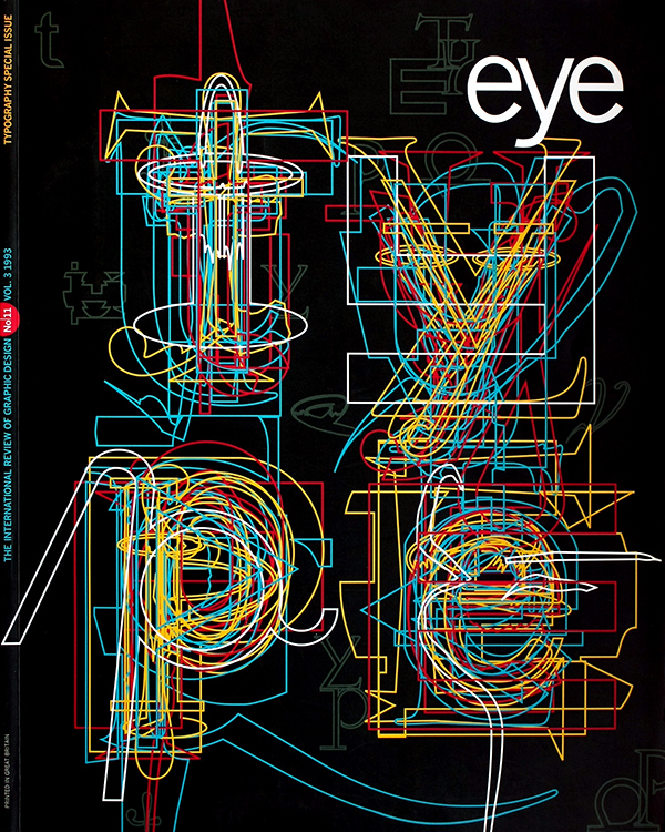
First published in Eye no. 11 vol. 3, 1993
Eye is the world’s most beautiful and collectable graphic design journal, published for professional designers, students and anyone interested in critical, informed writing about graphic design and visual culture. It is available from all good design bookshops and online at the Eye shop, where you can buy subscriptions and single issues.