Winter 2014
Nostalgia for the Carnation Revolution
anonymous designers
Design history
Graphic design
Illustration
Reviews
Typography
Visual culture
Freedom of Image – Design and Visual Communication in Portugal
Porto, 29 May–26 September 2014

The exhibition ‘Freedom of Image’, which was spread throughout Porto between May and September 2014, was a vast collection of work from a vital period of political change. It gave witness to ephemeral and functional graphic design production in the period between 25 April 1974 – when the so-called ‘Carnation Revolution’ brought almost half a century of dictatorship to an end – and 1986, when Portugal entered the European Union. This period saw the birth of many political parties, movements, rallies and associations that allowed democracy to flourish. Graphic design was instrumental in this process.
Approximately 500 pieces of graphic design were displayed in Porto institutions such as the Museu Romântico, Palacete dos Viscondes de Balsemão, Casa do Infante, Casa-Museu Guerra Junqueiro, the music hall Casa da Música, Biblioteca Almeida Garreth and the Contemporary Art Museum of Serralves.
Famous posters, like the exhibits, were loosely organised thematically: MFA (1974) by designer João Abel Manta, Povo / MFA Revolução em Marcha [Revolution under way] (1975) by Artur Rosa and Não faças o jogo da reacção, vota pela revolução [Don’t play the reaction game, vote for revolution] (1975) by Marcelino Vespeira. These posters used simple visual language, making use of Portugal’s rich tradition of political illustration and caricature, while revealing traces of Modernism.
Ana Hatherly’s decollages The Streets of Lisbon (1977) provided a visual overview of the city’s walls by ripping and collaging political posters. Examples of crucial works to be found in the many spaces of the exhibition included the satirical newspaper O Coiso, A Capital (1974) and the masterfully designed 1959 book by Victor Palla and Costa Martins, Lisboa, Cidade Triste e Alegre [Lisbon, Sad and Happy City] – the book’s pioneering importance justifies the chronological detour.
While the majority of the work in the exhibition revealed a political connection and affiliation with the revolution of April 1974, some exhibits had different aims. The easily recognisable output of the designer João Machado, one of the best known Portuguese graphic designers, had a strong presence, and revealed the influence of Modernism in social and cultural production. The exhibit allowed an exposure to paintings (by Vieira da Silva), illustrations and performance that shaped Portuguese graphic design. Some performance and co-designed work (labelled ‘intercreativity’) from the 1970s by multi-disciplinary artist Ernesto de Sousa highlighted the influence of the Fluxus Group and allowed the visitor to see the impact of other disciplines in graphic design.
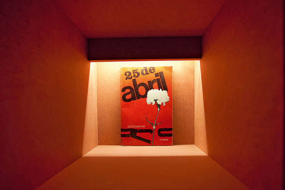
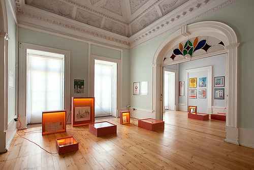
The scattering of exhibits made it difficult to see the whole exhibition in a single day, obliging visitors to explore the city and take breaks between venues. To make it more challenging, the historic venues had their own architecture and idiosyncratic interiors; in many cases, the work had to co-exist with permanent collections. Bringing temporary exhibitions to museums with collections that remain untouched by time can cause problems for visitors. At the entrance to each venue the work was announced by a text by the exhibition’s curator, José Bártolo of ESAD, Matosinhos’ Escola Superior de Artes e Design, and another from the Porto council of culture. The work itself was displayed inside red cabinets protected by glass and laid on the floor, or sometimes on top of furniture. Captions were largely absent, so that the audience had to rely on an overly academic introductory text to navigate myriad graphic design media – posters, newspapers, publications, stickers, pins, record sleeves, installations, collages and paintings.
The neutral visual identity was designed by the Porto-based design studio Drop, and the coherence between exhibits was achieved and signalled by red cabinets illuminated from inside, with a matching red power cable. With a playful black and red typographic composition, the visual identity seemed distant from the issues at stake. The exhibition posters had an important presence in the city but hardly engaged the viewer, provoked or raised awareness of its political and ideological dimensions. Nor, despite its openly celebratory aims, did ‘Freedom of Image’ seem to be open to non-Portuguese speakers. There was little to contextualise the work for visitors from other countries, who struggled to understand the presence of slick boxes in the middle of furniture from the Romantic period and the relevance and context of such work.
This celebration took place inside these stylish, glamorous cabinets which blended subtly with the lavish interiors of the venues, giving the work a nostalgic look. At a time when the achievements of 25 April 1974 are being challenged both by a monopolising mainstream media and by severe government cuts, the work deserved a bolder, more critical presence.
Exhibition installation at the Palacete dos Viscondes de Balsemão.
Top: 25 de Abril – Documento by Fernando Cascais (Casa Viva, 1974). Cover design by Carlos Rafael. Photos by Inês d’Orey.

Francisco Laranjo, graphic designer, researcher, London
First published in Eye no. 89 vol. 23 2014
Eye is the world’s most beautiful and collectable graphic design journal, published quarterly for professional designers, students and anyone interested in critical, informed writing about graphic design and visual culture. It is available from all good design bookshops and online at the Eye shop, where you can buy subscriptions, back issues and single copies of the latest issue. You can see what Eye 89 looks like at Eye before You Buy on Vimeo.

