Spring 2007
Oliver’s Posters
Slightly off the Ground: Vaughan Oliver and v23 poster designs
18 January – 3 March 2007<br>Stanley Picker Gallery. Faculty of Art, Design & Architecture, Kingston University, LondonThe latest music industry fly-poster spotted on the way to work used to be a frequent subject of discussion among designers. Put up overnight by illegal fly-tipping teams, these posters formed a vast urban tableau of what Vaughan Oliver calls ‘free art’. Advertising new albums and singles, many posters were by the best designers of the past few decades; many of them were examples of graphic art at its most expressive.
But the music industry poster is a thing of the past. Fly-posters have been successfully outlawed by city councils that claim to be reducing visual pollution, but who are in fact preserving the urban terrain for big buck advertisers. Record labels no longer even bother with ‘legal’ shop posters either, and as a consequence, music posters have joined vinyl album covers as cherished artifacts from a nostalgia-soaked and increasingly
distant past.
Viewing ‘Slightly off the Ground’, a collection of Vaughan Oliver and V23’s posters, mostly for the label 4AD, is to realise that in Oliver’s hands the large-format poster is an even better setting for his vivid displays of theatrical typography and dramatically charged imagery than the twelve-inch album cover. Most of the posters are derived from Oliver’s celebrated 4AD sleeves. In fact, Oliver describes his posters as ‘reconfigured album covers’. Many are encased in elegant black frames, but the show is greatly enhanced by large partitions made out of corrugated zinc fencing on to which real fly-posters have been stuck. These installations effectively replicate the experience of encountering banks of multiple posters in the street.
By chance on the day that I visited the gallery – a moodily lit modern space on the campus of Kingston University – Oliver was present. He showed me around, telling stories about the genesis of many of the works on display. It will come as no surprise to learn that many of his best-known images have their inspiration in childhood incidents or remote and highly personal observations.
Oliver is a likeable man. People who meet him expect a darkling prince from a Tarkovsky movie, or a man riven with poetic tumult and occult imaginings. Not so; he is big, burly and cheerful, with a sly sense of humour and speaks in a soft, musical County Durham accent. He talks about his work like a benign football manager describing the merits of his affectionately regarded team. It was hard to keep in mind that this was the same man who can be seen on one of his most famous album covers – The Breeders’ Pod – dancing naked except for large, flapping eels strapped to his waist.
Oliver has joined that small group of graphic design immortals. Like all great designers, his work is instantly recognisable and seems above the humdrum preoccupations of mere graphic communication. Nevertheless, Oliver is a man without a clear direction. Ever since he was ejected from the enchanted garden of 4AD (while at the label, Oliver was given a studio, a handsome retainer and enough creative freedom to satisfy a regiment of designers), he has struggled to replicate the creative fecundity of this golden era. ‘Slightly off the Ground’ reminds us of Oliver’s greatness, but begs the question, what’s next?
Adrian Shaughnessy, writer, creative director, London
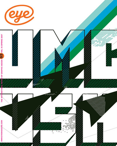
First published in Eye no. 63 vol. 16 2007
Eye is the world’s most beautiful and collectable graphic design journal, published quarterly for professional designers, students and anyone interested in critical, informed writing about graphic design and visual culture. It is available from all good design bookshops and online at the Eye shop, where you can buy subscriptions and single issues.

