
Winter 2014
Slip sliding into history
Jurriaan Schrofer: graphic designer, pioneer of photo books, art director, teacher, art manager, environmental artist
Frederike Huygen, with archival and image research by Jaap van Triest<br> Designed by Jaap van Triest and Karel Martens<br> Valiz, Amsterdam, $50 / €39.90, paperback<br>
About halfway through this long and highly detailed study of the life and work of Jurriaan Schrofer (born 1926), I had the thought that this Dutch graphic designer, who began his career in the postwar years and died in 1990, must have been a Zelig-like character. Woody Allen’s 1983 mockumentary presents the life of Leonard Zelig, a man with the uncanny ability to appear in newsreels and press reports of historic events in the 1920s and 1930s. Zelig parties with F. Scott Fitzgerald; he appears at a Nuremberg Rally; and he plays baseball for the Yankees. Moreover, assuming the character and the appearance of the powerful people around him, he slips into history almost unnoticed.
Schrofer designed some of the major publications of Dutch intellectual life, such as Forum magazine and Ooievaars’ paperbacks; he designed for PTT (the national post office), the Stedelijk Museum and numerous high-profile clients; he was a partner at Total Design, alongside Wim Crouwel; he laid out a version of the Situationist Constant Nieuwenhuys’ New Babylon, a project for a utopian anti-capitalist city; he sat on numerous official committees, including one tasked to commission a monument for Queen Wilhelmina. Not only was Schrofer highly prolific and busy throughout his life, his career, as Frederike Huygen argues, followed a remarkably winding path. Unlike his near contemporaries, Jan van Toorn, Otto Treumann and Wim Crouwel – Schrofer has not been picked up by historians and curators for serious analysis until now, almost 25 years after his death.
Unit Editions published a small, well illustrated book on his type designs last year, also with an essay by Huygen. But this is a much more substantial study covering all aspects of Schrofer’s diverse career (perhaps itself a reason why this book comes so long after studies on Toorn (2008), Treumann (2001) and Crouwel (1996) in the same series). It is also by no means a hagiography. In her conclusion, Huygen writes: ‘In contrast to many other designers, he cannot be identified by a personal signature or a long-standing relationship with another client. His oeuvre lacks visual consistency and stylistic development, and his career boils down to playing a role in policy making.’
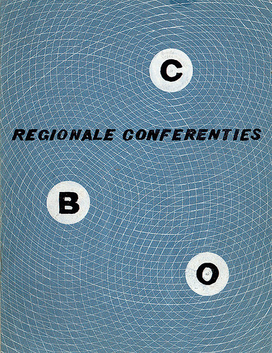
Cover by Jurriaan Schrofer for a 1956 brochure advertising conferences held by the CBO, a Dutch foundation for fostering relationships between business and education.
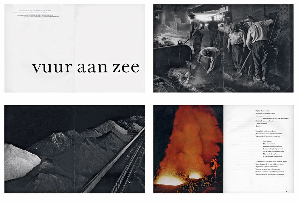
Top: spreads from Vuur aan zee (Fire by the Sea, 1958), a photo book which Schrofer designed and edited for the iron and steel company Hoogovens.
As the numerous testimonials in Huygen’s book make clear, Schrofer had a strong ego and could be a commanding presence. Allen’s Zelig is a hollow character and so perhaps this is where the comparison falters. Nevertheless, Schrofer appears to have been someone who could hold two seemingly incompatible views (or at least be capable of changing his mind fast). In the early 1960s he wrote a powerful essay, ‘Gigolos and Petty Capitalists’, attacking his own profession for lacking a critical perspective on the commercial world in which they operated, and yet he was busy working for the NPO (Nationale Publiciteits Onderneming) agency. Van Toorn recalls a conflicted individual: ‘Jurriaan was a very romantic man, he prided himself in his anarchistic ideas about life but he found it difficult to live with disorder and could not restrain himself from adopting a strictly intellectual approach to his students and the information society.’
Huygen’s study of this complex character is broadly biographical. Her book – 420 pages of densely set type and more than 1000 illustrations – combines broad themes with different phases in her subject’s life. Schrofer‘s work as art director is, for instance, set against the professionalisation of Dutch advertising under the influence of American models in the 1960s. Working with Jaap van Triest, she has consulted large amounts of material – including the Schrofer Archive at Amsterdam University. There are 47 interviews with friends and colleagues; dozens of sketches, flat-plans and mock-ups, plus printed designs; all Schrofer’s own writings and lectures (which, on the basis of the material quoted in this book, bristle with opinion), and the large amount of literature by others about him.
This heroic task of historic excavation is both the book’s advantage and disadvantage. It is, without a shadow of a doubt, a comprehensive study that any scholar of Dutch design will need to read. But lay readers will find the detail daunting. The book has a cast of thousands, or so it seems, and Schrofer’s propensity to join committees necessitates lots of acronyms. Occasionally, Huygen’s ideas get lost in the detail.
The same can be said for the presentation of Schrofer’s designs, too. Huygen’s approach is largely to take the reader through the commissioning process for Schrofer’s bold book covers for publishers, lively magazine and book spreads, restrained advertisements and image-rich environments. How, when and why these designs appeared is described with great accuracy; fewer words are spent interpreting them. Perhaps this is why two excellent essay-like chapters in the book – which break with the biographical format and focus sharp attention on Schrofer’s designs – stand out. One, on his cinematic layouts of photo books (often commissioned by corporations as promotional and gift items), explores the way in which this emerging format was conscripted in the 1950s to tell the story of postwar reconstruction of cities, such as Delft, and their citizens. The other charts Schrofer’s attempts to create dynamic letterforms in the 1960s and 70s. Engaged with new thinking about optics, gestalt theory and ornament, cybernetics and computer art, Schrofer created rippling fields of letters and other typographic elements. Some were applied in PTT stamps and the covers of books published by Mouton in the 1970s, while others remained experiments in Modern ornament. Curiously, if Huygen had only presented the material in these two chapters, Schrofer’s place in the front row of Dutch graphic design history would be more certain. The contradictions of his life leave the impression of a more equivocal figure.
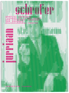
Cover of Jurriaan Schrofer.
David Crowley, head of Critical Writing in Art & Design programme at the Royal College of Art, London
First published in Eye no. 89 vol. 23 2014
Eye is the world’s most beautiful and collectable graphic design journal, published quarterly for professional designers, students and anyone interested in critical, informed writing about graphic design and visual culture. It is available from all good design bookshops and online at the Eye shop, where you can buy subscriptions, back issues and single copies of the latest issue. You can see what Eye 89 looks like at Eye before You Buy on Vimeo.