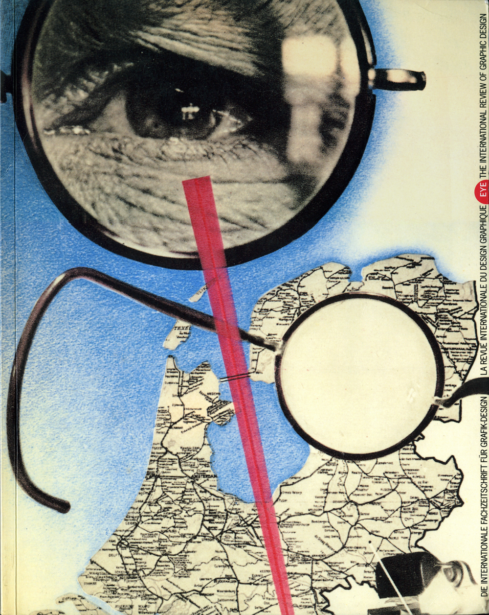
Autumn 1990
Typography’s new priests
Roger Black
Erik van Blokland
Neville Brody
Matthew Carter
Adrian Frutiger
Jost Hochuli
Zuzana Licko
James Mosley
Louis John Pouchée
Just van Rossum
Erik Spiekermann
Jack Stauffacher
Book design
Critical path
Graphic design
Technology
Typography
Type90
Oxford, England 31 August – 3 September Reviewed by Robin Kinross‘Type90’ brought several hundred typographically preoccupied people to Oxford this summer. Following the successful pattern of ‘Type87’ in New York, the event was convened and underwritten by the Association Typographique Internationale (ATypI) and sponsored by a clutch of the major companies that dominate the shrinking and expanding world of typography (read on for an explanation of this paradox).
Although it was possible merely to taste from the packed schedule of lectures and simultaneously running workshops, a number of major themes did emerge. One unexpected common thread was decoration: a theme that was incidentally reinforced by the thickly ornamented interior of the Town Hall, in which main lectures were held. A forthcoming publication of the decorative types of Louis John Pouchée was the pretext for a brilliant tour around the topic by James Mosley of London’s St Bride Printing Library. This was a demonstration that history can be imaginative and suggestive and, incidentally, a reminder that the present parochial threat to the future of St Bride Library has global implications.
Mosely had been preceded by the Dutch type-designer Gerard Unger, discussing with deadpan humour all aspects of his county’s chocolate letters. ‘Legibility? We need worry only about edibility.’ A nice joke, but it had resonance in discussions elsewhere about he need to recognise aesthetic factors in non-Latin scripts (‘exotics’, they used to be patronisingly termed). For centuries the rich, subtle forms of these scripts have had life squeezed out of them in crude versions from Western type-draftsmen. But now, in the meltdown of national cultures and with easier means of producing type, there is chance of something better. Back to Unger, who had brought chocolate letters for sale (£1 each) to the conferees: ‘don’t feed them into your Macs,’ he warned. That linked with another big theme of the event.
One of the demonstrators on a software company stand remarked that at ‘Type87’, not so many people had experience of the Macintosh, but now almost everyone had: as if the hegemony of that system within graphics is now complete. (Yet, one famous designer announced herself as a ‘technophobe’, preferring knife, gum – and photocopier.) There was much talk about the ‘democratisation of typography’, whereby anyone with access to the technology can be their won fontographer, their own pagemaker. If the people on the platform of the hall were the priests of typography, on the floor – and everywhere outside – is the new active laity.
The conference also confirmed the emergence of young type designers: ‘half my age’, said young-middle-aged Erik Spiekermann; ‘half my age less five’, said ex-hipster and ‘Type90’ chairman, Roger Black. Among these youngsters were Neville Brody, Zuzana Licko and Eric van Blokland. Unencumbered by the heritage of Western typography, they are radical theologians, a new kind of priest. For example, the Czecho-Slovak-Californian Licko designs forms ‘based on elements that are inherent to digital technology’ (in the words of the Emigre catalogue). Like the Emigre-produced music that accompanied her presentation, the letters show a certain romanticisation of the mechanical.
This position came in for some criticism by the older masters of type design – Adrian Frutiger, Matthew Carter – who reviewed their past contributions in the light of the technical constraints that had then existed. Carter argued that to take your bearings from technical constraint will, in such a rapidly changing context, produce rapidly obsolescent type; that the technology is now refined enough for anything to be reproduced; so why not plot the subtlest form? Another speaker asked for less smoothness in the recreation of historical letter forms: perhaps in the spirit of CD recordings of authentically performed early music.
These suggestions for type design had their parallel in the field of design with text. Modern-and-traditionally-minded typographers, such as Jost Hochuli and Jack Stauffacher, spoke up for the primacy of the text, for its loving investigation and thoughtful configuration. If people don’t read much now it may be, Hochuli thought, because text design has got so bad. Such indications that semantic subtlety and formal delight are now achievable – with the newest technology and some of the oldest wisdom – were among the hopeful aspects of ‘Type90’.
Robin Kinross, typographer, design historian, publisher, London
First published in Eye no. 1 vol. 1, 1990
Eye is the world’s most beautiful and collectable graphic design journal, published for professional designers, students and anyone interested in critical, informed writing about graphic design and visual culture. It is available from all good design bookshops and online at the Eye shop, where you can buy subscriptions and single issues.

