Summer 2008
We need a hero
Jan van Toorn: Critical Practice
By Rick Poynor <br>Design: Simon Davies<br>010 Publishers, € 37.50<br>
Third in the series ‘Graphic design in the Netherlands’, Jan van Toorn: Critical Practice takes on the difficult task of exploring and striving to elucidate the work of Jan van Toorn (JVT), a designer who is not always clear about his intentions, who makes frequent use of inexplicable images and text, and whose work is often described with concepts such as ‘alienation’, ‘incomprehensibility’, ‘defamiliarisation’, ‘digressions’ and ‘intrusion’.
Jan van Toorn is a rarity: a radical designer with a long, steady career and an international reputation as both designer and educator. He stood in counterposition to Wim Crouwel, another designer who dominated the 1960s and 70s in the Netherlands. Crouwel, the co-founder of Total Design, advocated an objective, functional and systematic approach to graphic design, while JVT’s style is personal, confrontational and highly idiosyncratic.
Van Toorn takes an interest in all forms of propaganda, manipulation and dissemination of information. From the 1970s on, his priority has been to make the viewer of his designs aware of the mechanics of manipulation. His work includes subversive ‘dialogic’ elements (he used the term ‘dialogic’ to describe interaction with the viewer of design), which are deliberately provocative and unfinished. He is also a theorist, observing: ‘In one way or the other, the public must remain in a position where they can measure the motives of the producer and mediator that lie behind the product, against their own experience of the world.’ JVT favours expression that stimulates the reader, rather than beautiful compositions and sleek forms. As a result, his work requires the viewer to have the ability and willingness to interpret the work.
Knowing that it could be risky to accept such a designer’s descriptions of his own works at face value, Rick Poynor chose a more effective way to describe Van Toorn’s work: instead of describing its appearance or speculating about the rationale behind it, Poynor looks in detail at his reading list.
The idea is simple: since Van Toorn is highly concerned with cultural and political theories and immersed himself in the world of Brecht, Chomsky, Debord, Deleuze, Eco, Enzensberger, Godard, Habermas, Marx and Shklovsky, studying these sources of inspiration reveals a lot about his development, and it is interesting to see how particular books manifest themselves later on in the actual work. Poynor points to crucial books that Van Toorn has read and presents their main arguments at length. For example, the German poet and cultural critic Enzensberger and his idea of ‘repressive and emancipatory media’ had a profound influence on Van Toorn’s later way of thinking about design.
The ten sections organise the book into thematic parts, though it also follows a chronological progression. The titles of the sections (Visual Reporting, Anti-house Style, Critical Practice, Deschooling Design, Styles of Representation …) give a good idea of what is discussed. Poynor’s text is squeezed between the early work and the beginning of JVT's mature phase, and while in most cases the work mentioned is shown on the same page as the text, in certain places the decision to concentrate the main text in one place requires one to page through the entire book to find the work referred to.
Poynor documents at length the important and at times also amusing debate between Wim Crouwel and Van Toorn, including Crouwel’s ‘correction’ of JVT’s 1974 calendar. These exchanges present two irreconcilable approaches toward design, which have now become landmark moments in Dutch graphic design history.
As in the two previous books in the series (Otto Treumann, Willem Sandberg), the designer of the book is also credited for ‘image-editing’. Designer Simon Davies mimics Van Toorn’s characteristic design elements: for the main text of the book he uses loosely spaced Univers 55 (a reference to the typography of Dutch Art + Architecture Today magazine where JVT determined the trial text setting by showing it to his neighbours and asking what they preferred). For the chapter dividers Davies used large, forced-justified, caps-only quotations (mostly by JVT), similar to JVT’s treatment of type on late posters for the Jan van Eyck Academy. Following JVT’s habit, the pages use very narrow margins that push the text to the edge of the page. Finally, to emulate the roughness of JVT’s use of images (see, for example, his calendars from 1976-77 for Amsterdam-based printer Mart.Spruijt), Davies avoids using discernible grids, but prefers using scrapbook-like compositions, cutting out photos with deliberate clumsiness.
The reproductions of Van Toorn’s works are on a neutral grey background, with visible pins attaching posters, or human hands holding books. While it is difficult to discuss the appropriateness of these design choices, the physical aspect of the book is not up to the standards of its subject. With the text of captions extending far into the inside margins, ‘perfect’ binding is not the right choice. One doesn’t have to go far to find a better example. Ad Petersen’s Sandberg, Designer and Director of the Stedelijk (from the same series, in the same format) does what a book should do: it lies flat when opened, accommodating the use of narrow margins. It was designed by Jan van Toorn.
The design community needs a model to look up to, someone who balances the number of designers operating in the commercial sector. We are even willing to tolerate the occasional ambiguities. There are not many designers who openly question the clients’ briefs, challenge and confound expectations, and moreover manage to infiltrate their work with a personal and political agenda in the manner of Jan van Toorn. This book is not only a commendable contribution to design history but a rare example of a graphic design monograph that celebrates forms and comprehensively presents a body of work that is deeply engaged in issues of social consciousness.
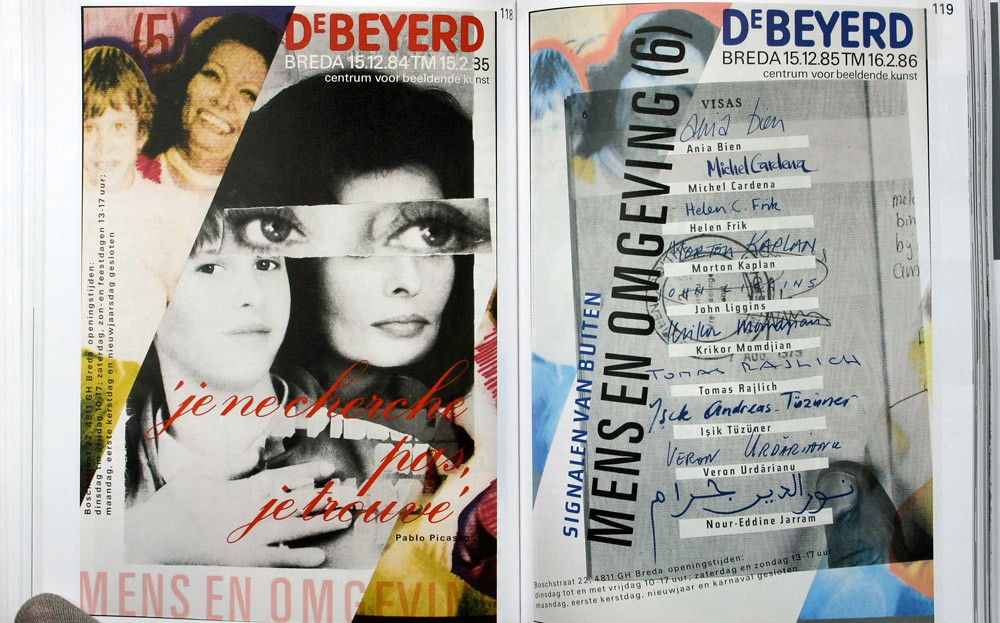
Top: Spread from Jan van Toorn: Critical Practice, designed by Simon Davies.
First published in Eye no. 68 vol. 17 2008
Eye is the world’s most beautiful and collectable graphic design journal, published quarterly for professional designers, students and anyone interested in critical, informed writing about graphic design and visual culture. It is available from all good design bookshops and online at the Eye shop, where you can buy subscriptions and single issues.