
Wednesday, 12:02am
26 June 2013
Sinhala’s voluptuous letters
A collaboration – between Columbo, in Sri Lanka, and Falmouth, in the UK – explores the typographic possibilities of the Sinhalese abugida
The orthography of the Sinhalese, one of the peoples of the beautiful island of Sri Lanka‚ is one of three writing systems that populate the visible culture of the south Asian island nation, writes Timothy Donaldson.
Tamil script and the Latin alphabet complete the triumvirate. Latin is familiar to all who are reading here. Tamil characters have a consistent mix of straight lines and curves. However Sinhalese script is a uniquely voluptuous phenomenon – the alphabet (properly an abugida, a system where the vowels are merged with consonants to form modifying characters) has hardly any straight lines.
The reason for this is delightfully functional. Early manuscripts were made not (as in Europe) with pen and ink on the robust and flexible skin of animals but on dried palm leaves – making an impression of the letters into which was rubbed a paste of charcoal and oil. In a way similar to the intaglio process, the mixture was removed from most of the leaf, leaving black marks in the grooves. The reason for the multitude of curlicues was the scribes’ desire to avoid splitting the substrate down its long fibres: perpendicular and orthogonal marks were rejected.
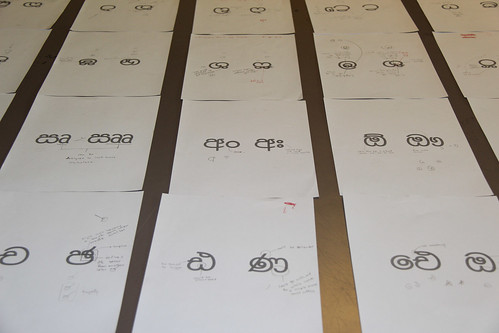
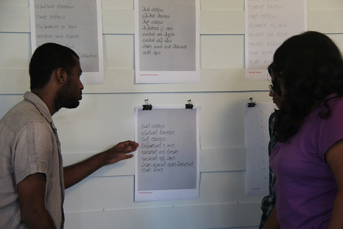
A group critique of individual Sinhalese characters, in response to initial thoughts from the first day’s questionnaire.
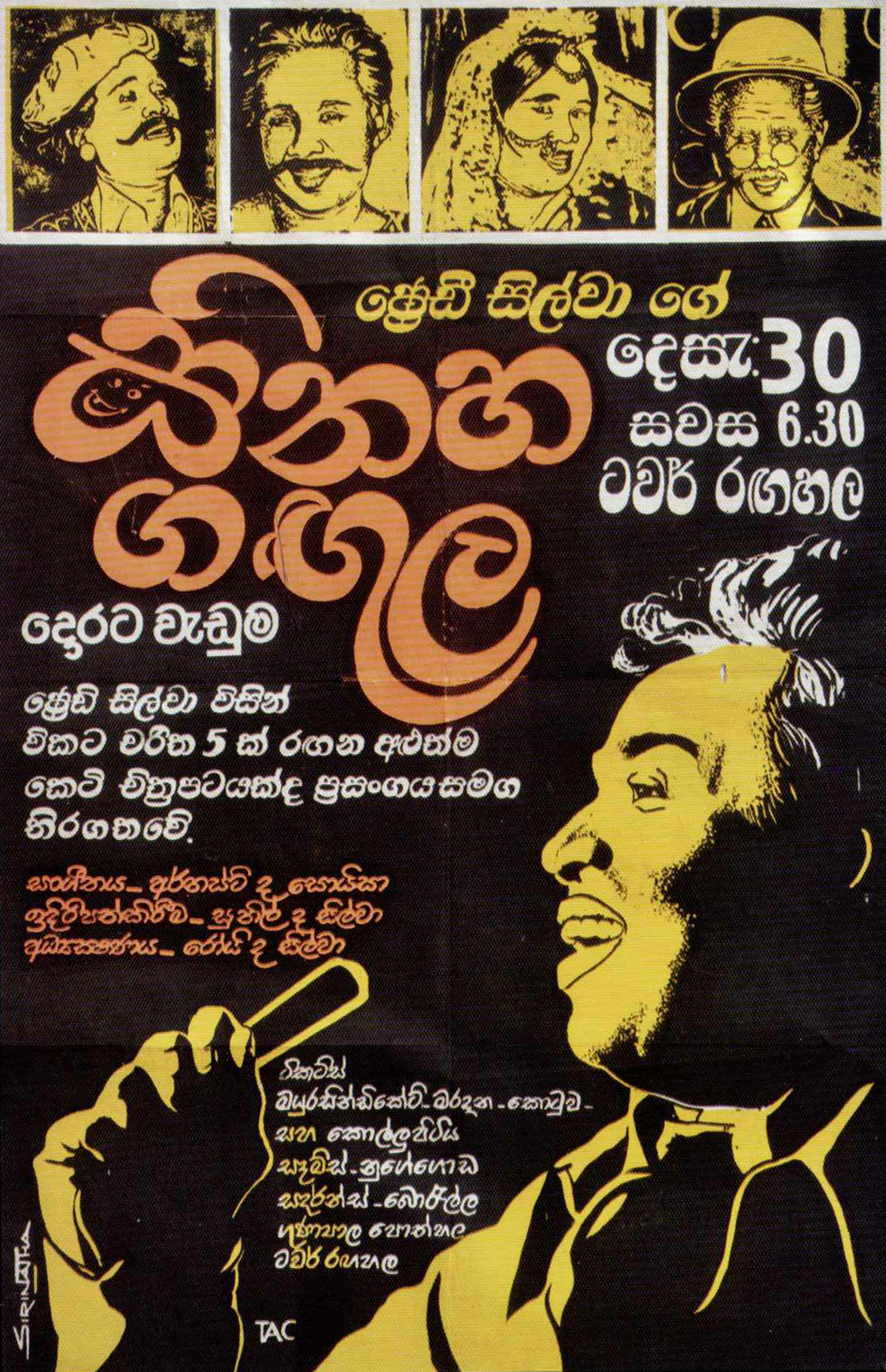
Top: Sinaha Gangula. Sinhala language comedy poster from the book Vintage Posters of Ceylon.
Despite a historical longevity that equals the Latin alphabet, the Sinhalese abugida is only used for the Sinhalese language, so the market for Sinhalese typefaces is small. But this has opened up an interesting possibility for the cultural philanthropy in which academia often plays a role.
Happily, the past two years has seen some fruitful dialogue between Falmouth University, where I teach, and The Academy of Design in Columbo, the commercial and cultural capital of Sri Lanka. This collaboration led to my participation, last month, in a type design workshop with a group of students and staff in Columbo.
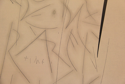
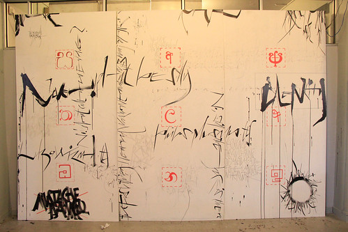
A detail of the pluralistic writing styles used for the text of the ‘jazz questionnaire’.
On arrival in Sri Lanka, I met informally with Alain Parizeau, the Academy’s head of design, and we prepared a ‘jazz questionnaire’ for the students. The responses to this would help us determine the state of undergraduate thinking, not just on available Sinhalese typefaces but on the state of the orthography itself, within a complicated, trilingual culture, with all the attendant sociopolitical perspectives.
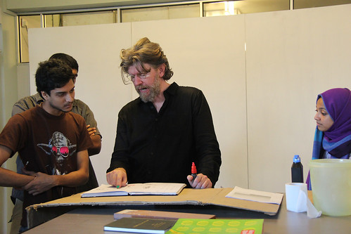
Timothy Donaldson (centre) discusses letter spacing with students (L to R) Sahil Gunasekera, Thamal Liyanage and Adhila Marzook.
Day two was spent considering the intricacies and problems of Sinhala as a prefabricated character, with a visit from Pushpananda Ekanayake, a former sign-painter turned type designer who seems to have been responsible for many of the available Sinhalese typefaces. The maintenance of self-similarity within the marks, so essential to type design practice, was placed clearly into the foreground.
In a deliberate, liberating adjustment to the usual pedagogic syntagm, the third day was initially spent in the company of Rizan M.A. Hameed, a Sinhalese calligrapher and later under mango trees, within the beautiful precinct of the Barefoot Café, where, in the sticky heat of the early monsoon season, students were encouraged to take part in the surreality of some short, sharp writing experiments, to energetically reflect on aspects of movement within writing, to interpret communal gesture and to simulate the reductive development of actual narrative to graphemic economy.
Pathum Egodawatta (left), Chethya Munasinghe (right front) and Shanika Ratnayake (right back) scrutinise some of the early typeface proposals.
Video made by Alain Parizeau.
By the fourth day it felt right to reflect on history by doing some collective drawing / writing in a public space. We asked students to record their visual statements in the form of selected characters – in their preferred styles – within red frames. Once completed, students gathered to edit the questionnaires and proposed excerpts that I recorded in black ink around the red letters. As this was happening, we received a visit from Dr Asoka Mendis de Zoysa, who displayed some of his precious palm-leaf books for our scrutiny.
On the final day we looked at some early proposals for typeface designs, nothing of which is ready to see yet, but full of promise for the eventual creation of new Sinhalese typefaces – it ain’t over yet!
The ‘jazz questionnaire’ dances with red boxes on Friday afternoon.
Read more about type design workshops in ‘Learning on location’ from Eye 85, and about non-Latin typefaces on the Eye blog in ‘Type in multiple directions’, ‘Here be all kinds of graphic dragons’ in Eye 66 and ‘Roadshows and rickshaws’ from Eye 64. See also the interview with Decodeunicode’s Johannes Bergerhausen from Eye 64 in ‘The United Nations of Type’.
Timothy Donaldson, type designer and Associate Professor of Graphic Design, Falmouth University
Eye is the world’s most beautiful and collectable graphic design journal, published quarterly for professional designers, students and anyone interested in critical, informed writing about graphic design and visual culture. It is available from all good design bookshops and online at the Eye shop, where you can buy subscriptions, back issues and single copies of the latest issue. You can see what Eye 85 looks like at Eye before You Buy on Vimeo.