Friday, 10:00am
23 May 2014
An end to the curatocracy?
Casson Mann
Opera
Nick Bell
Hermann Kossmann
Tom Duncan
Critical path
Graphic design
Information design
Reviews
‘Chaos at the Museum’ burned bright. The event was a rare opportunity to share new visions for the future of exhibition design, writes Nick Bell

The most unusual thing about the London conference ‘Chaos at the Museum’ was that it was devoted to design, writes Nick Bell.
Most discussion of museum practice is dominated by curators – whether at conferences or in the media. So it was not surprising that the designers attending ‘Chaos at the Museum’ (26-27 April 2014) could barely suppress their excitement all day. I’ve never seen so many smiles since, well, the Martin Creed exhibition at the Hayward. We were like children let out to play at this two-day programme about museums and exhibitions drawn up by designers.
‘Chaos’ was an event that burned brightly with feral visual intellects drawing deeply on a rare opportunity to share experiences, be outspoken and distil their vision for the future of visitor engagement and participation in the public spaces we call museums.
Why is it we behave like we do in museums and why must this behaviour be unlearned? How do we best organise museums to be engaging and why is it not really about narrative? Why is it not even about objects? Might visitors be the ones that finally undermine the authority of the curator? This was the dirt being kicked up at ‘Chaos’.
Day one was a colloquium of presentations by PhD students from as far afield as Australia, organised by CSM’s Jona Piehl and Claire M. Holdsworth. Day two was a programme of short talks by designers followed by workshops organised and hosted by Tricia Austin, Course Leader of Central Saint Martins’ MA Narrative Environments and Tim McNeil, Chair of Design at University of California, Davis.
Objects of desire
To kick off, David Francis (University College London) told us that the British Museum employed its first professional designer, Margaret Hall, in 1964. Up to this point, British Museum academics had autonomous control of displays. Hall’s arrival marked a sea change. As head of an entirely new design department, she had authority not just over design but also over the curatorial approach. Francis spoke about Hall’s darkly lit design for the British Museum’s first blockbuster ‘The Treasures of Tutankhamun’ (1972) that still holds the Museum’s best attendance record. With little experience of temporary exhibitions that were, at the time, seen as lowbrow; it seems that the museum’s academics disregarded the exhibition interpretation text, which was written by a journalist from The Times, the exhibition sponsor. Francis described the writing style as ‘sensational’. (The British Museum would have no interpretation department until 2005.)
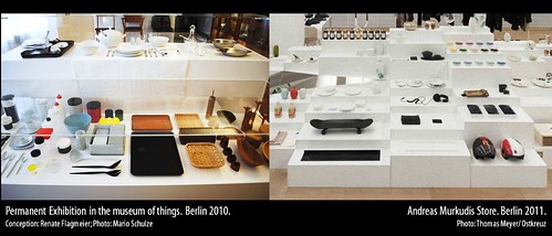
Evidence presented by Mario Schulze (University of Zurich) would, like Francis’s, indicate that the distinction we make between museums (not like shops) and shops (not like museums) is outdated. Schulze said that the first department stores that appeared in the 1850s took inspiration from the great museums. Through his comparison between the Berlin interiors of the Museum of Things at the Werkbund Archive and the Andreas Murkudis’ concept store of ‘curated’ design objects, Schulze concluded that the museum is by its nature consumerist. Like shops, museums are about the display of desirable objects and hence the commodification of desire. (Commodification would be agonised over in later presentations, too).
Schulze quoted the Australian sociologist Tony Bennett in calling this ‘the exhibitionary complex’ – a way of seeing the museum as part of the world instead of treating it as a monolithic archive with no category in which to place itself. My heart sank when Schulze signed off his paper with ‘what you’ve learned in the museum, you can test out in the shop,’ but it was good to hear potentially false oppositions conflated and have my ingrained twentieth-century prejudices scrutinised.
In her paper, ‘The Exhibition as Experience’, Donna Loveday was the curator who in avoiding one trap promptly fell into another. Loveday’s current and popular ‘Hello, My Name is Paul Smith’ exhibition at London’s Design Museum should be applauded for not further infecting the Design Museum with antiseptic commodification-of-desire type design moves. Loveday introduced a healthy dose of messy, human informality by choosing to present a singular creative mind with the warmth and chaos of all its motley inspirational sources rather than fetishising a few items from the Paul Smith back catalogue.
However delegates wondered (in the canteen at break time) why Loveday had assembled a design team without any critical distance from her subject? And why Paul Smith himself was allowed so much curatorial control? What kind of deal had the Design Museum entered into here? In trying to make sure the exhibition wasn’t a shop, Loveday succeeded in creating a pastiche of another reality – the Paul Smith studio. As Herman Kossmann of Dutch design studio Kossmann.dejong declared in his talk the next day, ‘Don’t copy reality – instead make another one.’
Museum of Things, 2011, compared to Andreas Murkudis concept store, 2011.
Top: ‘Hello, My Name is Paul Smith’ installation image at London’s Design Museum.
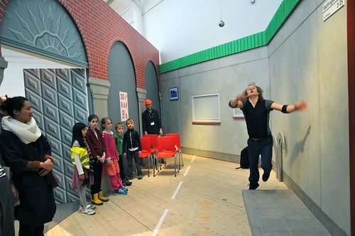
In a discussion with Canadian curator Gillian Russell (Royal College of Art) entitled ‘The Exhibition as Speculative Design’, Onkar Kular (Royal College of Art) and Inigo Minns (CSM) presented (in a rather oblique fashion) their performative exhibition ‘Risk Centre’ which took place at the Arkitekturmuseet, Stockholm in 2013. Together, with ‘Risk Centre’ and a number of other exhibition precedents dating back to the 1960s on the screen behind them, they posed the urgent question of ‘how can we unlearn the way we think we are supposed to act in museums?’ ‘Risk Centre’, was ‘a site-specific risk assessment facility and educational performance space’ that was ‘part film set, educational facility and theme park’ that took visiting groups on ‘guided daily risk tours’. We in the audience were unaware of this until Julia Pitts (CSM) was brave enough to get them to explain. Their stills showed what appeared to be a slapstick comedy: in one image, an adult actor trips up a pavement kerb and in another the same actor can be seen falling down stairs in front of a bunch of straight-faced schoolchildren wearing high-visibility tabards.
An actor at the ‘Risk Centre’ exhibition at the Arkitekturmuseet, Stockholm, 2013.
Kular’s and Minns’s collaboration on ‘Risk Centre’ questions the function of the museum. They are using the exhibition as a form of design research and practice. Kular claims his work involves ‘speculation, risk and failure’ and asked rhetorically ‘will the museum allow that?’ Russell stated that their aim was to ‘get the participants [visitors] to speculate in an exhibition’. She pointed out that this is difficult because ‘the setting of the museum has people thinking about what the designer is trying to do rather than accepting the invitation to speculate with them’. Minns said: ‘I turn to participative techniques to get the audience engaged rather than classic design or architectural techniques’.
Over the two days it would become clear that the spectacle of exhibition design can often reinforce traditional modes of museum behaviour. And it would also occur to us that designers and curators are lacking in these ‘participative techniques’ that might get museum visitors behaving less passively. Minns was honest in asking ‘are designers the right people to be doing this?’ Kular offered the following provocation: ‘get the curators to take a sabbatical and allow the audience in’.
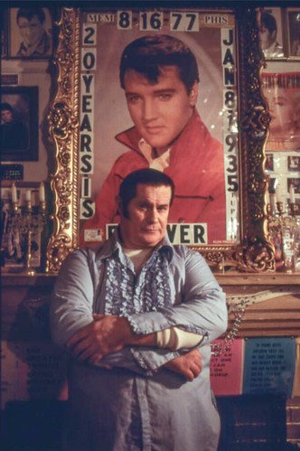
The next day, Dinah Casson (of London-based exhibition design practice Casson Mann) would go one step further with her demand to ‘get the visitor to join the design team’ – which would be fine if these were not run by risk-averse project managers and quantity surveyors. I much prefered Kular’s model whereby the museum gallery itself is used as a space for visitor speculation / production and not merely some hidden back room where the project meetings take place. The best example of the museum itself as a place for ongoing visitor production was presented by Frans Bevers of Dutch exhibition design group Opera. Bevers showed images of ‘Graceland Too’, Paul McLeod’s home in Mississippi, which has become a shrine to Elvis Presley crammed full with fan tributes. Is this the future of museums? As Bevers points out, it is so much more authentic than the squeaky-clean original.
Paul McLeod in ‘Graceland Too’, his Mississippi home, a shrine to Elvis Presley. Photograph: Toon Michiels.
Dematerialised curation
Kular revealed his ideological motivations when he said his work is ‘driving away from the market’ which he thinks makes speculative design ‘placeless’ – ‘the legibility isn’t there’. Some found the dematerialised nature of speculative design difficult to square with what museums are. A V&A curator in the audience asked (of speculative design) ‘what can be collected for the archive?’ Kular responded defensively by pointing to the resulting disseminated debate as a kind of object to kick around. Russell interjected on behalf of those agonising over commodification by saying that speculative design ‘is no longer object based’. ‘Why collect anything for the archive?’ countered Minns. He had a point.
With ‘Risk Centre’, like a lot of groundbreaking practice, it is sometimes difficult to decide whether it is genius or stupidity. Martin Creed said he swings back and forth precariously between these two polar judgements over his own celebrated output – I’m glad he soldiers on. A question from Kular and Minns’ slightly confused audience seemed to indicate that it was not convinced by ‘Risk Centre’: ‘Isn’t it like kindergarten? Isn’t this kind of thing happening a lot elsewhere?’ Yes it is and that is entirely the point. By bringing in other practice models that get people behaving uninhibitedly as protagonists and as speculators, museums can become ‘a part of the world’: a participant rather than an aloof authority.
Victory of the senses
Even though the museum world is full of objects it is dominated by text. The literary-verbal mindset (not just curators but designers too) holds sway. Which is why these two days at CSM were an opportunity for the visual people among us (not just designers but curators, too) to mount the fightback. On day-one, Mario Schulze got in fast by saying that ‘narrative installations devalue objects to be background actors in a story’, quoting Renate Flagmeier, senior curator at the Museum of Things. Yet at ‘Chaos’, the battle between objects and narrative was won by neither. It was won by the senses – all of them in play. And thanks in no small part to phenomenology – the theory of the moment that concerns itself with conscious first person experience: of what it means to ‘be’ in the world. Dinah Casson presented us with an image showing a glorious procession of stuffed animals at the National Museum of Natural History in Paris and launched day two with a fervent plea: ‘we don’t want to know what the objects are! We just want to feel it!’ Exactly. ‘It’s about entering [the museum] in one frame of mind and leaving in another’.
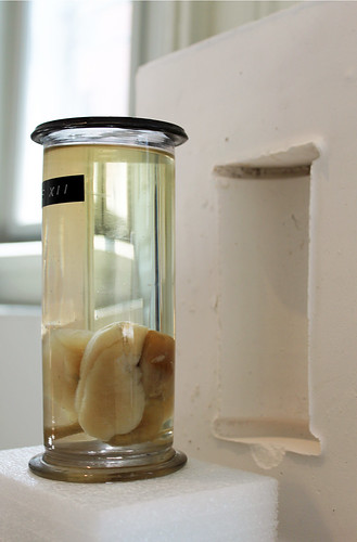
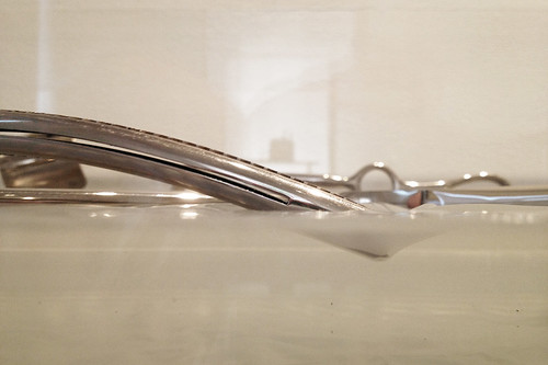
Ane Pilegaard Sørensen’s fascinating experiments aim to help visitors to get to know museum objects better as material objects with haptic qualities when it is not possible to touch them. Pilegaard Sørensen (from the Medical Museum, Copenhagen) took a phenomenological approach and talked about how ‘contextual information often overshadows the immediate experience of the object’. Her work is a fundamental shift from text to object, a deliberate rejection of the museum obsession with what she called ‘information packages’ that surround the object, designed for ‘focused eyes’. With photographs of her experimental medical object set-ups she demonstrated how it is possible to communicate the physical properties of the object visually through space and form. Quoting the Finnish architect Juhani Pallasmaa – ‘unconscious haptic experience mediated by vision’ – she presented an image that featured a negative aperture in a wall, the form of which is cast from the actual object positioned in front of it. Another image featured an exhibit mount designed to hold an object you can’t touch made of a material you can touch that feels like what you think the untouchable object would feel like if you could touch it (also known as ‘material encounter by proxy’). Another experiment involved laying heavy stainless steel medical instruments, used for obesity-related operations, on a bed of clear silicon gel. The way the surface of the gel is depressed by the weight of the instruments has an uncomfortable resemblance to the skin of an overweight human body.
Ane Pilegaard Sørensen’s experiment, featuring a negative aperture in a wall cast from the object positioned in front of it. Medical Museum, Copenhagen.
Medical instruments, used for obesity-related operations, on a bed of silicon gel, also from Ane Pilegaard Sørensen’s presentation. Medical Museum, Copenhagen.
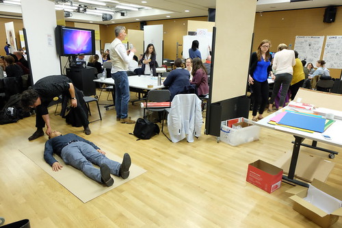
Discomfort was a thread running through the workshop I participated in on day two. I signed up for ‘Difficult Histories: visitors, ethics and interpretive design’ run by Suzanne MacLeod and Jocelyn Dodd of the University of Leicester and exhibition designer Tom Duncan (of Berlin-based studio Duncan McCauley). In the workshop, we learned about the ‘terrible gift’ of exhibitions that implicate visitors in coming to terms with histories of violence and suffering. An over-reliance on emotion has been proven to overcome visitors and make them want to run from exhibitions – as observed in the Imperial War Museum North in Manchester.
From something to someone
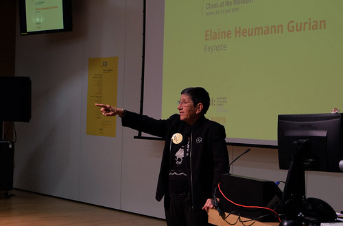
The high point of ‘Chaos in the Museum’ came on the evening of day one with a pitch-perfect keynote speech of gargantuan scope, warmth and humanity by museum consultant Elaine Heumann Gurian. Heumann Gurian entered the museum profession in the 1960s at a time when the United States government ‘decided that museums could no longer discriminate against people’. This would be known as ‘the economics of inclusion’ and it happened at the point museum endowments from the big benefactors of the twentieth century were starting to run dry and the museums were turning to government for funding structures. This was the moment in the US when ‘museums went from being about something to someone’.
Through her work with museums advocating on behalf of minority and indigenous groups Heumann Gurian is witness to the fact that ‘aboriginal peoples changed the future of museums, that native peoples of the world changed museology’. She began her talk with the bold statement: ‘Museums present evidence’. And then elaborated: ‘Note that I do not say objects.’
When asked ‘do we need the physical museum building any more?’ [now that abundant information is so readily at hand], Heumann Gurian replied unequivocally. ‘How do we hold urban spaces together? Museums are public spaces where strangers can safely meet. We need the big buildings even if our relationship there with strangers is only a visual one. Civic safety among strangers is a huge issue – it’s why you continue to think about why people got blown up here on the tube. Jane Jacobs (the late author of The Death and Life of Great American Cities) was adamant that the more multiple-use spaces we have in cities the safer they are.’
Both verbal and visual
Heumann Gurian sensed the tensions within her audience and devoted a large part of her talk to the roles of the curator and the designer in museum-making. With wit and diplomacy she labelled curators ‘autocrats’ and designers ‘mercenaries’ – an insult warmly received with much nodding and chin-stroking from both factions. Acknowledging that ‘there are curators of genius’, she said the in-house ‘autocrats’ have presided over a team approach ‘that has not enjoyed consistent success’. The ‘mercenaries’, thrown out long ago ‘for economic reasons’, ‘may never work inside the museum again’. Yet ‘exhibitions have to have the soul and creativity of the artist’ that makes the ‘hiring of a designer, who has the sensitivity to understand many things, essential’. I was pleased to hear from Heumann Gurian that the problem of the team approach to creating exhibitions is the fault of both sides. In reference to curators and designers she said, ‘the differences between mental approaches may be incompatible’. She underlined this point of view at the end of day two by observing that the team processes of the afternoon workshops where ‘irreconcilable’.
Designers and curators should not be too concerned because this apparent impasse will no doubt appear a trifling concern before the tumultuous changes that are about to shake up the whole sector. It seems to me that designers might as well be excited about it – what have we got to lose? For museums ‘knowledge sharing is the next big activity of the future’, promised Heumann Gurian. It will all be about ‘personalisation, customisation and communication’. Of course, this has been happening elsewhere for a while but is only now seeping into museums. We have to start thinking of ‘visitors as equal creators or even in charge. The notion that the visitor has content is one of the great changes’. She gave the example of a museum in Scandinavia that ‘opens exhibitions unfinished’, and through the participation of visitors, ‘they become finished by the time they close’. She foresees museums offering ‘not intellectual but rather impressionistic experiences’ and announced that ‘technology will undermine the authority of the curator’ and force museums to ‘shift from being a singular authority into being a participant in the production of cultural activity’. For example, ‘the handheld allows us to deviate from the frame and go where we want’. This deviation is similar to the way we explore Google: ‘If I go to a museum about war I really can learn about bicycles.’
In the museum ‘we don’t need all the texts’ on physical display because ‘we can supply that’ – she said while shaking her hand miming use of a mobile phone. The sentiment was reiterated later: ‘Do we need to isolate information in frames in the museum when it is already in our pockets?’ asked architect Franco Rolle of Milan design studio N!03.
In the months and years preceding this conference it is safe to say that museum practice has provided designers with extremely limited moments of joy. (Trust me, I know this.) There have been moments over the last few years when it has felt as if we had nothing to lose. (I know this sounds melodramatic but you will have to excuse me.) Emblematic of this is the way the British Museum, since the 1960s, has gone from having a designer (Margaret Hall) at the helm to having had its exhibition-making capability reconstituted entirely of non-design functions – leaving no in-house design authority whatsoever.
In the UK, none of the major museums retains an in-house designer with an authority or practice comparable to Hall’s. Instead, designers are suffocating under the weight of a bureaucratic system (defined by procurement) that disrespects what designers have to offer. It is an unsustainable mechanism that often dumps curators and designers on opposite sides of the verbal-visual divide and makes us think we have less in common than is actually the case.
Patron saint of inclusion
The sense of barely suppressed excitement referred to earlier at ‘Chaos’ had everything to do with being given the oxygen of a platform … of being included. During the audience Q&A sessions the honesty and frankness of the responses were liberating. For the ‘children’ the air was sweet: we discovered the patron saint of inclusion in Elaine Heumann Gurian, the person who brought the word ‘and’ into museums.
Tricia Austin and Tim McNeil must be congratulated for inviting her and for putting on such a well organised and inspiring event, stacked with high-calibre international speakers. ‘Chaos’ gave me renewed hope that there is a future for design in museums. After the storm, I look forward to landing on the same bit of wreckage as the curators. And if the visitors are in charge, then bring it on. (Now back to that 120-page tender invitation document.)
‘Chaos at the Museum: Designing for Audience Participation’ took place at Central Saint Martins in Granary Square, London, 26-27 April 2014.
Elaine Heumann Gurian.
Afternoon workshop session.
Nick Bell, designer, Eye special consultant, London
Eye is the world’s most beautiful and collectable graphic design journal, published quarterly for professional designers, students and anyone interested in critical, informed writing about graphic design and visual culture. It is available from all good design bookshops and online at the Eye shop, where you can buy subscriptions and single issues.
