Monday, 1:35pm
3 December 2012
An umbrella approach
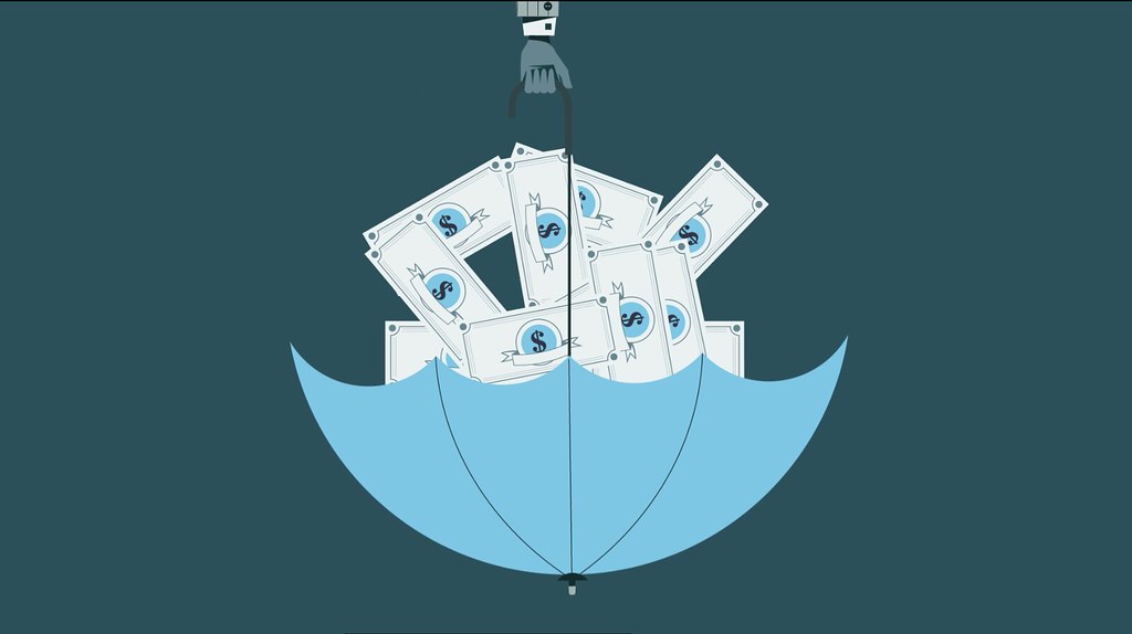
A simple three-minute animation is the first product of the new visual journalism department at The Times, an initiative that aims to explore new ways of reporting the news.

The machinations of the contemporary global economy are often difficult for the lay-person to understand, and even harder to visualise writes Elizabeth Glickfeld.
This was the task the new visual journalism department at The Times in London set itself for its inaugural project, the result of which which is an elegant three-minute animation entitled The Umbrella Fund.
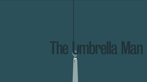
‘The Umbrella Man’ from The Times’s new department of visual journalism.
Top: frame from animation. Video and images courtesy of The Times, 2012.
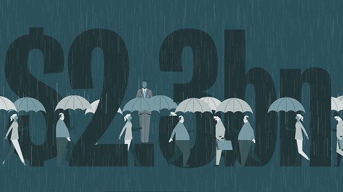
The ‘umbrella’ was the name UBS rogue trader, Kweku Abodoli, gave to the secret fund he established for the profits of his off-book trading. In 2011 Adoboli was found guilty of conducting $2.3 billion of unauthorised trades and nearly destroying Switzerland’s biggest bank in the process. Using an umbrella and other instantly-recognisable motifs, The Times’s visual journalism department took a few tricks out of Saul Bass’s book. They then combined a naïve graphic style with modern-day info-graphics, visual puns and cinematic transitions in order to tell the story. To communicate the magnitude of the fraud, the animation culminates in the observation that the amount of money Abodoli lost was ‘enough to buy everyone in the UK a new umbrella.’
In a predominantly monochrome blue-green colour scheme, ‘The Umbrella Man’ shows the influence of film-credits pioneer, Saul Bass.
The Times’s new visual journalism department is an initiative of graphic designer Matt Curtis and sports journalist Calvin Shulman and is staffed by Curtis himself, illustrator Nathalie Lees and graphic designer Fraser Lyness. All three were previously employed in different capacities as designers at The Times.
Curtis, for instance, worked on the now defunct monthly science magazine, Eureka (See ‘Pull out pages and panic’ by Simon Esterson on the Eye blog) before covering the Olympics. These experiences informed his approach to the new department.
Rather than conventionally situating the job of graphic design at the end of the news-reporting process, all the projects that come out of the visual journalism department will be initiated by the designers.
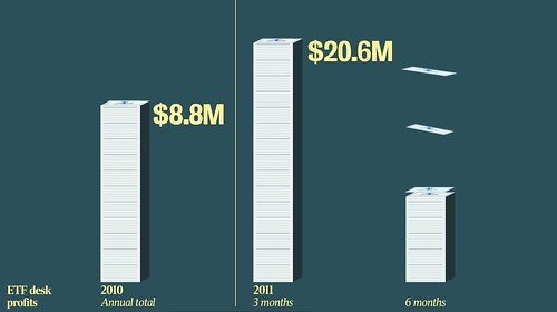
‘The Umbrella Man’ uses visual puns and combines animation with information graphics.
Formal outcomes will not be designated and it will be up to the designers to decide on the format as they engage with the material. In the case of the story of Kweku Adoboli, the designers were faced with a mountain of documents and emails from UBS and were given access to a Times journalist who attended the trial every day.
‘However the more detail we added to the story,’ said Curtis, ‘the duller it became.’ So in the era of online news-reporting and increased bandwidth, the trio decided on an animation as their desired outcome. Trained only in design for print they then took crash-courses in AfterEffects, teaching themselves the software over a period of three weeks.
One of the department’s upcoming projects is to visualise the American fiscal cliff. ‘We don’t even understand what that is yet,’ said Curtis. ‘We’re the lowest common denominator in the building. If we understand it, everyone will.’
The animation culminates in the observation that the amount of money Abodoli lost was ‘enough to buy everyone in the UK a new umbrella.’
Eye is the world’s most beautiful and collectable graphic design journal, published quarterly for professional designers, students and anyone interested in critical, informed writing about graphic design and visual culture. It is available from all good design bookshops and online at the Eye shop, where you can buy subscriptions, back issues and single copies of the latest issue. You can see what Eye 84 looks like at Eye before You Buy on Vimeo.

