Saturday, 8:00am
14 October 2017
And then there were six …
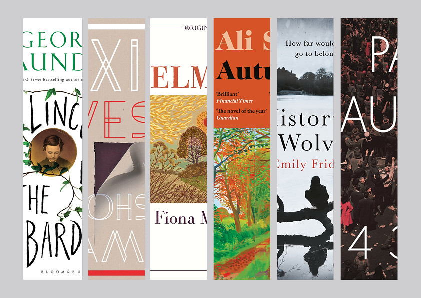
various designers
Greg Heinimann
Tom Duxbury
Richard Bravery
Debbie Holmes
Luke Bird
Awards madness
Book design
Graphic design
Illustration
Photography
Typography
Visual culture
The winner of the Man Booker Prize 2017 will be announced on 17 October. Robert Hanks talks to the designers whose covers wrap round the six shortlisted contenders

In ‘The look of literature’ I wrote about the thirteen covers on this year’s Man Booker Prize* longlist – widely praised as one of the most adventurous and wide-ranging ever, writes Robert Hanks.
Reaction to the shortlist has been less wholehearted. Articles, blogs and social media have resounded with complaints and WTFs about the omissions – especially Sebastian Barry’s Days without End and Colson Whitehead’s The Underground Railroad, which, having won the Pulitzer and the National Book Award in the US, had been the bookies’ favourite. From the cover fetishist’s point of view, the most notable omission has been Gray318’s zingy typographic design for Zadie Smith’s Swing Time; but in other respects it is a strong field.
Lincoln in the Bardo, by George Saunders. Design by Greg Heinimann at Bloomsbury.
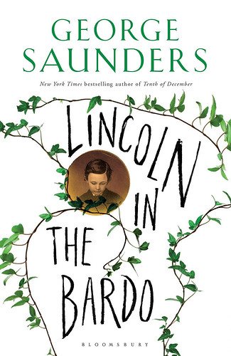
The current favourite for the prize, at 6/4, is George Saunders’ strange, sad novel Lincoln in the Bardo, which revolves around the death of Abraham Lincoln’s eleven-year-old son Willie in February 1862. Greg Heinimann’s cover mixes Shango for the author’s name – a classical, lapidary face, with a hint of the tomb – and scrawled capitals for the title, matching the novel’s mix of voices. The central image is a circular, bronze-tinted engraving of Willie cradled by ivy: a Lincoln penny or, Heinimann suggests, a nod to the coins placed on a corpse’s eyes.
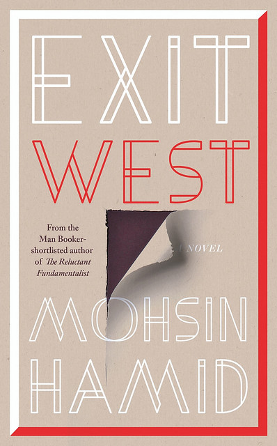
Exit West, by Mohsin Hamid, Hamish Hamilton. Design by Richard Bravery at Penguin Random House.
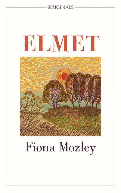
Joint second favourites, at 4/1, are Exit West by Mohsin Hamid (best known for The Reluctant Fundamentalist) and Elmet, the first novel by Fiona Mozley. Elmet is one of John Murray’s ‘JM Originals’ – a paperback label reserved for new literary voices. With the small print-runs come small budgets and limited time for the designer, and elements of the design – notably, the rule that boxes the design – are laid down. But Tom Duxbury at John Murray saw the image on Vanessa Lubach’s Instagram and instantly decided it fitted the novel’s rural, wooded setting and suggestion of lurking violence. The prescribed box turned out to be an advantage: ‘It gave it something, you focused on that copse of trees, so you felt here’s a sense of place, contained.’ The typeface is Bodoni Classic Handdrawn: ‘It’s such a great title to spell out, all lines, no curves.’
Exit West – in which refugees cross the world through mysterious doorways – was one of two covers on the shortlist by Richard Bravery at Penguin. The central feature is a trompe l’oeil lesion on the cover; like Duxbury, Bravery says the idea came quickly, but the execution was harder: ‘The thing I laboured most over was different ways of cutting the page; slicing, puncturing, ripping.’ The outlined lettering also mirrors a sense of openings, of space, while the frame around the design suggests a doorway. The conceptual underpinnings are not obvious to the reader, but it’s an elegantly spare design.
Elmet by Fiona Mozley, John Murray Originals. Design by Tom Duxbury at John Murray / Hodder; illustration by Vanessa Lubach, ‘Farewell to a Norfolk Summer’.
Autumn by Ali Smith, Hamish Hamilton. Design by Richard Bravery; image by David Hockney, Early November Tunnel.
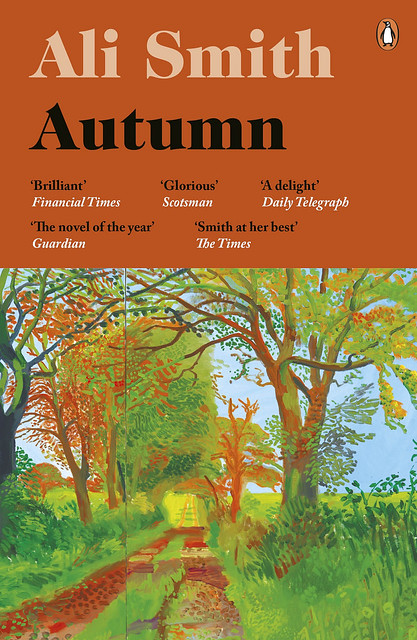
Bravery’s other cover was for one of the three 6/1 outsiders – Ali Smith’s Autumn. This is the second Smith novel (after There but for the, 2011) to feature a Hockney image, but in other respects, this is a new look. The clean sans serif type strongly associated with Smith’s books is replaced by the almost roly-poly ITC Caslon No. 224 Std Black on an autumnal russet cloth with the picture reduced to a half-wrapper, Bravery’s idea to show off the natural colour and texture. With a different typeface, this would be my personal contender for the imaginary Booker Cover Prize.
History of Wolves by Emily Fridlund, Weidenfeld & Nicolson. Design by Debbie Holmes at Orion / Weidenfeld & Nicolson; photograph by Nikki Smith / Arcangel Images.
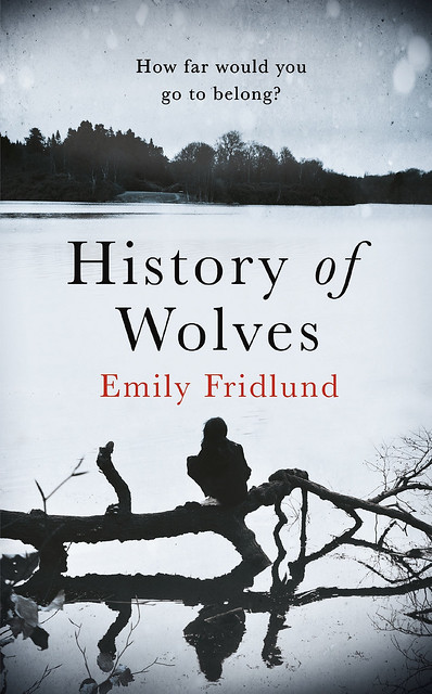
Debbie Holmes says she struggled for some time with the cover for Emily Fridlund’s History of Wolves, because the novel inspired strong emotions in everyone involved. She experimented with images of fur, with purely typographic designs: ‘We did have lots of really beautiful covers, but they weren’t getting across what everybody felt about the book.’ The final result is classical, melancholy – but also, with its image of a solitary female figure staring into the darkening landscape, from the photo agency Arcangel, the one on the list that comes closest to feeling generic.
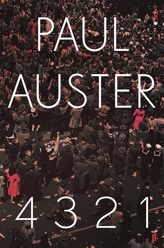
Finally, there’s Luke Bird’s design for 4321 by Paul Auster. A novelist noted for slim, spare narratives has finally gone for sprawl, with multiple narratives tracing the protagonist’s possible lives; the image Bird chose – VE Day celebrations in New York – has a sense of crowding and energy. Bird himself says the picture is ‘almost graphic, almost like a pattern’; the virtually monochrome effect is disrupted by saturated reds, and the effect is helped by the lean, discreet typeface. It’s the most classical of the shortlisted covers, but also inventive and lively, inviting study. It’s my personal favourite.
The Man Booker winner will be announced on 17 October 2017, see here.
* The prize is awarded each year for the best original novel written in the English language and published in the UK.
4 3 2 1 by Paul Auster, Faber & Faber. Design by Luke Bird at Faber, photograph of crowds in New York celebrating VE Day by Herbert Gehr / Getty.
Robert Hanks, journalist, critic, broadcaster, London
Eye is the world’s most beautiful and collectable graphic design journal, published quarterly for professional designers, students and anyone interested in critical, informed writing about graphic design and visual culture. It is available from all good design bookshops and online at the Eye shop, where you can buy subscriptions and single issues.
