Monday, 12:00pm
27 April 2020
Are we there yet?
In the second instalment of Eye’s online series about graphic design at the UK seaside, Justin Burns navigates the history of the travel poster

The Bank Holiday, a very British institution, was first introduced in 1871, allowing workers an allocated day for respite and recuperation in August, writes Justin Burns.
The 1938 Holidays with Pay Act had a significant effect on British society, particularly postwar, with an increased allowance of six days’ holiday per year for all. Day trippers and holidaymakers were drawn to the medicinal allure of sunshine and sea air.
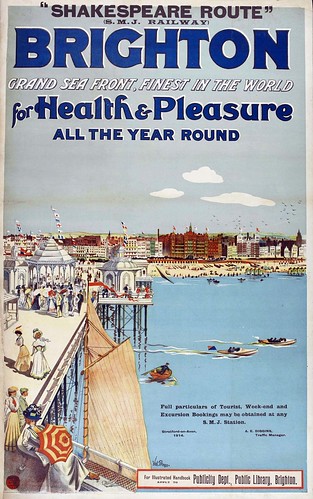
Val Prince, Brighton for Health and Pleasure. 1910.
Top. Fred Taylor, Bridlington, LNER poster, 1930.
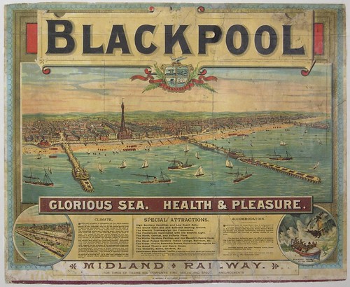
Rail promised to get people there fast. The advertising offered us a utopian vision that was accessible on a national scale, promising leisure and relaxation. Railway poster designs would highlight the benefits of visiting Blackpool, Brighton and Scarborough with large-scale print poster ads that visually transport tourists to the promenade.
Bemrose & Sons, Derby & London (printers), Blackpool, Glorious Sea, Health and Pleasure, 1893, produced for the Midland Railway.
The poster has a cultural and social significance in the emergence of seaside resorts in the UK. Often recognised as the designers’ ‘canvas’ many of the early poster designs were created by artists or were reproductions of paintings portraying coastal scenes. Evocative illustrations and representations embraced national identity, localised dialect and humour. British artists and designers were influenced by Modernism, European aesthetics and the reproduction methods deployed by artists such as Roger Broders, A. M. Cassandre and Toulouse-Lautrec.
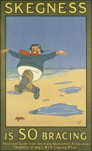
Although such influences were evident, many UK posters depicted a decidedly British experience, informed by the beaches, piers and weather. This was epitomised by Skegness is SO Bracing, John Hassall’s 1908 commission for London and North Eastern Railway (LNER). This became a bold, iconic campaign, duly reflecting British identity, personality and humour.
John Hassall, Skegness is so Bracing, 1908.
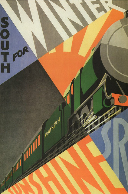
By the early 1920s, Britain’s railways operators recognised the value of encouraging passengers to visit coastal destinations by train. Artists and designers such as Hassall, Frank Mason, Frank Newbould, Fred Taylor, Tom Purvis, Dorothea Sharp, Edmond Vaughan and Norman Wilkinson were all commissioned to promote rail journeys to the sun. Between 1923-47, posters simultaneously advertised the destinations and formulated visual identities for the resorts. For many tourists this would be the first sight of the place they were about to visit.
South for Winter Sunshine, Edmond Vaughan, 1929.

Artists and designers such as Purvis, Andrew Johnson and Edward McKnight Kauffer challenged the pictorial visual conventions of the travel poster in the 1930s. McKnight Kauffer’s commissioned series of posters for GWR deployed visual associations to industry and the natural landscape, enticing holiday makers to the resorts of Devon and Cornwall. Influenced by the Vorticists, McKnight Kauffer’s works used visual tropes of efficiency and travel to metaphorically transport tourists to the south west.
Edward McKnight Kauffer, Go Great Western to Devonshire, 1932.
Graphic design is integral in developing brand heritage and identity. John Gorham’s ‘The English Riviera’ identity and poster series of 1982 still promotes the resorts of Torquay, Paignton and Brixham as Britain’s answer to the Côte d'Azur. Subsequently, repeatedly appropriated, Gorham’s minimal representation became a lasting identity for Torbay.
John Gorham, The English Riviera, 1982. Gorham (1937-2001) was an influential (if under-recognised) designer of book covers, packaging, postage stamps, titles and posters for films.
The popularity of the ‘vintage’ graphic design aesthetic has seen reproduction seaside posters of the early twentieth century in souvenir shops, and appropriated to promote UK resorts. Some seaside towns reference their heritage in developing strategies to enhance the identity and representation of place.
The poster has been a fundamental tool in advertising these resorts and the journeys to them, and through print and digital media continue to promote destinations, festivals and events. The poster’s role in the development of UK seaside resorts is significant as the medium has continually communicated and identified the ‘offer’ of the seaside.
Scarborough Railway Poster, W. Smithson Broadhead, 1935.
Justin Burns, Head of Art & Design, Leeds School of Arts at Leeds Beckett University. Burns is exploring the graphic language of the seaside for a PhD.
Eye is the world’s most beautiful and collectable graphic design journal, published quarterly for professional designers, students and anyone interested in critical, informed writing about graphic design and visual culture. It is available from all good design bookshops and online at the Eye shop, where you can buy subscriptions and single issues.


