
Friday, 12:00pm
4 September 2020
Artificial sunshine
Illuminated lettering signals entertainment and escapism by the sea. The fifth in Justin Burns’s series about coastal graphic design
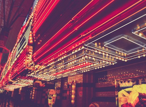
If we take away the bright lights is there a place? The Blackpool Illuminations first lit the Lancashire seafront in 1879 when they were described as ‘Artificial Sunshine’, and remains an annual event every autumn, writes Justin Burns.
Images of Blackpool Illuminations, 1953.
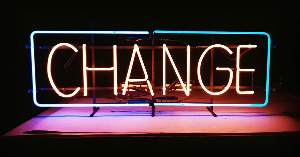
Top. Change, Andy Doig Neon Studio, 2019.
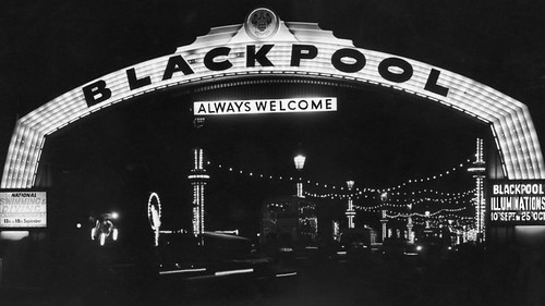

The initial display consisted of eight carbon lamps preceding Edison’s patent of the electric light bulb, this subsequently led to 10,000 bulbs forming the first recognised illuminations to commemorate the royal visit of Princess Louise in 1912, to the Lancashire resort. Seaside illuminations are synonymous with Blackpool, but Morecambe was the first resort to flood its seafront with synthetic light in the late 1880s. The lights of the fairground and promenade form part of the expected experience of the seaside with the glow of the saccharine palette lighting up the shop-fronts and piers. Alongside the siren noises of the dodgems and the interchangeable climate, illuminated lettering and three-dimensional signs are recreational, nostalgic, visual signifiers.
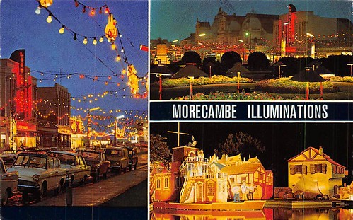
Morecambe Illuminations, Hip Postcards, early 1970s.
Blackpool Illuminations, Hip Postcards, early 1970s.

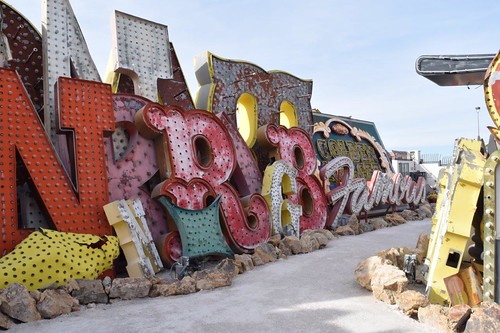
Blackpool has often self-proclaimed itself as the Vegas of the North, a brightly lit mecca for entertainment and escapism by the sea. At the seaside, graphic signs dominate architectural, retail, leisure, and public space. In Learning from Las Vegas, Robert Venturi, Denise Scott Brown and Steven Izenour (1972) observed that the Modernist view of ‘form follows function’ had been disregarded. In Las Vegas, communication overrides function, with an emphasis on the image and typographic representations that evoke emotional, symbolic associations. An environment where the authors observed: ‘if you take away the signs, there is no place.’ Illuminated signs are fundamental to the narrative of the seaside, day or night, they are a key visual component in the construct of the British seaside holiday.
Las Vegas, Neon Boneyard, Neon Museum Las Vegas, 2019.
Las Vegas, Neonbrand, 2020.
The illuminated letter has a transitional presence within the architecture of the seaside. The multi-faceted, synthetic surfaces, are visible by day, creating shadows and shapes, before dusk when the lit characters begin to adorn seafronts with florescence. In Lettering on Buildings (1960), Nicolete Gray describes the linear neon or metal letter as a type that has no ‘norm’, each sign an individual form of typographic communication or representation. The illuminated lettering we observe along the promenade possesses both individual and familiar characteristics. In Words and Buildings (1980), Jock Kinneir highlighted the importance of lighting design, its relationship to its subject, and how when successful, an installation can suitably command attention, similarly to a lit stage, set for a performance. Egyptian slab serifs, Cooper Black and Tuscan typefaces are lit by tungsten bulbs, neon, and back-lit lightboxes, illuminating shops, arcades and attractions.
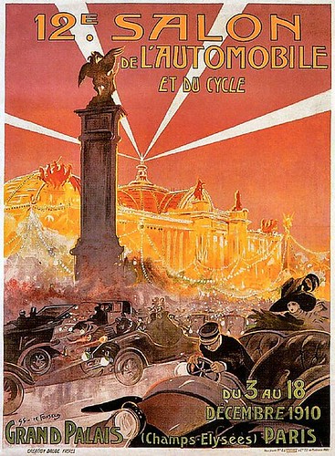
Inspired by inventors William Ramsay and Morris W. Travers in 1898 and Thomas Edison’s incandescent lightbulbs, neon (meaning, new) tubes of light were further developed and introduced by French engineer Georges Claude at the Salon de l’Automobile (the Paris Motor Show). Claude assessed that the new tube lighting would not challenge the standard light bulb and that neon would be useful in illuminating monuments, architecture and importantly, become an advertising tool. His first commercial neon sign was installed in a Parisian barbershop on the Boulevard Montmartre.
Margate, 2020. Photo by Justin Burns.
Gaston Simoes De Fonseca, Poster for the Paris Motor Show (12th Salon de L'Automobile et du Cycle), 1910.
In his 2012 book L’être et le Néon (Being and Neonness), Luis de Miranda argues that neon is a representation of twentieth-century ambition, of commerce and capitalism, with the industrial technology once the sign of innovation, now seen, in some contexts, as a symbol of decay and decline. This is evident in the coastal towns of Britain. Newly restored commissioned signage and installations at theme parks such as Dreamland and Blackpool Pleasure Beach compete for attention along the promenades and piers, where fast-food outlets continue to use neon and cheaper forms of illumination to sell their seaside fayre.
Morelli’s Ice Cream parlour, Broadstairs, 2020. Photo by Justin Burns.

Neon can be sometimes unfairly viewed as a cheap form of communication when borrowed and copied through more efficient and economic forms of lighting and typographic display. The sculptural quality of cursive neon typography still seen at the seaside complements the physicality of accentuated three-dimensional confectionary signage outside ice cream parlours, gift shops, and fast-food outlets. Neon typography is architectural in form, evolving from a static, flat aesthetic by day to a lit glowing state by night. The warmth of the light mirrors the hot food it sells, enticing day-trippers to enjoy the delights of alfresco consumption along the seafront.
Neon lights evoke advertising and cinematic images of the past, in which persuasive images promise new experiences through brand names lighted up in cities and coastal towns. Such signs are still prominent within seaside resort landscapes today, but the methods of illuminating typography are often through LED and digital technologies, as these are more time-efficient and less costly.
Margate, 2020. Photo by Justin Burns.
Brighton, 2020. Photo by Justin Burns.

There has been an acknowledgment of the value of neon within seaside resorts commercially and in an artistic context. Practitioners continue to be active in the field, with designers and makers producing bespoke neon signage for commercial purposes and limited-edition artworks. The restoration of Dreamland, by Hemingway Design, combined the use of neon and LED screens to restore the external signage sympathetic to the original 1930s neon-edged fin tower and façade.
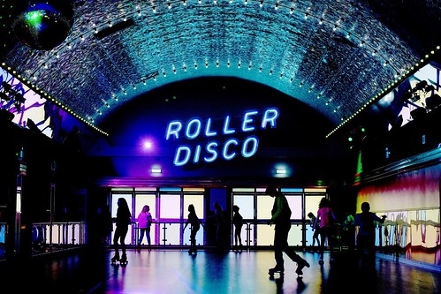
Dreamland, Margate, 2020. Photo by Justin Burns.

Dreamland, Margate, Roller disco, 2017. Photo by Paul Webb for the New York Times.
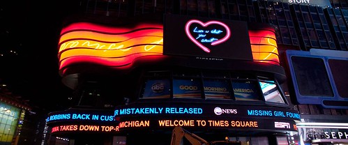
Alongside commercial commissions, Kerry Ryan, of Neon Specialists, has been working with artists for more than twenty years, working closely with artists such as Tracey Emin to produce illuminated artworks exhibited in Times Square, New York, London’s St Pancras Station and the Pier and Harbour Building (Tourist Information Centre) outside the Turner Contemporary gallery in Margate.
Tracey Emin, I promise to love you, a series of neon works in Times Square, New York City, 2013.
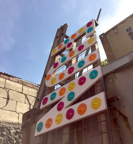
Andy Doig (see Change, top), an independent neon artist based on Brighton seafront, creates contemporary pieces using traditional methodologies, producing his work, artists commissions, and commercial projects for clients such as Komedia in Brighton, experimenting and developing new ways to work with illuminated glass.
Tim Etchells, Let’s Pretend None of This Ever Happened, Grundy Gallery Blackpool, 2017.

‘The Charged Line’, a 2017 exhibition at the Grundy Gallery in Blackpool, assessed neon works within a fine-art context, but also considered the resort’s past, acknowledging its tourism heyday and working-class associations. Works exhibited by David Bachelor, Shezad Dawood, Tracey Emin, Tim Etchells, Robert Irwin and Mai-Thu Perret formed a substantial survey of artists who have created and articulated messages through the medium of neon. The exhibition ran simultaneous to the annual illuminations, and as the critic Elly Parsons asks, is it time we considered the lights of the bright promenade as artists and designer works as well as a tourist attraction?
Joseph Kosuth, What (does this mean?), 2009, Grundy Gallery Blackpool, 2017.

Tracey Emin, I never stopped loving you, a neon work at Droit House, Margate, 2010.

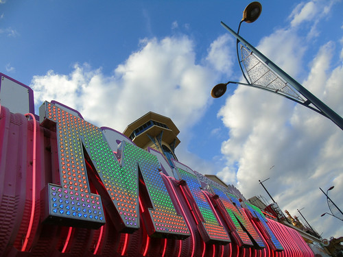
Great Yarmouth, photograph by Justin Burns, 2020.
Justin Burns, Head of Art & Design, Leeds School of Arts at Leeds Beckett University. Burns is exploring the graphic language of the seaside for a PhD.
Eye is the world’s most beautiful and collectable graphic design journal, published for professional designers, students and anyone interested in critical, informed writing about graphic design and visual culture. It is available from all good design bookshops and online at the Eye shop, where you can buy subscriptions and single issues.