Thursday, 2:37pm
15 April 2010
Athens snapshots: MNP
‘Greek design is everywhere … even in multi-photocopied civil service forms’

In this week’s snapshot, Eye catches up with a studio who have designed for some of the biggest names in Greek culture, writes John Ridpath.
MNP was founded in 2003 by Vasilis Marmatakis and Katerina Papanagiotou, who met while working together at advertising company Upset. Marmatakis studied in London, at Camberwell College of Arts and the Royal College of Arts, and Papanagiotou studied at Tei Graphic Design School in Athens. Alongside their work at MNP, both teach at the Vakalo School of Art & Design.
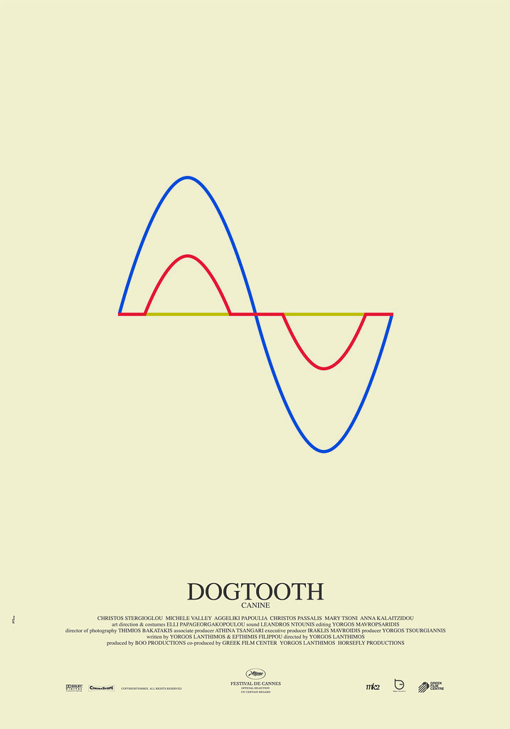
Top: Poster for Dogtooth (dir. Giorgos Lanthimos), winner of the Prix Un Certain Regard at the 2009 Cannes film festival. ‘Dogtooth is a dark, comic and imaginative allegory with robotic performances, a comment on family dynamics and the dangerous power of adolescent sexual curiosity. The aim of the poster was not to be descriptive or emotionally directive. It consists of a simple but cryptic diagram that creates two spaces: inside and outside. Three coloured lines correspond to the three main characters of the story, which begin their course from a common starting point, gradually separate, and finally meet again.’
Eye: Is there such a thing as ‘Greek design’?
MNP: Of course there is. Reference to graphic design dates back to the fifteenth century when the first Greek book was printed. Today all you have to do is look around you and its presence is there: from old signs to numerous artistic editions, fanzines, posters for gigs, objects found in second hand shops, and even in the layout of messy multi-photocopied A4 forms used by the civil services.
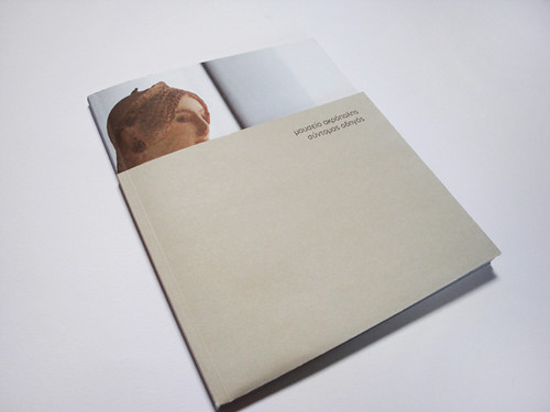
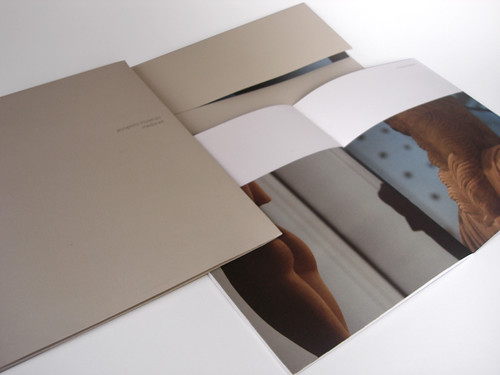
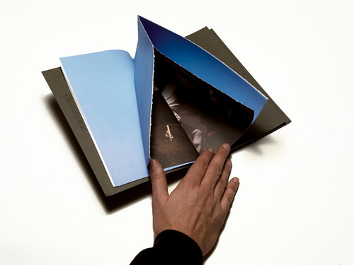
Above and below: Leaflets and press kit for the new Acropolis museum. ‘We were inspired by the fact that the exhibits are finally displayed and protected properly. The cover is consists of a photograph partially covered with a grey jacket resembling the main architectural medium of the construction, concrete cement. This unfolds and the photograph/exhibit is displayed fully’.
Eye: What makes Athens a good place for your work?
MNP: Greece is a country struggling its way into Europe but looking sideways towards the east. This eccentric mix is reflected in the everyday life of Athens, and that’s what makes living here so interesting. And, of course, the weather.
Eye: What are the particular problems facing Greek designers?
MNP: Apart from dealing with technical/practical problems due to the Greek alphabet, our clients have a tendency to undervalue design. They always have a little cousin who’s got Photoshop in his computer. And you can’t really deal with that, can you? That, along with the Mediterranean mentality of not following a schedule, can cause problems every now and then.
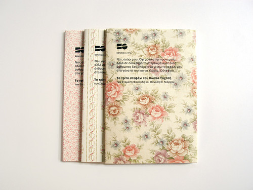
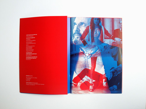
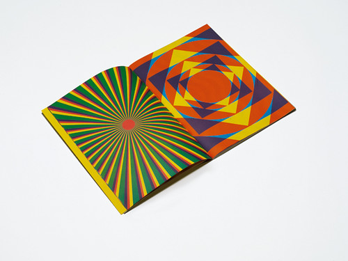
Above and below: Theatre programmes for the National Theatre of Greece.
Eye, the international review of graphic design, is a quarterly journal you can read like a magazine and collect like a book. It’s available from all good design bookshops and at the online Eye shop, where you can order subscriptions, single issues and classic collections of themed back issues.

