Friday, 4:27pm
16 September 2011
Awesomely awesome FOTB
various designers
Eva-Lotta Lamm
Ji Lee
john l. walters
the events department
Graphic design
Illustration
Information design
New media
Reviews
Technology
Buzzwords and the inspiration of improv at the Brighton codefest

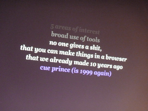
If you were to play buzz-word bingo at Brighton’s ‘Flash on the Beach’, the squares for ‘awesome’, ‘pumped’ and ‘stoked’ would fill up pretty quickly, writes John L. Walters. A wordcloud of all three days’ presentations would bloom with the same words, plus ‘HTML5’, ‘agile’, ‘responsive’, ‘Molehill’ and the inevitable ‘clients’, ‘schedules’ and ‘budgets’.
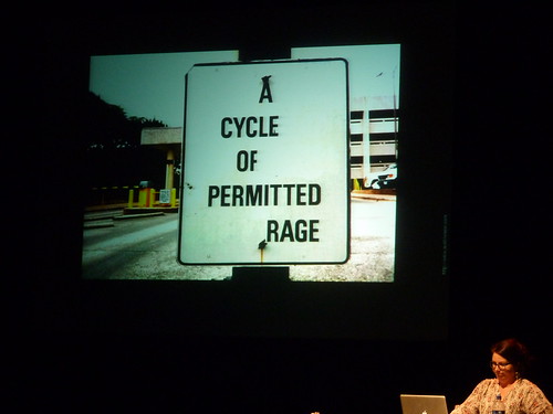
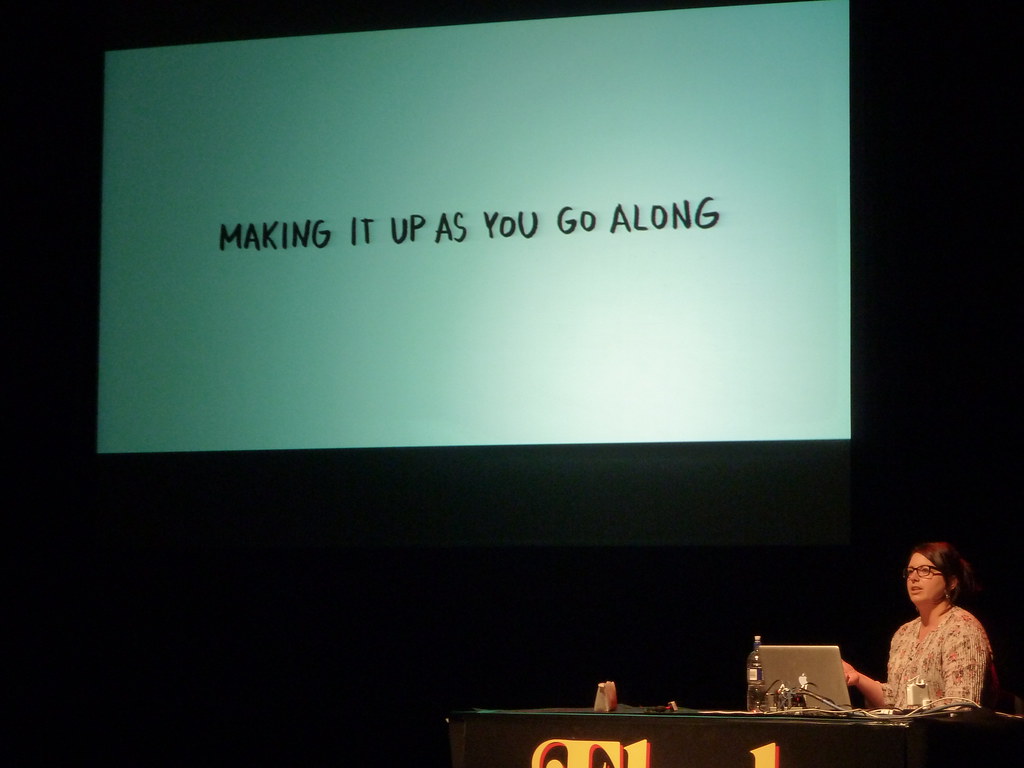
But probably not ‘improvisation’, though that was the central theme of a lucid talk by user-experience designer Eva-Lotta Lamm (top and below).
Lamm drew on examples of improv in comedy, music and theatre, illustrated by her distinctive lettering / cartoon narratives (which she calls ‘sketchnotes’) and lots of visual examples: Berlin street art, Ji Li’s ‘bubble project’ (see Eye 59), Layer tennis, Austin Kleon’s ‘De-signs’ and Google beatbox. You can buy a book of her sketchnotes on Lulu.
Lamm’s point about improvisers dealing with what they’re presented with (rather than what they would like) was echoed in a Monday session with BBC Children’s games head Jon Howard, who emphasised the importance of simplicity, playability and ‘in-game metrics, which told them how kids actually play their games, and for how long. Howard told us that small children often have low-spec, hand-me-down computers (and very few mobile devices at present) and that ‘ten minutes of hedonistic fun trumps all other forms.’
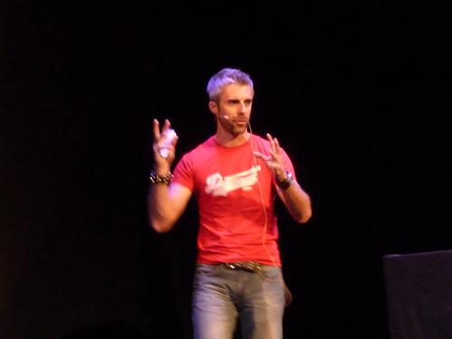
The JAM session featured short bouts from presenters chosen (at short notice – an example of organiser John Davey’s improvisatory skill) to fill ten-minute slots with extra awesomeness. So we got advanced motion detection (David Ellis), AR (the engaging Eugene Zatepyakin aka @inspirit, above), more about the flashy FOTB titles (Bradley G. Munkowitz), music visualisations (Jared Ficklin, below) and 200+ ‘Phone pixels’ from Seb Lee-Delisle.
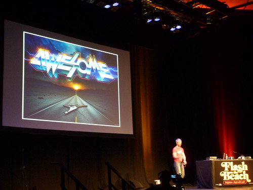
James White (above) of Signalnoise delivered a high-speed slideshow (with metal soundtrack) dominated by self-initiated work, including this ‘Awesome’ poster (below) which he dedicates to his seven-year-old self.
White then went into specific projects, including posters and T-shirts for The Sword, whom he approached after they tweeted they were looking for an artist, and his Japan fundraising poster, which, he explained, ‘went viral’, and reached a whole new audience. The image ended up as the cover of the ‘Quakebook’ 2:46 Aftershocks. White’s poster, (much discussed online) has now raised more than $20,000.
Where White emphasised his achievements, Joshua Davis focused on failure. His ultra-professional delivery style, however, was more like motivational lifecoaching – he urged us to ‘use failure to arrive at success.’ (This intersected with Randy Nelson’s ‘Failure is just the negative space around success,’ quoted earlier by Lamm.) He talked about art gallery projects, tattoos, Minecraft, gardening, skateboarding and how he likes to draw in Flash ‘because it’s so horrible’, declaring that ‘there are things we can do with computers that far exceed the human hand … painting is dead. Sorry Jon Burgerman.’
I enjoyed the final twenty minutes of his talk more: public installations, audio based systems and ‘Watson’, a data visualisation project for the US game show Jeopardy. Davis ended back in motivational mode (‘Let’s go and make something!’) but the sentence that struck home with most of the attendees was the straightforward: ‘Build your career on ideas not tools.’
In a thought-provoking conference that touched on aspects of contemporary design from interaction to webfonts via the brilliant Han Hoogerbrugge, Eva-Lotta Lamm had (conceptually) the last word: ‘We’re in the age of improvisation … we’re designing for improvisers.’
See also ‘Code tripping’ about the first day of this year’s ‘Flash on the Beach’.
Thanks to John Davey and everyone involved in Flashonthebeach.com for three stimulating days.
Eye is the world’s most beautiful and collectable graphic design journal, published quarterly for professional designers, students and anyone interested in critical, informed writing about graphic design and visual culture. It’s available from all good design bookshops and online at the Eye shop. For a taste of the new issue, see Eye before you buy on Issuu. Eye 80, Summer 2011, is out now.

