Monday, 10:00am
19 March 2012
Bigger, brighter, better

matt edgar
pam bowman
Graphic design
Illustration
Information design
Reviews
Visual culture
Pam Bowman and Matt Edgar report from Dublin conference Offset 2012

Pam Bowman and Matt Edgar report from the Offset 2012 conference in Dublin.
Part one: from Friday to Saturday afternoon. (See also part two.)
With the scale of an event like this and the amount of speakers, beautiful, inspirational material, and delegates in a great venue, in a fair city with an active nightlife, it is almost impossible not to become overwhelmed. The event was extraordinary value for money – a fraction of the cost of comparable conferences – making it accessible to students and younger practitioners as well as educators and more senior design and advertising people. Offset was not an academic conference – it aimed to inspire, and judging by the praise and grateful comments on Twitter it appears to have done exactly that. The whole event ran strictly to time, an big achievement with two stages and a solid timetable running from 10am to 7pm across three days. Organisers Peter O’Dwyer, Bren Byrne and Richard Seabrooke made it look easy (but they probably do need a month or two off now).
Friday
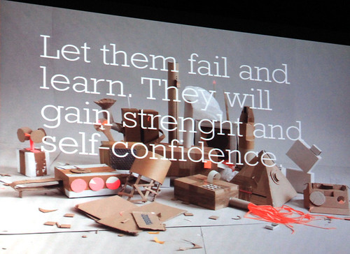
An assault of quickly spliced images and pounding music provided the backdrop for Eike König of Hort, who comes bearing gifts: T-shirts and freshly pulled screen prints were launched towards the outstretched arms of the front row delegates. Achtung Bono! Hort is the German word for an after school club and is how Eike wants his studio to feel, ‘like a place to play, a safe place where young designers can experiment and fail’.
Hort’s projects range from Microsoft through Universal Music to a rebrand for Bauhaus Dessau. König explained how they tried to balance organised austerity alongside the cultural heritage of the original brand while avoiding the visual clichés of the Bauhaus. ‘It seemed impossible to use the square, circle and triangle without it appearing ironic.’ The project was controversial for the decision to use Courier as a corporate font (although it is surprising that their use of Arial didn’t raise more eyebrows.)
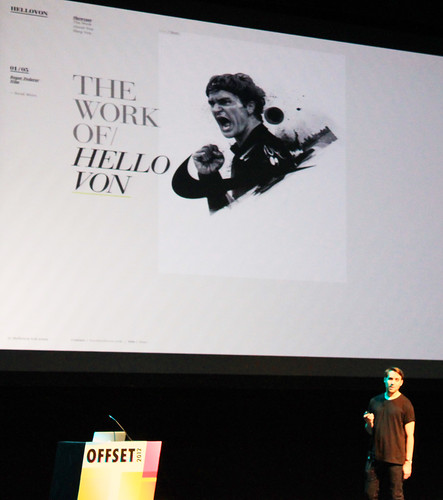
Close on Hort’s heels, Von began by introducing the audience to his background and influences: his Dad’s drawings, Jonathan Glazer’s video for Radiohead’s ‘Street Spirit’ and the Guinness ‘Surfer’ commercial. Black and White, contrast, movement, stillness and composition, being the themes that occur throughout his pencil drawings. Time-lapse films of some of the drawings demonstrated his working process alongside those of billboard installations in London and New York. He also talked about how he has presented his work in collectable book format with lavish production values.
The conference was split across two stages, the second being a much smaller, less formal and discursive space. The line-up included panel discussions, interviews, routes into... advice for students and graduates and the power of ten slots which allowed delegates to speak for ten minutes on projects or initiatives they are involved in, highlights included Simon Roche, on ‘Re-analoguing studio life’, Chris Haughton, on ‘Designing in a fair world’ and V&A curators Laurie Britton Newell and Ligaya Salazar, on ‘Curating a book’.
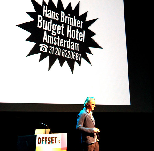
Back on the main stage Erik Kessels, of Amsterdam-based international agency KesselsKramer has a languid presenting style, but there is a sharp mind at work, with an eye for vernacular photography and seemingly effortless skill in storytelling. Erik introduced us to their London base, the KK outlet that combines an office, store and gallery. The emphasis here is on the creative richness of working across different disciplines. The publishing arm of the company provide great examples of this in action.
The series ‘In Almost Every Picture’ was the highlight of the talk, a series of lovingly curated collections of found photographs documenting the way we use photography to tell stories.
Meet Oolong the rabbit who balances stuff on his head, photographed by his owner Hironori Akutagawa, also Ria van Dijk chronicled by cameras in fairground shooting galleries between 1936 and the present day. The series is a collection of wonderful stories and obscurities. Erik interspersed cultural self-initiated projects with agency work, including a stamp for the Dutch PTT, with a lenticular treatment (30 frames shot by Anton Corbijn) that re-defines what a stamp can be, as well as being the shortest film in the world.
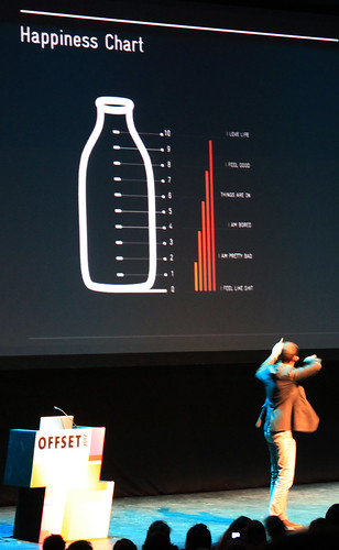
Stefan Sagmeister, who had top billing on Friday night, started with the question: ‘What makes us happy?’ He used a graph to help gauge the current happiness of the audience (we appeared to be around 7 or 8). He told us that our choosing to attend the conference rather than staying in our workplaces was likely to make us happier. This is all part of his current film, in production with Hillman Curtis, about happiness. He presented his research to date; ‘men and women have the same sort of happiness, white people are as happy as black people, older people are a little bit happier than younger people, ugly people are as happy as super-models. Religious people are happier than non-religious people and married people are happier than single people. I am neither religious nor married so I’m clearly fucked, and not in the good sense either’.
We were treated to a short section of The Happy Film, a typographic treatment of ‘Now is better’, where sugar cubes, milk, eggs, jelly and coffee poetically affirm that there’s been no better time to be alive. The scientific advisor for the film is Jonathan Haidt, a professor of psychology at the University of Virginia. Haiti outlines the three most effective ways to improve happiness: meditation, CBT and drugs. Sagmeister spent three months in Bali with the film crew practicing meditation, has recently completed cognitive therapy and will shortly be starting on the drug programme.
The line Sagmeister walks between culture and commerce appears to be the key to his happiness and he shows examples of this balancing act with his clients: a remote controlled culture book for BMW, identity work for Aishti and Levi’s and social responsibility work for True Majority in the form of two yellow school buses welded together with the aim of doubling the US education budget. He asked at the end of the talk how happy the audience now feels (mostly 9s and 10s).
Saturday daytime
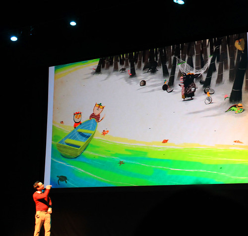
Despite the conference party being on until 2am the auditorium was busy at 10am on Saturday morning for Kevin Waldron, who aims ‘to inspire children to read and to draw’. His influences in the field of children’s books include Frank Muir and Roger Hargreaves. Waldron was humble and open in his presentation style, sharing his references and his studio space, including his table tennis table and the view from his rooftop.
To develop characters Waldron draws from memory, five or six beautiful pages followed by another five or six pages drawn from reference material and combines the best elements of both. He drew a distinct line between work for children’s books and his ‘personal work’, which encompasses collage and has a very different approach.
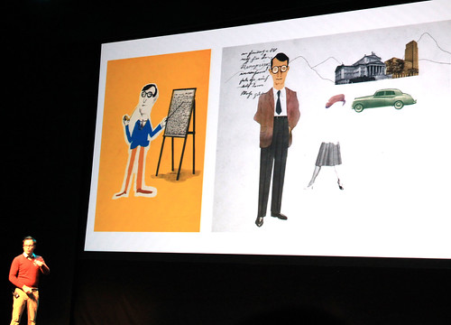
When Pentagram’s Michael Bierut talks, you listen. He structured his talk around a number of headlined lessons. If there’s one message that runs through it all though, it’s that design counts. Michael’s informed us that he was 50 per cent Irish (on his mother’s side) but for the purposes of this Dublin talk he was Michael Campbell Bierut, America’s favourite 100 per cent Irish designer. He comes across as warm, generous and funny: ‘I’m an extreme monogamist’, his wife being the first and only girl he’s ever kissed, ‘the only thing that I’m promiscuous about, an absolute over the top psychotic slut about, is typography’.
For Beirut there are no little problems in design. He illustrated this by showing US election ballot papers whose typographic mistreatment lead to confusion with serious consequence. It’s the problem that drives him. He claims not to have much creativity, and that he has to have a problem to work with. ‘Without problems there would be no solutions’.
Bierut speaks with an authority that helps define what it is we do as graphic designers. He does self-deprecation, too. His desk is next to Paula Scher’s at Pentagram and he tells a story about having a great idea for a client that he just can’t make work. He asks for Paula’s help. She has a think and paces around the office for a bit before saying; ‘maybe it’s a bad idea’.
It was a relief to finally hear a female voice – Paula Scher’s – in Offset’s predominantly male line up. There’s a connection between the two female speakers at the conference, that being the Tyler School of Art in Philadelphia. Jessica Hirsch in her talk on Sunday (see part two, later this week) called it the ‘Paula School of Art’ – such has been her standing and influence within graphic design.
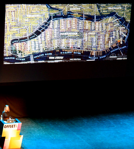
With partners Michael Beirut (professional) and Seymour Chwast (personal) also speaking at the conference, Scher (see Reputations interview in Eye 77) adds colour and scale. Her work balances the rational and emotional, reflected in both her Pentagram work and her painted maps. ‘I loved painting Los Angeles, it was as if someone had taken New York, dropped it and it had splattered’.
She paints for three days and is at Pentagram for four. She showed the recently completed work for Windows 8, ‘Give it a year, you’ll like it’. Her advice was to keep all things in balance and not just rely on the latest technology. ‘If you can be the thinker, the decider and the maker, then you will always be employable’.
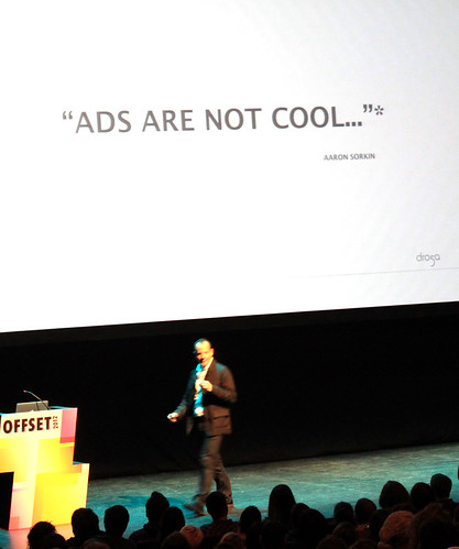
Andrew Essex, the CEO of advertising network Droga5, had already spoken as part of a ‘Future of Advertising’ discussion at Offset. He continued with some of those themes: ‘Evolution is mandatory’, ‘Creativity is more important than ever, it’s a business imperative’, ‘No more campaigns, but ideas that permeate culture’, ‘Be the content!’ Essex is an advocate for change, and the work he presented included some innovative and effective ideas. However, there was certainly a section of the audience that was (and always will be) uncomfortable with the level of manipulation used. Will advertising ever be in a position to tell the truth to an educated audience and not only that but to tell it beautifully, with humour and subtlety? Erik Kessels demonstrated that this could be the case.
Part two of Pam and Matt's report will cover Saturday evening and Sunday (mainly motion graphics) with presentations from Jessica Hische and Shepard Fairey.
Pam Bowman is Typographer at du.st and Principal Lecturer at Sheffield Hallam University. Matt Edgar is Course Leader for Graphic Design at Sheffield Hallam University.
Eye is the world’s most beautiful and collectable graphic design journal, published quarterly for professional designers, students and anyone interested in critical, informed writing about graphic design and visual culture. It’s available from all good design bookshops and online at the Eye shop, where you can buy subscriptions and single issues. Eye 81 has the theme of ‘Designers and clients’. Eye 82 is on its way to subscribers worldwide.


