
Wednesday, 10:35am
18 November 2009
Bigger is better
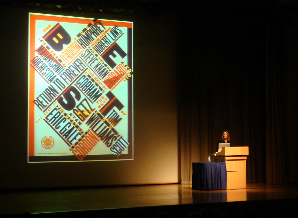
Paula Scher relates ‘A series of strange circumstances’ for her D&AD talk
Paula Scher started her talk in London last week with examples of her work from her first job at CBS records, where she had to design more than a hundred LP covers a year, writes Sara Martin.
It allowed her to experiment with design and she showed the ones that shaped her style.
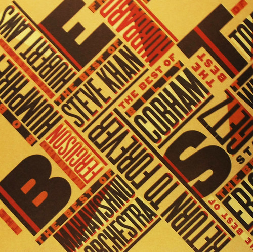
These two (above) were my favourites, with strong, cut and paste typography. Scher said she always thought ‘bigger was better’ and tried to get her type as big as possible within the design. Each one was like a small poster, and shouted out.
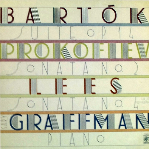
She showed work that influenced her in the early years, such as a Jean-Pierre Rampal cover she bought in Japan in the early 1970s, with the vertical running type and block coloured letters that feature in some of her later work.
One point she made was that no one could predict the effect design has on the culture, which can often never be intended or planned by the designer. She showed a poster she created (below) to promote the US release of Elvis Costello’s Trust.
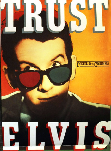
Costello’s manager hated it, and thought the red and blue glasses made him look like a clown. Yet the poster became an icon of 1980s youth culture.
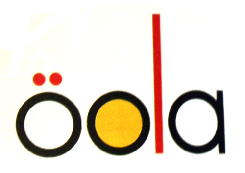
Scher talked about setting up her first company, Koppel & Scher, creating work for small clients such as this logo for a confectionary company.
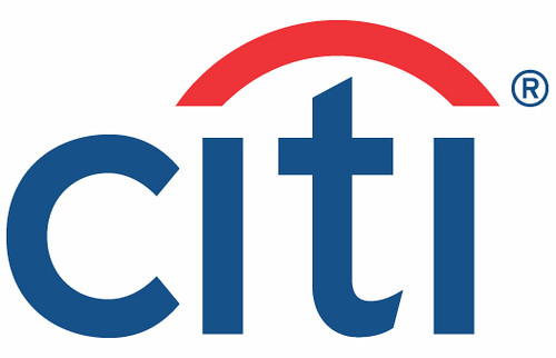
She then moved on to her years at Pentagram, which she joined in 1991, working alongside Michael Beirut and designing corporate identities such as this one for Citi.
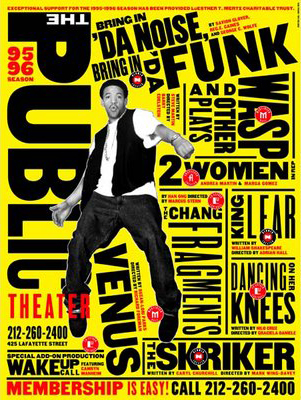
Also her fantastic lively identity for New York’s Public Theater, for whom she was designer and consultant for more than ten years
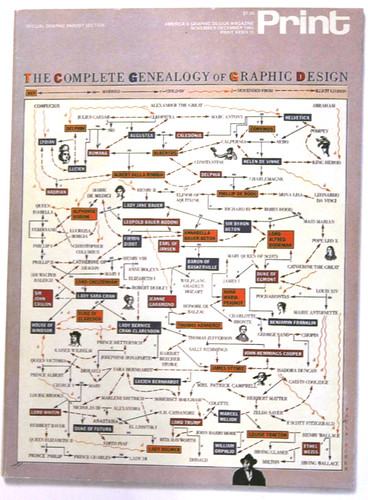
Scher makes sense of the systems surrounding her everyday life with spider diagrams. She collaborated with Steven Heller in 1985 on this Print magazine cover, a diagram showing a family tree of designers and typefaces, ending with Milton Glaser.
And I loved this diagram of a blog.
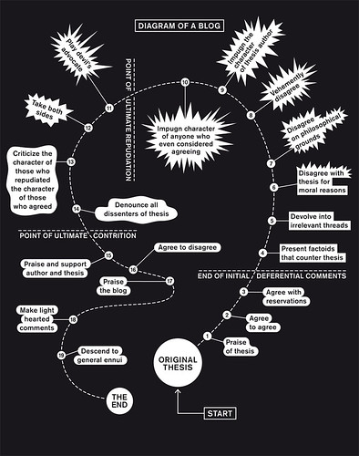
Scher says: ‘Apply it to any blog and it works every time.’
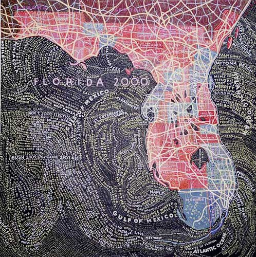
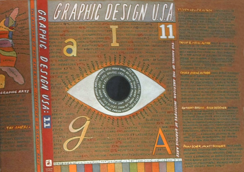
From this she moved on to her intricate, opinionated maps (above) which she hand-paints in her spare time. The obsession began with a cover for AIGA, (below) where she hand-painted the whole thing to save money.
One amazing thing about Paula was her long-running determination to knock down the barriers that pigeonhole people as designer, illustrator, fine artist, art director … She is determined to do it all. And make it bigger.
Eye is available from all good design bookshops and online at the Eye shop. For a taste of the magazine, try Eye before you buy.