Monday, 4:46pm
19 March 2012
Birth of a typeface
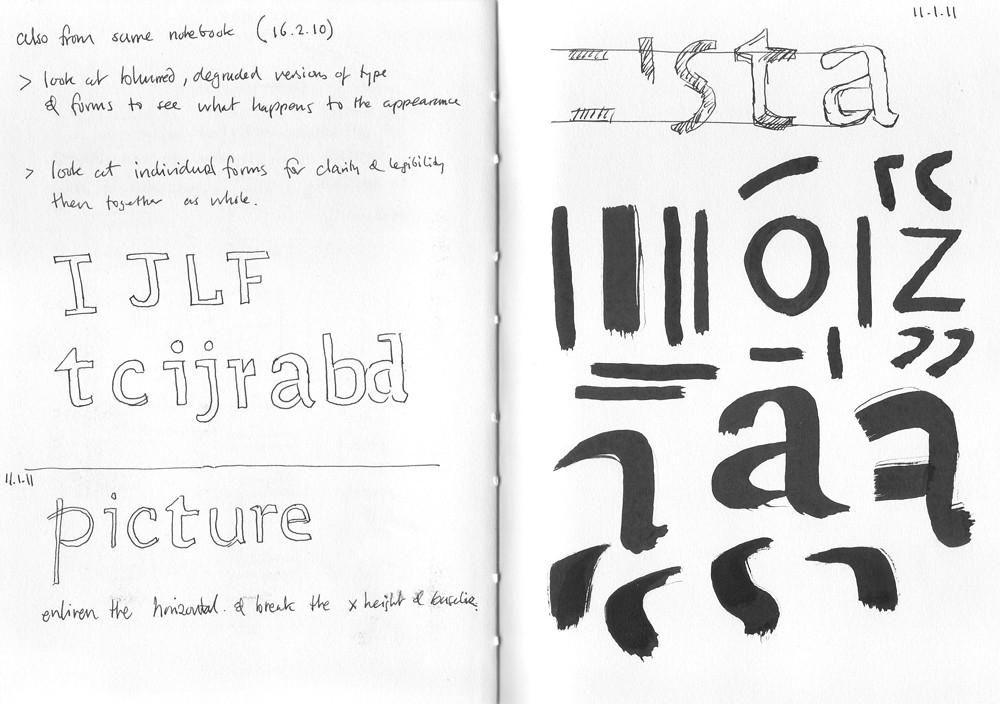
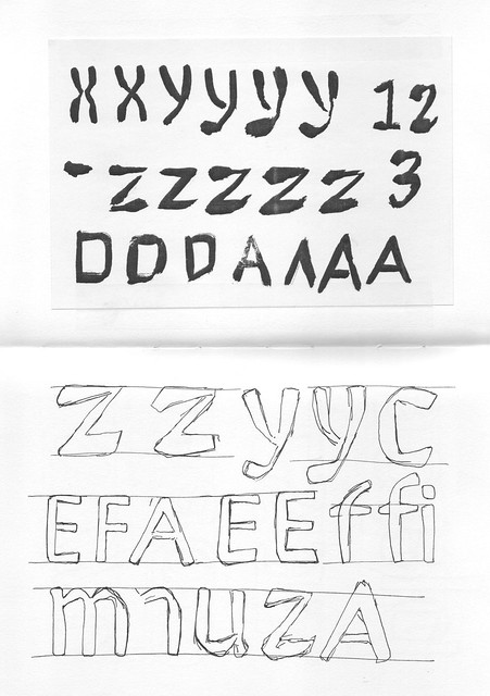
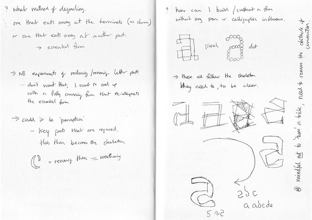
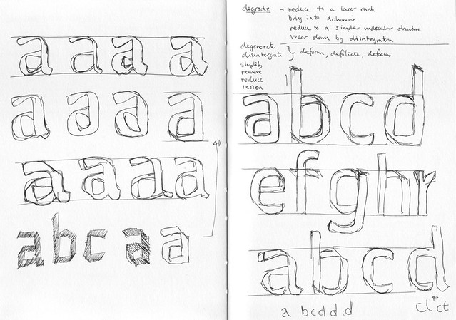
A sketchbook preview of Jeremy Tankard’s new type family Fenland

After almost twenty years working in graphic design and a studious attitude to the subject of design and typography, I thought I understood type, writes Alex Cameron.
That was until a three-hour conversation with British type designer Jeremy Tankard convinced me otherwise. His enthusiasm about type is more than matched by the depth of his knowledge on the subject. He peppered our discussion with historical references, noted individual contributions and gave insights into contemporary problems still to be resolved. He comes across as a one-man typographic tour de force. The conversation was instigated by my excitement at the forthcoming release on 19 March of Tankard’s latest type family, Fenland.
The release coincides with a launch party and exhibition (for one night only, tonight, 19 March) at the Kemistry Gallery, London and will show his sources of inspiration and the development of the typeface through thirteen A1 typographic panels. Parties and exhibitions to celebrate the release of a new type family are rare, but if anyone deserves to throw one it is the consistently productive and innovative Tankard.
The idea behind Fenland has contemporary relevance but is firmly rooted in historical practice. Considering a typographic conundrum – is a pen-written structure necessary to produce a typeface intended for text use? – it follows that if we are increasingly reading on screen, a calligraphic metaphor may not be appropriate or relevant for modern type design.
Getting even virtual access to Tankard’s notebooks is an exciting and illuminating experience. We can see in his sketches the progressive development of ideas on form but also the questioning of received notions. Particularly strong is the question of the degradation of type, both natural and manufactured, and the impact these occurrences have on our understanding of a typeface’s structure and form. For Tankard it is ‘how these concepts can ignite a fresh approach to a lettershape’s construction.’
Through Fenland, Tankard is questioning some fundamental typographic design criteria. In the latter stages of his notebooks, we see him overturn the convention of conjoining thick and thin strokes. As he notes: ‘thicks can join thicks as long as there is relief somewhere.’
As Tankard would have it, ‘in order to balance the pressure across the typeface … in order to maintain a rhythm and sparkle to the text setting, something has to give – there needs to be “relief” of the “pressure” within the shape and across the typeface, otherwise you end up with an unbalanced collection of elements.’
How close these early sketches are to the final rendering of the Fenland family we will know soon enough, but whatever the answer, the insights they offer into the still much misunderstood world of type design is thanks to the dedicated Jeremy Tankard.
Fenland was launched online at 19.00 GMT Monday 19 March. The launch party and exhibition was at Kemistry Gallery in London.
More about Fenland on Tankard’s site.
Eye is the world’s most beautiful and collectable graphic design journal, published quarterly for professional designers, students and anyone interested in critical, informed writing about graphic design and visual culture. It’s available from all good design bookshops and online at the Eye shop, where you can buy subscriptions and single issues. Eye 81 has the theme of ‘Designers and clients’. Eye 82 is on its way to subscribers worldwide.

