Thursday, 5:00pm
9 June 2016
Bodoni the celebrity

Giambattista Bodoni: His Life and His World
By Valerie Lester Designed by Jerry Kelly David R. Godine, $40, £34.95 (hardback, 255pp)Giambattista Bodoni was a pioneer, a polymath and a perfectionist printer. Robert Hanks reviews a new book about the man behind the typeface

Anybody with an interest in typography will have come across the name Bodoni; but the reasons for his fame are more obscure, writes Robert Hanks.
At a time when the craft of typography was neglected – printers were more interested in reproducing illustration and elaborate ornaments – Giambattista Bodoni (1740-1813) and his great Parisian rivals the Didots demonstrated the beauty and pleasure to be found in unadorned, well composed text, and gave printing a new prestige.
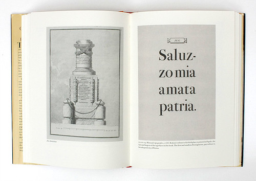
Spread showing the title page from Ara Amicitiae (left), ‘a slim, elegant guide to a large, impressively virile’ monument of that name, and Manuele tipografico (1788). Top: spread showing a 1782 poster (left) by Bodoni and Callimachus’s hymns and epigrams (1792).
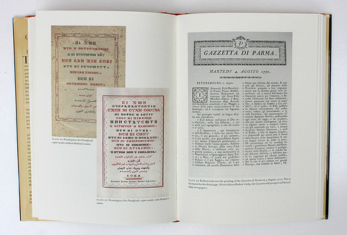
Spread showing frontispieces for ontificale copto-arablo (left) and the front page of Gazzetta di Parma 4 August 1772, printed by Bodoni.
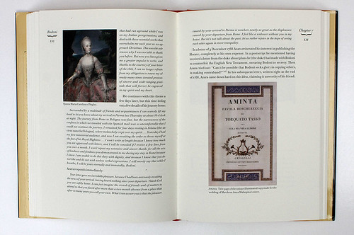
Spread showing Queen Maria Carolina of Naples and the title page for Aminta made for the wedding of Marchesa Anna Malaspina’s niece.
He was the greatest early master of the modern style of type (which compared to predecessors such as Baskerville owed less to calligraphic forms, more to geometry), achieving a new sharpness of contrast between thick and thin strokes. Since his death Bodoni’s reputation has wavered. His most prestigious productions, editions of the classics, have been criticised for poor proofreading, and there has been a persistent criticism that while his faces look lovely the accentuated verticals interrupt the flow of reading: William Morris took this argument to extremes when he complained of ‘the sweltering hideousness of the Bodoni letter, the most illegible type that was ever cut, with its preposterous thicks and thins’. But in 2013 the bicentenary of his death was marked by an exhibition, a conference and the Compulsive Bodoni project, a ‘typographic system’ inspired by his work, and accompanied by a stage play and multimedia events.
Still, in his lifetime Bodoni was a Europe-wide celebrity – Parma’s most famous citizen, according to Valerie Lester, his studio a regular stop on the grand tour, his services in demand from influential patrons across the Continent. Other cities and rulers tried to lure him away. When Napoleon, newly crowned emperor, visited Parma he is supposed to have demanded to know where Bodoni was (answer: laid up with gout).
Bodoni was born in Saluzzo in Piedmont, into a printing family. At eighteen he travelled to Rome and worked at the Propaganda Fide, the Vatican department responsible for missionary work, gaining early experience with non-Latin alphabets such as Coptic and Tibetan. In 1768 he accepted an offer to run the Duchy of Parma’s official printing-house, and spent the rest of his life there, perfecting his craft, preparing the Manuale Tipografico (published posthumously by his wife, Ghitta). His official position placed him close to the heart of government; but he had contacts with literary, artistic and church circles.
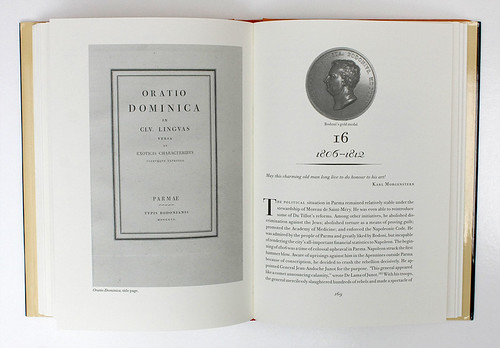
Spread showing title page from Oratio Dominica and Bodoni’s gold medal.
Lester’s style is self-consciously vivid. On Bodoni’s arrival in Rome: ‘Now we must imagine the moment: a few paces more and the boys can quench their thirst in the huge, gushing Acqua Paola fountain, and then, looking east, they see the city unfolding in the valley below.’ The notes are not detailed enough to distinguish between well sourced facts, informed guesses and wild speculation. While Lester has done her homework on Bodoni and his immediate circumstances, and on aspects of eighteenth-century Italian life that interest her – notably the cuisine – it is not always clear that she grasps the wider cultural background. At this period, Enlightenment rationalism was giving way to romantic fervour; Robert Bringhurst has characterised Bodoni’s typefaces as Romantic. Lester talks about (and reproduces) Bodoni’s edition of poems by the British diplomat Viscount Hampden: she does not point out that one of these poems, Lathmon, is a translation into Latin of one of James Macpherson’s Ossian poems, the cod-Celtic epics that were foundational texts of the Romantic movement – though it is hard to imagine a better illustration of Bodoni’s position at the intersection of cultural movements. She mentions (and misspells) Stendhal, as a visitor to Parma, without noting that one of his great novels, The Charterhouse of Parma, opens in the city at the height of Bodoni’s fame.
The author is not a type specialist – she came to Bodoni, she explains, when investigating the story of Mimi Meyer, a thief of rare books whose haul included a copy of Bodoni’s masterpiece, the Manuale Tipografico. This book has three appendices on aspects of the art of printing, though from a modern perspective, and the main text adds details on, for example, punch-cutting (at which Bodoni was astoundingly quick and prolific – at his death, he left behind more than 25,000 handcut steel punches). But for typographical insight you would do better with the chapter on Bodoni in Alexander S. Lawson’s Anatomy of a Typeface (1990, also published by David R. Godine) – briefer, more thorough and more authoritative – or Taschen’s 2010 facsimile of the Manuale Tipografico. What Lester’s book does convey is a lively sense of what a printer-typographer’s life was like in Europe in the late eighteenth and early nineteenth centuries; and it is handsomely produced, with gorgeous examples of Bodoni’s work.
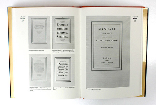
Spread showing pages from Bodoni’s Manuale Tipografico (1818). Photos by 42-line (see ‘The hi-res past’ in Eye 88.)
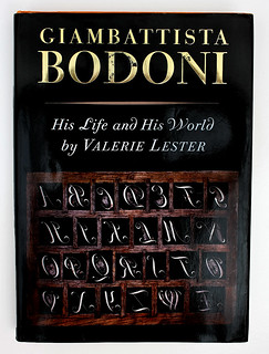
Cover of Giambattista Bodoni: His Life and His World, showing some of Bodoni’s punches for swash italic capitals.
Eye is the world’s most beautiful and collectable graphic design journal, published quarterly for professional designers, students and anyone interested in critical, informed writing about graphic design and visual culture. It is available from all good design bookshops and online at the Eye shop, where you can buy subscriptions and single issues.
