Thursday, 3:00pm
9 January 2025
Books received #60
A pop-infused type sample; a handbook for visual research; & ampersands galore
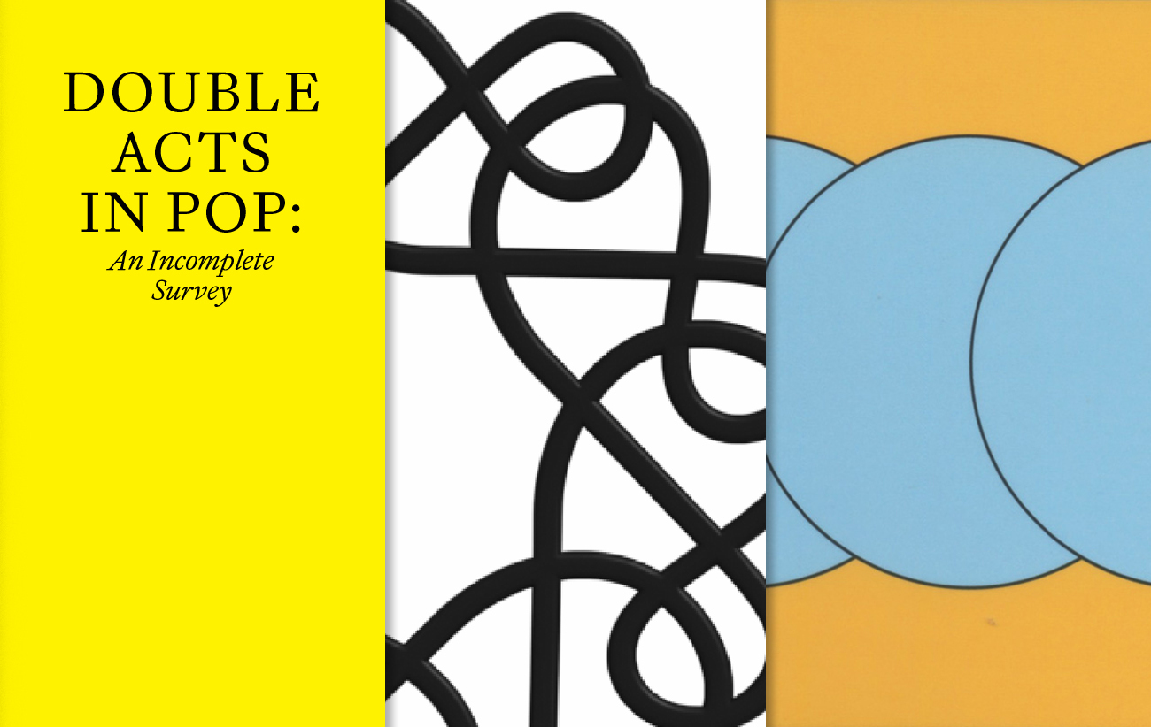
The first ‘books received’ of 2025 looks at three unconventional design publications.
Double Acts in Pop: An Incomplete Survey. By Molly Lambert
Christian Schwartz and Paul Barnes, the double act known as Commercial Type (see Eye 82) have published a type specimen using an extended essay by Molly Lambert, an LA music writer.
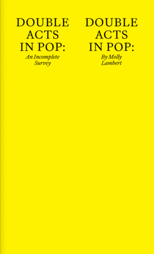
In their intro, Schwartz and Barnes declare their interest in the way ‘two people working together can create something different than either would have created on their own.’ The entertaining, highly opinionated summaries by Lambert (who appears in the ‘dockumentary’ Yacht Rock) are squeezed and pumped into appropriately theatrical layouts that showcase more than a hundred of the duo’s typefaces, from Action Condensed to Thorowgood Grotesque.
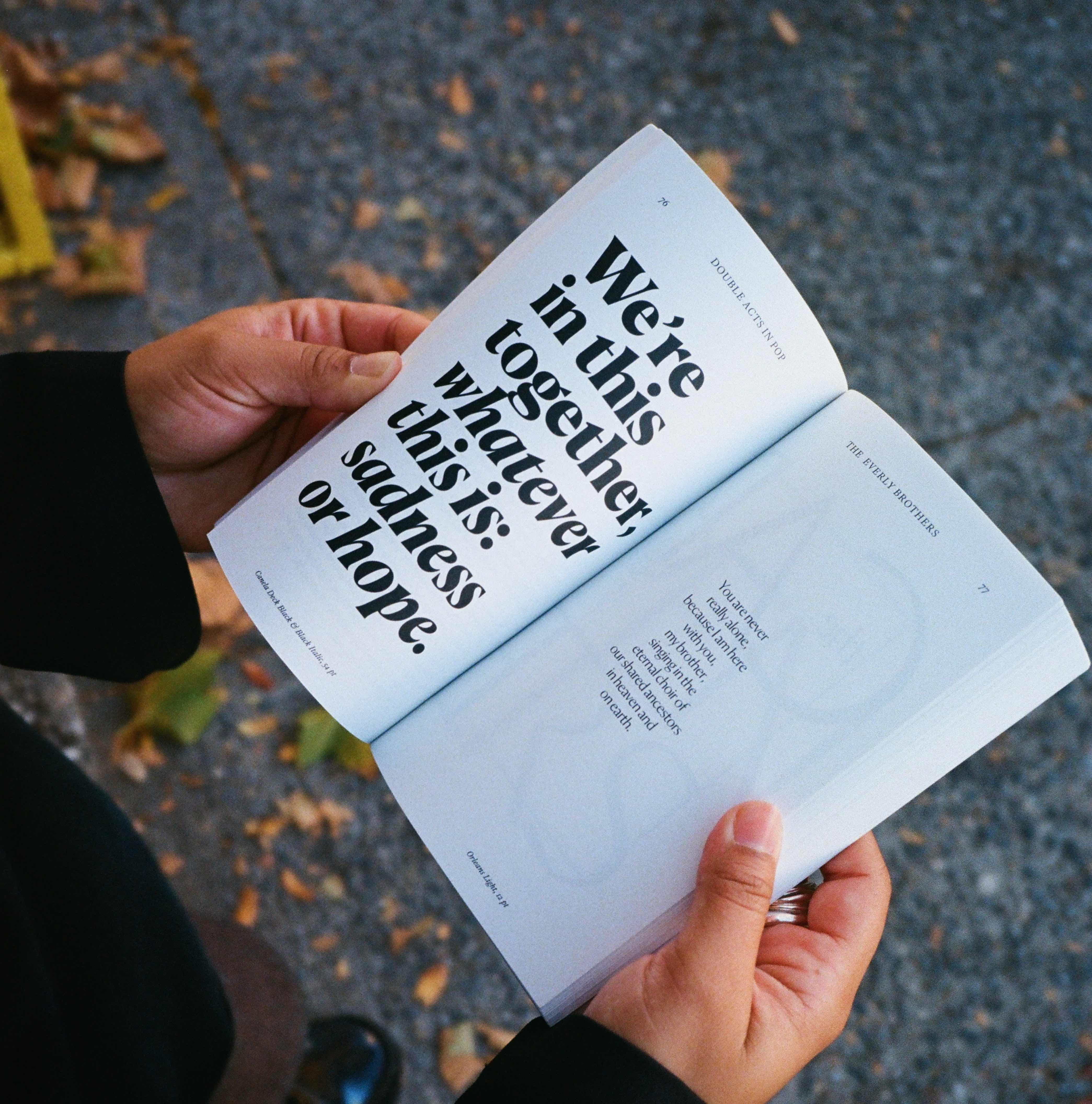
Spread about the Everly Brothers, set in Canela Deck and Orleans (sounds like another pop duo). Lambert compares the voices of Don and Phil to ‘two winding vines climbing together.’
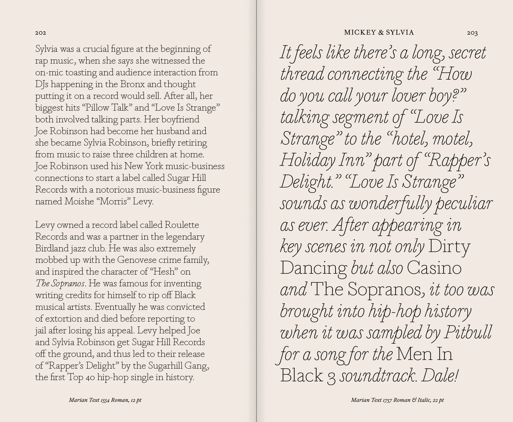
This spread from a fascinating section about Mickey & Sylvia is set in Marian (see cover of Eye 82).
Research for People who (Think They) Would Rather Create. By Dirk Vis (Onomatopee).
This pocket-sized book, now in its third edition, ventures to answer the many perplexing questions that are likely to surface when approaching the artistic research and documentation process.
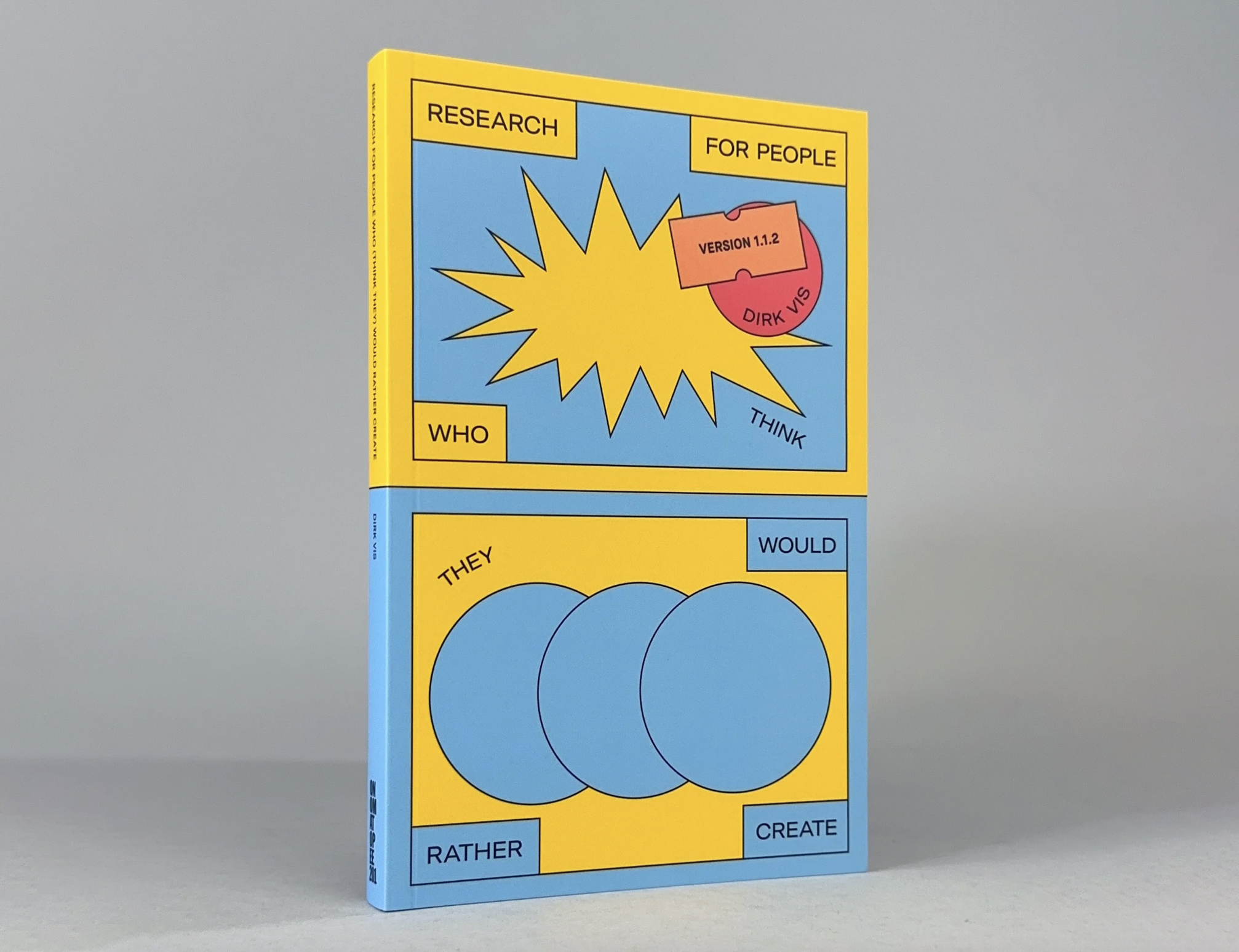
Used in education and beyond, and including various valuable case studies, this publication delves into the many relevant aspects to consider: such as how to choose a topic and formulate a research question, working out which methods to use, how to structure the document, as well as tips for the process, reflection and content.
This publication features relevant case studies for different aspects of the research journey.
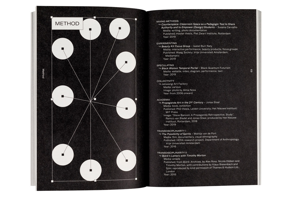
Author Dirk Vis breaks down the information with reflective prompts to help start the artistic research journey.
Published by Onomatopee, this book was designed by Robert Reinartz and printed by Kopa.
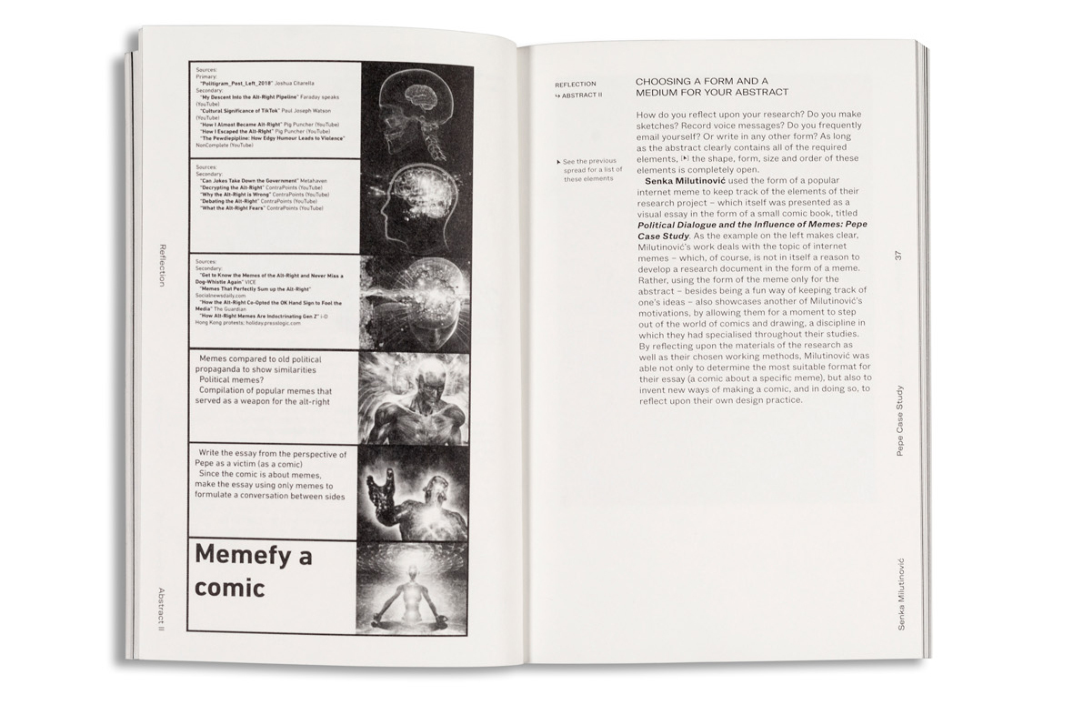
This spread shows work by Senka Milutinović, titled Political Dialogue and the Influence of Memes: Pepe Case Study.
A Collaboration of Ampersands (Studio Sutherl&)
Designer Jim Sutherland (see profile in Eye 101) has an obsession with ampersands. To celebrate the tenth anniversary of his company Studio Sutherl&, he invited a host of friends and collaborators (including Sonya Dyakova, Marcus Lyon, Eye’s Simon Esterson and Sarah Boris) to devise ampersands.
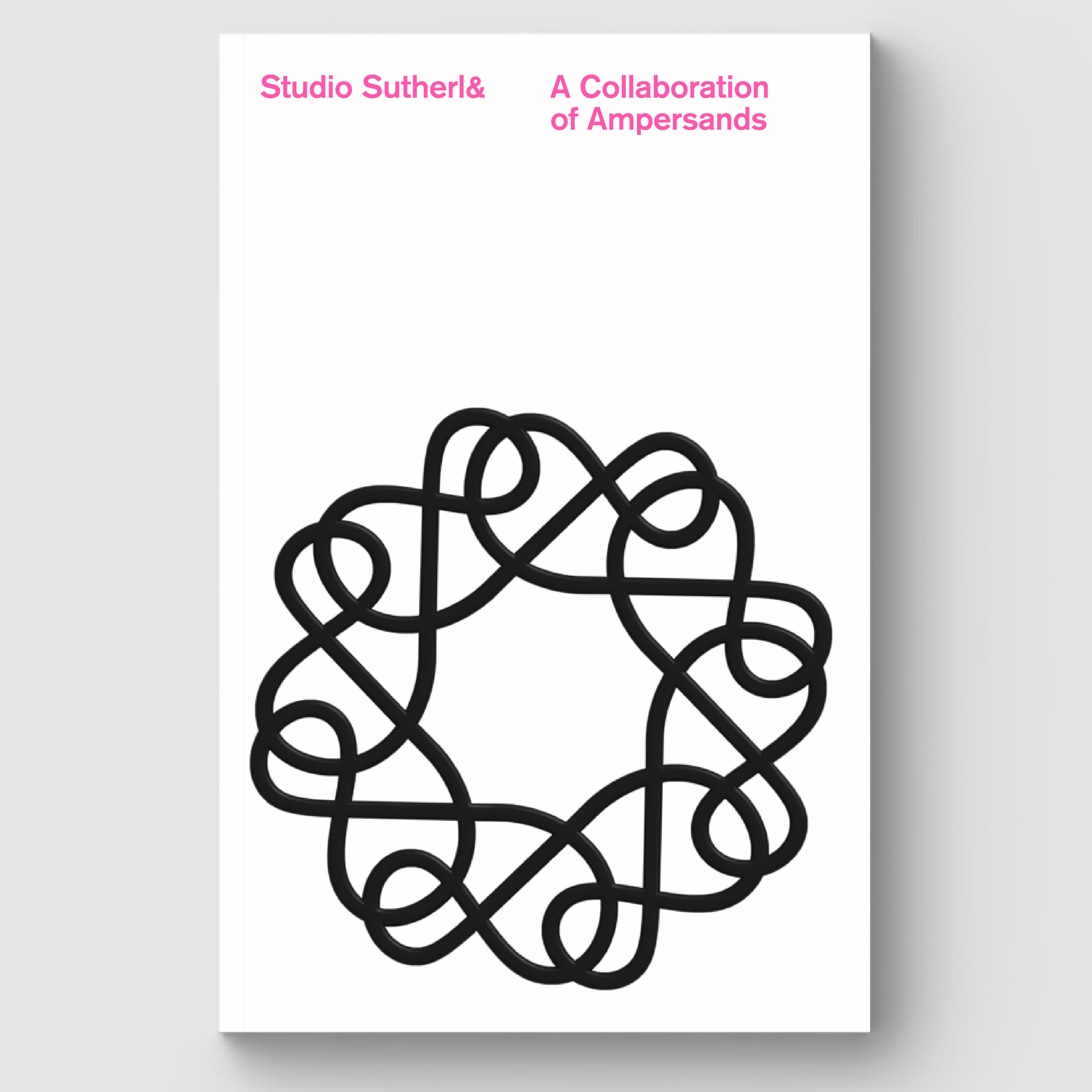
With the help of sponsors, including Fenton Smith and Fenner Paper, he has published a limited-edition book that combines ampersands for his own client work with guest ones, which he launched last month at an event at London’s D&AD offices. Sutherland traces his interest in the glyph back to a day spent at Kelvyn Smith’s Letterpress Workshop when he realised that it could be used as a symbol for ‘joyful collaboration’.
You can order the limited-edition book from studio-sutherland.co.uk
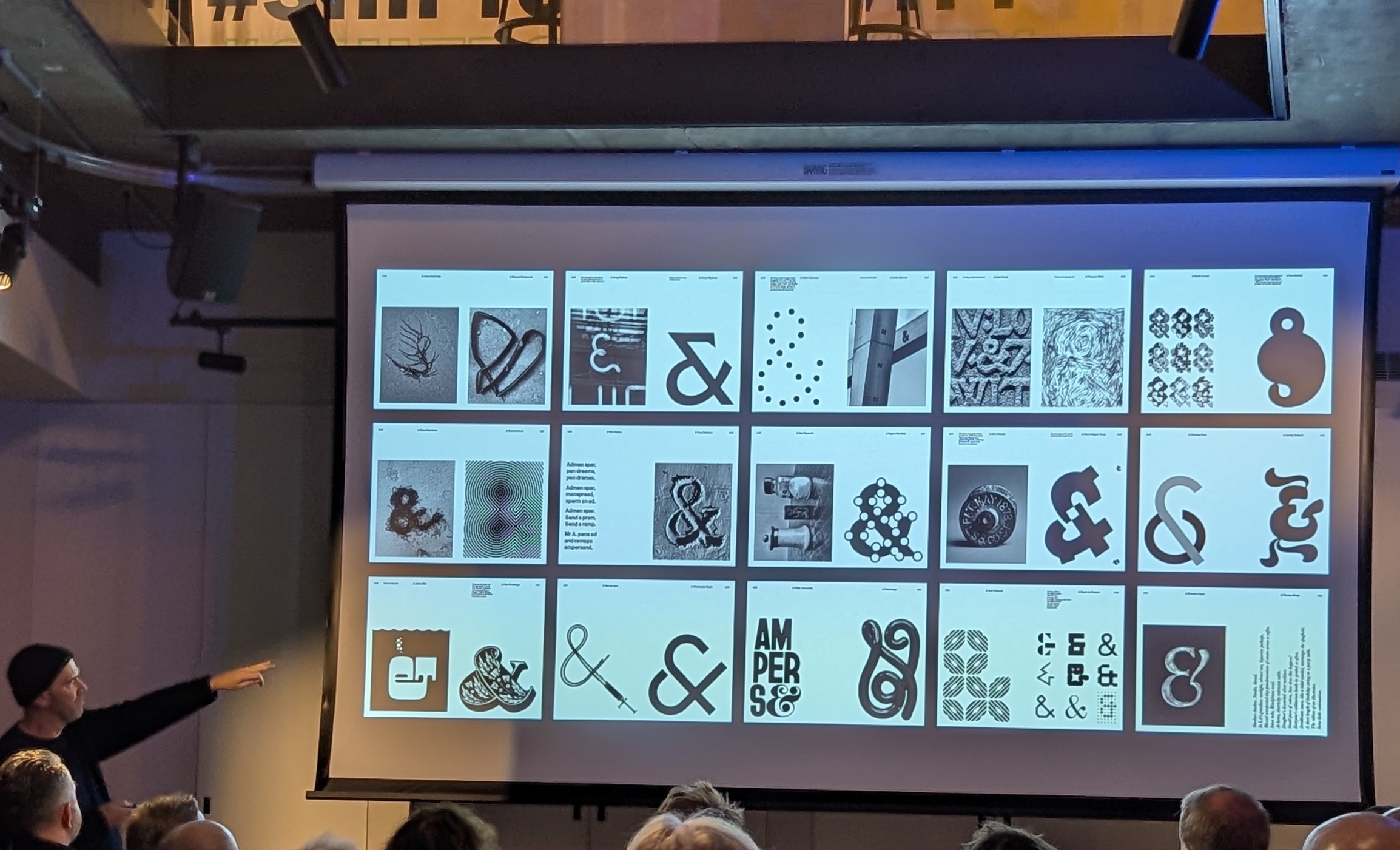
Sutherland points to examples of ampersands provided by ‘collaborators, friends and peers’, presented in the order in which they were received.
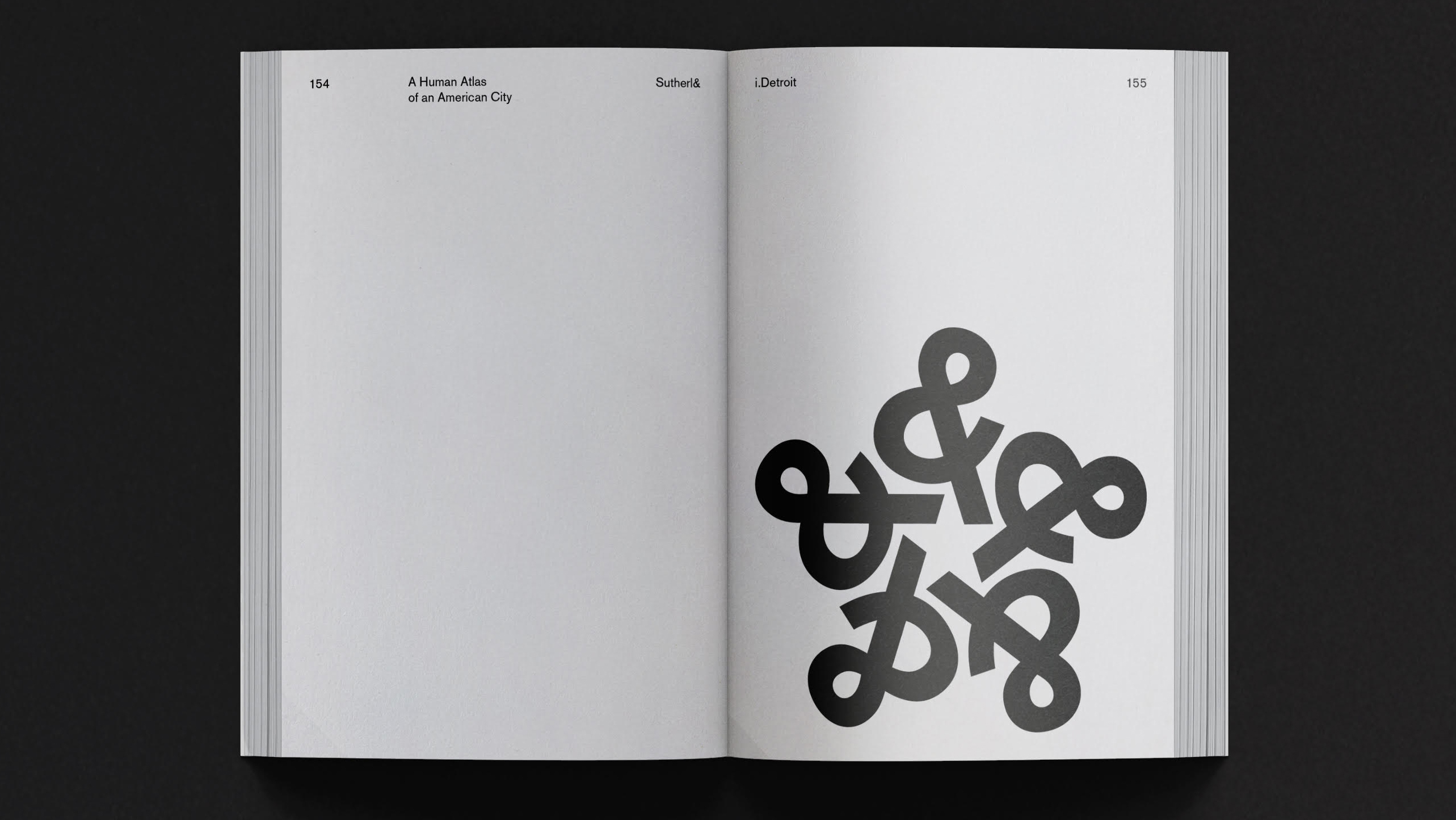
Five ampersands make a star in this example from i.Detroit (2020), Sutherland’s collaboration with photographer Marcus Lyon. (See ‘Ten projects by Jim Sutherland’ in Eye 102).
Eye editors, London
Eye is the world’s most beautiful and collectable graphic design journal, published for professional designers, students and anyone interested in critical, informed writing about graphic design and visual culture. It is available from all good design bookshops and online at the Eye shop, where you can buy subscriptions and single issues.
