
Friday, 4:00pm
31 July 2026
Books received #64
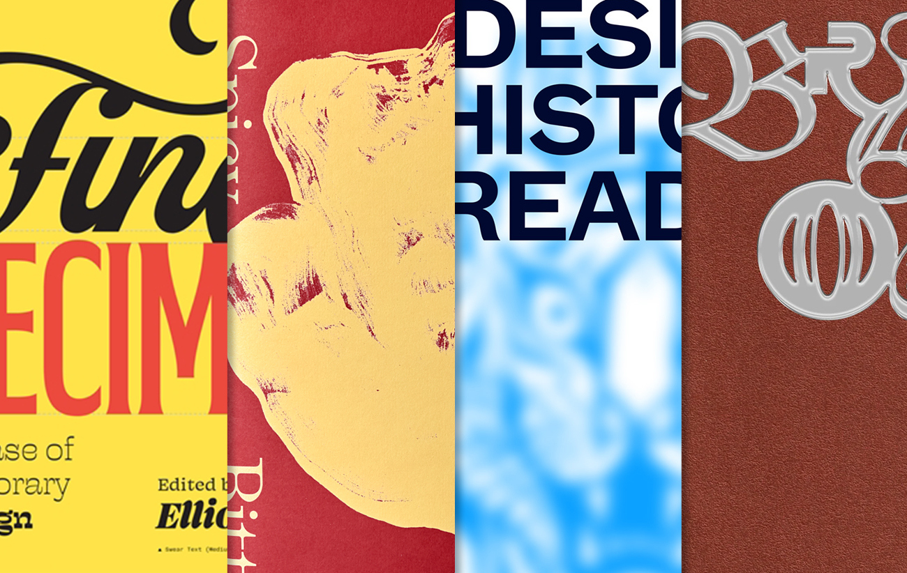
Fine Specimens; Spicy Bitter (a study of radicchio); Design History Reader; and posters in Breakout #2.
In our latest edition of books received, we look at four quite different titles: one featuring contemporary type design; a commentary on the visual nature of radicchio; a narrative investigating collaborative visions of graphic design history from students’ perspectives; and Cihan Tamti’s second edition of Breakout posters.
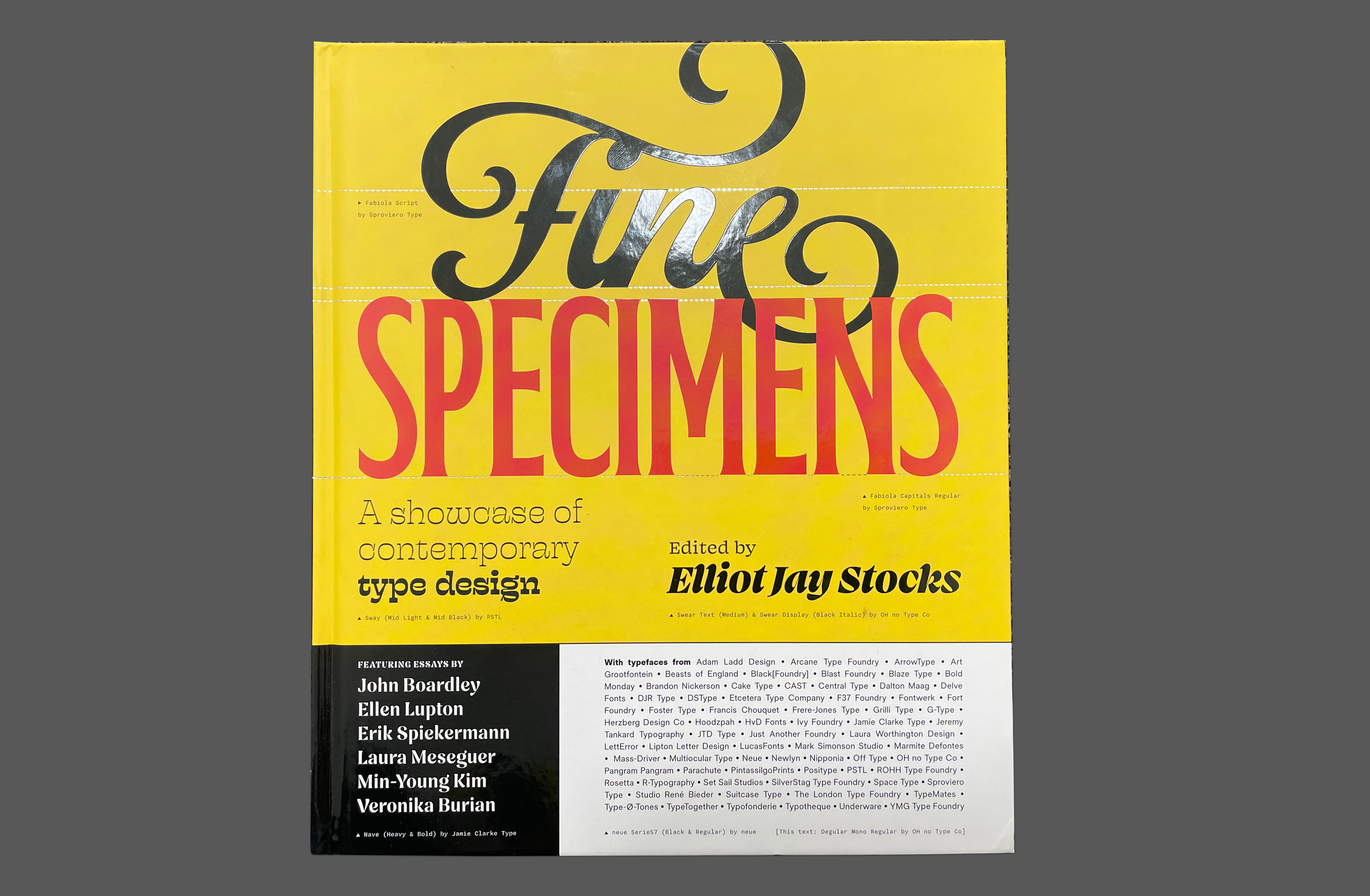
Fine Specimens: A Showcase of Contemporary Type Design (Rockport Publishers). By Elliot Jay Stocks. £30
Fine Specimens, by UK-based designer and musician Elliot Jay Stocks, features a wonderfully curated compilation of modern type design from around the globe that celebrates the art of the letterform.
An essay by type designer Laura Meseguer (see Eye 102). Above. Cover of Fine Specimens.
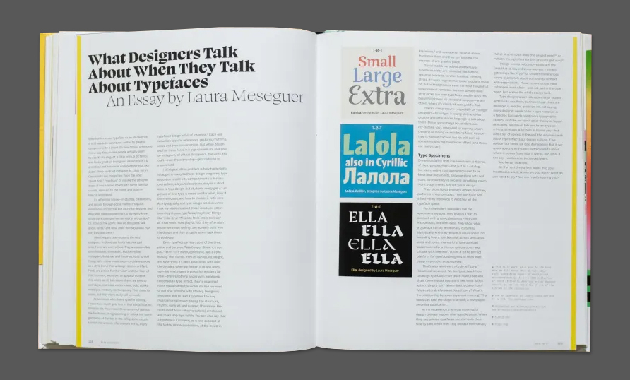
The 200-plus page book is separated into sections that highlight varying classifications of type (including ‘Classification-Defying’). There are essays by six renowned graphic designers, type designers and authors: John Boardley, Ellen Lupton, Erik Spiekermann (see Eye 74), Veronika Burian (see Eye 109), Laura Meseguer (see Eye 102) and Min-Young Kim, a Korean artist based in London, who contributes an essay entitled ‘Under the Same Roof’ that discusses functionality across languages and multiscript type development, along with the unique cultural nuances of each language and script.
Type specimen for Postea, esigned by Veronika Burian, José Scaglione, Azza Alameddine, Yorlmar Campos, Vera Evestafieva and Tom Grace. Published by TypeTogether.
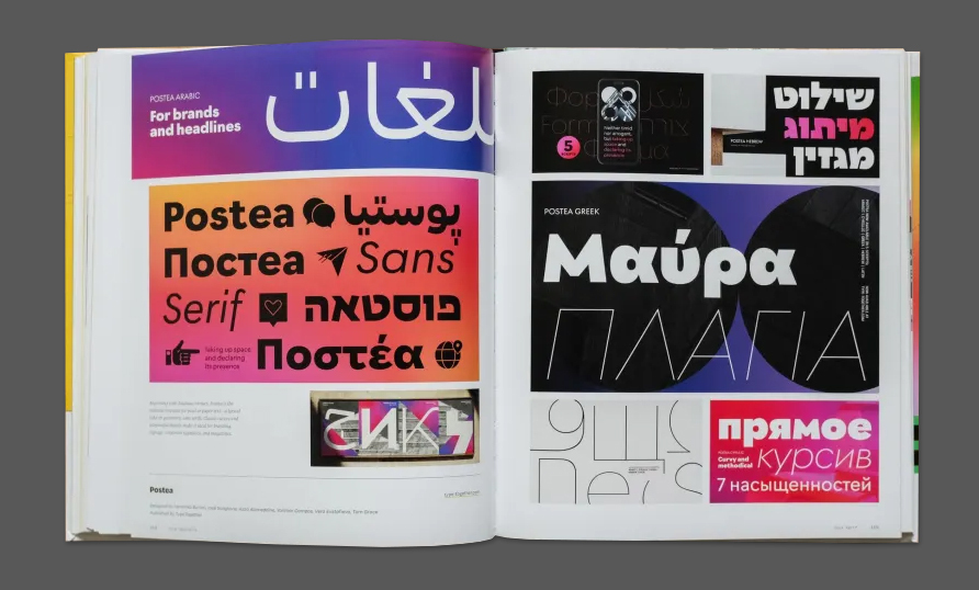
Featuring a range of international type specimens, the publication's contemporary examples include Bowery Lane by Hoodzpah, a type foundry studio based in Southern California, and Dash, by Peter Biľak’s Typotheque (see Eye 75).
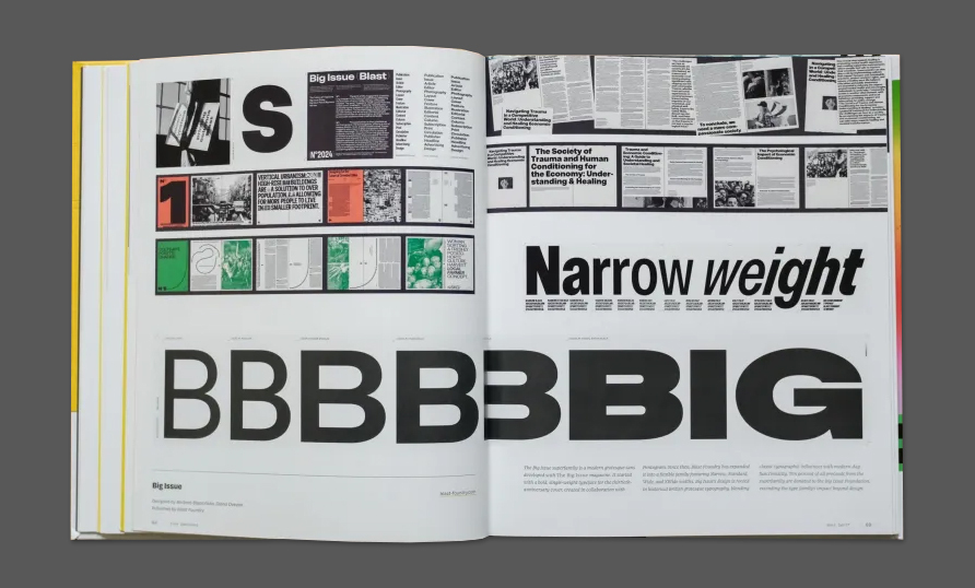
Type Specimen for Big Issue, designed by Barbara Bigosińska and Diana Ovezea (see Robert Newman’s review of the family in Eye 110). Published by Blast Foundry in The Hague.
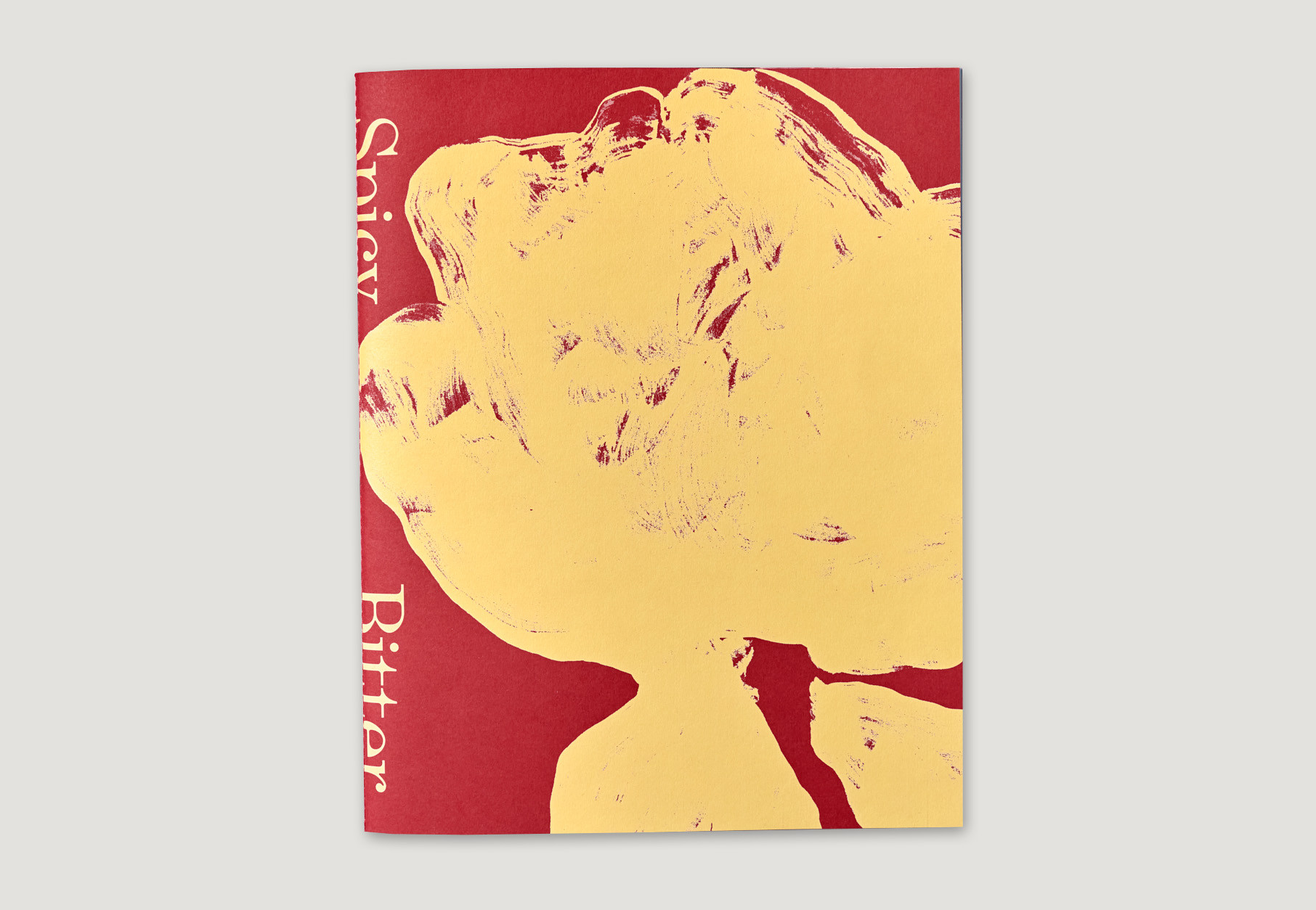
Spicy Bitter—A Dialogue Between Color, Texture, and Obsession. Self-published by Anna-Sophia John and Riccardo Carrara. £30
Spicy Bitter is an unusual self-published book by London photographer Anna-Sophia John and graphic designer Riccardo Carrara. The slim volume visually investigates the colourful leaf vegetable radicchio through a series of still life images.
A spread from Spicy Bitter. Above. Cover of Spicy Bitter.
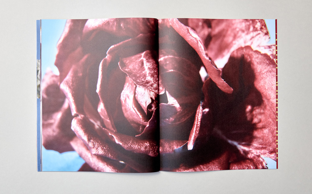
A softback with 60 pages and a sewn binding, the publication features vibrant spreads with pages of varying sizes offering captivating juxtapositions of images that lean into the abstract nature of the vegetable.
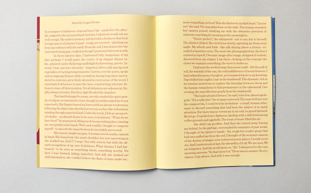
The first spread of Spicy Bitter features an essay by Logan Brown entitled 'Astrid'.
A playful spread from Spicy Bitter featuring varying page sizes.
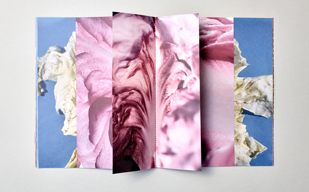
Described as ‘a dialogue between colour, texture, and obsession’, the publication begins with an essay called 'Astrid' by Logan Brown, written from the perspective of a radicchio that is being put into a compost bin.
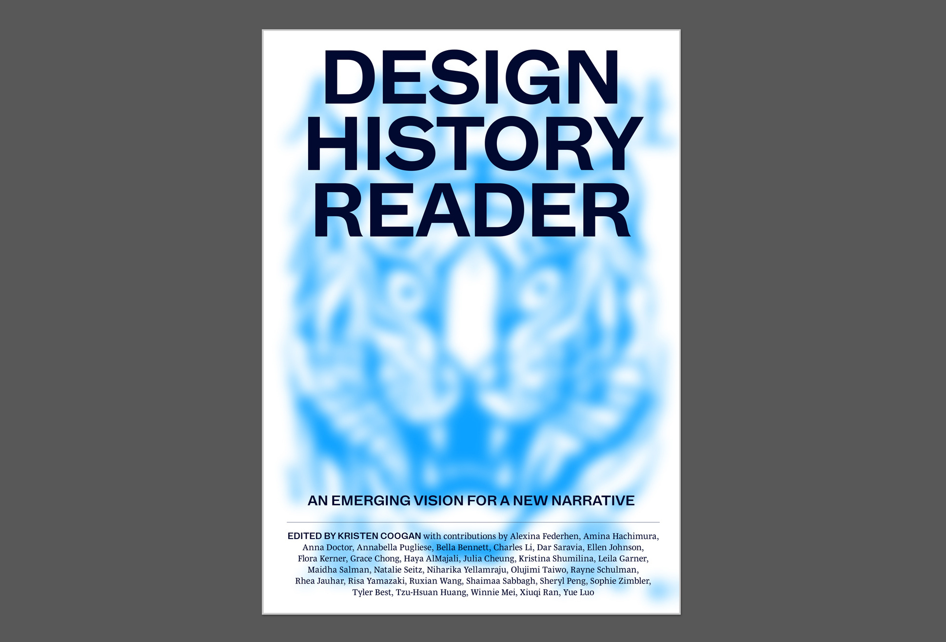
Design History Reader: an emerging vision for a new narrative (Onomatopee). Edited by Kristen Coogan, €26.
The Design History Reader, created by students of the History of Graphic Design course from Boston University and edited by Associate Professor Kristen Coogan, offers a variety of perspectives into design history. In the introduction, ‘An Emerging Vision for Graphic Design History’, Coogan writes that the book challenges the Western design history canon with a ‘pluralistic approach’.
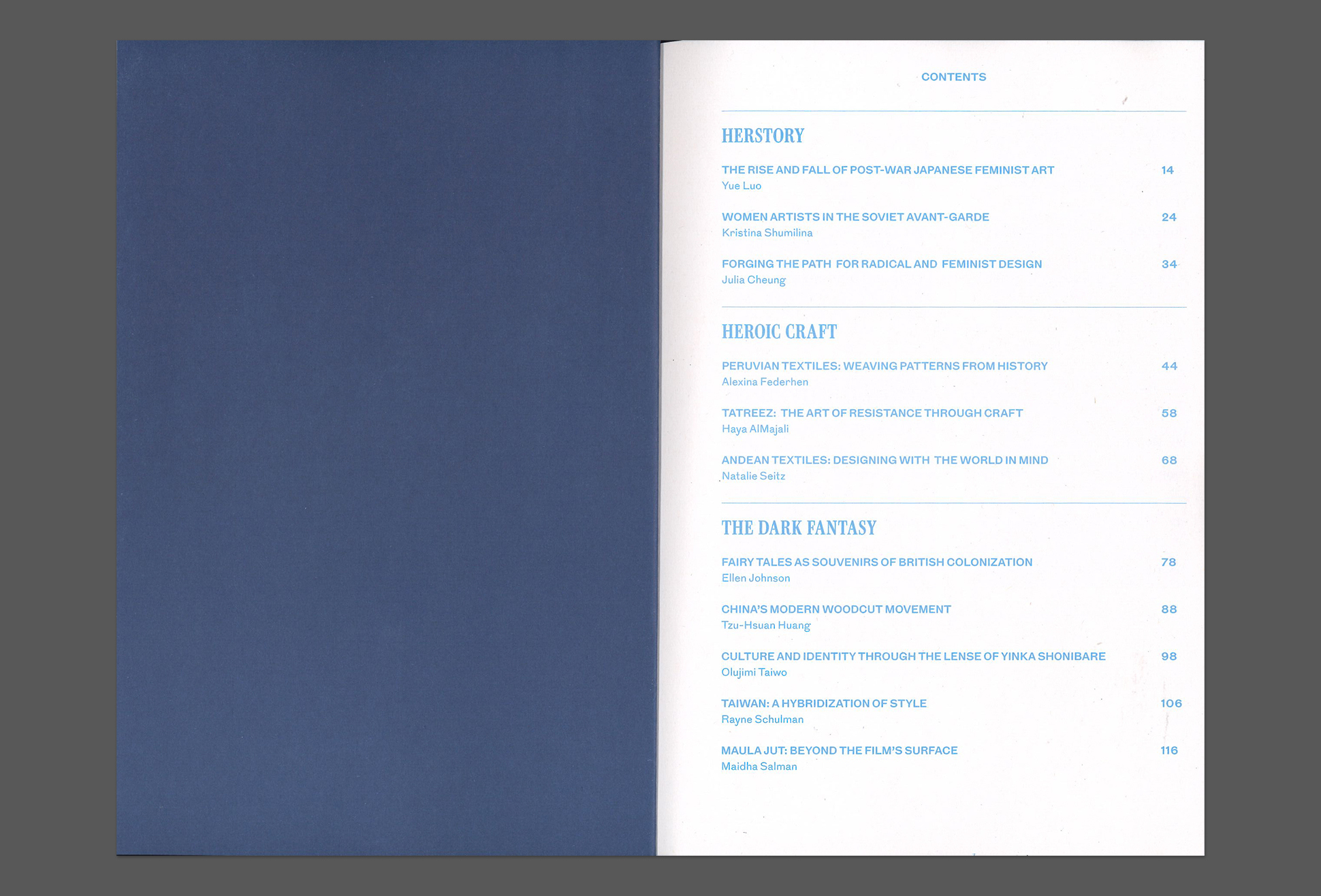
The table of contents from the student-led Design History Reader, highlighting different areas of design history interest for contributors.
Above. Cover.
A spread from Design History Reader featuring a contribution by Yue Luo called ‘The Rise and Fall of Post-War Japanese Feminist Art’, with an image of Japanese contemporary artist Yayoi Kusama.
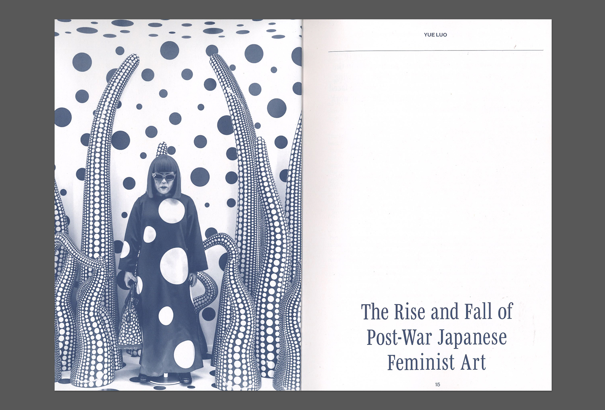
With 30 contributors who represent student voices, the 324-page softcover features research that highlights ‘under-known designers and design movements who deserve representation’, with global case studies including: ‘The Rise and Fall of Post-War Japanese Feminist Art’; ‘The Impact of Colonization on Taiwanese Graphic Design’; ‘Fairy Tales as Souvenirs of British Colonization’; ‘The Overlooked Impact of Afrofuturism’; and more.
A spread from Design History Reader featuring Grace Chong’s ‘Beyond the Brush: Exploring the Evolution of Korean Typography’.
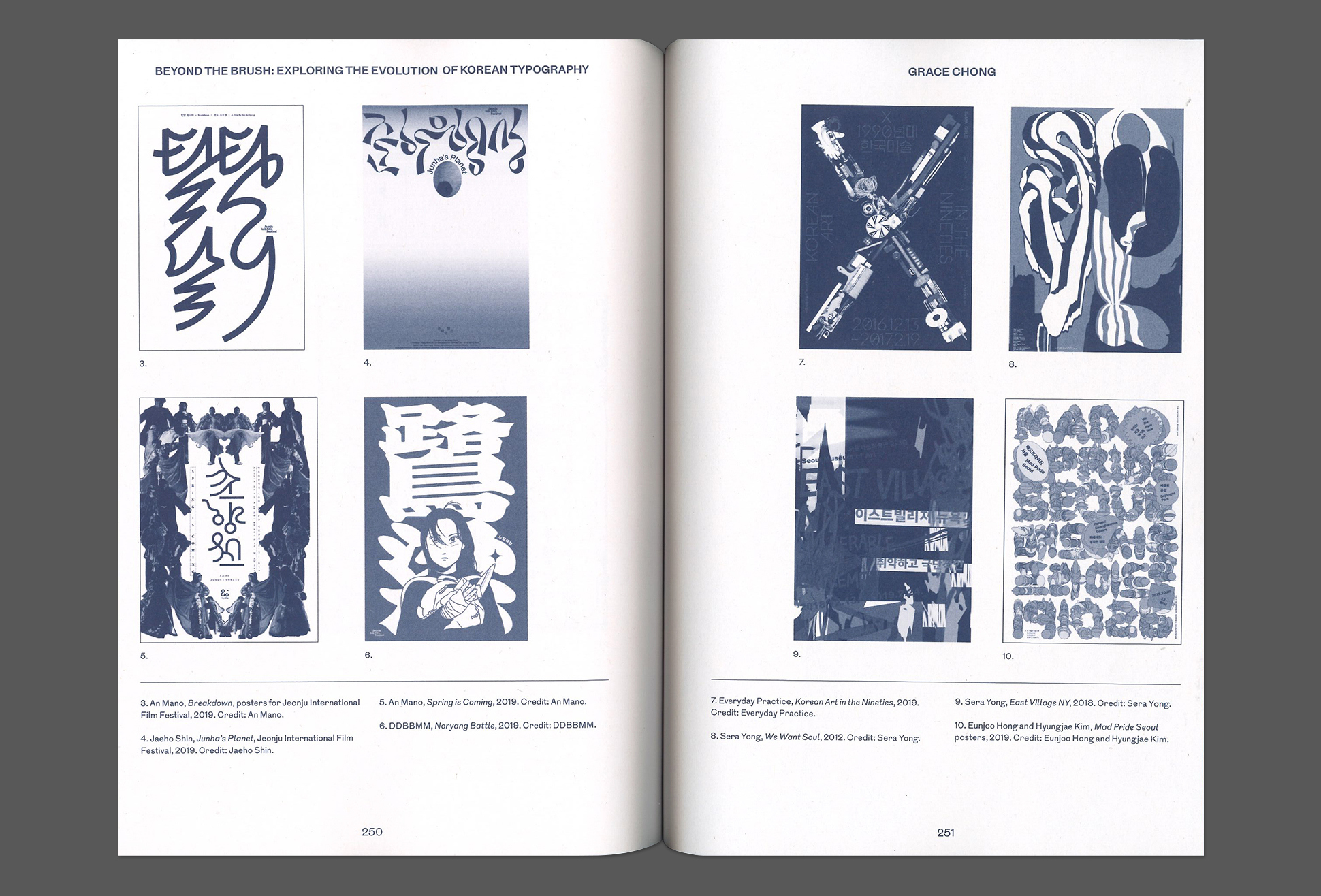
The publication has chapters such as 'Herstory’, highlighting areas of feminist struggle and defiance; and ‘Heroic Craft’, which investigates the history of textiles and resistance through craft as a political force.
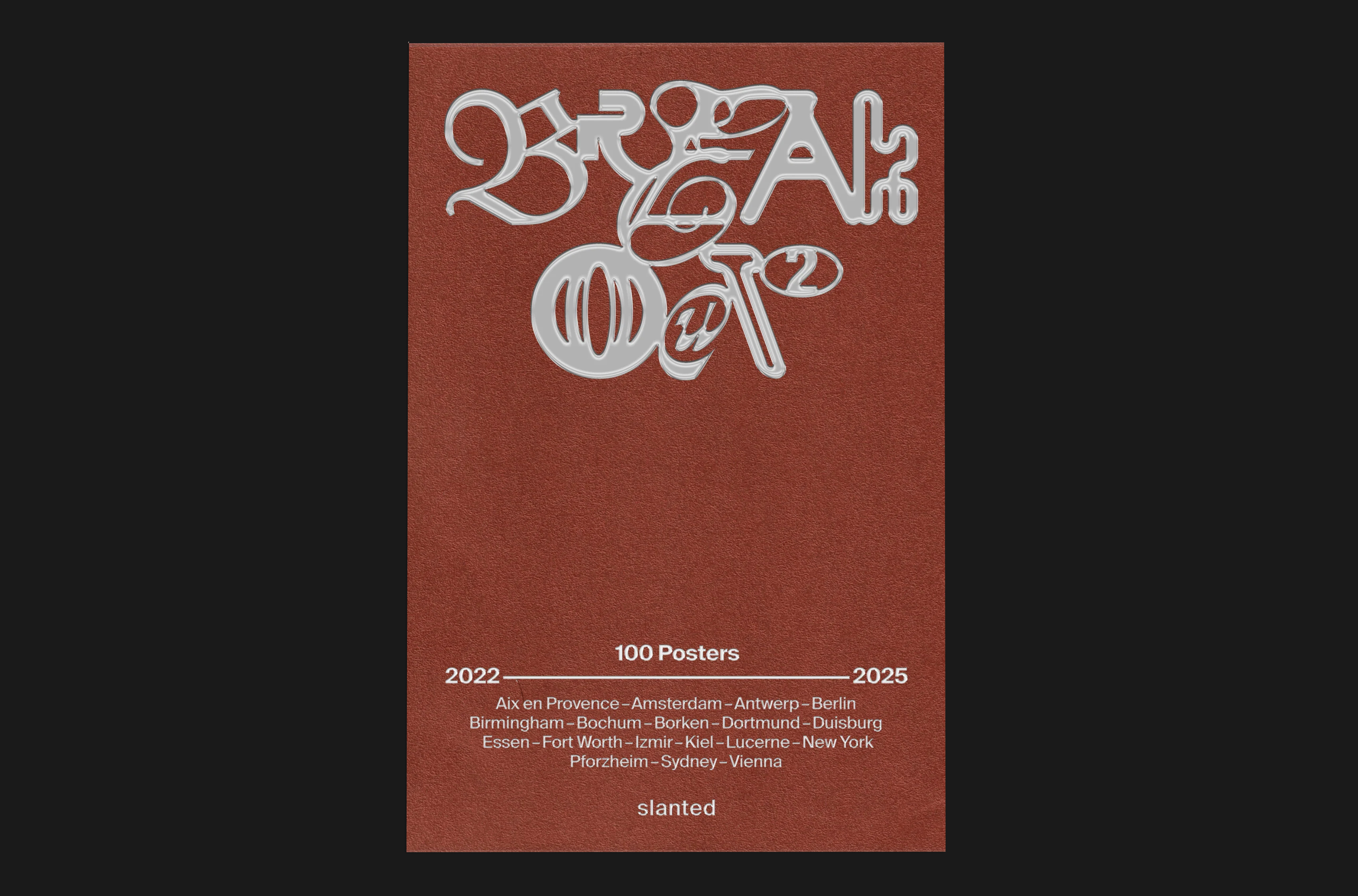
Breakout #2–100 Posters (Slanted Publishers). By Cihan Tamti. €26.
With a terracotta red cover and hot-foiled silver embossed letters, Breakout #2—100 Posters shows 100 selected works by graphic designer and creative director Cihan Tamti. The contents span the years 2022-25. Based in Bochum, Germany, Tamti presents a wide range of works, including international commissions with cultural institutions, companies, initiatives and musicians (Lauryn Hill), along with local support projects, personal experiments and collaborations with fellow designers.
A spread in Breakout #2–100 Posters that features a poster design for Stills, a platform for licensing photography with custom typography, and a poster design for Fullspin, a physical theatre festival in Essen, Germany.
Above. Cover of Breakout #2–100 Posters.
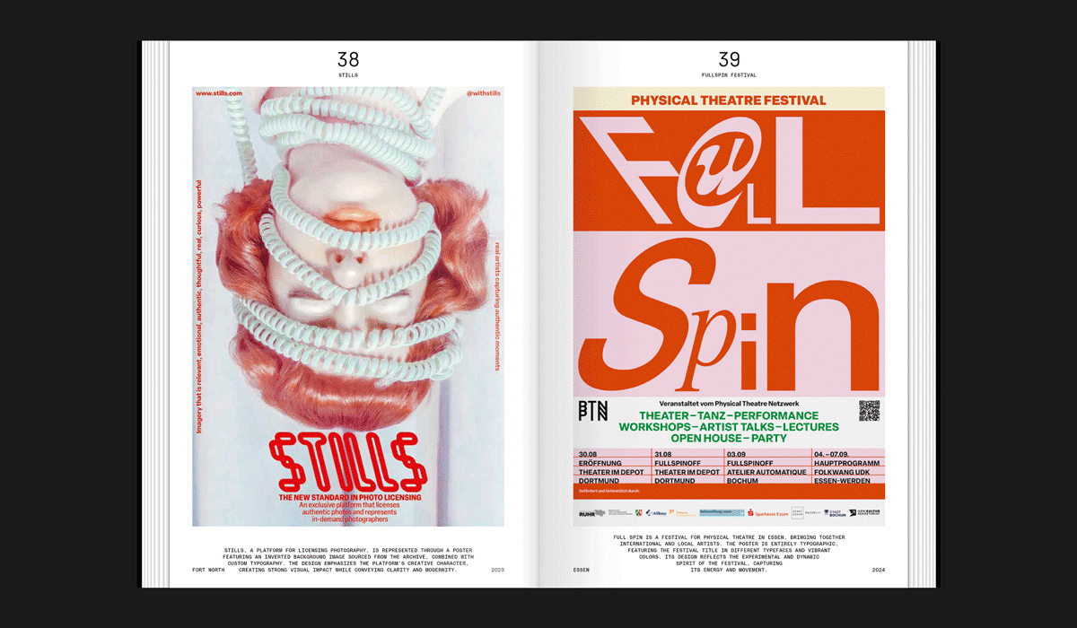
Breakout #2 builds from of Tamti’s first publication Breakout—100 Posters, published by Slanted (see Eye blog) in 2021. It began as a personal experiment, using Instagram as a ‘graphic design gym’, designing a poster every day, which grew a large social following, garnering awards and client interest. The first issue largely featured experimental personal work; this second version shows many real-world projects.
A spread from Breakout #2–100 Posters featuring Tamti’s work for Kieler Woche (Kiel Week), the world’s largest sailing event, held annually in late June in the northern German city of Kiel.
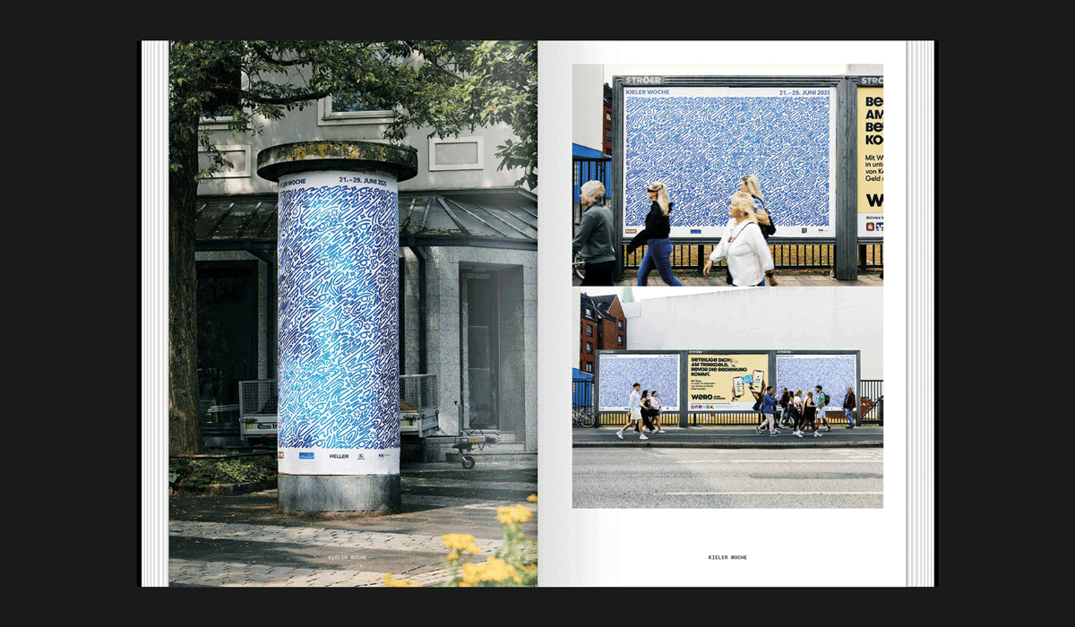
With more than 125 pages, this thread-stitched softcover book showcases a spectrum of design techniques and approaches, such as custom lettering, engaging layouts and dynamic fonts, with small descriptions accompanying the work, along with the client’s city and the year the work was commissioned.
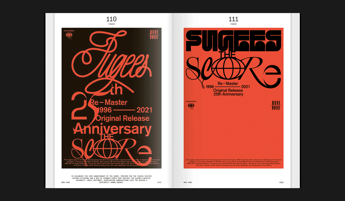
A spread featuring two poster designs by Tamti which celebrate the 25th Anniversry of The Score, the final studio album by American hip-hop group Fugees, showcasing custom lettering and a mix of dynamic fonts.
Eye editors, London
Eye is the world’s most beautiful and collectable graphic design journal, published for professional designers, students and anyone interested in critical, informed writing about graphic design and visual culture. It is available from all good design bookshops and online at the Eye shop, where you can buy subscriptions and single issues.