Thursday, 11:30am
13 October 2011
California dreams
Exhibition charts the sunny design aesthetic of the Golden State

I have developed a habit, when travelling, of making a mental snapshot of what strikes me as different on arrival at my destination, writes Jessica Jenkins. It might be the behaviour at the baggage carousel, the persistence of Helvetica, or ladies’ hairstyles.
The point is, you have to snap it, and save it, as very quickly you begin to adapt, and start elbowing your way in the queues, or chatting to strangers, as appropriate. After a length of time as a foreigner in a country, you exist in a kind of liminal state between your native culture and the one you are adopting, never completely at home in either.
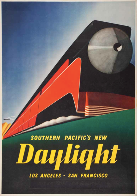
Top: Southern Pacific’s New Daylight, designer unknown (ca. 1937).
An exhibition which has just opened at the Los Angeles County Museum of Art, California Design, Living in a Modern Way 1930-65, curated by Wendy Kaplan, begins with that very arrival of foreigners, such as Viennese architects, Richard Neutra and Rudolph Schindler, Hungarian born architect and polyfaceted designer Paul László, Swiss graphic designer and photographer Herbert Matter, who acclimatised to the existing conditions as well as forging, together with American designers, such as Charles and Ray Eames, Frank Lloyd Wright, Saul Bass, Deborah Sussman, Alvin Lustig (see ‘Born modern’ by Steven Heller in Eye 10), Louis Danziger, Jack Werner Stauffacher, and poet, Jake Zeitlin, a new culture of Californian design.
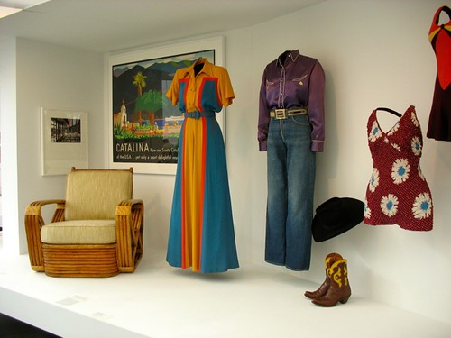
Above: The beginnings of Californian Modernism. Poster: Catalina, by Otis Shepard (1938), designed on Catalina Island. Blue jeans, originally designed for famers, were invented in California by Levi Strauss
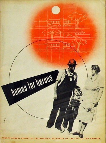
Below: Homes for Heroes, Alvin Lustig (1942).
The exhibition traces the growth of Californian Modernism in graphic and industrial design and the applied arts during the period of exponential urbanisation of this part of the Pacific Coast. Local conditions, driven by a growth in consumer culture and the dominance of the American economy, conspired to influence the creative scene, the warm climate enabling ideas of a fluidity between interior and exterior space to flourish, At the same time, the neighbouring influences of Mexican culture, “outdoor living” and ceramics traditions brought an exoticised, colourful playfulness into Californian design.
As is often the case, wartime production spurred inventive uses of technology and materials, the Eames’ experimentation with plywood to make a more practical type of splint being an example. Synthetic resins and fibre glass were new too. However, in spite of architectural programmes such as Homes for Heroes and the experimentation with low cost modular, though individual, housing forms, (for example, the Case Study Houses) any social agenda was eclipsed by the promotion of a new way of living for the consuming classes, and there was an attempt to export this aspirational culture through the soft propaganda of the Design for Use exhibition which toured Europe during 1951-53. For all the emphasis on outdoor living, this was a very privatised form of outdoor living, where glass walls do not simply offer a wide angle view, but also make the interior home a symbolic showcase of private material acquisition.
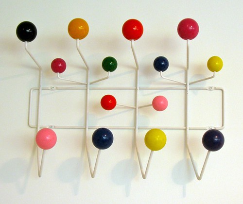
Above: ‘Hang-It-All’ coathanger, Charles and Ray Eames (1953).
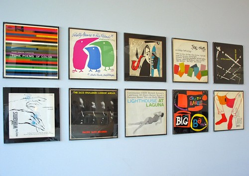
Below: Miscellaneous record sleeves.
In spite of traversing the war years, there is clearly much less of a rupture in this period than there was in European and in particular German Modernism. There is a economy of form, but the enduring narrative of the unimpeded pleasures of modern living was comfortable with bright colours, pattern, and even figuration, making much of what is on show appear closer to the to pop culture and hippy aesthetics which it predates, than sombre rationalism. The show displays the first kidney shaped swimming pool, a form which became indelibly associated with American Modernism, and the exhibition architecture is appropriately curvaceous.
Other stylistic signifiers bounce back and forth: Edward McKnight Kauffer (see ‘Modern visions’ on the Eye blog) who traversed the Atlantic in the other direction to make his mark on the London Underground posters was influential on Alvin Lustig, as was Jan Tschichold; monochrome and flat colour photomontage techniques are reminiscent of Soviet constructivism and Weimar Modern graphics, and then again remind us of some of Jan van Toorn’s work (see ‘The designer unmasked’ in Eye 2); Bauhaus inspired designs end up back in Europe, even in East Germany. Atomic forms, exemplified in the Eames’s ‘Hang it All’ coat hooks, become fashionable in American and European textiles and graphics. (The exhibition suggests that appropriating symbols of potential armageddon was a way to assuage public fears.)
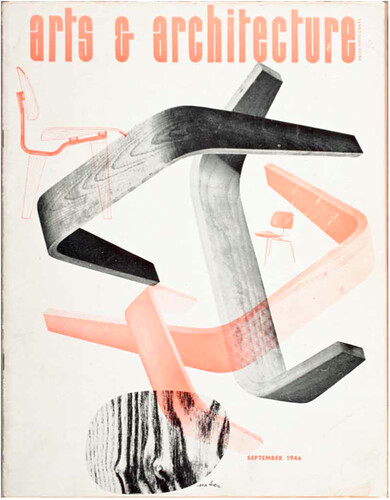
Above: Cover of Arts and Architecture, Herbert Matter (September 1946). The design interprets the Eames chairs using photomontage to reveal the technical innovation of the chair’s structure.
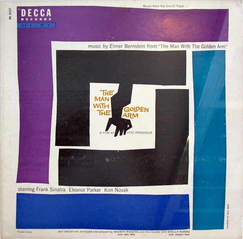
Below: LP cover using Saul Bass’s identity for Hitchcock’s The Man with the Golden Arm (1955).
A highlight of the show is the complete re-creation of the Eames’ living area (the actual Eames house is closed for renovation), which rather than resembling a Hermann Miller showroom is a living space, full of mementos, some of them kitsch, and natural materials and surfaces.
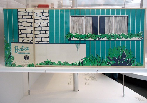
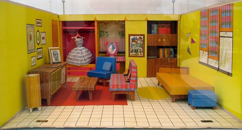
Other exhibits worth a special mention are art director Marget Larsen’s packaging, the ur-Barbie and Ken and their dream home, Sister Corita Kent’s anti commercialism posters (see Eye 35), and some rather fabulous bathing wear. Video interviews with several of the designers, some of them still working, give an insight in to the designers’ enthusiasm and self-conviction.
The home of Hollywood was fertile ground for the interchange of creative genres, with movie stars promoting fashion lines, and popular forms of graphic design such as record covers, lifestyle magazines and advertisements entering the home. Saul Bass’ seminal identity for Hitchcock’s The Man With the Golden Arm presented the feature film as a medium for corporate identity (see also ‘Overtures and psychotic symphonies’ in Eye 39), something which also flourished within the growing tourism sector.
The exhibition demonstrates how pioneering artists were engaged in small-scale operations which situated their work more closely within the applied arts than in industrial production. The final item, Harry Keck’s roadside barricade lamp, is out of place in the design-for-living context, but serves as an illustration of the ultimate incompatibility of garage production with the demands of mass consumption. Nonetheless, as some concurrently running exhibitions suggest, the traditions of the hand-made endured in the latter part of the twentieth century. My first impression of difference at the airport had been the display of huge pieces of colourful textile art; my last was of the body artistry at Venice beach. In spite of international cross currents, some characteristics of creative expression evidently flourish in the local climate.
Above and below: Barbie’s dream house, exterior and interior.
See also: ‘West coast latitudes’, Ken Coupland’s piece on LA design in Eye 31.
The show is part of Pacific Standard Time, which brings together more than 60 cultural institutions across Southern California. Also of particular interest: Eames Designs: The Guest Host Relationship at the A+D Architecture and Design Museum, Golden State of Craft: California 1960-1985, Craft and Folk Art Museum (CAFAM), Peace Press Graphics 1967-1987: Art in the Pursuit of Social Change at the University Art Museum, California State University, Long Beach, San Diego's Craft Revolution-From Post-War Modern to California Design at the Mingei International Museum and Drawing the Line: Japanese American Art, Design, and Activism in Post-War Los Angeles at the Japanese American National Museum.
Many thanks to Jeremy Aynsley and Wendy Kaplan for introducing me to this exhibition; Jeremy Aynsley’s contribution to the exhibition catalogue deals specifically with the graphic design of the period.
1 October 2011 > 25 March 2012
California Design, Living in a Modern Way 1930-65
Los Angeles County Museum of Art
5905 Wilshire Boulevard
Los Angeles, California 90036
www.lacma.org
Eye is the world’s most beautiful and collectable graphic design journal, published quarterly for professional designers, students and anyone interested in critical, informed writing about graphic design and visual culture. It’s available from all good design bookshops and online at the Eye shop. For a taste of the new issue, see Eye before you buy on Issuu. Eye 80, Summer 2011, is out now. Eye 81 will be out soon.

