Friday, 3:38pm
11 October 2013
Chat show
Matt Edgar
Marion Deuchars
Lars Muller
Adrian Shaughnessey
Ian Anderson
Rico Lins
Hamish Muir
Michael Bierut
Stefan Sagmeister
Marian Bantjes
Pierre Bernard
Paula Scher
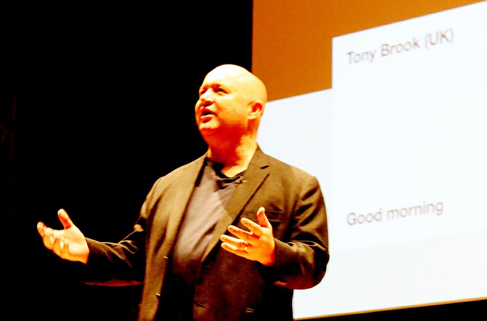
Tony Brook
Peter Saville
Michael Bracewell
Catherine Dixon
Ken Garland
Patrick Thomas
Astrid Stavro
Pablo Martin
Eddie Opara
Kenya Hara
Roger Law
Design education
Design history
Graphic design
Magazines
Typography
Visual culture
Pam Bowman and Matt Edgar report from day one of the AGI Open conference in London, where the theme was ‘dialogue’

London’s AGI Open set out to shun the standard conference show-and-tell format, and to bring ‘dialogue’ to the stage, write Pam Bowman and Matt Edgar.
Panel discussions, interviews and even a game of ‘Mr and Mr’ via Skype, set out to entertain and engage. Speakers and AGI [Alliance Graphique Internationale] members were expected to mingle with the Barbican audience and welcome interaction. ‘Dialogue’ is difficult to manage with 2000-odd people but it was certainly a step in the right direction. (See Linda Kwon’s ‘The accessible elite’ in Eye 86).
Marion Deuchars, Ian Anderson, Adrian Shaughnessy in the ‘No Client’ discussion.
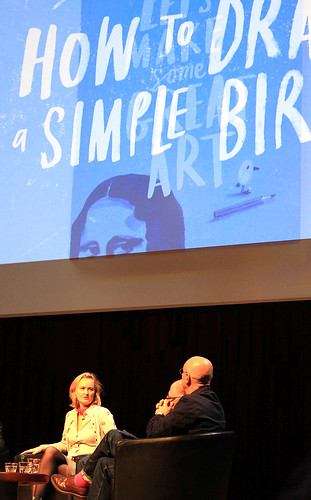
Thursday (26 September 2013) was opened by Tony Brook, Lars Müller and Adrian Shaughnessy and went straight into a panel discussion entitled ‘No Client’ with Ian Anderson (The Designers Republic), Marion Deuchars, Patrick Thomas, Astrid Stavro and Pablo Martin chaired by Shaughnessy. Their discussion centred around the need for students and practitioners to ‘find their voice’ through working at what Deuchars called a play desk’. Both Deuchars and Thomas talked about the value of these spaces, and Anderson referred to them as a ‘playground to experiment and test’. This is not about encouraging self indulgence, but instead, is about development and communication. ‘Because I’ve come from a commercial background,’ said Deuchars, ‘I do want my work to be accessible’.
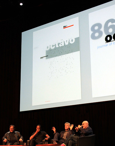
Rico Lins, Eddie Opara, Hamish Muir, Adrian Shaughnessy discuss working without a client.
Spread from the seventh issue of Octavo, 1990.
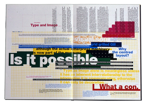
A second ‘No Client’ panel featured Hamish Muir (Outcast Editions), Pentagram’s Eddie Opara and Brazilian designer Rico Lins. Muir began by describing the legendary Octavo, a self-initiated magazine project from his former studio 8vo. Muir noted that it may have scared more clients than it recruited, yet the title has had a significant influence on other graphic designers.
Opara talked about his data-driven products and the relationship, encouraged at Pentagram, between clients and self-initiated work, while Lins presented work that brings together letterpress and digital processes.When asked why he instigates clientless projects, Muir replied, ‘Because I hate football!’ Opara referred to balancing the joy of these kinds of projects with the pain of less desirable work. Lins said, ‘These are the projects that no clients have asked for yet, so we have to do it.’
Image from ‘Tokyo Fiber Senseware’, 2009, an exhibition directed by Japanese designer Kenya Hara.

Experimentation with materials and collaboration across disciplines were the key themes in Kenya Hara’s entertaining presentation. He focused on his House Vision project and future living spaces, designed for the way we live now, the shape of our families and the needs of the individual. Hara’s proposals for design, concerned with environment, energy and best use of technology, seems far removed from a country such as the UK, with large proportions of housing stock built more than a century ago, but we can dream.
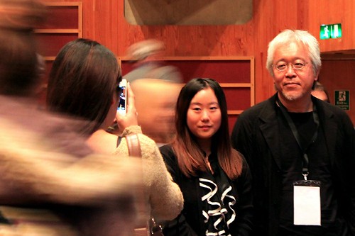
Kenya Hara with an audience member.
Roger Law’s ‘Spitting image’ drawings.
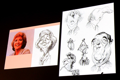
Roger Law’s talk ‘Roger Law used to be famous’ was appropriately titled, given that a large section of the AGI Open audience appeared to have been born in the 1990s. The themes that came up included appropriation and the importance of drawing as a thinking skill. ‘Drawing is the key to getting it right … If you can draw, you can steal from anywhere and do anything you want.’
Michael Bierut introducing ‘Cavaliers v Roundheads’.
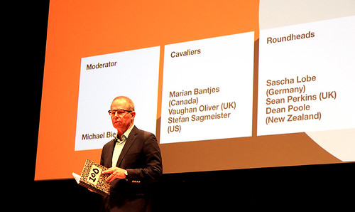
Pitting designer ‘Cavaliers’ against ‘Roundheads’ prompts a few questions that do not really need answers. It may be the case that, as Michael Bierut suggested, most designers are a unique balance of both. However it ledto an entertaining discussion, and a good place to start when talking to students and young designers about what their practice may become.
The Roundheads began with Sean Perkins (North), presenting no-fuss, no-nonsense Yorkshire as an influence in his Modernist approach. Sasha Lobe (L2M3), who followed Perkins, was pleased to not be the only person on the panel with a German accent (the other was Sagmeister) since that usually made him the ‘bad guy’. The third member was Alt Group’s Dean Poole, whose aesthetic may be Roundhead but whose approach takes influence from the Cavalier.
Sean Perkins ponders his ‘roundhead’ position.

Stefan Sagmeister, an über Cavalier.
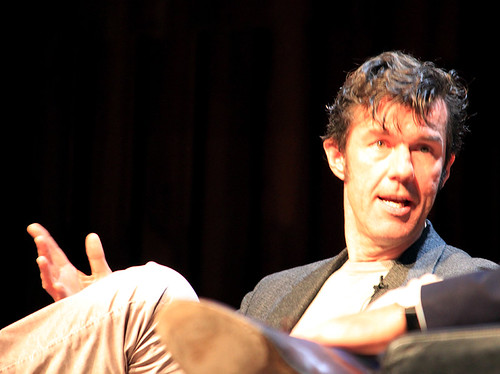
For the Cavaliers, Marian Bantjes dressed for the part in fabulous gold boots. Marian set the scene with a historical overview of the place and purpose of decoration. Then she and Stefan Sagmeister went on to demonstrate decorative redesign for their opponents’ minimal websites.
The panel continued to poke fun at each other and the audience spent most of this time laughing. It certainly sounded like the Cavaliers had edged a win.
Adrian Shaughnessy and Pierre Bernard.
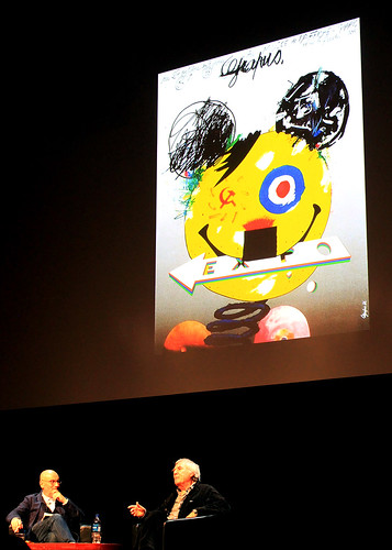
In an interview format, Adrian Shaughnessy spoke with Pierre Bernard. Pierre’s love for teaching and working with students was evident, ‘The questions they ask are new, never the ones you are waiting for’. Adrian asked about the importance of hand drawing in the making of work, of the human element, ‘We were not industry messengers, we were people messengers’. Pierre stressed the importance, to him, of working on projects that are meaningful to the designer, which echoed some of the earlier discussions. ‘You have to believe in the content … you have to put yourself into the design … you have to love your work.’
Tony Brook and Paula Scher.
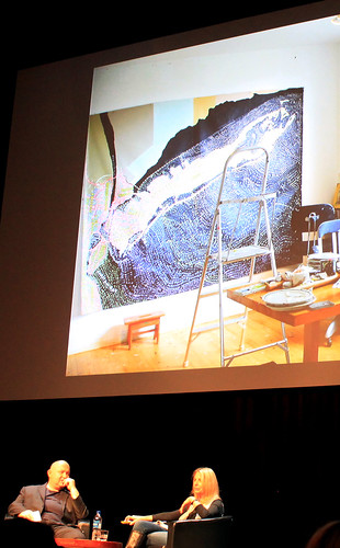
Another interview format, Tony Brook introduced Paula Scher as ‘The First Lady of Graphic Design’. Earlier, Eddie Opara had introduced Pentagram’s encouragement of personal projects, and here Paula was presenting her map paintings, explaining how ‘The obsessiveness of the painting had to be counteracted by the design … Design makes you frustrated, this (painting) makes you crazy!’ Her painting has been a kind of release from the overt control required for identity design. Paula is known as an artist for the map paintings and is commissioned as an illustrator alongside her successful design practice. She seems to have no problem moving between these states and for her, ‘there is no value judgement.’
Rick Poynor (left) had Peter Saville in reflective mode.
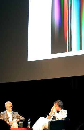
The writer and critic Rick Poynor set up an engaging interview with Peter Saville, a designer he says, ‘who thinks about culture through graphic design.’ The conversation centred around Saville’s work pre and post 1993. The pre-1993 Saville story was somehow more alluring with the articulation of his ‘taste agenda’ set against the cultural backdrop of the 1980s preoccupation with style. ‘Style could be an idea’, he said, ‘culturally style was a value.’ Poynor questioned Saville’s previous assertion of fashion providing a lens that shows us who and where we are. For Saville, ‘fashion is the quickest indicator of the zeitgeist’. Post-1993, Poynor questioned whether it was still possible to be a critical designer. ‘Yes’, said Saville, ‘but in collaboration.’ There was an interesting question about where Saville belongs now or who claims ownership of him as a cultural force, with reference to Michael Bracewell’s description of Saville as ‘a design based artist’. And it is interesting that the same question was not asked of Paula Scher who exists quite comfortably as Pentagram designer and map artist. However, there is no doubt that Saville exists in a different space now, evidenced by his recent Swing project with Anna Blessmann.
Poynor and Saville with a projection of Saville’s album cover for Technique (1989) by New Order, featuring a photograph by Trevor Key. Photo: JLW.
‘In two weeks, I’m 58. Why on earth would I want to do a record cover at 58? It’s totally inappropriate.’ He still finds cause to be optimistic, citing Metahaven and the wiki-leaks scandal, that we are more politically engaged now than previous decades, and that the social psyche has changed for the good, but concluded with a cautionary and pessimistic note: ‘Find the market that imposes the least amount of damage on you.’
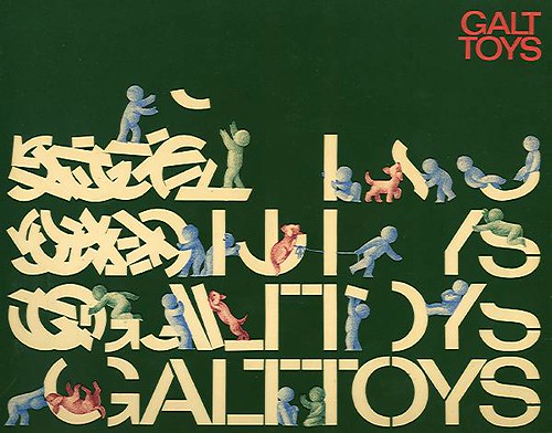
The ‘Fringe’ sessions gave a more intimate opportunity for ‘dialogue’ with Catherine Dixon and a few of the speakers including Ken Garland, an addition to the bill.
Ken Garland’s Galt Toys catalogue cover, 1974-75. Drawing: Daria Gan.
Pam Bowman, typographer, writer, joint course leader of graphic design at Sheffield Hallam
Matt Edgar, motion designer, writer, joint course leader of graphic design at Sheffield Hallam
All AGI Open event photographs by Bowman and Edgar except where noted.
Eye is the world’s most beautiful and collectable graphic design journal, published quarterly for professional designers, students and anyone interested in critical, informed writing about graphic design and visual culture. It is available from all good design bookshops and online at the Eye shop, where you can buy subscriptions, back issues and single copies of the latest issue. You can see what Eye 86 looks like at Eye before You Buy on Vimeo.

