Friday, 10:00am
27 April 2012
Clicks and sparks

data.anatomy – Ryoji Ikeda’s new audiovisual installation in Berlin

Ryoji Ikeda’s work quivers somewhere between electronic music, digital art, installation and performance, writes John L. Walters. He uses raw materials – both visual and sonic – that seem plucked from the innermost depths of contemporary gadgetry: tiny clicks and flashes that are amplified to colossal proportions.
Using giant screens and huge speaker systems, Ikeda gives these hidden elements something approaching the scale and monumentality of industrial manufacturing processes. Though he uses raw electronic tones rather than samples, the noise he pumps into galleries, halls and clubs can attain the grandeur of throbbing factories or clanking shipyards. The resulting performance is part musique concrète, part minimalist DJ set. And though Ikeda’s work can seem austere, the total effect is often surprisingly emotional.
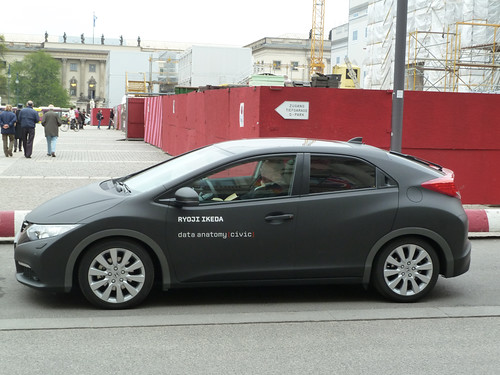
His latest audiovisual work at the Berlin gallery MUMA (aka Kraftwerk, above) is entitled data.anatomy [civic]. This twelve-minute video, projected though multiple screens and speakers, takes as its starting point the digital data generated during a car’s design and development processes, All the visual content in data.anatomy is derived from immensely detailed CAD files and wireframes used in the design of a new Honda Civic car. The manufacturer, unsurprisingly, has invested a lot of time and money in Ikeda’s paean to its industry, and it flew 25 international journalists to Berlin for the private view last week.
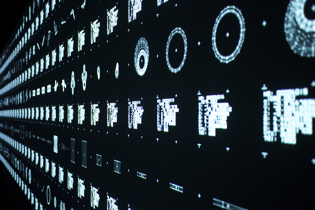
Organised into three ‘movements’, Ikeda’s data.anatomy presented us first with a data landscape, almost like a night sky (above). Then followed a busy matrix of rapidly changing diagrams and chattering machine texts (top). Finally, we were treated to a balletic arrangement of rotating and panning wireframes (below).
The sound element, unlike other Ikeda works, functions more as an attractive and moody underscore, with a repeated high note that pulses like a sonar and gets under the listener’s skin. In conversation after the opening, Ikeda cheerfully scorned any intellectual or technical pretension: ‘I didn’t study music or art or mathematics. I’m from the street!’ He made the piece with an assistant and four programmers.
Mitsuru Kariya, the Civic’s project leader (based in Tochigi in Japan), seemed genuinely moved by the installation, which he saw for the first time at the private view. ‘Every part of it is familiar,’ he said, noting that it also brought to mind the faces of all the different people he had known on the design team. The development process took place over four years and involved up to 30 designers and technicians. Kariya claimed modestly to have found himself thinking ‘I could have done that better’, when his old sketches flashed across data.anatomy’s multiple screens.
For those of us not in the automotive industry the flickering diagrams had an almost retro ‘graph paper’ aesthetic, and the rapidly changing texts reminded me of Rob Lord’s electronic book animations for the BBC version of Hitchhikers’ Guide to the Galaxy (see Eye 42) and Tron. You could criticise data.anatomy (or enjoy it) as ‘infoporn’, too: there’s far too much detail to take in as the audience wallows in a huge audiovisual bath.
Compared to Ikeda’s other pieces, data.anatomy is softer, less confrontational, possibly more accessible. It could be viewed as high-tech commercial art direction. Ikeda has taken the time-worn ‘the solution lies in the problem’ approach advocated by designers such as John McConnell.
In common with many examples of design and advertising, data.anatomy is impressive at both conceptual and technical levels, using a degree of screen resolution that he hasn’t been able to use before (three Projectiondesign F32 projectors at WUXGA resolution, with up to 8000 lumens of brightness and a contrast ratio of 7500:1). But data.anatomy isn’t a TV commercial, nor is it a piece of ‘art’ in the sense of earlier Ikeda works such as data.tron or C4I.
Yet there’s something about new digital work, often sponsored by or closely linked to big companies, that seems to slip away from the old categories of art, design and advertising. Digital can’t really be ‘pure’, so it resists categorisation. We’ve recently seen some very interesting, hard-to-pigeonhole work from designers such as Field (see ‘10,000 one offs’ in Eye 80), Karsten Schmidt (see interview in Eye 74) and Matt Pyke (see ‘Super – computer – romantics’ on the Eye blog). Johnny Hardstaff argued in ‘Dreams can come true’ (Eye 80) that such new designer-client relationships were the way forward:
‘Clients are learning to recognise left-field creativity and, delicately, buy into it. Where once they might have tried to shape it, they are often now becoming sponsors, remote patrons even, and thus empowering designers to say more in very different ways with far less external control and censorship.’
Ikeda’s data.anatomy almost fits into Hardstaff’s definition, even if Honda could hardly be described as a ‘remote patron’. The piece, which fits well within the mixed bag of Ikeda’s body of work, is still more ‘branded’ than, say, Michael Nyman’s double concerto for Mazda.
But taking Johnny Hardstaff’s optimistic line, I hope that the relative success of data.anatomy encourages some other big companies to venture into this exciting area of digital work, which is full of talented practitioners. And that they will resist the temptation to control and brand things too much: Ikeda and his producers, Forma, know their stuff in the way that Mitsuru Kariya knows every detail of his new Honda Civic.
Ryoji Ikeda, Data.anatomy
MUMA (Kraftwerk), Köpenicker Straße 59, 10179 Berlin, Germany
Until 1 May 2012
See a short extract on Vimeo.
Eye is the world’s most beautiful and collectable graphic design journal, published quarterly for professional designers, students and anyone interested in critical, informed writing about graphic design and visual culture. It’s available from all good design bookshops and online at the Eye shop, where you can buy subscriptions and single issues. Eye 82 is out now – you can browse a visual sampler at Eye before you buy on Issuu.

![Data.anatomy [civic], a new audiovisual installation by Ryoji Ikeda at MUMA (Kraftwerk) Berlin from 19.04.12 – 01.05.12](http://farm8.staticflickr.com/7099/7113263599_ce049c3dd4.jpg)

![Data.anatomy [civic], a new audiovisual installation by Ryoji Ikeda at MUMA (Kraftwerk) Berlin from 19.04.12 – 01.05.12](http://farm8.staticflickr.com/7094/7113265151_2381da2f9d.jpg)
![Data.anatomy [civic], a new audiovisual installation by Ryoji Ikeda at MUMA (Kraftwerk) Berlin from 19.04.12 – 01.05.12](http://farm8.staticflickr.com/7193/6967187490_20311c4a21.jpg)
![Data.anatomy [civic], a new audiovisual installation by Ryoji Ikeda at MUMA (Kraftwerk) Berlin from 19.04.12 – 01.05.12](http://farm8.staticflickr.com/7232/6967187792_236e662da8.jpg)
![Data.anatomy [civic], a new audiovisual installation by Ryoji Ikeda at MUMA (Kraftwerk) Berlin from 19.04.12 – 01.05.12](http://farm8.staticflickr.com/7037/6967186956_1bf97ae330.jpg)
![Data.anatomy [civic], a new audiovisual installation by Ryoji Ikeda at MUMA (Kraftwerk) Berlin from 19.04.12 – 01.05.12](http://farm8.staticflickr.com/7100/7113263719_3d90109bac.jpg)

![Data.anatomy [civic], a new audiovisual installation by Ryoji Ikeda at MUMA (Kraftwerk) Berlin from 19.04.12 – 01.05.12](http://farm6.staticflickr.com/5444/7113264299_40fc9818f4.jpg)