Wednesday, 12:20pm
30 July 2008
Commercial modernism

Teague’s modernistic gem gave Kodak a distinct visual personality

The Summer 2008 issue of Eye, no. 68, goes ‘Beyond the canon’ to question and to enlarge the accepted pantheon of graphic design history; here Steven Heller reminds us of a forgotten ‘modernistic gem’.
Modernity was the spark that ignited the engine of the 1920s American consumer boom prior to the Great Depression. And few corporations were more fervent about the application of ‘commercial modernism’ than Eastman Kodak, the New York film and camera company.
In 1928 Kodak commissioned industrial and advertising designer Walter Dorwin Teague (1883-1960) to design the Art Deco gift camera, an otherwise conventional box camera with a colourful cubistic design on the lens side, which came in various colour combinations. Teague’s New York firm went on to design the Baby Brownie, Beau Brownie, Bantam Special and Kodak Super 620, each one a modernistic gem.
Cubistic graphics on packages and point of purchase displays were already the rage in Paris at stores like Printemps, Bon Marché and Galeries Lafayette. ‘It is extremely “new art” and some of it too bizarre, but it achieves a certain exciting harmony, and in detail is entertaining to a degree,’ wrote the advertising pioneer Earnest Elmo Calkins, the first in the US to champion Modern veneers. ‘It is not always beautiful, but it is diabolically clever.’
This cleverness – and aesthetic vigour – piqued the interest of designers who at first simply applied a novel surface to otherwise antiquated shells but ultimately transformed the core products too. Like Calkins, Teague saw ‘art’ as a means to trigger allure. As an advocate of the concept known as ‘styling the goods’, Teague helped enliven the market (and created objects that defined their times). He also provided Kodak with a distinct visual personality.
Although some critics, like advertising man Claude Hopkins, argued that ‘fancy advertising images were elitist distractions, unresponsive to the tastes of ordinary consumers, and therefore doomed to fail’, its promoters viewed Modern art as a democratising force in terms of the middle classes, so-called ‘people of taste.’ And Teague, being one of the foremost industrial and product designers – known for his contributions to the 1939 New York World’s Fair (The World of Tomorrow) – was a leading progenitor of the modern look.
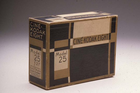
He did not design the Ciné-Kodak Eight, one of the early amateur movie cameras, but the box in which it came (and was displayed on the shelves) was based on his Art Deco gift camera. Although extremely popular, its deco gold, black and white palette, modernistic lettering and cubistic pattern would give way to Kodak’s rebranding in yellow and red around 1935. It was nonetheless a vivid mnemonic signalling the company’s vision of the future – and a keen sense of style.
Do you have a suggestion for ‘Beyond the canon’? If so, please comment, or email editor John L. Walters: John dot Walters at eyemagazine dot com.
See ‘New frontier’, Steven’s article about original Playboy art director Art Paul, in Eye no. 68.
Eye is the world’s most beautiful and collectable graphic design journal, published for professional designers, students and anyone interested in critical, informed writing about graphic design and visual culture. It is available from all good design bookshops and online at the Eye shop, where you can buy subscriptions and single issues.
