Wednesday, 7:00am
18 December 2013
Comp up the volume
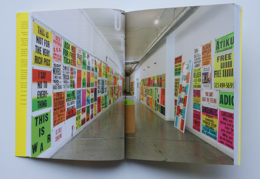
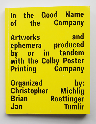
In the Good Name of the Company; Artworks and ephemera produced by or in tandem with the Colby Poster Printing Company
Organised by Christopher Michlip, Brian Roettinger, Jan Tumlir<br>Picturebox / ForYourArt, $34.95<br>A loud new book pays tribute to the Colby Poster Printing Company of LA and their clients, from artists to junk dealers

This new book is a riotous feast of posters produced in recent decades by the Colby Poster Printing Company, which shut its doors for good at the end of 2012, writes John L. Walters.
Since it was founded in 1948, three generations of Colbys have churned out every kind of letterpress poster – designed or ‘undesigned’ – often printed on garishly coloured or fluorescent stock, promoting anything from house sales to carnival rides to punk gigs.
Client posters by Colby Poster Printing Company.
Top: installation view of posters printed by Colby.
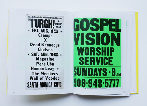
In recent decades, a significant percentage of its clients has come from the world of fine art. This 320-page book, published by Dan Nadel’s redoubtable company Picturebox, mixes everyday posters with work that Colby printed for artists such as Vincent Ramos, Euan Macdonald, Emilie Halpern and Peter Coffin. The posters are generally shown one to a page. (A few silkscreen posters and collages are thrown into the largely letterpress mix.)
So you can see a big, bold poster for the ‘Gospel Vision Sunday Service’ just a few pages away from an Anthony Burrill poster demanding: ‘Give the joy back’.
Anthony Burrill, Give the joy back, 2012 and Peter Coffin, Untitled (designs for Colby Poster Co.), 2008.
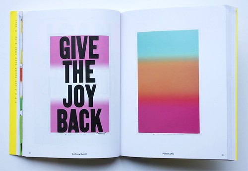
Burrill (see ‘Over the rainbow’, Eye 75) has long valued the ‘big type’ authenticity of vernacular poster printing, working with Gráfica Fidalga (now closed) in São Paulo and Adams of Rye (still thriving). But the practice goes back several generations.
An end-note to ‘Concrete Poetry’, the opening essay by co-editor Jan Tumlir tells an anecdote about Ed Ruscha, who, when asked to design an exhibition poster for the 1962 show ‘New Painting of Common Objects’, telephoned a commercial printer, read out the copy with artists’ names and other details and added the single printing instruction: ‘make it loud.’
Most of the posters in this book are very loud indeed.
Colby Poster Printing Company. An (atypically) illustrated in-house poster (right) urges clients to proof-read their copy. (The same image block also appears in a poster for women-only welding classes.)
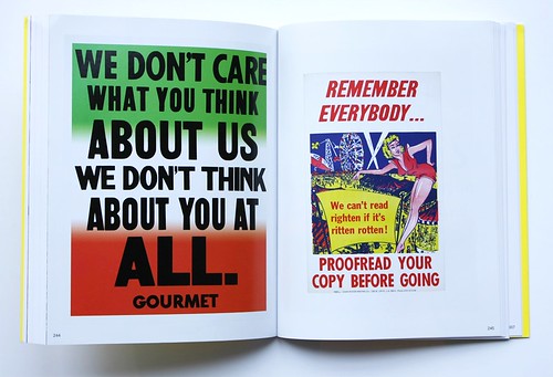
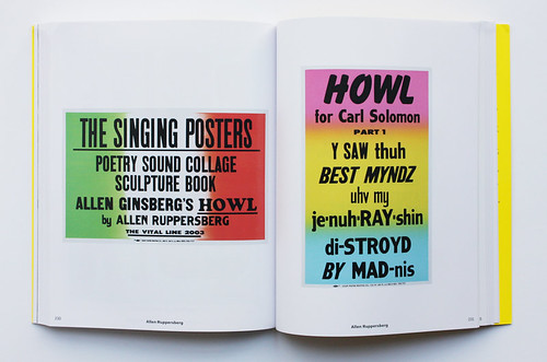
One imagines that proofreading may have been a challenge when the Colby company printed Allen Ruppersberg’s whimsical phonetic interpretation of Howl by Allen Ginsberg, a series of which the first twelve posters are shown in the book. Sample line: ‘anjəl-hedid hipstərz BER-ning FOR the ancient heavenly connection.’
The start of Allen Ruppersburg’s poster series The Singing Posters: Allen Ginsberg’s Howl, 2003.
The opening essays by co-editors Jan Tumlir and Christopher Michlig are written partly in ‘International Art English’ (see ‘Artspeak’ in Eye 62). Michlig writes about the point ‘where the skillful hand of the union typesetter meets the contextual and generative instinct of the artist.’ Tumlir conjures up a ‘perspectival chute of semiosis’ (try saying that out loud).
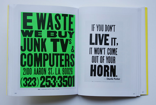
Happily, the posters – lots of them – tell their own story, and that of the Colby printworks, whose comps continued to pump up the volume for anyone and everyone who walked in the door. Some of the ‘vernacular’ posters, made for uncredited clients, look less dated (or more punchy) than the art.
Colby posters for uncredited clients.
The ‘Artist Statements Checklist’ at the back of the book adds more art world context, with clear, charming notes by Burrill, Eve Fowler, Vincent Ramos and Yale designer Chris Svensson. Euan Macdonald tells a tale of the pungent power of print from Colby’s final days, when he was driven downtown (by co-editor Tumlir) with a pile of fresh posters in the car: ‘As we zigzagged our way through the traffic, the fumes from the posters filled the car … Jan made a quick left-turn … Then: BOOM!’
Happily no-one – neither the car’s occupants nor passing pedestrians – was seriously injured when the car smashed into a shopfront.
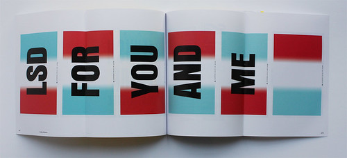
Double gatefold showing Cody Hudson’s six print set, You Can’t Win Them All, 2012.
Available from Picturebox.
Cover design by Brian Roettinger.
John L. Walters, editor of Eye, London
Eye is the world’s most beautiful and collectable graphic design journal, published quarterly for professional designers, students and anyone interested in critical, informed writing about graphic design and visual culture. It is available from all good design bookshops and online at the Eye shop, where you can buy subscriptions and single issues.
