Friday, 1:00pm
4 March 2011
Context is king
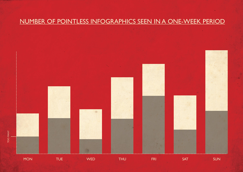
Life-logging could be a treasure trove for information designers

Hardly a week goes by without a new story of someone’s personal data being left on a train or farmed by Facebook, but a new wave of solipsistic statisticians are taking advantage of their own to do some soul-searching, writes Alexander Ecob.
Microsoft research scientist Gordon Bell has been promoting the idea of ‘life-logging’ – the practice of tracking your every action, from computer keystrokes to thoughts and conversations – for a number of years (he is the subject of Microsoft’s MyLifeBits project). However, with technological advances such as the iPhone bringing sophisticated data-gathering capabilities to the general public, it is only in recent times that the idea, put forward in the 1940s by Vannevar Bush, has gained in popularity.
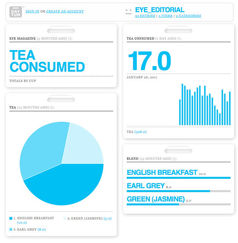
Within the graphics sphere, designers such as Nicholas Felton have been plundering this vein as a means of self-promotion for some time (see ‘The numbers man’ on the Eye blog). Another Felton venture is the website and iPhone app Daytum (below). Users define any data they want to record and see it displayed in Feltron’s clean and clear style. But after the initial quirkiness of visualisation wears off what we are left with – as Max Gadney laments in Eye 78 – is data that looks pretty but tells us nothing.
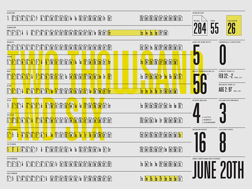
Above: ‘Year by day’, from Felton’s 2006 Annual Report
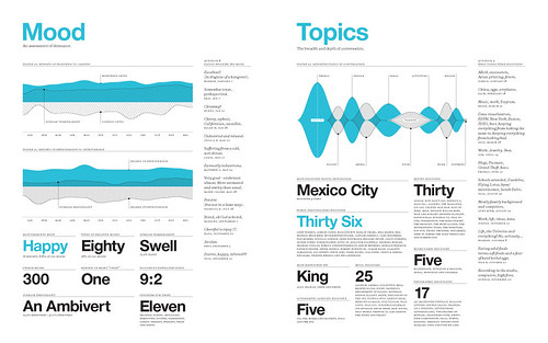
Below: ‘Mood’ and ‘Topics’ from the 2009 report.
The difference between data and information is context; by itself data can be meaningless. It requires comparisons and correlations to be drawn for it to inform, otherwise a number is just a number. This is the crux of the new personal data movement. Members of life-logging groups such as Quantified Self are not only collecting data, but analysing it to reach conclusions.
With the contemporary design landscape becoming ever more saturated with infographics, it is important for information design to truly inform (for a critical take, see Tom Morris’s recent blog post). Perhaps designers will take their cues from the aims of Quantified Self et al; the real beauty of information is in what it tells us, the voice it uses is just window-dressing.
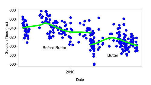
Above: Seth Roberts’ Quantified Self project, ‘Arithmetic and Butter’: ‘It shows how fast I did simple arithmetic problems (e.g., 2*0, 9-6, 7*9) before and after I started eating 1/2 stick (60 g) of butter every day. The x axis covers about a year. The butter produced a long-lasting improvement of about 30 msec.’
Eye is the world’s most beautiful and collectable graphic design journal, published quarterly for professional designers, students and anyone interested in critical, informed writing about graphic design and visual culture. It’s available from all good design bookshops and online at the Eye shop. For a taste of no. 78, see Eye before you buy on Issuu.

