Thursday, 5:49pm
4 June 2009
Corporate identity set in concrete

How Zlín did for the city what Basel did for the page

If the name Zlín, a town in Czech Moravia, rings a bell, it is probably for its international film festival, writes Jessica Jenkins. Less known, yet far more influential, is its achievement as the twentieth century’s most successful experiment in social spatial engineering.
An international symposium, ‘Utopia of Modernity: Zlín’, which I attended recently, describes it as ‘corporate identity set in stone’.
Top: One of the workers’ settlements in Zlín. ‘As a servant in the factory, the worker [male] should feel like a king at home,’ said Tomáš Baťa. Karfik, the chief architect, proposed positioning the homes at an angle to the grid to avoid visual monotony.
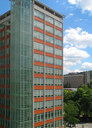
Above: Baťa’s administrative HQ, Building 21, (architect: Karfik), the most famous building in the heart of Zlín. Entirely renovated and now the regional Ministry of Finance/regional government. When completed in 1939 it was the tallest building in Europe.
Zlín did for the city what the Basel School of Design did for the page. Its author was Tomáš Baťa, the footwear magnate, who in the 1920s and 30s made rationalist design the key to his welfare Capitalism. His construction concept took the core motif of a 6.15m x 6.15m square as the basis for his grid on to which every architectural element of factory, institutional and residential building was grafted. Standardisation was essential to efficiency and thus profit, and this was not realised only in bricks, concrete and leather but also in the form of the new industrial worker who, on Workers’ Day, honoured Baťa’s vision in gridded choreographic performances.
The formula of conformity in exchange for security and a decent standard of living was a winner. Functionalism did not equal drabness, the grid allowing for variation and hierarchy, both of which Bata strove for. And it is impressive what a little colour and nature can do, the red brick set into the verdure creating a most pleasing visual aesthetic. As we walked around the workers’ estates, a colleague from the Bauhaus enthused: ‘It’s a little paradise.’
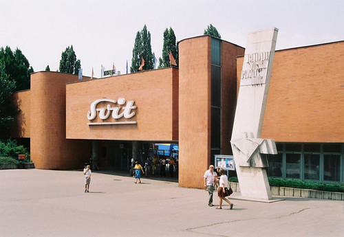
Svit factory entrance 1990.
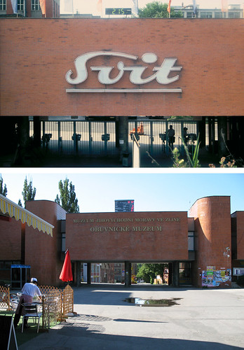
Above: Svit factory entrance 1990 and 2009. upper picture shows workers clocking out. Lower picture shows the entrance to the shoe museum. The typography seems inappropriate for a Modernist building.
This was not my first visit to Zlín. Just after the Velvet Revolution I saw the Communist incarnation of the shoe factory, renamed ‘Svit’ after Baťa was thrown out, limping to the industrial finishing line. I photographed the typography and façades, and observed on my second trip that those graphics have been erased.
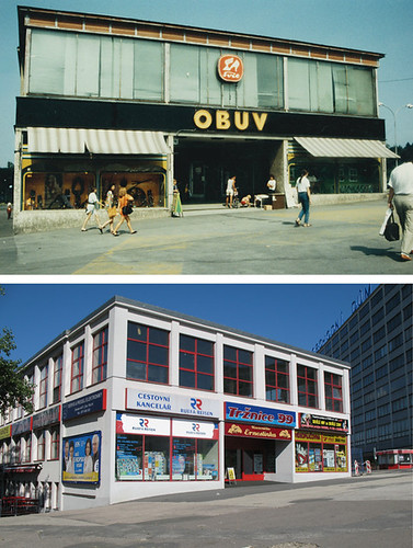
Above: OBUV (shoe) shop on Zlín’s ‘Freedom Square’ (formerly ‘Labour Square’) 1990 and 2009 (lower picture). Designed by Baťa’s chief planner, Gahura, early 1930s. No restrictions on treatment of façades. (The building restoration is not true to Gahura’s original.)
While the ‘Utopia of Modernity’ symposium offered consensus on the importance of preserving the economically defunct factory buildings, permanence in public graphics seems to be abhorred; today, even buildings with solid financial backing often content themselves with poorly hung inkjet tarpaulins. It’s as though while ‘big brother’ gigaprint ads are spanned across façades, no company has the confidence of its own permanence to install a well designed advertisement in the style of those Michelin and Orangina gables on the old French roads to the coast. Rapacious consumer culture leaves companies only as strong as their latest product, too ephemeral to merit any graphic permanence.
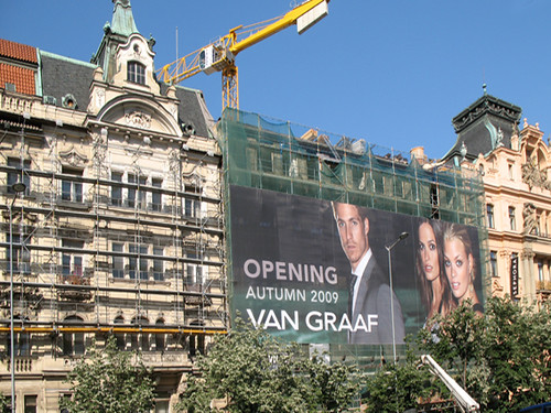
Above: Today’s flexible megalomaniacal façades mask the pomp of the Austro-Hungarian empire, Wenceslas Square, Prague.
In Zlín today, the only investor willing to protect the industrial heritage is the state. New businesses shy away from reconstruction costs and throw up disposable buildings on the periphery. The two freshly renovated architectural showpieces (Buildings 21 and 23, now the regional government and the ‘business incubator’ respectively) are graced with discreet graphics, but where the imperative is commercial, plastering and stickering of once sedate facades is the norm.
Perhaps there is an argument for the protection of not just buildings, but of graphics. It seems that these legacy signages are either too politically potent or economically detrimental to be left intact. Just 170 km south of Zlín in Vienna, I chanced upon a beautiful collection of Viennese graphic heritage in a newly published book featuring signage bequeathed mostly by small businesses, City Alphabet, Vienna [Stadtalphabet Wien], and an exhibition at the Design Forum, ‘War of Signs. Reading the Traces in Urban Space’. While these gradually disappear from the city fabric, it is encouraging at least that there are records being made.
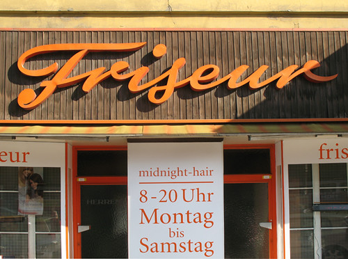
Above: Viennese Façade. Hairdresser at the South Station. 2009.
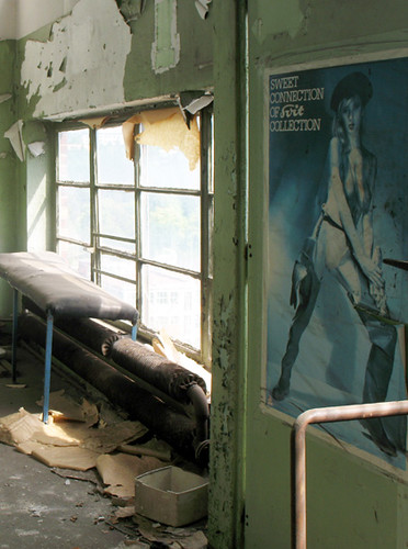
Above: Remains inside a factory building in the heart of Zlín. I was fascinated by this Svit poster, post Velvet Revolution – a last-ditch atempt at profitability? This factory is the subject of an architectural competition for restoration as the regional cultural centre.
All photographs by Jessica Jenkins.
Eye is the world’s most beautiful and collectable graphic design journal, published for professional designers, students and anyone interested in critical, informed writing about graphic design and visual culture. It’s available from all good design bookshops and online at the Eye shop, where you can buy subscriptions and single issues.
