Wednesday, 5:30am
8 April 2009
Cutting some Slack for the AR
A framework that’s more than just a (projected) shadow of its former self

The Architectural Review, the 113-year-old monthly known simply as ‘the AR’ by its visually aware audience, has had a tough time of it over the past few years, writes Simon Esterson. Changes in ownership and a loss of design direction left it looking like an also-ran in a field it once dominated. I’ve been a keen follower of the AR since its Manplan issues (see Eye no. 54 vol. 14) sparked my interest in both architecture and magazine design in the school art room nearly 40 years ago, so it is very encouraging to see the redesigned April issue emerge phoenix-like from the inferno that is contemporary magazine publishing.
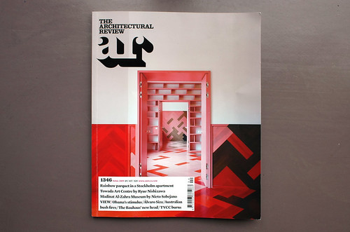
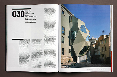
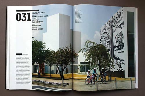

Under editor-in-chief Kieran Long, creative director Violetta Boxill and art director Cecilia Lindgren, the new design is a very smart attempt to revisit and resample some of the great days of the AR, while at the same time making the magazine look contemporary for the first time in more than twenty years.
Things to Look At have posted some covers and internal pages from old issues. For more than 25 years, until the mid-1980s, the look of the AR was in the hands of one man, Bill Slack, who now would be called the creative director, but then worked under the more modest title of production editor. He controlled the flatplan, designed all the pages and organised production with the printer.
Bill loved punning headlines (which he wrote himself so they'd fit his layouts) set all-caps in condensed grot fonts (like Twen magazine was doing in Germany), with Clarendon for text and captions, and Victorian display fonts to headline articles about architectural history. He mixed black and white architectural photographs printed on art paper with text printed on uncoated tinted stock, would turn the pictures at 90 degrees as content demanded and, where budget allowed, insert a dramatic gatefold.
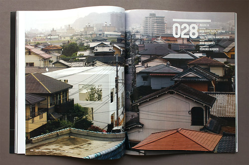
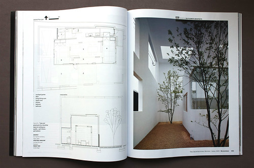
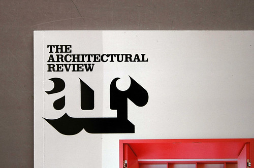
While the mixed papers and gatefolds have yet to reappear, April’s AR has successfully channelled the spirit of Slack’s 1960s design aesthetic. The new AR logo is a reworking of a Clarendon-based design from the archives, enlivened with a fashionable-then / fashionable-now projected shadow and elegantly foil-blocked on this month’s cover. Inside, the condensed sans serif T-Star by Mika Mischler and bold rules make the Buildings section look clean and elegant. Building features are no longer headlined but numbered, in a Factory Records-like outbreak of catalogue compulsion. Jonathan Hoefler’s always impressive Mercury is the body face throughout, and also the headline font in the let’s-not-mess-about text-led sections that act as a visual foil to the boldly illustrated building pages, where proper respect is paid to drawings as well as photographs.
For me, the exciting thing about making a magazine is how it can change issue to issue: it’s not a fixed format but an organic thing where the features and the design interact. For the AR, this redesign seems to create a strong framework in which to rebuild the magazine at a time when architecture is changing along with the rest of the world's economy. The design's real test is the issues to come.
See ‘Building a graphic language’, Richard Hollis’s article about the AR’s design in Eye no. 28 vol. 7. Some copies are still available from [email protected].
Eye is the world’s most beautiful and collectable graphic design journal, published quarterly for professional designers, students and anyone interested in critical, informed writing about graphic design and visual culture. It is available from all good design bookshops and online at the Eye shop, where you can buy subscriptions and single issues.

