Wednesday, 7:20am
6 February 2013
Work to make it simple
various designers
Stefanie Posavec
Phil Gyford
Ben Terrett
Cait O’Riordan
Eva-Lotta Lamm
Graphic design
Illustration
Information design
New media
A review of this year’s Design of Understanding conference by Mark Barratt

‘Stuff that Max Gadney and his friends think is interesting’ would have been a more awkward but accurate title for the one-day conference ‘The Design of Understanding’, writes Mark Barratt. The event was curated by Gadney, an information designer, at St Bride Library, London on Friday 25 January 2013.
Luckily, Max has a good brain and interesting friends. This was the third annual conference, and the ideas aren’t yet running thin. Those listening were generally information designers, graphic designers and visual communicators; those speaking often were not. Presenting were Web people, product people, programmers, a novelist, an architectural journalist and designers from opposite ends of the ‘designing with data’ spectrum.
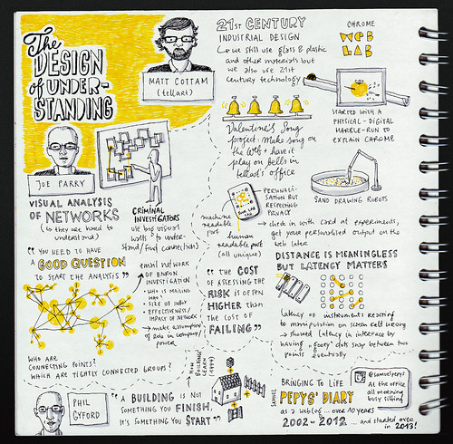
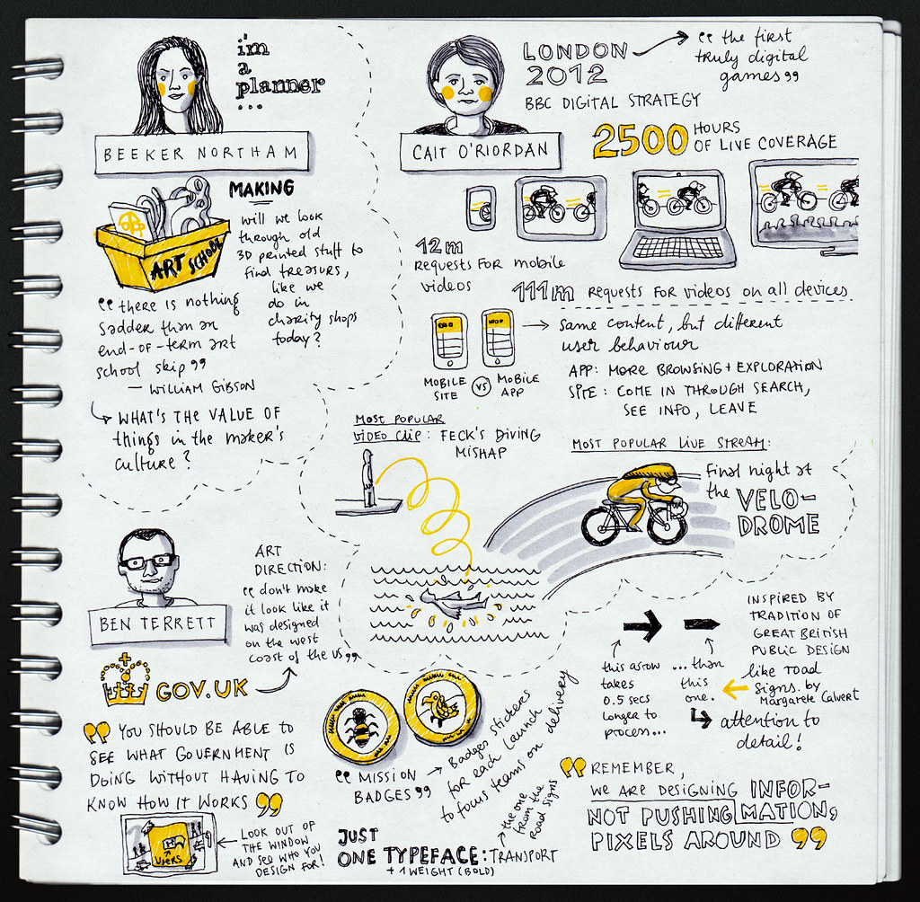
Top: one of four sketchnotes made by Eva-Lotta Lamm at DoU 2013, see sketchnotes.com.
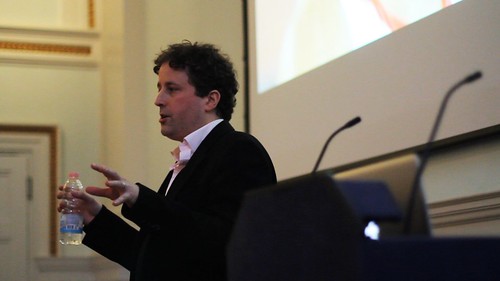
Right: DoU founder Max Gadney.
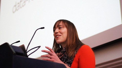
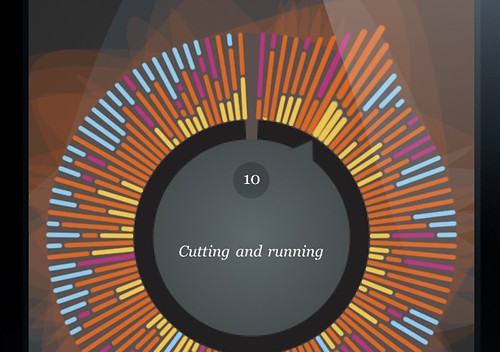
Stefanie Posavec (below) uses data to help her design things, but recognises that the result isn’t necessarily going to be useful for the user attempting to understand that data, as in her design (in collaboration with with Dare) of a ‘non-linear index’ in the ‘myFry’ app for Stephen Fry’s autobiography. See ‘Designing MyFry’ on the Eye blog.
Stefanie Posavec at DoU.
Will Stahl-Timmins is at the other end, working as part of an academic research team, both researching the effectiveness of information design in the communication process, and transforming research outputs into useful tools for citizens.
Somewhere between these approaches is ‘Chrome Web Lab’ explaining the Web at the London Science Museum and online until July 2013. Matt Cottam, from industrial and information designers Tellart, showed how his company’s immersion in teaching and learning informs the exploration opportunities in the Chrome Lab.
Proving that Big Brother can exploit the new opportunities of wWeb applications and big-data visualisations, Joe Parry showed how network visualisations through his Keylines framework reveal links and influences between people. US intelligence agencies and fraud-detection professionals are of course snapping this up.
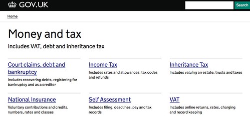
Self-explanatory screenshot from GOV.UK. Typeface: New Transport New Transport typeface designed by Henrik Kubel of A2-Type in close collaboration with Margaret Calvert.
London is in the middle of a design renaissance, with some of the best work coming from the public service. UK public sector design was once– sober, clear and humane – the best in the world. As head of design for the UK’s Government Digital Service, Ben Terrett self-consciously presented his attempts to reclaim it from over twenty years of drift and half-understood brandspeak.
The single UK government website gov.uk (top), launched last year, is attracting admiring gasps from around the world. The look nods to UK tradition, with simple, lucid typography and humanist sans-serif type (a webfont based on Jock Kinneir and Margaret Calvert’s 1950s Transport type, used for road signs in the UK and around the world, see Eye 34).
This is great work built on good process. Web designers and front-end-developers have been merged into a single team, design is done ‘in the browser’ where possible, writers and coders are part of the team, the work is open-source and obsessively accountable. The mantras are ‘remember, we are designing information for people, not pushing pixels around the screen’ and ‘putting in the work to make it simple’.
The dirty secret of success in this new world is the same as the old one, of course: GDS and Google and the BBC (whose Cait O’Riordan walked us through the BBC Digital Olympics) have money and power, so anything is possible – though there are plenty of rich, powerful organisations who fail to create interesting or credible work. We were reminded that power is about more than money in Justin McGuirk’s stories of social action as a key enabler of change in South American architecture. Replacing traffic police with mime artists is part of a useful lesson for designers on making a difference.
And sometimes one person can make that difference. Phil Gyford built the modest, engaging and successful Diary of Samuel Pepys website by himself over ten years – then tore it down and started again. Paraphrasing Stewart Brand, he said: ‘You can only start a website, you can’t finish it …’
Twitter was fairly quiet during the day – maybe because there was a lot to concentrate on – but Eva-Lotta Lamm did the presentations proud with a series of sketchnotes (top and above) of some of the presentations on Flickr.
‘The Design of Understanding’ is and has been a good reflection of London’s pool of talented makers and shapers as they rebuild our world. At some point it will get tired, stale, and repetitive. But not yet – and the good news is that Max plans to do it again next year.
Detail from MyFry app. Design: Stefanie Posavec and Dare, 2010.
Eye is the world’s most beautiful and collectable graphic design journal, published quarterly for professional designers, students and anyone interested in critical, informed writing about graphic design and visual culture. It is available from all good design bookshops and online at the Eye shop, where you can buy subscriptions, back issues and single copies of the latest issue. You can see what Eye 84 looks like at Eye before You Buy on Vimeo.

