Tuesday, 1:30pm
8 September 2009
Dimensional typography
The unbearable flatness of being, by Leslie Atzmon


‘One evening Harold decided to go for a walk in the moonlight. But there wasn’t any moon, and Harold needed a moon for a walk in the moonlight. Fortunately, he had brought his purple crayon. So he drew a moon. He also needed something to walk on. So he drew a path.’
Thus begins Harold’s illuminating adventure in the children’s book Harold and the Purple Crayon (by Crockett Johnson, 1955). Harold is the consummate designer. He uses a purple line to imagine into being a variety of ‘material’ objects. Harold takes no notice of the differences between two- and three-dimensional experiences. He first fashions and then steps into the two-dimensional line drawing environments he creates.
Top: Keetra Dixon, The Great Illusion
Like Harold, many contemporary graphic designers have produced inventive tactile and environment-sited two- and three-dimensional work. The books Paper Graphics (2001) and Touch: Graphic Design with Tactile Appeal (2001), for instance, feature work that reconfigures the run-of-the-mill print design medium, paper. Touch This: Graphic Design That Feels Good (2006) and Fingerprint: The Art of Using Hand-Made Elements in Graphic Design (2006) are volumes that present projects made from ‘you can’t print on that’ materials including ceramic tiles, fur, and cut up auto tires.1
It seems to me, though, that over the past two years some tactile or dimensional graphic design has gone beyond print media that capitalises on creative paper configurations or unusual materials. Of this design, I’ve found the dimensional typography to be particularly provocative. Like Harold, these type designers create imaginative work that allows them – and their audiences – to enter into and participate in fabricated environments. Some of this design lifts letterforms right off page or screen and plants them firmly in the material world. This work isn't limited to real-world typographic forms made from unconventional substances, though. There are projects that aspire to pull viewers into virtual spaces in which they come face-to-face with shape-shifting letters or letter-like forms. Whether they are physical, virtual, or both, these thought-provoking typographic experiments require audiences to interact with typography as if it were a physical commodity.
Dimensional letterforms made from unique materials are clearly ‘hot’ in contemporary typographic design. Although, as designer Jack Featherstone notes, making 3D type from unorthodox stuff can at times be ‘just another technique’, I believe that it is invaluable to consider what work this design does for our discipline. These dimensional projects stretch the definition of graphic design. They add fresh substance to the decades-old debate about whether the moniker ‘graphic’ design is appropriate to what we do. This dimensional typography highlights novel twists on design processes, new angles on matters of surface versus depth, and unique takes on issues of legibility versus illegibility. This work also expands the range of possibilities for the making of meaning. When these designers do decide to ‘flatten’ their work, for example, the transformation from three-dimensional construction to two-dimensional print media is more than just expedient – the transition becomes an opportunity to enrich the work’s metaphorical meaning.
Physical phases and digital versions of these projects typically flow effortlessly into one other. This dimensional type is just as likely to culminate in one-off, three-dimensional pieces as in reproducible two-dimensional design—and both genres transgress the line between art and design. I don’t mean the sort of blurring of boundaries between art and design we’ve seen again and again over the past 100 years; this new dimensional stuff is not merely graphic design that champions personal expression. Some work featured in the books Tactile: High Touch Visuals (2008) and Stereographics (2008), for example, would have unquestionably been considered ‘art’ just a few years ago. These constructions are now nonchalantly labeled graphic design by the books’ authors.
The previous observations bring up some provocative questions. If dimensional formats or unconventional media—or even the design process itself—inadvertently render type unreadable, is it still communication? How is visual meaning made in this work? If illegible three-dimensional typographic work can be mass-produced, what are the ramifications of mass-producing it? What is lost and what is gained in our discipline when reproducibility, a hallmark of traditional graphic design, is traded for uniqueness? What are the implications when designers move seamlessly among three-dimensional and two-dimensional versions and physical and virtual iterations of one piece? What do we get if what we used to call art is now impulsively dubbed graphic design? Is this just a question of renaming, merely calling this work graphic design instead of art, or does this signal a change in what we deem communication design?
Consider work from the show Dimension and Typography: A Survey of Letterforms in Space and Time, which spotlights dimensional typographic work done by twenty designers. This exhibition ran in the I space Gallery in Chicago from 9 January to 7 February 2009. According to co-curator Ryan Molloy, this work is a direct result of the fact that designers from various disciplines influence each other ‘instantly’ via ‘blogs, photo tagging sites like Dropular Ffffound, [and] social networking sites … like Behance’.2 One result of this cross-pollination is that many of the projects in Dimension and Typography eschew familiar information systems. In the 1980s and 1990s, some designers likewise rejected traditional information systems; they challenged the limits of legibility and readability by deconstructing typography in print media. Testing the boundaries of legibility was one goal of this work. A number of the pieces in Dimension and Typography, on the other hand, introduce alternative information systems that engage unusual metaphors and contend with issues of surface versus depth. In the process, their letter-like forms may end up coincidentally illegible.


Above: Geoff Kaplan, The letters A, C, H, L, M, R, T and Y from Letter(s) to Ed
(Fella).
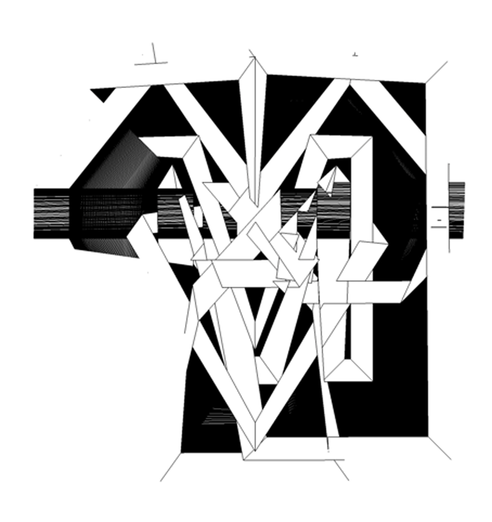
Geoff Kaplan’s digitally created font Letter(s) to Ed (Fella) (above) is one such alternative information system. Kaplan’s approach is based in systems theory, an interdisciplinary field in which human-made phenomena—such as letterforms—are considered to be interrelated components that execute specific processes—such as written languages. Kaplan believes that two-dimensional lettersets are closed systems. That is, according to Kaplan the information systems that structure two-dimensional fonts are mostly unaffected by other systems or external forces. With these ideas in mind, Kaplan added a z-axis to two-dimensional uppercase Akzidenz Grotesk letterforms—a process that he believed would destabilize the closed system. Kaplan then removed the z-axis and to see if he’d get back ‘any degree of the original [two-dimensional] data set [Akzidenz Grotesk]’.3 The final product is the set of letter-like forms called Letter(s) to Ed (Fella) (above).4 Kaplan wonders if these characters become a three-dimensional language system. He also speculates that the original Akzidenz letters are destabilized by the disruptive z-axis. Kaplan sees both possibilities as ‘simultaneous realities, which is why he believes that 'these marks live between page and screen’.
That Letter(s) to Ed (Fella) is illegible is not the point of Kaplan’s project; rather, it is a byproduct of his inserting and then removing a three-dimensional axis in virtual space. Kaplan’s final letter-like forms were printed on paper and several of these characters were featured in Dimension and Typography. It is interesting to me that the transitional three-dimensional form of Kaplan’s font is virtual – the three-dimensionality is rendered in screen-based media – while the final two-dimensional form of this font is physical and printed on paper. In the end, we are left with a set of 26 gorgeous grotesques and a cascade of thought-provoking questions about the impact of forcing other dimensionalities on to stable two-dimensional communication systems.
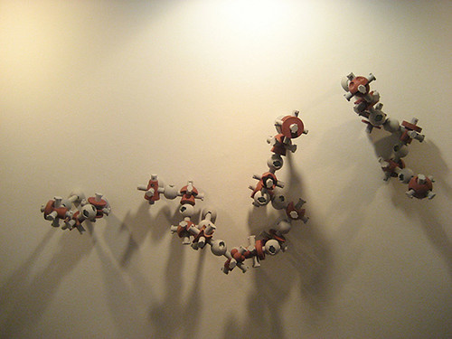
In a similar vein, Jim Stevens and Ryan Molloy translate two-dimensional letterforms into a three-dimensional communication system. But their font La Robia, which was printed on a Zcorp 3-D printer that utilizes plaster with chromatic binder, is decidedly concrete. Their collaboration was spurred by a conversation about the ways both architecture and letterforms can function as street art. Stevens, who is an architect, worked out the tectonics for La Robia, and Molloy, who is a graphic designer and an architect, devised the letterforms. Loosely based on a brick and mortar paving pattern metaphor, La Robia (below) melds the modular aspects of letterforms with the modular pattern of Della Robbia-style masonry.
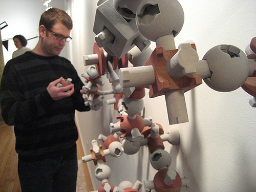
Above: Jim Stevens and Ryan Molloy, La Robia.
Stevens and Molloy followed certain ground rules to create their font: they devised red ‘brick’ letterform units and gray ‘mortar’ connector and ball joint units to facilitate reading in various directions, and they made sure that individual characters bore some resemblance to roman letters. To prevent confusion among letterforms, each character also had to be visually distinct since letters that mirror each other (such as d, p, q, and b) may be confused in three-dimensional space. Finally, Stevens and Molloy decided that each character ‘should have rotational symmetry along at least one axis’, which allows each letter to be ‘recognized from multiple vantage points’. The piece Stevens and Molloy installed in Dimension and Typography reads: ‘Escape from the architectural ghetto’. Knowing this – and that the letterforms are the red parts – makes recognizing the letterforms fairly easy. It is also important to note that La Robia letterforms can be mass-produced, and like the letterpress process, their units can be disassembled and reassembled to create any text.
In the past, type based on an architectural metaphor would likely have remained on the printed page or the computer screen. If this type happened to be built out of three-dimensional material, in the end it would probably be ‘flattened’ in graphic or photographic form. La Robia, on the other hand, challenges the two-dimensional mindset that is still prevalent in our field. The composition of the units and the structural system they devised allow Stevens and Molloy to build on their architectural metaphor. Stevens explains that ultimately, ‘for the piece to be fully successful it will need to be installed in an environmental context.’ Molloy too envisions La Robia as ‘a building unit … a public space created by letterforms: a built environment in which … navigation and content could be both written and experienced.’ They intend to use La Robia to create structures in which letterform, textual content, and built form merge.
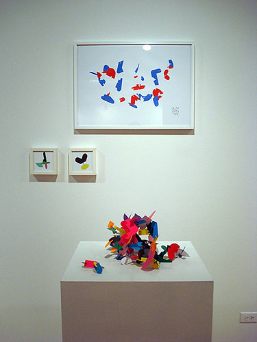
Above: Jack Featherstone, Play with Type
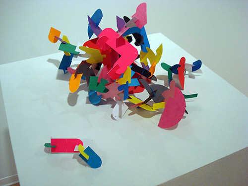
In a similar fashion, Jack Featherstone’s piece Play with Type melds type and toy. Each letter in his brightly colored cut paper font is divided into three flat pieces. These pieces, which are created on the computer, have slits by which the letter parts can interconnect to create an expressive tinker toy-like construction (above). The three-dimensional piece entails a ‘toy’ metaphor. Featherstone’s design process, though, conveys a ‘play’ metaphor. The tinker toy-like construction is flattened once again on the computer, and then cut out for use in another three-dimensional piece. This circular process loops continually from paper to three-dimensional construction to computer screen, amalgamating three distinct ways of playing. Featherstone, who purposely intended to ‘blur the line between art and typography’ in Play with Type, explains that ‘different pieces or sections of the type can be picked up and felt[,] then rearranged to create new versions from the same word’.5 Again, illegibility is not a goal of this piece, it is an artefact of Featherstone’s process. Remixing, though, is integral to Featherstone’s concept of type as plaything – and the audience is encouraged to participate.
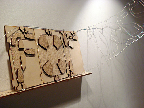
The audience also becomes immersed in Denise Gonzales Crisp’s room-filling puzzle-like project Prototype. The piece begins with basswood jig units, which are the understructures for all the letter designs. The jigs – which have standardized slots and extensions that fit with those on other jigs – function as molds for strands of typographic information. The jig letters ‘snap’ into place to form a line of letters (below). As with La Robia, Gonzales Crisp’s unit forms can be disassembled and reassembled to create any text.
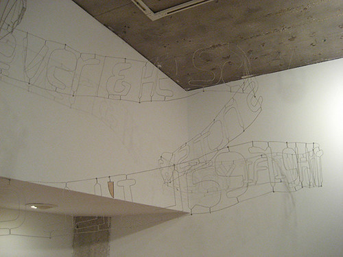
Above: Denise Gonzales Crisp, Prototype.
The face of each jig features a two-dimensional rendering of its letter that is shaped by a lush letterform pattern. Gonzales Crisp’s two-dimensional pattern is not merely a decorative surface, however; it provides detailed visual information about each letter. In a process reminiscent of the way DNA units come together as a template for protein production, a second layer of wood functions as a matrix around which wire can be wrapped to outline the letter. When the jig letters are removed, full-text wire traces remain. Gonzales Crisp did not consciously intend this DNA metaphor. Nevertheless, it is intriguing that Prototype suggests a bodily ‘communication process that depends upon the interaction of surface matrices to produce physiological 'information.’
The letters come together in a ribbon of wire text that is suspended from the walls and ceiling of the gallery. Gonzales Crisp’s text documents her thoughts at a visit to the hardware store when she began working on 'Prototype': ‘I ASK FOR BASSWOOD & HE LEADS ME TO TOWERING PLANKS & I SHOW HIM THE JIG & HE WITH EYES THAT MEASURE RIGHT ANGLES TRUE SAYS LASERCUTTER BUT I PREFER THE REAL THING & I SAY THAT WOULD TAKE FOREVER & HE SAYS NOT SO & I SAY WHEN I WANT THE REAL I’LL CALL YOU.’ The text ribbon meanders around the room in a fashion similar to Gonzales Crisp’s wandering thoughts.
Ben Van Dyke’s piece utilizes the gallery spaces as well, but Van Dyke does not construct letterforms—he dismembers them in his site-specific installation RAW. According to Van Dyke, his intention is to force viewers to slow down and ‘absorb the message’. He explains that ‘complex systems’ like the type treatment in RAW, ‘become a way of chewing on something long enough to absorb all of its nutrients instead of a steady diet of regurgitated food’.6 Van Dyke’s title for this piece and his digestion metaphor are apropos. The surfaces of the ‘R’ and the ‘W’ have been ‘chewed’ and then the parts of the letters have been uncoiled like intestines. Moving on, the ‘A’ is made from white tape affixed to a perpendicular wall. The ‘A’ form is defined mainly by its cast shadows; it is practically invisible.
RAW plays out like a typographic scavenger hunt. Viewers are challenged to become completely immersed in the work; first to search for clues and then to interpret these clues in order to find the letters ‘R’, ‘A’ and ‘W’. Although it features stationary two-dimensional letterforms installed in a three-dimensional space, RAW is a variant of time-based media—viewers navigate their way around the piece while the visuals stay put. In fact, Van Dyke describes viewer participation being 'more like a move from J-Lo’s choreographer than… a typical exhibition stance. “R” was only legible if you first put your ear to the wall followed by a straight on view of the vertical and diagonal lines. For the “A” and the “W”, it was necessary to spend some time on your knees'. RAW straddles the line between installation art and design; the piece is not reproducible, but it clearly has much to say about letterforms as individual characters.
Keetra Dixon’s dreamlike three-dimensional poster The Great Illusion (top) also gives letterforms soul. Although this piece wasn’t shown in Dimension and Typography, it deals with many of the same issues posed by the work in this show: questions about surface versus depth, stereographically enhanced meaning, audience or designer participation in the project, and fluid transitions between two- and three-dimensional iterations. The Great Illusion features a flesh and blood couple (Dixon and her then fiancée, J.K. Keller) beneath winged cut-paper letterforms. The Great Illusion has religious undertones. It brings to mind portraits of Adam and Eve that highlight the estrangement between these formerly paradisal creatures; and Dixon’s piece seems to capture this moment of disillusionment brilliantly. Dixon’s kinetic letterforms appear to take flight. The winged letterforms – clearly intended to reinforce the fleeting quality of perception – function like a typographic Archangel Michael banishing the couple from paradise. Illusion and delusion metaphors also play out on other levels in this performative piece. A white frame flattens the scene when it is perceived as a picture frame. Seen from another vantage, this white frame enhances the three-dimensionality of the scene: Dixon and Keller hold up the frame and the winged letterforms use the frame as a take off perch.
Three-dimensional sets, of course, are not new in print graphic design. In the 1980s, for instance, designer Gert Dumbar and photographer Lex van Pieterson designed and shot staged scenes for the Zeebelt cultural foundation and for Holland Festival posters. According to Max Bruinsma, ‘Dumbar and associates interpreted the flat print surface as a “virtual space” in which letters and images seem to freely float about. With this photography-based technique, the Dumbar-studio – without using computers – anticipated the possibilities for digitally reworking images and type.’ 7 Dixon’s piece can be understood as a logical next step – The Great Illusion reinserts into physical media the dream-like or surreal visual vocabularies that have flourished in digital media.
Some Final Thoughts
In fact, it seems to me that a lot of this new dimensional work exports to the real world the sensibilities we graphic designers have garnered from three decades spent in the digital realm. But what’s going on here is not merely unidirectional exportation; this new work breaks down the distinctions between material and virtual media at the same time as it embraces the very qualities that make them so different. Julien Vallée’s recent project Every Morning I Check Many Stuff (below) – which was also not exhibited in Dimension and Typography – clearly manifests this duality. In this piece, paper and yarn cascade from a paper computer monitor and surge onto Vallée’s desk at which he sits and ponders this extraordinary amalgamation.
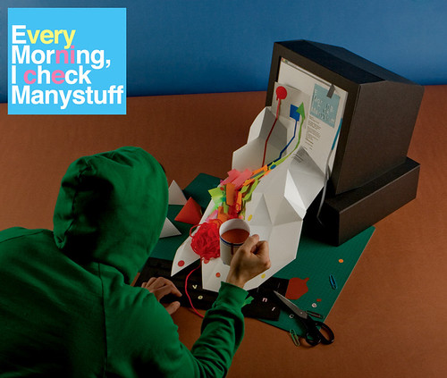
Above: Julien Vallée, Every Morning I Check Many Stuff
Indeed, digital media encourages work that features fantastic or surreal virtual spaces. The work in Dimension and Typography can be understood as precisely these sorts of virtual spaces made material. Fantasy and surrealism typically utilise unexpected combinations of elements—as do the pieces in Dimension and Typography. Whether legible or not, the textual content makes meaning. Illegible text can be understood, in part, as a manifestation of the thinking behind its illegibility. The textual content is combined with meanings attached to the materials from which the letterforms are made and meanings attached to the spaces in which the pieces are configured. When a designer builds type from wire and then winds it through a room, both the wire and the winding become part of the piece’s metaphorical content.
Fantasy and surrealism also typically feature strange transformations. Letter(s) to Ed (Fella) mutates when the z-axis is inserted and then again when it is removed, Play with Type turns parts of letters into digital and physical playthings, La Robia transforms letterforms into three-dimensional tinker toy-like building units, Prototype alters form as it moves from the jigs into the gallery space, RAW reconfigures three letterforms into barely recognisable letter remnants, and The Great Illusion transforms type into a flying creature. To many designers, letterforms are individuals who collaborate to create a community of meaning. Add to these unexpected combinations and strange transformations the way many designers zoomorphize or anthropomorphise type. That letterforms can be understood as creatures to whom designers and viewers can relate adds potency to the fantastic or surreal aspects of this work.
In their call for entries for Dimension and Typography, co-curators Jimmy Luu and Ryan Molloy ask: ‘How much further have we pushed the boundaries of dimensional typography since [Abbott] Miller’s initial survey [Dimensional Typography]?’. 8 After giving this question a lot of thought, I told Molloy that I see the difference between the work in Dimension and Typography and the stuff in Abbott Miller’s book this way: the dimensional type in Abbott Miller’s book is to the design in Dimension and Typography like early photography is to early cinema. In early photography, the audience felt as if they had viewed one momentary representation of the physical world, while in early cinema the audience felt as if they had been completely immersed in a representation of the physical world. Harold could have chosen merely to view what he drew with his purple crayon. Instead, he saved himself from his own monster, kept himself from drowning by creating a boat, fed on nine kinds of hand-drawn pie, climbed a treacherous one-sided mountain of his own making, and conjured up a balloon that saved him from falling over the other end. Harold entered into and even consumed the environments he constructs. This new work makes me ask: what novel creative hazards and pleasures does dimensional typography signal for our discipline?
Read Alice Twemlow's article about Denise Gonzales Crisp and decorative typography (Eye 58)/
Reputations interview with J. Abbott Miller (Eye 45).
FOOTNOTES AND FURTHER READING
1. Synopsis and review of Touch This: Graphic Design That Feels Good by Scott Witham, on Amazon.co.uk (accessed March 7, 2009).
2. Quotes from Ryan Molloy are taken from an interview with Leslie Atzmon (2009).
3. Quotes from Geoff Kaplan are taken from an interview with Leslie Atzmon (2009).
4. Kaplan explains that yes, Letter(s) to Ed (Fella) is a play on the double meaning of the word ‘letter’.
5. Quotes from Jack Featherstone are taken from an interview with Leslie Atzmon (2009).
6. Quotes from Ben Van Dyke are taken from an interview with Leslie Atzmon (2009).
7. Bruinsma, Max. ‘Official Anarchy: Dutch Graphic Design.’ maxbruinsma.nl (accessed March 22, 2009).
8. See J. Abbott Miller, Dimensional Typography, (Princeton: Princeton Architectural Press), 1996.
Eye is available from all good design bookshops and online at the Eye shop, http://bit.ly/Eyeshop. For a taste of the magazine, try Eye before you buy, http://bit.ly/ebyb.


