
Thursday, 9:00am
20 August 2026
Farsi cast in iron
Maryam Hosseinnia celebrates the typography of Persian manhole covers
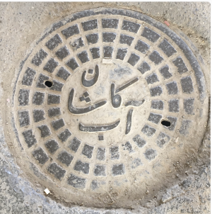
The first manhole cover that caught my attention was in my front yard in Tehran, writes Maryam Hosseinnia. Years later, while studying graphic design in the United States, I realised that the covers were examples of graphic design – type, framing, proportion, contrast. The letters run right to left, most of them connected, each form changing shape depending on its position in the word.
A manhole cover from Hosseinnia's yard in Tehran.
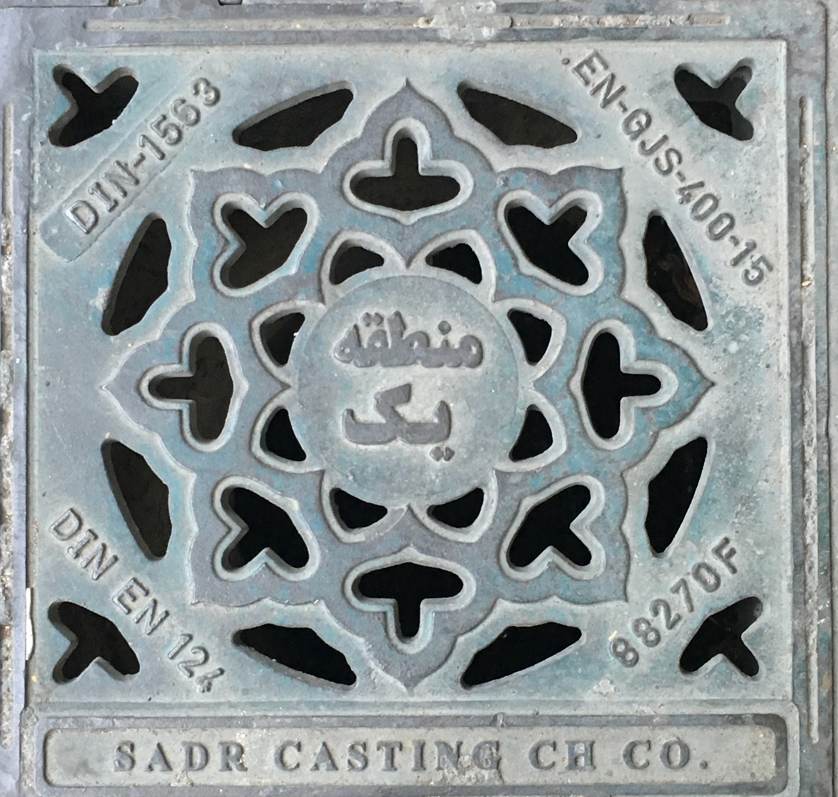
Above. Cover featuring Arabic script translating to ‘Zone One’, north of Tehran (see below).
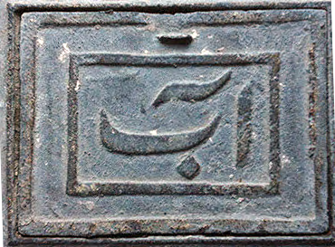
Every month, a utility worker rang the doorbell and came into the yard to read the water meter under this cover. At the time I never noticed it, but now I see how clever the designer was with the small space. To fit the word آب – meaning water – they moved the آ, the Alef with its hat, slightly left and tilted it over the ب below. The letterforms remind me of a sign-painting tradition that balanced calligraphy and business in Iranian visual culture.
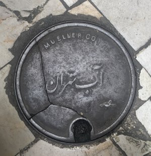
Before 1920, water for the country and its cities came from qanat and cheshmeh – natural springs. Each city or village kept its own ab anbar, a water reservoir, and its own water-carrier system. Piped water arrived after the 1920s, introduced under Western influence as part of a broader sanitation push, and the older system began to disappear. One cover reads آب تهران – 'water, Tehran' – but the manufacturer's name arcs above it in English, MUELLER CO., an American water-hardware company founded in Decatur, Illinois, in 1857 by a German immigrant, Hieronymus Mueller. I don't know how it ended up on a Tehran street, but it's hard not to read it as a small piece of that same imported history.
A cover that juxtaposes the Arabic text ‘water, Tehran’ with the English text ‘Mueller Co.’, an American water-hardware company.
Two manhole covers from Isfahan in central Iran.
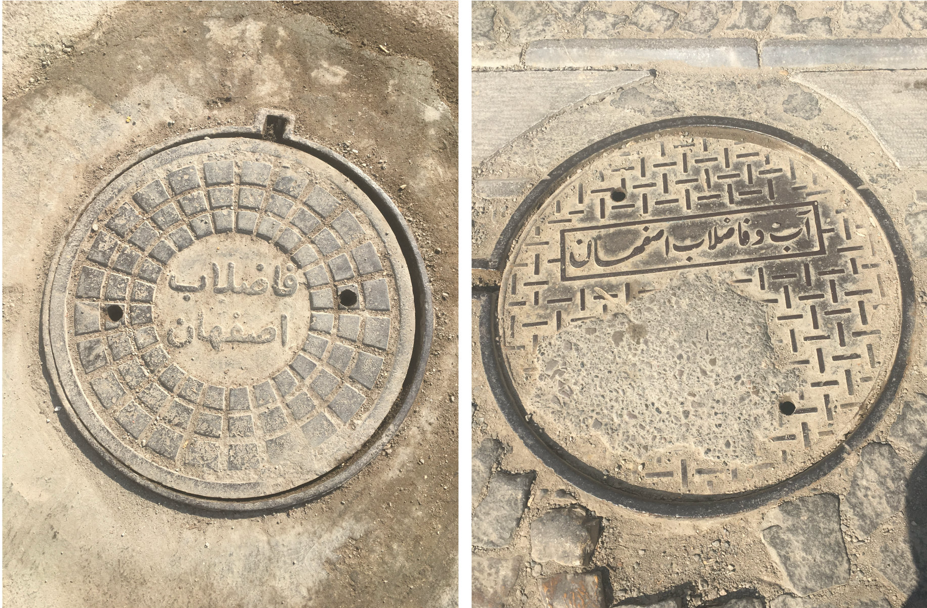
Two Isfahan covers caught my eye. The first – آب و فاضلاب اصفهان, ‘Water and sewage, Isfahan’, is the strongest Nastaliq of any of them: thick-and-thin strokes, letters elongated by kashida (justification used in written Farsi scripts where the line that connects the letters is extended). The terminal strokes of اصفهان are, to me, the clearest example of that form here, classical Persian calligraphy on a sewage cover.
The second is still Nastaliq, but closer to a font: twentieth-century Persian type, clean and legible, without calligraphic flourish, perhaps the official voice of a city turning modern. The script still runs right to left, but here the designer's concern was weight and presence inside the circle, the frame holding everything together.
Manhole cover from Kashan, Iran.
For this Kashan cover, which reads: ‘Water. Kashan’, the letters are almost architectural. The ک stands out in the centre with a strong diagonal line, and the آ at the bottom opens up like a gate. آب کاشان. The cover’s surface has a grid of raised squares, a cast-iron pattern that looks like tilework. Kashan is the city that gave its name to the tile. The Persian word for ceramic tile is کاشی (kashi), meaning ‘from Kashan’.
Kashan and Isfahan both take their inspiration from the pyramidal dome, the gonbad. The peak of the dome carries the shamseh, the ‘sun medallion,’ and that same point sits at the centre of each cover’s design. Even the covers’ circular form echoes a roof or ceiling, in both cities – as if you're looking straight up into a dome, or down onto one from above. Architecture and calligraphy, meeting on a cover underfoot. Tile, a dome-shaped ceiling, the sun at the centre – together they echo, for me, the beauty of Persian architecture.
Cover featuring Arabic script translating to ‘Zone One’, north of Tehran.
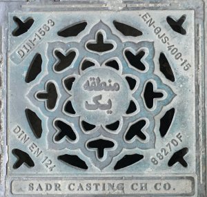
The square cover reads منطقه یک – Zone One – and sits, in the north of Tehran, inside a Persian geometric pattern resembling a lotus flower. Its petals repeat in the order of Islamic ornament that has shaped Persian design for centuries. Around the edge, pressed into the iron rim, is the standard: DIN 1563. At the foot, in bold Latin letters, is: SADR CASTING CH CO. The sharp lines of English sit next to the smooth curves of Farsi. Two visual languages share one object: the lotus and the DIN code, without conflict.
A manhole cover with a Persian script that features enlarged dots called nuqta.
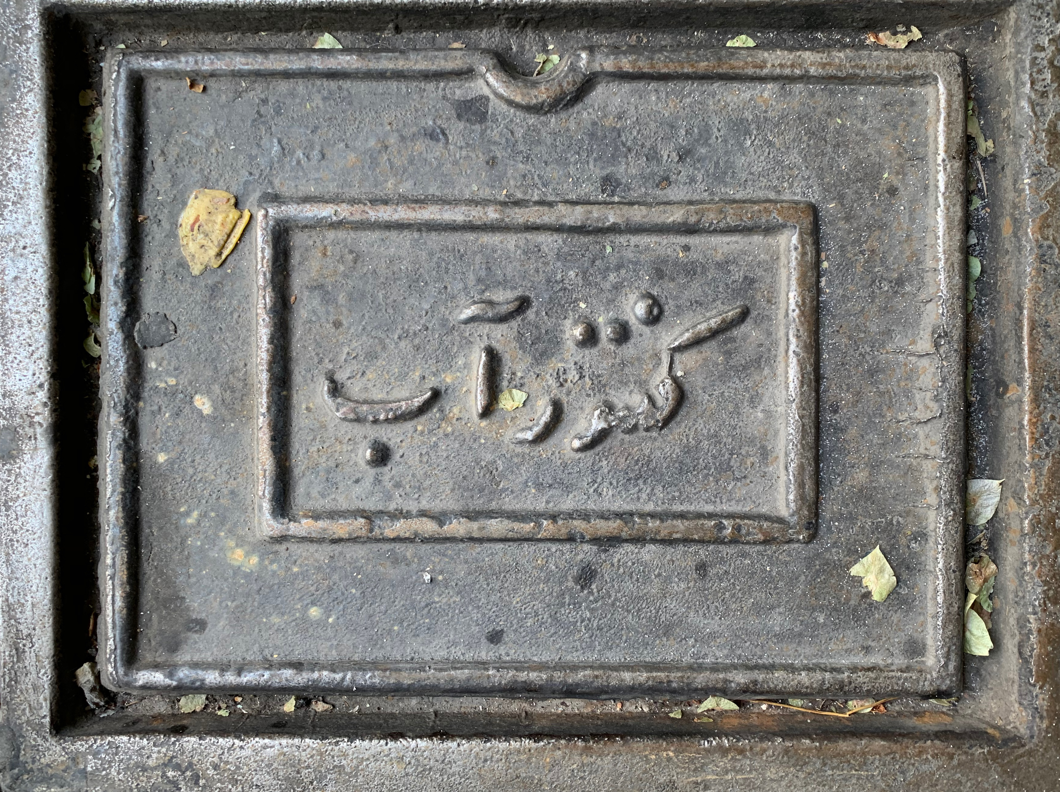
In Persian script, the dots, called نقطه (nuqta), give the letters their meaning. Without them, the script becomes unclear. On this cover, the dots are larger than usual, sitting above and below the letters like large punctuation marks. They're a bit off, but you can read them from ten feet away. Someone knew that people would walk by without looking closely, so they made the dots big enough to be noticed. I can't recall the city in which this was taken.
A cover from Yazd, Iran that features Nastaliq, a style of Persian calligraphy, which was developed in 14th-century Iran.
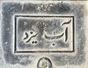
In Yazd, I see something closest to Nastaliq: the natural pull of the curves, the way آ opens like a breath, and the downward arc of the ب. Nastaliq, often called the bride of Islamic scripts, was created in Tabriz in the fourteenth century by Mir Ali Tabrizi, who combined Naskh and Taliq to make a script that moves and tilts, with strokes that carry weight like a reed pen. The lines are uneven, beautiful and alive. Yazd is also the world centre of Zoroastrianism, a faith older than Islam, with a deep connection to fire, water and the sacred elements – I have always seen water in the strokes of Nastaliq. Yazd has been moving water through its qanat – hand-carved channels that flow beneath the desert – for three thousand years.
A manhole cover featuring the Arabic text for ‘water’ with a water wave decoration underneath.
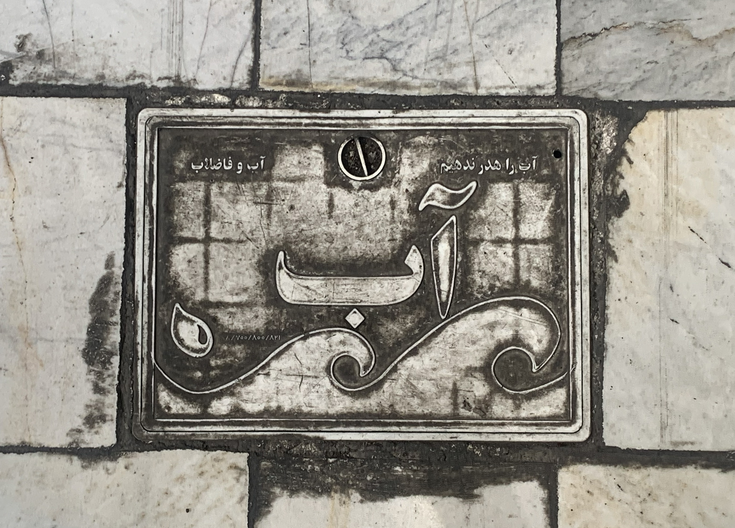
This journey took me from the most calligraphic style of writing, Nastaliq at its most elaborate in Isfahan and Yazd, to something that looks more like a font. I want to finish with this cover. It uses the same word, آب, seated on a water wave. This reminds me of the way water is shown in Persian miniature painting, where it is almost always a series of small curls instead of a literal drawing. The letters here are simpler than anywhere else I saw, looking more like a font than script. Behind them, a faint grid is pressed into the metal, echoing the marble tiles where the cover sits. Even on this plate, which most people will never notice, someone carefully considered every detail – word, wave, grid and frame – to make its function clear.
Maryam Hosseinnia, designer, typographer, Tehran, Iran, Minneapolis
Eye is the world’s most beautiful and collectable graphic design journal, published for professional designers, students and anyone interested in critical, informed writing about graphic design and visual culture. It is available from all good design bookshops and online at the Eye shop, where you can buy subscriptions and single issues.