
Tuesday, 12:00pm
25 July 2017
Felt-tip fundamentals

Daniel Eatock
Mark Gowing
Stanley Donwood
Book design
Design education
Graphic design
Reviews
Technology
Visual culture
Daniel Eatock: Pens Paper
Essay by Andrew Blauvelt. Design: Mark Gowing. 306pp.<br> Formist Edition 8, $50 AUD<br>Ink soaks into paper as Daniel Eatock’s mark-making processes result in a riot of colour
Designer and artist Daniel Eatock has a good-natured but unswerving way of reducing things to their essence, writes John L. Walters.
Daniel Eatock: Pens Paper, published by Mark Gowing’s Australian imprint Formist, shows the effects of multiple felt-tip pens on paper. Most of what we see resulted from the actions of a mark-making machine of Eatock’s devising. The first 198 of its 306 pages are about the felt-tip works, including a lengthy essay by Andrew Blauvelt. The next 78 pages are devoted to various ways of making freehand circles, also using felt-tips, while the final pages show Eatock’s ‘Pen Paintings’ and end matter.
Exposed Swiss binding for Daniel Eatock: Pens Paper, art directed by Mark Gowing.
Top: Installation view of Marker Marks (Felt-Tip Prints), 2011, at the Walker Art Center in Minneapolis, US.
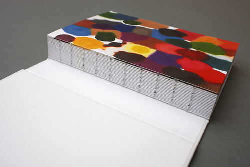
The Swiss binding, with its exposed stitching, means that the casebound book lies pleasingly flat, showing spread after spread of Eatock’s colourful artwork, if that’s the correct word for something so deliberately artless.
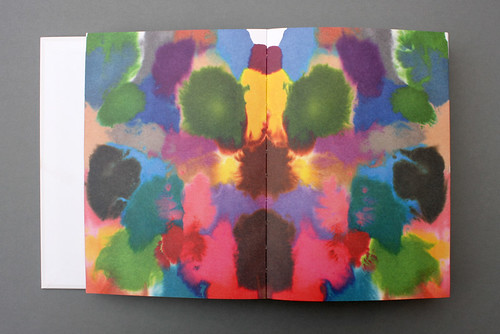
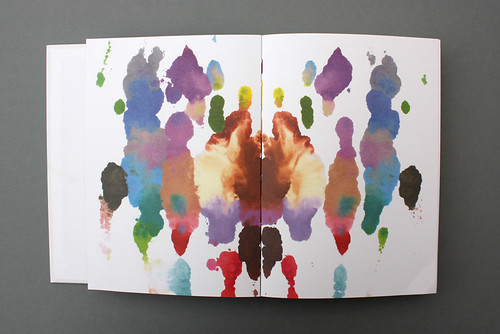
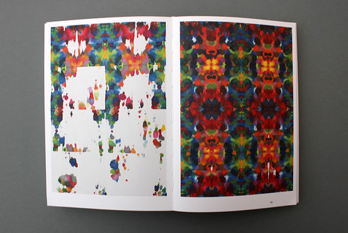
Two spreads from Daniel Eatock: Pens Paper showing images from the series ‘Preface Pen Prints’, 2015. Felt tip pens were left to soak through a stack of papers. The lower down the stack, the weaker the coloured marks.
In his article for Eye 35 (2000), Blauvelt identified a strand in then contemporary design that he called ‘complex simplicity’. Many of the practitioners he cited – including Eatock, Paul Elliman, Jeremy Coysten and Dave Eggers (of McSweeney’s etc.) – have moved into areas that are not exactly design any more.
Eatock’s bio doesn’t mention two of the design projects he is most associated with: the Big Brother identity for Channel Four in the UK and Indexibit (designed with Jeffery Vaska). Blauvelt locates Eatock within art history, citing Eva Hesse, William Anastasia and Dorothea Rockburne; he even compares him to a DJ (though not very convincingly).
Spread showing an installation view of Pantone Pen Print, 2006, at The Aram Gallery, London.
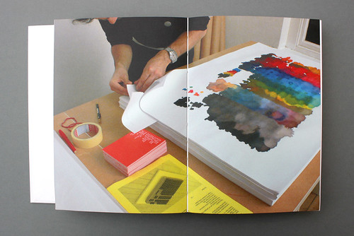
Blauvelt describes the work as entropic: ‘Completion of the process was achieved when the ink flow through the sheets was exhausted.’ A fascination with entropy, the decline of systems into disorder predicted by the second law of thermodynamics, can be seen in individuals as different as Steve Reich and Thomas Pynchon.
There are examples in graphic design, too: Stanley Donwood’s use of paper chromatography for Matthew Herbert’s Plat du Jour record cover (see Eye 57) followed a similar line of thought. Similar processes can be found throughout the history of printing and design – from bookbinders’ marbling, to slow-motion footage of coloured ink in water, to what Alan Kitching calls ‘crappy type’. It’s down to the partial control of (and/or selection from) an unpredictable, often semi-automated physical process. The results can seem sensual … and human.
Eatock has an admirably dogged way of initiating such a process, a system, for the delight of seeing it through, and discovering what it does (which is not dissimilar to what Paul McNeil talks about in my forthcoming Eye 94 feature about the ‘constructed type’ he makes with Hamish Muir as MuirMcNeil).
Art books about the work of conceptual artists can be austere, but Mark Gowing has art directed Pens Paper as a book that is a pleasure to hold and leaf through. Gowing (see ‘In the neighbourhood’ in Eye 81) is also the founder of Formist, whose latest book, The Cover Art of Preservation Music, came out last month. Ultimately, though, as Blauvelt describes, Pens Paper is about the way that order descends into chaos as the ink seeps through the paper. Pens Paper is metaphorically and literally a riot of colour.
One of Eatock’s ‘Pen Paintings’.
John L. Walters, editor of Eye, London
Eye is the world’s most beautiful and collectable graphic design journal, published quarterly for professional designers, students and anyone interested in critical, informed writing about graphic design and visual culture. It is available from all good design bookshops and online at the Eye shop, where you can buy subscriptions and single issues.