Tuesday, 10:00am
8 September 2020
Font Li Beirut – harmony in discord

Nadine Chahine
various designers
Jean-François Porchez
Erik Spiekermann
Jessica Hische
Tobias Frere-Jones
David Berlow
Pascal Zoghbi
Toshi Omagari
Martin Majoor
Petr van Blokland
Erik van Blokland
Graphic design
Posters
Type Tuesday
Typography
Li Beirut is a unique font – made in a week by 160 type designers – to support victims of last month’s Beirut blast. Nadine Chahine writes for Eye about her Letters of Hope project
 On Tuesday 4 August 2020, villages and towns to the north, east, and south of Beirut began to report a big explosion, writes Nadine Chahine.
Windows shattered and houses shook. If an explosion of this scale had happened in London’s Westminster heart, windows would have shattered in Highgate, six miles away. Some thought the country was under attack, but once the dust settled, people realised that the capital had been struck with an unprecedented calamity.
I was born in Beirut during the horrors of the Lebanese Civil War. Beirut is the scene of much personal trauma, but it is also home, the place I want to be but cannot. To be Lebanese is a struggle, whether one lives at home or in self-exile. I have watched with agony the tragedies that have befallen my country, and have wondered in despair, how much more can the country take? After frantic hours reaching out to family and friends, worried about toxic fumes and falling structures, I wanted to go home, but for many reasons I could not. So I did the thing I do best, I drew type, and I asked my friends to draw with me. My aim was to create a monospace display typeface in two scripts whose sales would raise funds to support the victims of the blast and the reconstruction efforts. The ‘brief’ I set my fellow type designers was to draw a decorative letter in a square design, either an isolated Arabic character or a Latin capital.
Eighteen postcards with glyphs from Li Beirut, printed in Beirut.
Top. Characters include ‘ß’ by Erik Spiekermann, ‘M’ by Martin Majoor, and ‘T’ by Jean-François Porchez.

The first replies were so supportive, offering help and guidance. Jean-François Porchez and Neil Summerour were the first on board, ready to assist any way they could, and support from around the world followed quickly. By 14 August we had a typeface! The font, named Li Beirut, has more than 300 Latin or Arabic glyphs in a variety of styles and flavours, made by 160 designers.
You can order Li Beirut, plus printed samples, by contributing to this crowdfunding campaign, launched on Tuesday 18 August. Proceeds raised go to victims of the Beirut blast.
Spreads from the 60-page catalogue / specimen book, which showcases all the glyphs in the font. Measuring 15×15cm, it will ship with the postcards after the 18 September 2020 deadline and includes an index of the 160 designers.
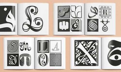
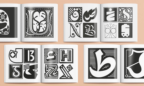
Many of the best type designers practising today took time away from projects and family to draw for Beirut. The contributors include Jean-François Porchez, Jessica Hische, Erik Spiekermann, Martina Flor, Tobias Frere-Jones, Hannes von Doehren, Erin McLaughlin, Erik van Blokland, Petr van Blokland, Martin Majoor, Neil Summerour, Toshi Omagari, and David Berlow. Arabic designers include Mamoun Sakkal, Bahia Shehab, Pascal Zoghbi, Khajag Apelian, Wael Morcos, Yara Khoury, Kristyan Sarkis, and Maha Akl. The designs bonded together beautifully. In the span of one week we made a testament to our profession’s talent, and to the humanity that binds us together. In these divisive times, it means so much to come together.
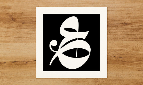
Arabic letter ‘Ain’ drawn by Lebanese designer Greta Khoury.
There have been other initiatives of this kind before, FontAid being the main example of communal design in the wake of disaster. For this case, because of the many difficulties facing Beirut and the pressures its people are under, it felt necessary to be small and nimble, and to bring these designs home. To tell Beirut’s people that the world stands with them, to bring forth messages of hope, of solidarity, of empathy and of love. The postcards and specimen showcasing the full typeface will be printed in the city and sent around the world.
This is a symbol of the hope that Beirut will reflect back to the wider community – that it is the city that refuses to die. That its famous presses will not stop and we can mail out postcards stating: ‘Printed in Beirut.’
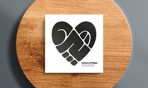
The cover of the catalogue showcases a social symbol drawn by award-winning type designer Mamoun Sakkal. It draws the word ‘Beirut’ into the symbol of a heart. The simplicity and power of the design made it a perfect symbol for the project.
My hope now is that the rest of the design community will join us in sending these letters of hope, and that people around the world will open their letterboxes to see a heartfelt message, written on a beautiful postcard that has been lovingly printed in Beirut.
I once read that you need a friend to learn the song in your heart so that they can sing it to you when you have forgotten. We need you to be that friend, because it is so hard to hope right now, in this year seeped in international misery.
One of the crowdfunding ‘perks’ includes two digital alphabet posters, which show the diversity of styles in the font. Most letters have several variants and designers are able to select the desired option via the blue ribbon or the Glyphs palette (in Adobe apps).

Li Beirut is a typeface drawn with love. The decision to request a decorative design was not accidental. Decorative work takes time, and there is no gift more precious than time. Bringing together so many designers for a text typeface is impossible, because it would need to have internal harmony. But what if there is harmony in discord? When every glyph is different, but by virtue of sharing the same size and a contrasting pattern of black and white, harmony can emerge.
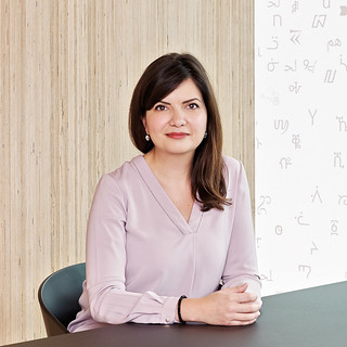
Portrait of Nadine Chahine (who curated the Li Beirut project),
by Suki Dhanda for Eye magazine. See Reputations in Eye 94.
Thanks are due to all the designers who contributed to the typeface; to Rana Elgohary who created the product visualisations; to Mohamad Al-Khouli, Rohit Sharma and Irina Koryagina for animations; to Erich Rainer Scheichelbauer for support with font technology.
Dr Nadine Chahine, type designer and researcher, London and Beirut.
Eye is the world’s most beautiful and collectable graphic design journal, published for professional designers, students and anyone interested in critical, informed writing about graphic design and visual culture. It is available from all good design bookshops and online at the Eye shop, where you can buy subscriptions and single issues.
