Wednesday, 8:00am
19 March 2014
Freestyling text and image

The Graphic World of Paul Peter Piech
By Zoe Whitley<br>Designed by John Morgan<br> Four Corners Books, £20<br>What can we learn from Paul Peter Piech? Fraser Muggeridge hails an overlooked but highly original graphic artist

As a second-year undergraduate student at Reading in the early 1990s, I was shown the linocut posters and prints of Paul Peter Piech as inspiration for a project, writes Fraser Muggeridge. I hated them.
[…]
Read the full text of Fraser Muggeridge’s review ‘Freestyling text and image’ in Eye 88.
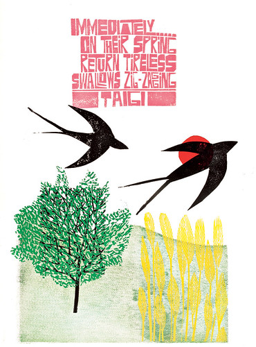
Paul Peter Piech, Haiku, Taigi, ca. 1990. From the Department of Typography & Graphic Communication, University of Reading.
Top: Vote (Lies, Lies, Lies), 1973. From the Victoria and Albert Museum, London.
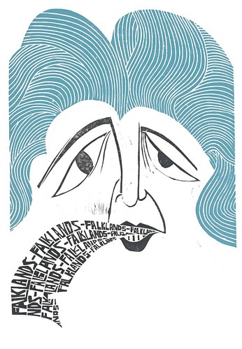
Falklands Falklands Falklands, 1984. From the Victoria and Albert Museum, London.
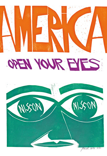
America, open your eyes, 1973. From the Victoria and Albert Museum, London.
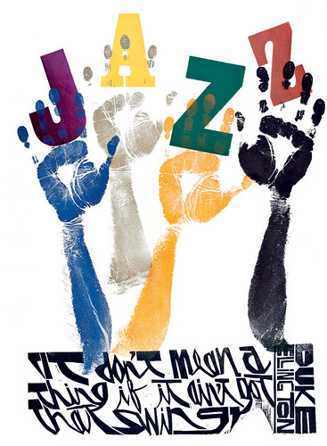
It Don’t Mean a Thing if it Ain’t Got That Swing, 1995. From the Department of Typography & Graphic Communication, University of Reading.
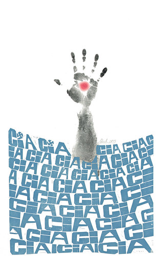
CIA, CIA, CIA, 1963. From the Victoria and Albert Museum, London.
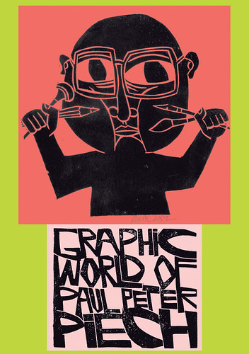
Cover of The Graphic World of Paul Peter Piech, by Zoe Whitley, showing a self portrait of Piech (Four Corners Books in association with V&A Publishing). From the Department of Typography & Graphic Communication, University of Reading.
Fraser Muggeridge, graphic designer and founder of Typography Summer School, London
Eye is the world’s most beautiful and collectable graphic design journal, published quarterly for professional designers, students and anyone interested in critical, informed writing about graphic design and visual culture. It is available from all good design bookshops and online at the Eye shop, where you can buy subscriptions and single issues.
