
Monday, 5:00pm
29 July 2013
From cave to code
James Victore
Katherine McCoy
Philippe Apeloig
Willi Kunz
Helmut Krone
Hillman Curtis
Charles Goslin
George Tscherny
Paul Sahre
Luba Lukova
Design education
Design history
Graphic design
Posters
Typography
Designer Scott W. Santoro writes about the lessons he learned while producing a textbook for graphic design students
My young son once asked, ‘Why are we here?’, writes Scott W. Santoro. When the question was flipped back to him, ‘Why do you think we are here, Ellis?’, he responded, ‘To learn stuff!’
Ellis was right. If for no other reason, we’re here to learn stuff, and graphic design makes it easy. Our field is so rife with varied subjects that we can’t help ourselves – it is almost forced upon us.
When Pearson Education asked me to produce a graphic design textbook five years ago, I went through everything I know about the subject, and learned a lot more in the process.
Lascaux cave paintings, Dordogne, France.
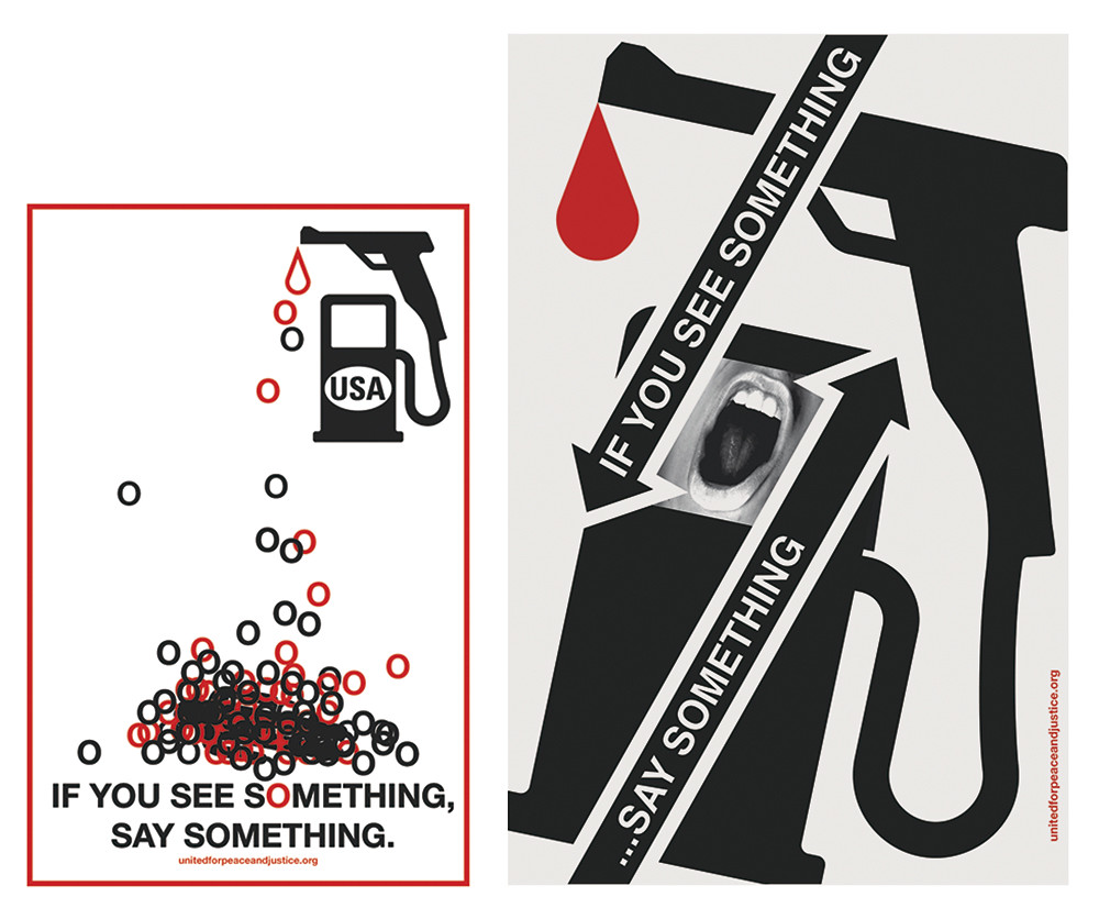
Top: Caroline Woolard’s before and after design flyer as social comment for the New York City Metro Transit Authority (MTA) campaign ‘If You See Something, Say Something’.

About Graphic Design
To understand fully what graphic design is, I kept looking back – past the International Style, past W. A. Dwiggins’ official coining of the term, past Gutenberg’s press, and past Egyptian hieroglyphs. I stopped 30,000 years back with cave paintings created by very hairy graphic designers doing the same job we do today. Their designs educated, as a guide for which animals to hunt. Their designs also inspired, by capturing each animal in spirit and thereby moving their audience to action. And finally, their designs pleased, through aesthetic expression – think torch-lit eye candy. The more things change, the more they stay the same.
Henri de Toulouse-Lautrec, La Goulue, 1891.

A Brief History of Graphic Design
Henri de Toulouse-Lautrec’s colour lithographs had a huge impact on graphic design. His first lithographed poster La Goulue (1891) broke ground in terms of how to graphically translate a scene through contrasting shapes and bouncing typography. But the sad, distant expression he put on the face of a cancan dancer – in place of a happy, smiling expression – created a double-coded layer of social consciousness. Yes, the poster promoted the club for his client, but it also expressed the unhappy situation the dancers of Paris found themselves in – a life of long hours and prostitution. The bar was set extremely high for the graphic design profession. We’ve been reaching toward it ever since.
Poster, complete with its own graffiti, for the School of Visual Arts. Creative Director: Silas Rhodes. Designer: James Victore.
Graphic Design Concepts
The words ‘idea’ and ‘concept’ are sometimes used as interchangeably as are the words ‘font’ and ‘typeface,’ or ‘logo’ and ‘brand.’ But for me, the two words had to be clarified before I could go any further with the book. I explained an idea as a creative spark (searched for and collected), and a concept as a bonfire (an assembly of ideas, form, and content). From there, I created three categories of design concepts: the analytic, the metaphoric, and the meta concept (one that relies on the reader’s understanding of the parodying aspect of the design). These ideas set the premise for the entire textbook.
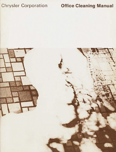
Katherine McCoy, cover of a Chrysler Corporation office cleaning manual, 1969.
Researching a Graphic Design Project
To most of us, the word ‘research’ reminds us of books piled high on a library table. But what I learned in my research about research is that if you can answer the ‘five Ws’ – who, what, when, where, and why – then you’ve pretty much done your homework. My graduate degree chair, Katherine McCoy, wrote a ‘Speakout’ for this chapter on the consequences of incomplete research – in particular, a 1969 Chrysler Corporation Cleaning Manual she designed. McCoy brought a functionalist Swiss approach to an audience of workers that couldn’t penetrate its ‘universal’ design language, and were making mistakes, which endangered themselves and damaged the facilities. The union sent all the manuals back.
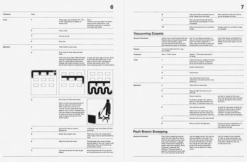
Katherine McCoy, interior spread of a Chrysler Corporation office cleaning manual using typography and graphic illustrations inspired by Swiss functionalist design, 1969.
Generating Ideas
In this chapter I explain the mechanism of an idea as ‘bringing together two separate thoughts in an attempt to solve a problem.’ I used to explain this process to students with the word ‘montage’, but I’ve discovered that the word ‘mash-up’ has more leverage (thanks to MTV). One should never mash-up more than two things at once – best explained by a US Navy design principle, around 1960: Keep it simple stupid (KISS).
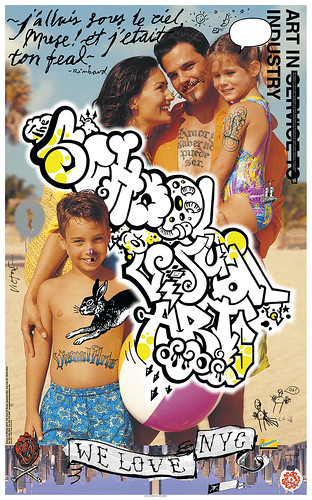
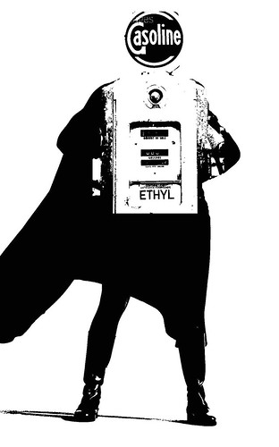
A student op-ed project, by Adva Meirovitch, on the subject of the world needing a kind of ‘Supergas’.
The Elements and Principles of Form
Writing this chapter, I learned how to use words to explain form. For example, during a student critique, rather than saying ‘Your page needs more pop’, I would first explain the reasoning behind my thinking, ‘Consider ‘elements’ such as texture and scale to increase ‘principles’ such as contrast and dominance to increase both the emotional and visual response.’ Once the discussion is legitimised with more specific language, I can use more informal words such as pop, or kick ass for that matter, and they know what the hell I’m talking about!
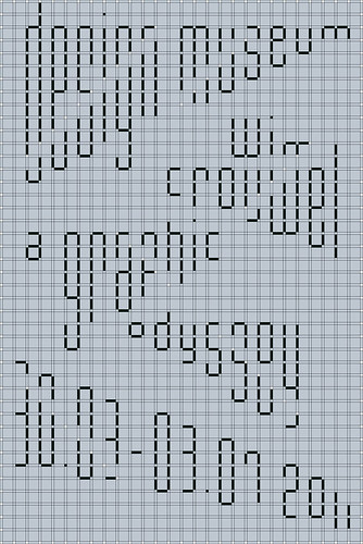
Philippe Apeloig’s poster for the Design Museum exhibition ‘Wim Crouwel: A graphic odyssey’, 2011.
Type and Typography
Type is the most powerful tool we have as graphic designers – it not only completes an image, but also can function as the image. No-one better exemplifies this than the subject chapter’s profile, Philippe Apeloig. After reviewing Apeloig’s body of work I was left in awe; every design pushes the idea of ‘text as image’ as far as it can go. But Philippe has a way of pushing it over the edge with designs that are simultaneously readable, approachable, meaningful, and striking.
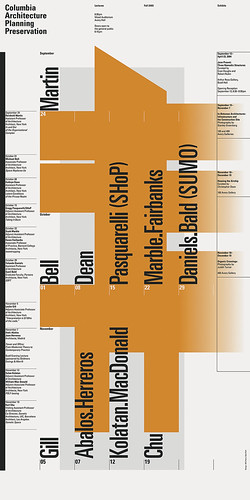
Willi Kunz, poster for Columbia University’s Architecture, Planning and Preservation School announcing ten lectures and four exhibitions held over a three-month period.
Proportion Systems, Grids and Alignments
This chapter’s profile is of Swiss designer Willi Kunz, who has produced nearly 100 posters for Columbia’s architecture department, and I asked him to describe the grid he used to create them. But to my surprise, Kunz claimed there wasn’t one. Each is based on a unique series of alignments, beginning with one dominant graphic. Kunz demonstrated this by holding his hand over one tiny element. ‘You see, even when this bit of type is removed, the entire poster falls apart!’ Kunz was right; the poster felt uncomfortable, as if a tooth was missing. This is why I felt it important to include the word ‘alignments’ in the chapter’s title.
Graphic designer George Tscherny.
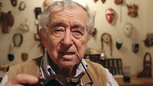
Concepts in Action
I worked as an intern for designer George Tscherny 32 years ago and have always wanted to record him discussing his conceptual process. This book allowed it to happen in both print and video. Tscherny is in his late 80s and has hardly slowed down. Vibrant as ever, Tscherny works every day on the ground floor of his Manhattan townhouse. He has a clarity of thought that I can only describe as inspiring, and puts to rest the cliché that designers retire from the profession and go on to make bad paintings. Tscherny just keeps on making great design.
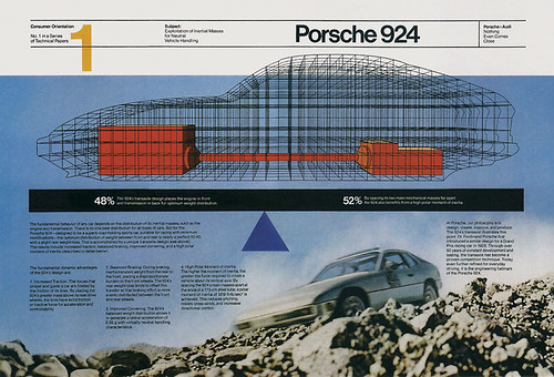
Helmut Krone’s (Doyle Dane Bernbach) print advertisement for Porsche car manufacturer in which ‘the treatment is the concept’, 1979.
Visual Coding, Loading Form with Meaning
Bill Bernbach was the first to observe it – that the treatment of a design could be the content. He noticed this in a series of ads graphic designer Helmut Krone had created for Porsche car manufacturer. The scientific look and feel (or visual code) Krone built into the series suggested technological superiority without the need for large, supportive headlines and text. In other words, the ads were ‘being it’ rather than ‘talking about it’.
Graphic designer Hillman Curtis.
Interaction and Motion Design
Hillman Curtis (1961-2012) is this chapter’s profile because he excelled in both interaction and motion design. I also asked Curtis to help create twelve short design films as an online extension to Guide to Graphic Design. Curtis’s own interview (as one of the twelve) became his epitaph – he died of cancer soon after. I didn’t know the severity of his condition – he never complained, never let on, and never allowed his suffering to get in the way of creating what he loved doing.
Supplementary video profile of Hillman Curtis.
Becoming a Designer
The final chapter of Guide to Graphic Design ends with an excerpt from a commencement speech submitted by my college design mentor Charles Goslin (1932-2007). Goslin’s words remind me of why I’m a designer: ‘That small child with the scissors and coloured paper, sitting in the middle of the parental living room rug, making shapes out of beautiful colours, for his or her own joy, not for money, not for critical acclaim, that child is you. You have the opportunity to create what never was. Forget about revolutionising the world. Work for the joy of working, and without intending to, you will help to change your corner of the world.’
Charles Goslin. Photo: Steph Goralnick.
Profile video of graphic designer Paul Sahre.
Profile video of Luba Lukova.
Guide to Graphic Design (Pearson Education) is available, with twelve supplementary video profiles, an e-text version of the publication and 24 pullouts, from MyArtsLab and other online retailers.
Eye is the world’s most beautiful and collectable graphic design journal, published for professional designers, students and anyone interested in critical, informed writing about graphic design and visual culture. It is available from all good design bookshops and online at the Eye shop, where you can buy subscriptions, back issues and single copies of the latest issue. You can see what Eye 85 looks like at Eye before You Buy on Vimeo.