Wednesday, 6:25pm
5 November 2008
Giant Steps

Michal Levy: Colour has the same effect it had when we were ‘cavemen’

Previously unpublished ‘beyond the canon’ Q&A with Michal Levy about design history. Levy, now resident in Philadelphia, US, comes from Tel Aviv, Israel.
She graduated from Bezalel Academy of Art and Design, Jerusalem, in 2001.
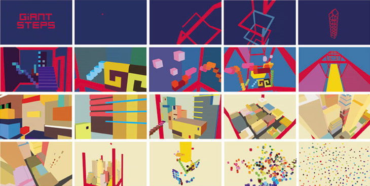
Above: Animation for ‘Giant Steps’ by John Coltrane. To watch Michal Levy’s work full screen, and at better quality go to the animation page of her website.
Q1. Is ‘the canon of graphic design history’ relevant to your practice?
A1. Generally speaking, I believe that exposing myself in my first years at the design academy to canonical pieces of design had a profound impression on me. I’m more attracted to the ‘abstract-timeless’ works. I guess I wanted to get an understanding of shape, colour and composition. I wanted to ‘dive’ into the good-looking negative spaces, to acknowledge the ‘breaks’ between the shapes, which are no less important than the shapes themselves.
Q2. Where did you learn about design history (if at all)?
A2. I learned some design history at Bezalel as part of my BFA studies.
Q3. Does history have any relevance to the new technology and techniques you’ve had to master in your work?
A3. Design history has relevance to new technologies because designers have always been on the same quest. Back then and now, we try to deliver a message and hope to be as clear as possible. Using type, colours and composition – our basic tools were and remain the same. Colour has an effect on people today, the same way it had when we were ‘cavemen’. The sky is blue, so blue will always be a calming colour and project reliability. Red is the colour of our blood and / or mouth, so it will always deliver passion and a call for action.
What I am trying to say is that there are things that as human beings we discover along the years and it’s important to be aware of this.
Q4. If you were in charge of a design education programme, what aspects of design history (if any) would you teach to your students?
A4. If I were in charge on a design education programme I would include a review of all the design styles created over the years. I would give more thought to all the abstract studies that have been made of form and colour. I think once designers understand the basic tools they work with, they can better invent their own style.
I always compare it to jazz. As a jazz musician I know that you learn and practise, for example, scales and harmony. That’s your basic tools. Then you transcribe all the timeless solos till you know them by heart and understand the language and style other people developed before you. Only then can you find your own unique phrasing that will define who you are and what you sound like.
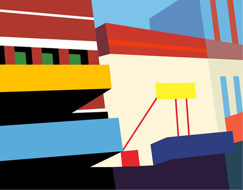
Above: Animation for 'Suheir' by the Jason Lindner Big Band.


Eye is the world’s most beautiful and collectable graphic design journal, published quarterly for professional designers, students and anyone interested in critical, informed writing about graphic design and visual culture. It is available from all good design bookshops and online at the Eye shop, where you can buy subscriptions and single issues.
