Monday, 4:37am
29 October 2012
Giants of the visual imagination

Massimo Vignelli
Lella Vignelli
Design history
Graphic design
Typography
Visual culture
While others struggle with ‘personal expression’, the Vignellis prove that a simple approach and focus makes great design, writes Quentin Newark.

Quentin Newark writes: As I was designing the catalogue for the Tate Modern exhibition ‘Albers and Moholy-Nagy’ (2006), a book hefty with designs for adverts, glass paintings, books, chairs, exhibitions, logos, films and colour studies, I thought: we don’t make them like that any more. Creative minds that can flit between disciplines without inhibition.
The argument you hear is that the creative world is so much more complicated today than it was at the Bauhaus in the 1920s. It is harder to join one area to another. It takes so long now to master the intricacies of graphic design that it is well nigh impossible to move into film, or exhibition design. Sometime a designer makes a film, or a product designer designs a building, but two disciplines is it. And we consider this a miracle.
If this is true, then we are all destined to remain pygmies. Well, not all of us.
It is hard to sum up Massimo and Lella Vignelli. He is essentially a graphic designer, and she an interior designer, but by enhancing their powers in a personal and professional pairing, the Vignellis have spent a 50-year career designing almost everything there is to design.
The exact nature of their partnership is hard to fathom. You can’t really tell, and they won’t say, who designs what. Which is surely part of the point – we have all worked in creative teams where the origin of an idea is shared; sometimes it comes from an assistant or even the client. By joining their names, the Vignellis show that even before a project has begun, they are a team.
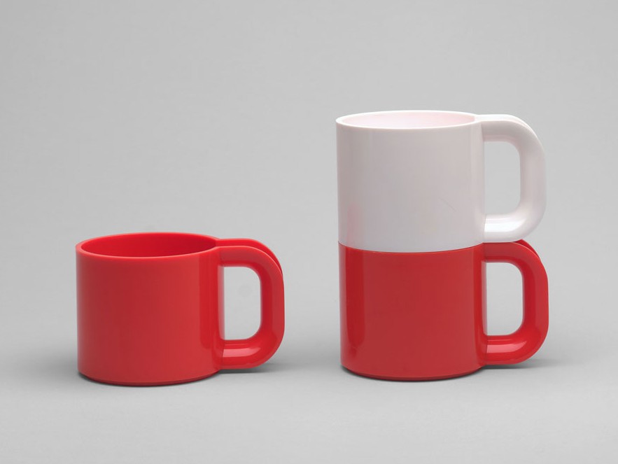
It is easiest to talk about their work: you can fly to New York in a plane with a Vignelli-designed livery, rattle through the subway system looking at Vignelli signs, pray in Saint Peter’s Church on Lexington Avenue on Vignelli pews, stride about in Vignelli suits, carrying Bloomingdale bags by Vignelli. And then you can go home, pull up a Vignelli-designed Handkerchief chair to a Vignelli table and eat dinner on Vignelli plates and pour wine from Vignelli bottles, a sparkling Vignelli ring on your finger, as you thumb through a Vignelli book in a Vignelli typeface. (And if this isn’t enough, there are Vignelli trains, factories, newspapers and candles!)
They do all this with the plainest of means. Three or four typefaces, a very limited colour palette, and a passion for elementary geometry. And the remarkable thing about this is that these fonts, colours and shapes are readily available to all of us. While most designers struggle to develop never-seen-before-jiggery-pokery for their ‘personal expression’, the Vignellis prove that it is a simple approach and focus that makes design great. (Indeed, this use of simple means is a sure way to identify anyone really great; from Achille Castiglioni and his flower-pot lamps to Josef Müller-Brockmann and his Akzidenz.)
And it’s not as if the Vignellis have simply been content to feather their own nest. They care about the quality of design discourse, education and ethics. Massimo edited and designed Zero, a magazine exploring design issues some decades before anything similar appeared.
In part it is the undeniable dignity and durability of their work has given them influence, but Massimo in particular has always been very vocal about what makes good design good. He fought a very noble campaign – and got called all sorts of dreadful names – in the pages of design magazines during the 1990s. It is clearer now with a little distance to see whose argument had more weight. While advocates of trendy typography – who were busy designing a self-funded leaflet or maybe a poster that would never be printed – poured scorn on Massimo’s apparent rigidity, he was being asked to design the identity and literature system for the cutting-edge future-thinking worldwide Guggenheim Museum.
An American critic wrote: ‘In many ways, the Vignellis are considered to have given graphic design its stature in contemporary society.’ A giant claim for two Bauhaus-style giants.
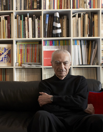
Massimo Vignelli portrait first published in Eye 83. Photograph: Maria Spann.
See R. Roger Remington’s Reputations interview with Massimo Vignelli in Eye no. 83 vol. 21, 2012.
Quentin Newark is a principal of Atelier Works, London.
Eye is the world’s most beautiful and collectable graphic design journal, published quarterly for professional designers, students and anyone interested in critical, informed writing about graphic design and visual culture. It is available from all good design bookshops and online at the Eye shop, where you can buy subscriptions, back issues and single copies of the latest issue.

