Thursday, 6:30am
10 May 2012
Grey matter ... in living colour
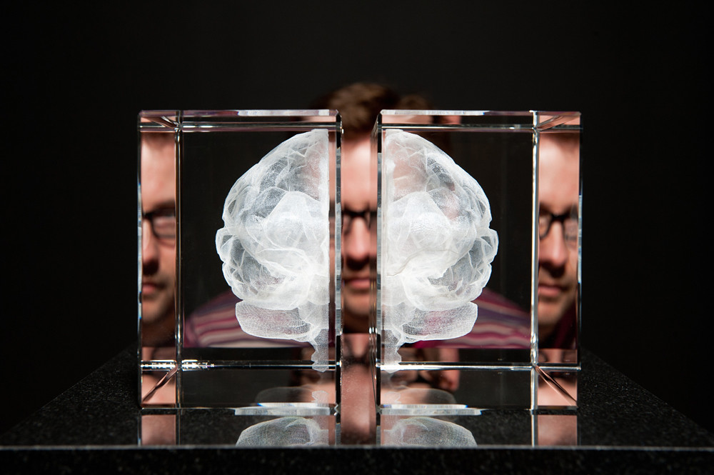
The Wellcome Collection slices through the beauty and terror of brains

The Wellcome Collection asks: ‘not what brains do for us, but what we have done to brains’, writes Rosie Walters. ‘Brains’, the London gallery’s new showstopper, takes visitors on a whirlwind tour of the role of the brain in culture and society, from 5000-year-old skulls to contemporary art from artists such as Katherine Dowson and Helen Pynor.
The exhibition’s tagline is ‘the mind as matter’ and it shows not only the physical matter – there are plenty of actual brains floating around – but also how we relate to the most complicated organ in the body.
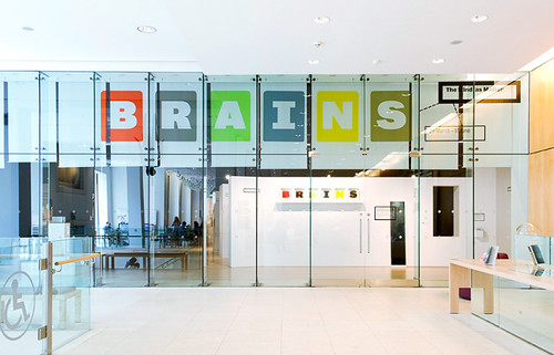
Calum Storrie’s design for the exhibition carves up the Wellcome’s huge space (which can sometimes swallow up shows) into manageable corridors, which combined with Lucienne Roberts’ clear signposting leads the viewer through four sections: measuring / classifying; mapping / modelling; cutting / treating; and giving / taking. Storrie says that when coming up with the concept he thought about the idea of ‘slices’. He wanted to create a single route through the exhibition, but one from which viewers could also break and deviate to make their own path through the objects.
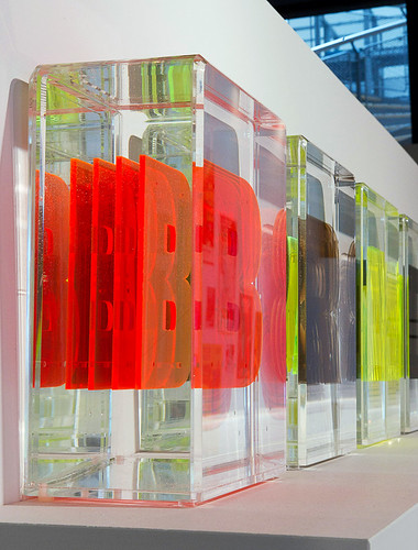
To create the opening lettering – brightly coloured letters suspended like specimens in transparent blocks (above) – Roberts and her colleagues visited the Royal College of Surgeons and found out how real specimen jars are put together. They were particularly interested in the glycerin and water solution, whose refractive index makes specimens appear unsupported, creating the illusion of multiple objects. The team worked with Capital Models to make the letters, using slices of Perspex suspended in the same glycerin and water solution in bespoke acrylic boxes.
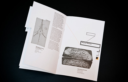
Roberts’ scientific approach is also seen in the exhibition literature (above), which references the idea of classification – clear diagrams, leader lines and labelling, with added flair through the use of fluorescent ink on the mainly black and grey exhibition guide. She chose Bureau Grotesque because it ‘clearly draws on the design of nineteenth-century grotesques and was initially developed by David Berlow in 1989 from original Stephenson, Blake specimens’ (see ‘Sense of place’, Eye 58). Although decorative and interesting, the graphic design of Brains does not detract from the complexity of the objects it labels, but enhances and – along with Storrie’s architecture – gently guides the viewer through the maze of artefacts, including movie posters (below) and engravings.
Above: Trepanning being performed. (Image: Wellcome Library, London, via Wellcome Images.)
In typical Wellcome style, the exhibition is curated to bring together historical, social and artistic commentary on ‘the mind as matter’ and explores everything from the murky depths of Nazi attitudes to mental illnesses, to new medical holographic imaging techniques that allow viewers to look at the moving brain in 3D without wearing glasses, and photographer Ania Dabrowska’s moving portraits (including Albert Webb, below) and interviews with people who have chosen to leave their brains to science.
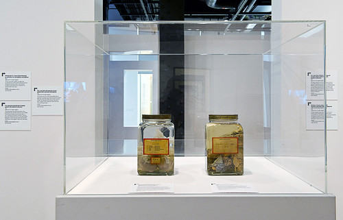
This is not a show for the squeamish, and from almost every angle the viewer is subjected to photos of fresh brains extracted from steaming corpses, videos of them being frozen and sliced like pastrami, plus jars of floating brains (above), that could be enough to make the most seasoned gore fan feel queasy. However the show is extremely interesting, if complex – a little like the organ behind the show.
Below: slices of Einstein’s brain. Wellcome Library, London. © Wellcome Images.
Brains: The mind as matter
From 29 March to 17 June 2012
Wellcome Collection, 183 Euston Road, NW1 2BE, UK.
Eye is the world’s most beautiful and collectable graphic design journal, published quarterly for professional designers, students and anyone interested in critical, informed writing about graphic design and visual culture. It’s available from all good design bookshops and online at the Eye shop, where you can buy subscriptions and single issues. Eye 82 is out now – you can browse a visual sampler at Eye before you buy on Issuu.

