Thursday, 7:50am
21 January 2016
Gutter press

Nigel Ball on packaging graphics, ‘gutter share’ – and whether design blogs should be more sceptical about big brand news stories

As a design educator I need to keep on top of the latest developments, writes Nigel Ball, and a large aspect of this involves reading design blogs.
Recently, something happened that made me question whether reading such material was a legitimate research activity. In the space of one week I saw four almost identical posts on four well regarded design blogs: CR Blog; Design Week; It’s Nice That; and Dezeen.
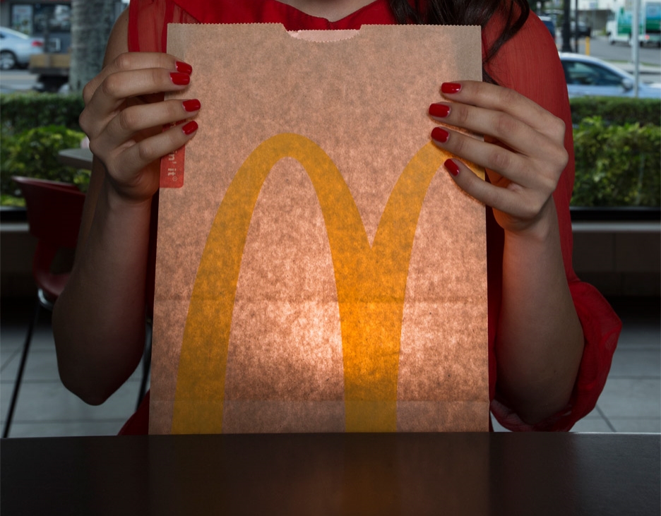
Each post announced the launch of a new range of packaging graphics for McDonald’s. Each blog applauded both the process of the rebrand – the result of several firms on the McDonald’s design roster working together – and the ‘bold and simple’ concepts that the agency Boxer created as an outcome of this collaboration.

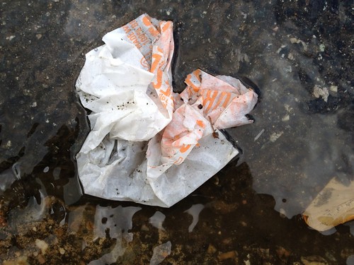
What struck me about this was that while each post paid attention to process and aesthetics – the graphics are progressive for McDonald’s – none gave critical consideration to the context the work sits in, the discarded packaging that graces our gutters and hedgerows.
A 2013 survey by Keep Britain Tidy found that the fast-food chain was the fourth brand in terms of ‘national gutter share’, behind Walkers, Cadbury and Coca-Cola. 1 (This was an improvement on their no. 1 spot in a similar survey in 2011.)
The issue of using graphic design to urge consumers to dispose of food packaging responsibly was posed in a 2010 report by Tim Barnes of Litter Heroes. He argued that brands should ‘take action to reduce the likelihood of these products being littered … Current anti-littering markings on the most littered brands are either non-existent or too small to be credible.’ 2
Here is an uncontroversial opportunity for commercial graphic design to make things better. McDonald’s doesn’t need imagery on its packaging to sell its products – the design is not seen until after purchase. It is reasonable to ask why these surfaces are not used to tackle the brand’s litter problem. Yet there has been little effort in the past six years on the part of McDonald’s or the agencies that work for them to use design in this way.
McDonald’s have scored a publicity coup by having such well respected blogs write about their untrendy products. So the question I’m posing is whether design blogs have a responsibility to be critical? I believe they do. As participants in a creative discipline we can’t leave important debates about the impact of our practice to the pages of books most designers and students won’t read, or lectures they won’t recall attending. If not, then blogging will be little more than a medium for the design industry to congratulate itself, or a billboard for brands who wish to ingratiate themselves with a creative audience.
Endnotes.
1. Most dumped brands.
2. What’s littering Britain
Nigel Ball, design educator, graphic designer, photographer, Ipswich
Eye is the world’s most beautiful and collectable graphic design journal, published quarterly for professional designers, students and anyone interested in critical, informed writing about graphic design and visual culture. It is available from all good design bookshops and online at the Eye shop, where you can buy subscriptions, back issues and single copies of the latest issue.
