Friday, 11:30pm
18 March 2011
Help!

Poster initiatives mean well, but what are designers raising awareness of?

Is there a need for an awareness-raising campaign for one of the worst natural disasters of the modern age, heading every front page and topping every news bulletin? Following the horrific events and resulting humanitarian crisis in Japan, writes Alexander Ecob, a number of designers have trained their skills upon the relief effort and come up with support – in the form of posters. But is this the best use of their time and talents?
The relief effort for Japan is having no trouble raising support, sympathy or donations. Problems will come later, when attempting to maintain that support after the media buzz subsides. (Despite a huge outpouring at the time, Haiti is still struggling to recover after the earthquake that devastated Port-au-Prince in January 2010, yet popular coverage of the crisis has all but evaporated.) While any effort that raises money for a worthy cause is to be applauded, shouldn’t designers use their problem-solving skills to address difficult, more long-term issues?
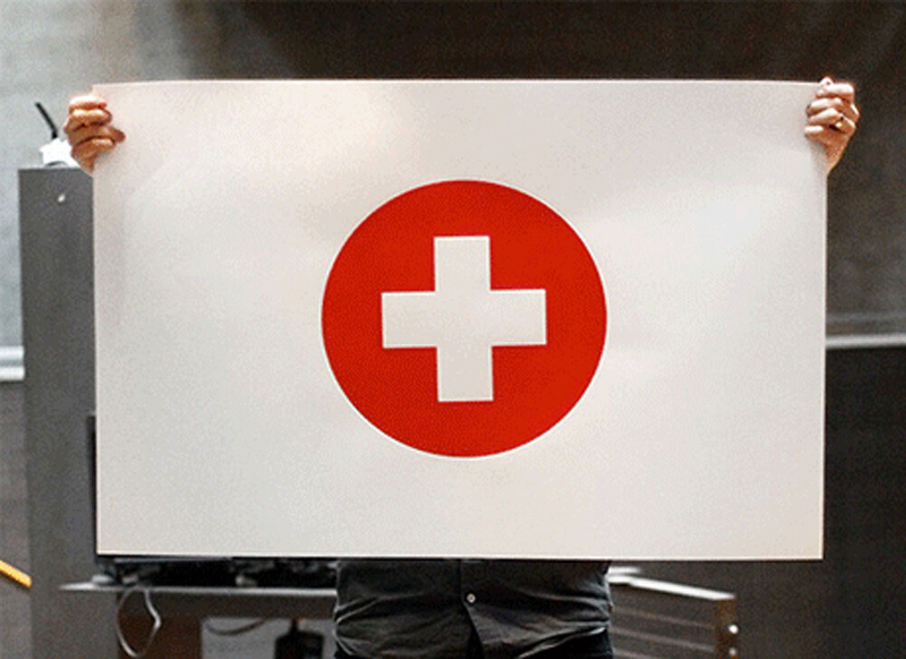
Top: Max Erdenberger's Japan Relief poster.
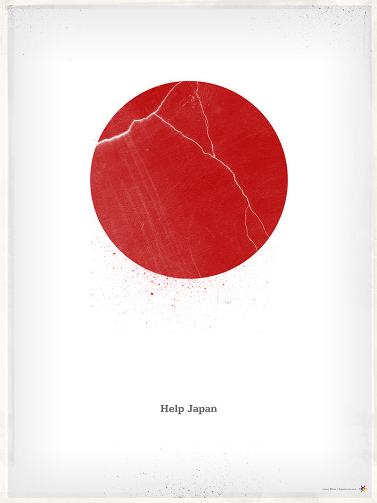
Above: Signalnoise’s Help Japan poster.
Design Taxi’s Help Creatives Re-Create initiative does look to the future. In addition to a monetary donation, Design Taxi (an online portfolio provider and creative network) are also offering free accounts and account extensions for designers hit by the crises in Japan and Christchurch to connect them with opportunities through the network. This both offers immediate financial aid, and longer-term support as people try to return to normality and working life, and seems a better use of creative skills and resources to provide aid.
But why are so many focused on making a poster? A cynical observer would look at the number of Japan posters compared to other humanitarian appeals and note a lack of a blog-friendly modernist red circle on white background in the latter. There are many ways in which to help after a crisis, but most are difficult to post on Tumblr.
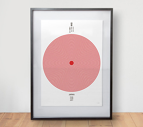
Above: Daniel Freytag's Editions of 100 poster.
And therein lies one of the conflicts of poster initiatives; the uneasy juxtaposition of ostensible charity with self-promotional benefits for the creator. It would be callous to suggest that these posters were designed with anything in mind other than good-will. However, with all of the Japan posters featured, it was far easier to find the designer’s name and personal website than, for example, donation details for the Red Cross, information on how the money raised would be distributed, or ways that the viewer could help beyond buying a poster. Make of that what you will.
Isn’t the human tragedy of the event enough? It does not need to be packaged and sold like a commemorative plate.
See also ‘Is This Poster to Aid Japan’s Tsunami Victims a Crime Against Design?’ on fastcodesign.com.
And Véronique Vienne’s ‘Sticks in the mind’, a feature article from Eye 69 about posters.
Eye is the world’s most beautiful and collectable graphic design journal. Available from all good design bookshops and online at the Eye shop, where you can buy subscriptions, back issues and single copies of the latest issue


