Tuesday, 12:50pm
14 October 2008
Helter Skelter
A bumpy ride with Alan Aldridge:
The Man with Kaleidoscope Eyes

The Design Museum is hosting an Alan Aldridge retrospective, writes Roger Sabin. ‘Just go along to the private view,’ chirps the editor, ‘and blog a few hundred words about your first impressions.’ Hmmm.
Not so easy, John, since I’m not at all sure what I think at this stage. Opinions take time. By the deadline when I file my ‘proper’ review for the printed magazine next week, I’ll have had time to cogitate, sleep, maybe read some other people’s opinions (yes, journalists do that), and then be ready to say something coherent. But now?
Let’s start with some obvious thoughts. Aldridge is certainly a major figure – worthy of a big show like this – and some of his work is astonishing. There’s also more to him than his illustration of the Beatles’ lyrics (see Eye no. 57 vol. 15), and the show is a solid and very enjoyable reminder of the other Aldridge – the bestselling children’s book author, the designer of Penguin fiction covers, the advertising hotshot, etc.
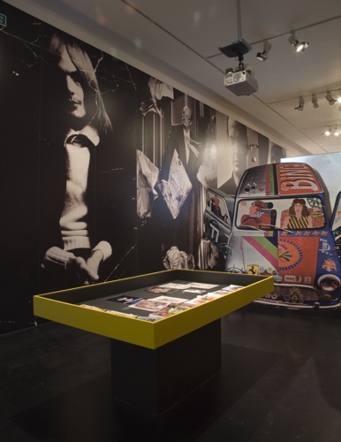
Every inch of space here is covered with Aldridgiana, including the floors, and there’s groovy 1960s music wherever you tread. Exhibition design is by Morag Myerscough – hats off to you, Morag. (It reminded me of the great days of the Angouleme Comics Festival, when exhibition spaces would be complete worlds based on a particular cartoonist’s work, with a soundscape to match.)
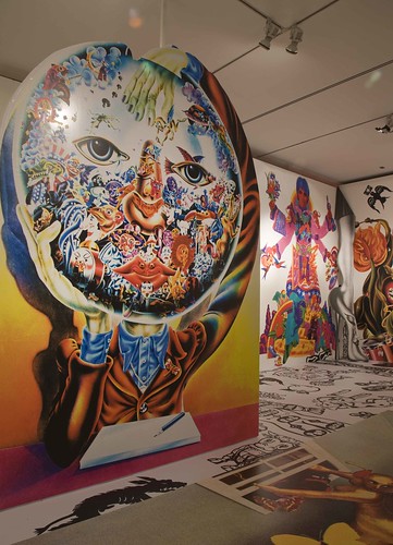
But unfortunately – and I feel bad saying this – the show goes downhill the further you get into it. You begin with Aldridge’s early career, and end with where he’s at now. Which means that the utterly brilliant covers he conceived for the Penguin science fiction paperbacks (a J. G. Ballard tale of the apocalypse, a Clifford Simak time-travelling odyssey) are among the first things you see.
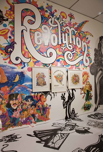
The Beatles room is dominated by Aldridge’s illustrated lyrics. Some of this is brilliant – a naked lady with what looks like a plastic-and-plasticine helter-skelter running down her body for ‘Helter Skelter’ – and the addition of the soft colour gradations made possible by airbrushing gives the work an extra dimension. The room is like a huge Beatles fairground ride.
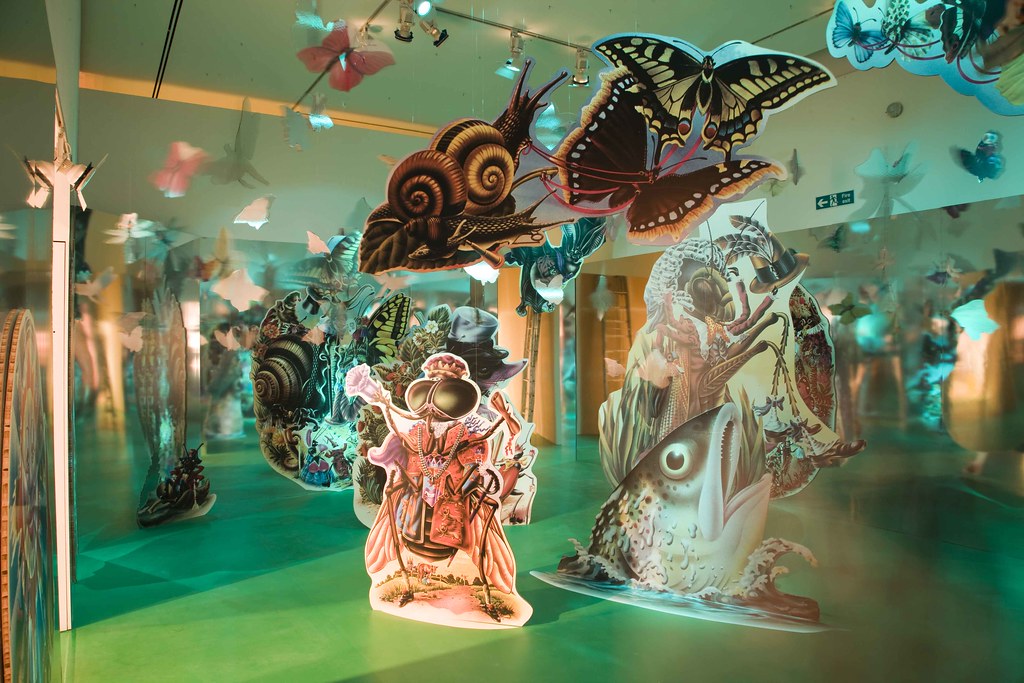
But the Butterfly BalI room (top), devoted to Aldridge’s 1973 children’s book, is like tripping on dodgy mushrooms in the storeroom where they keep all the kids’ insect costumes for the Notting Hill Carnival. The book is often cited as his masterpiece. For me, it felt like the transition from 1960s pop to 70s prog.
Finally, Aldridge’s most recent work. The curatorial text talks of a ‘career marked by a continual search for new projects’. So why did he return to one of his greatest hits and spray-paint a 2008-vintage Mini?

The result, which should have been the culmination of the show, is the equivalent of Paul McCartney’s video for his most recent single, where he wears teenagers’ clothes and does a little skip.
When I’ve had time to think about the show, I’ll come up with opinions that may be different to (or possibly the polar opposites of) the ones you’ve just read. But for the moment, my feeling is that it’s another nice, safe, colourful, nostalgic show for the Design Museum. I long for the day when I’ll come to this place and see something challenging. As for Aldridge and his psychedelic revolution? You can count me out/in.
See also Getting better all the time . . . an extract from Aldridge’s new book, in the latest issue of Eye, no. 69 vol. 18.
All photographs by Luke Hayes.
Alan Aldridge: The Man With Kaleidoscope Eyes
Design Museum, London
10 October – 25 January 2009
Eye is the world’s most beautiful and collectable graphic design journal, published quarterly for professional designers, students and anyone interested in critical, informed writing about graphic design and visual culture. It is available from all good design bookshops and online at the Eye shop, where you can buy subscriptions and single issues.
