Thursday, 11:00am
24 May 2012
Home-made heavy metal

With no need to be cool, bands happily riff on the visual vocabulary of the 70s

Heavy metal culture has always been on the outside, writes Gareth Hague. Outside cool, outside fashion, outside the zeitgeist.
As such, it has its own momentum outside a mainstream culture that views it with confusion.
Being separate from mainstream society is what youth cults are about. But with heavy metal culture, somehow there has been a separation from a specific connection to a moment, or a connection to something more universal, that has allowed it to carry on where other youth cultures fade or become parodies of themselves. Heavy metal in its different forms has been vital, energised and relentless since certainly the mid-1970s. Heavy guitar music, long hair and denim must be a potent and universal representation of male teen rebellion.
Heavy metal has its own visual language and reference points – fantasy, swords and sorcery, and merging these with horror and science fiction. This derived from hippy counterculture and its interest in nature and the occult; the 1970s and 80s resurgence of interest in Tolkien; the mix of violence, sex, sci-fi and fantasy in films such as Conan the Barbarian and Mad Max; the huge popularity of fantasy role-playing gaming.
At the same time artists such as Roger Dean created an archetypal otherworld of outer space, medieval mysticism and erotica. Buxom loincloth-clad Amazons roamed these worlds, battling dragons or aliens, and selling as posters in huge quantities, via record shops and high street shops such as Athena.
Heavy metal 1970s instigators such as Rainbow and Black Sabbath introduced medieval / fantasy references into their music and the typographic language of medieval-inspired blackletter lettering. Since then, it is claimed, there may be as many as 70,000 bands, mostly on local club and pub circuits, making music and releasing demos, tapes and records, without access to professional designer and artists, needing a visual representation of what they do.
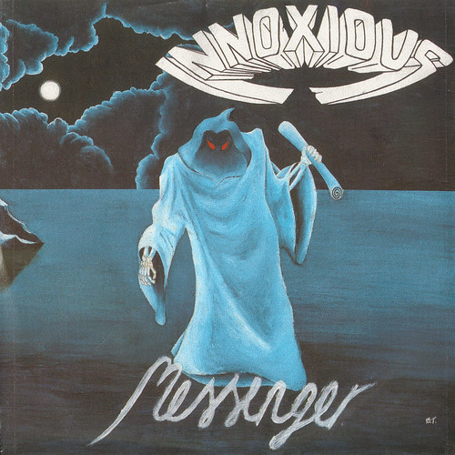
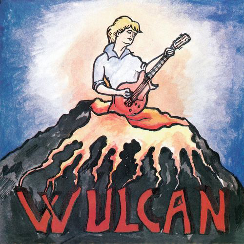
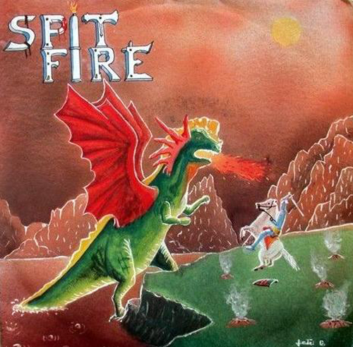
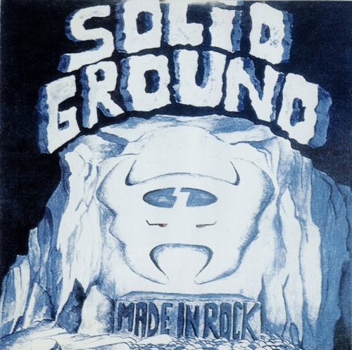
There is a fantastically gung-ho do-it-yourself character in their graphic imagery. Bands taking the vocabulary of forms familiar to them and riffing on them in their own way, with exuberance and lack of irony. Typography is built into airbrushed, pencilled and painted illustrations. Words are worked into or carved out of rock, flames, lightning, electrical pulse, clouds and trees. This may have come from a pre-DTP lack of awareness of typesetting, or purely for the need to make something unique, decorative and crafted.
Gareth Hague is a graphic designer and type designer at Alias, London.
Eye is the world’s most beautiful and collectable graphic design journal, published quarterly for professional designers, students and anyone interested in critical, informed writing about graphic design and visual culture. It’s available from all good design bookshops and online at the Eye shop, where you can buy subscriptions and single issues. Eye 82 is out now – you can browse a visual sampler at Eye before you buy on Issuu.


