Saturday, 9:19pm
17 April 2010
House of the rising sun

Manifesto design and the colourful visual codes of British party politics

Britain is still rubbing its eyes in amazement since the telectorate voted Nick Clegg the next prime minister last Thursday night, writes Jessica Jenkins.
The ‘historic’ debate (though we should drop the prefix unless it refers to the archiac televisual style suggesting there was one fixed camera, apparently fixed in Cameron’s line of vision), was followed by extensive analysis on essential matters such as whether Brown looked like he was praying, the turns of the electronic worm, the snappiest sound bites, and who picked their nose. In order to discover the parties’ real messages, I turned to the manifestoes.
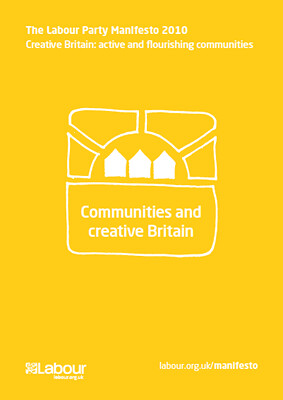
I still have a copy of Labour’s 1983 ‘suicide note’ election manifesto, the one with ‘LABOUR’ set into a red flag and grainy black and white pics on the cover picturing salt of the earth working class folk and the promise of ‘radical socialist policies to revive the economy’. The 2010 publication surprised commentators by offering an illustrative sop to those nostalgic for those heady days with an extraordinary Socialist Realist cover illustration, not unlike a Maoist rising sun poster, with a tidy nuclear family looking across fertile lands to the joyful future promised by the five year plan (see top).
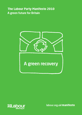
Inside, it's the rainbow colours and roundy font recipe, and the reduction of imagery to wobbly line drawings in the style of an in-house designed social services brochure.
Quite right, too, for this ‘my belt is tighter than yours’ campaign, which accounts for that sad photo shoot of cabinet members holding up USB sticks of the manifesto, with printed copies reserved only for the front line. Were we supposed to read this as a commitment to waste reduction, or tacit admission that we may as well drag to trash after 6 May?
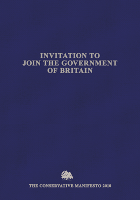
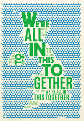
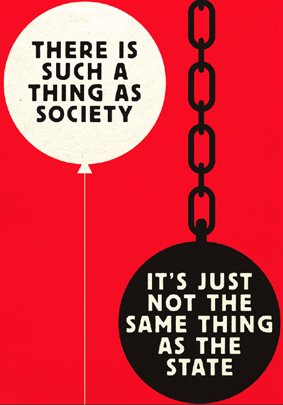
The Tories are having none of this. Their weighty, 131-page hardback production promising smaller government (surely welcome if they are to be running it) offers a sombre invitation to Join the Government of Britain, though it looks more like an invitation to a funeral.
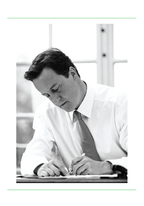
Inside, however, it is packed with visual treats, clearly designed by three different committees targeting, well, everyone really, except those disinclined to fork out a fiver for this splendid souvenir. Firstly, there is the Old Tories committee who think opening with a full page pin up of the man himself must be a Good Idea, followed by his statement signed with that kind of quill signature reserved for prime ministers, chief cashiers of the Bank of England and royals. I am disappointed it didn’t just say ‘David’.
No font other than Times would do of course, with centred text to emphasise that invitational quality. On page 7, however, we are hit by the first rather gorgeous woodblock print illustration authored, I can only imagine, by one of those anonymous Parisian May ’68 artists.
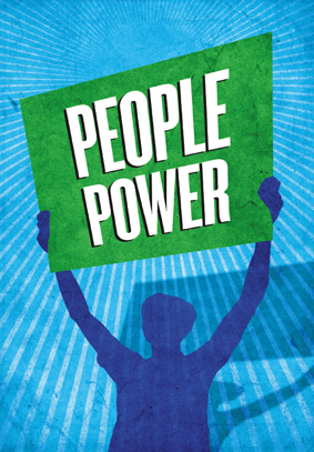
I’m almost swayed. Only when you get to the poster ‘people power’, can you be sure they are having us on.
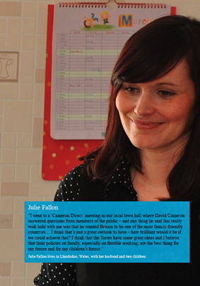
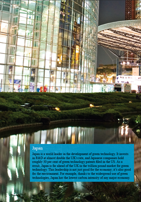
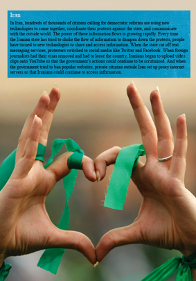
For ‘bye bye Bureaucracy’, they seem to have run out of newsprint. The third visual code is the photographic language of cool (pre-crisis) corporate reports, but at the same time going for that old trick of showing people who look like they wouldn’t be seen dead voting Tory, but who now can, because they are now so very different to what we remember, so very international, cool, youthful, green.
So Swedish, Glasgwegian, Japanese, Iranian, Welsh, German, Aberystwithian, Strangford Loughish … take your pick. (The Iranian bit is because in Iran they can use technology to bypass the State. Right.)
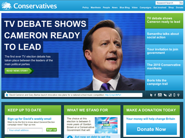
On the subject of colours, all parties are presented with a challenge. Naturally, the Conservatives are the party of the environment. We know this because Cameron rides a bike and they have a tree as a logo. But, damn it, they are stuck with blue. They can either edge towards viridian, to suggest the greenness of their blue, or splash all their communications with touches of green, which is the strategy they chose, especially on their website.
(Incidently all the sites seem to be made from the same template, stressing the many technologies that can be used to spread the word.) Labour’s dress code is now pink, either to remind us of their very lite connection to socialism, or to posit themselves as gay friendly.
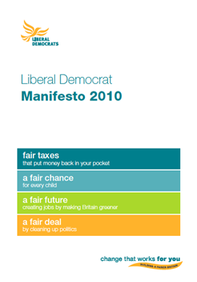
With the Lib Dems now set for government, I turned this morning to their manifesto. They are also a bit stuck on colours, with Clegg faced with the ignominy of wearing a pee-coloured tie. (They handle yellow, however, better than the German liberals, who look like Lidl.) They are free of course to find any secondary colour, and opt for that bluey green that the Conservatives surely envy.
Their manifesto comes out tops, managing more successfully than the other two to take the politics out of politics.
Rather than policy chapters, such as Labour’s the below the belt ‘crime and immigration,’ they come closest to looking like a mortgage lender, addressing us personally with ‘your life’, ‘your money’, ‘your job’. This is the only manifesto without socialist iconography. Insisting on their difference, they actually look like what the other two are trying not to offer: more of the same.
Conservative website.
Labour website.
Liberal Democrat website.
Eye, the international review of graphic design, is a quarterly journal you can read like a magazine and collect like a book. It’s available from all good design bookshops and at the online Eye shop, where you can order subscriptions, single issues and classic collections of themed back issues.

