Thursday, 8:00am
10 December 2020
In memoriam Bush Hollyhead
Bush Hollyhead’s illustrations had a nervous energy and paranoid style that enchanted both colleagues and rivals. Walker Mimms pays tribute

With the death last month of Bush Hollyhead, the illustration world has lost one of the most beguiling and self-aware interpreters of the 1970s, writes Walker Mimms.
Hollyhead (b.1949) helped forge an influential paranoid style, at once anarchic and formally suave, that gave voice to the fraught interregnum between hippie optimism and punk rage.
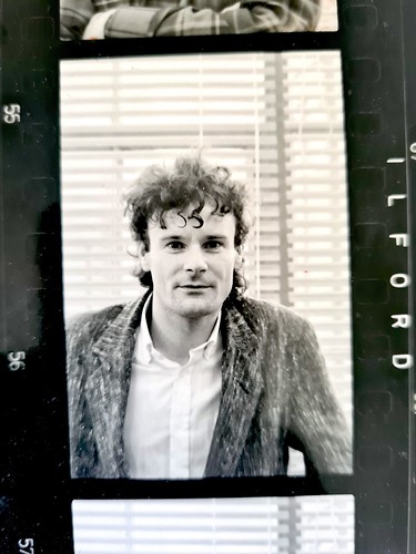
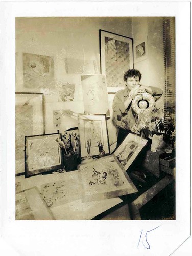
Bush Hollyhead, late 1970s.
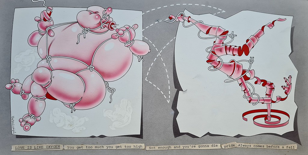
Top. Lyric page for The Sweet’s song ‘Love Is Like Oxygen’ from a calendar for the pop group (Polydor, 1978).
Bush Hollyhead, illustration for ‘men’s magazine’ Club International, 1974. This image – the texture of the brothel-creepers, the gradient stubble, the balance of temperature and arrangement – prompted Ian Wright (then a student) to write a ‘gushing’ fan letter to NTA. ‘I wanted to do something as good as that,’ says Wright.
Educated at Newcastle and Hornsey, Bush Hollyhead’s portfolio crackled with his fondness for Magritte (a plaster torso guitar featured prominently). Design jobs were scarce in 1970, he told me late last year , in what would be his final interview, across a coffee table of tattered portfolios at his Crouch End home. Bentley Farrell Burnett (see Mike Dempsey’s profile of BFB in Eye 93) liked his work. ‘If we could afford it, we would employ you,’ they told him. Fortunately art director Nicholas Thirkell could. Thirkell was just leaving UK book publisher Macmillan & Co. to assemble his own illustration supergroup, and Hollyhead joined Bob Lawrie, Malcolm Harrison and George Hardie (see Dan Nadel’s profile in Eye 58).
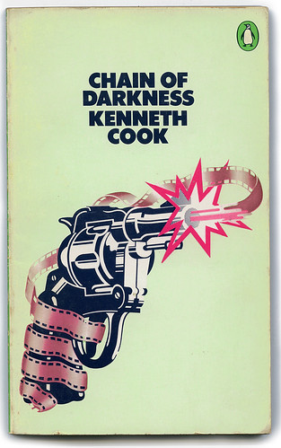
Bush Hollyhead / NTA, Penguin Crime cover, 1971.
The open floor plan of Thirkell’s studio – first in Victoria, then in a large warehouse loft in Earlham Street, Covent Garden – turned the air covalent. ‘If I was struggling,’ Hollyhead reminisced, ‘Bob would look over my shoulder and make suggestions.’ Among his first briefs was a poetry paperback series, where Hollyhead’s love of textures meets the crisp repetitions of Lawrie and Hardie. Razorblades straighten the curve of a rainbow. In his cover for a Kenneth Cook thriller, the group’s ambient fixation on comic books anchored Hollyhead’s airy 3D to a stark black.
At NTA Studios, as the group renamed itself upon Thirkell’s departure in 1974, Hollyhead incubated an approach to graphics that put ideas first. Individualists with a shared love of flat colour and jagged edge, the four main designers combined the anxiety of the 1970s with endless wit. To Hollyhead, it was a band. This group ethic was new for its time. As George Hardie finished his cover for the Pink Floyd’s The Dark Side of the Moon, Hollyhead lent his steady hand for the airbrush glow.
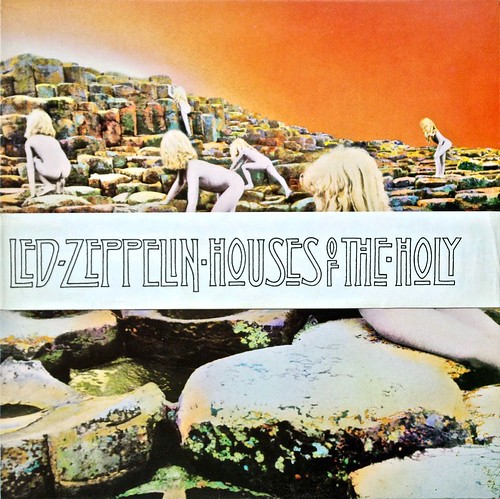
Hollyhead’s (now famous) wordmark covered up offending elements of the Hipgnosis cover for Led Zeppelin’s album Houses of the Holy (Atlantic, 1973).
Hollyhead could work quickly, commanding a freehand line and pulling from a well of art-historical reference. When Hipgnosis had to shield the American Midwest from overt nakedness on its Led Zeppelin cover for Houses of the Holy, Hollyhead dashed off an Art-and-Crafts logotype that is now synonymous with Led Zeppelin. ‘The band loved it,’ recalls Hipgnosis’s Aubrey Powell. ‘What a genius that man was.’
Bush Hollyhead / NTA, portrait of Liza Minelli for Club International, 1973. When celebrity profiles arrived on Hollyhead’s desk, he was frightened by the pressure to draw likenesses of well known faces. NTA colleague Malcolm Harrison imparted to him a caricaturist’s economy – shown in Hollyhead’s giraffid Minelli – but little of his confidence.
Portrait of Malcolm Muggeridge for Alan Brien’s profile of the controversial writer in The Sunday Times, 1977.
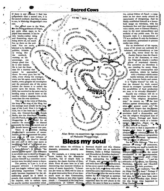
When celebrity profiles arrived on Hollyhead’s desk, he was frightened by the pressure to draw likenesses of well known faces. He recalls pacing the evening studio, sometimes into daylight, pondering the brief and distracting himself down the block with Sid Vicious at the Roxy. He might glance at a reference photo but preferred indirectness in a face. For The Sunday Times, wordstreams from the column coalesce into an aged Malcolm Muggeridge, ink spurting like bile. With Times Newspapers straitened that year, the issue with Muggeridge briefly threated to be the last. Its art director recalled scrambling ‘to get one more Hollyhead in.’
Finding his likeness in print, the TV host Russell Harty phoned NTA to buy it. (Hollyhead demurred.) Spike Milligan, seeing his own, invited the artist to dinner and commissioned a record sleeve. The underground publisher J. B. Rund, one of the first collectors of English commercial art in this period and later a design agent overseas, would make annual trips to NTA from New York. He was enchanted by Hollyhead, ‘a real genius of design and illustration. ‘Bush was the only one who didn’t want to sell anything,’ said Rund. Hollyhead’s tentativeness was one reason for the cerebral quality of his later work.
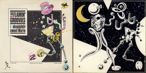
The Flamin’ Groovies, covers for Absolutely Sweet Marie and Jumpin’ in the Night (Sire, 1979). Hollyhead’s free-floating geometry creates a postmodern nursery rhyme.
NTA moved to Charterhouse Square – minus Lawrie, plus Ian Wright, who had been ‘obsessed’ by NTA’s work while a student at Goldsmith’s. The members settled into solo paths. Hollyhead’s assemblages turned inward to allegory. Such pictures retrace an idea from genesis to expression. One of Bush Hollyhead’s strengths was to convert nervous energy into a visual re-enactment of the creative process.
Bush Hollyhead / Mitchell Beazley, Intl., GLC Thamesday poster, 1985.
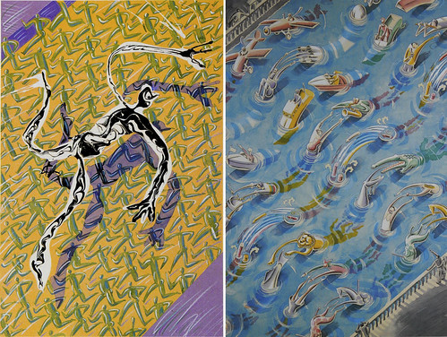
In the 1980s, while he tutored at Middlesex Polytechnic and Newcastle, judged for the Association of Illustrators, and showed at the ICA, Hollyhead ditched the frenetic ligne claire that had impressed students like Wright. A page from a book about dreams, and a GLC poster, both 1985, show the lightness of his later career.
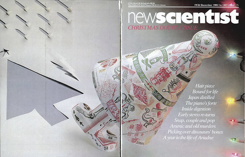
Bush Hollyhead, cover for Japanese design magazine Idea, 1985.
Bush Hollyhead’s inner sleeve for The Undertones’ album Positive Touch (Sire, 1981). His cover was nominated for a Grammy.
Bush Hollyhead’s original lettering for Houses of the Holy is still used extensively on the Led Zeppelin website and the band’s merchandise, 2020.
Hollyhead’s portfolios show a constant reach above graphics, above the client’s brief towards some third thing of the viewer’s own making. His practice – aside from being studied by colleagues and competitors, by art directors and by his students – helped give commercial illustration of the 1970s and ’80s the seriousness it commands to this day.
Walker Mimms, researcher and teacher, Tennessee, United States.
Eye is the world’s most beautiful and collectable graphic design journal, published for professional designers, students and anyone interested in critical, informed writing about graphic design and visual culture. It is available from all good design bookshops and online at the Eye shop, where you can buy subscriptions and single issues.

