Monday, 12:05pm
31 October 2011
In the bunker
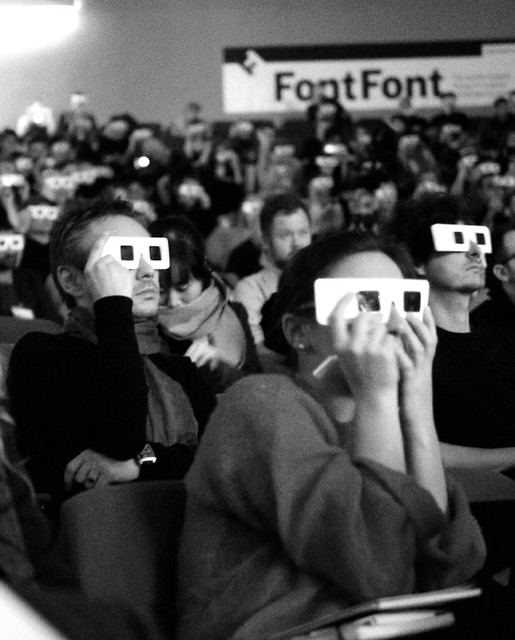
The first TypoLondon stirs things up – and takes the locals by surprise

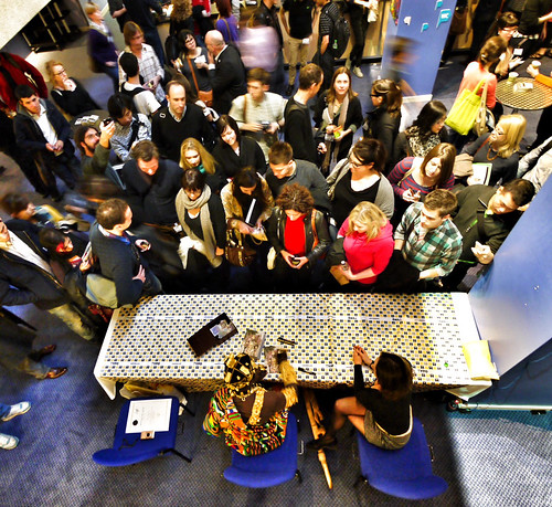
The first TypoLondon conference took many locals by surprise, writes Gerry Leonidas. It was a big event, nearly filling out the Institute of Education’s uninspiring and bunker-like Logan Hall.
It was also expansive in its programming, gathering fine artists, film-makers, book designers, art directors, and typeface designers under a very woolly theme (‘Places’). This deflected from the real thread running through pretty much all the presentations: TypoLondon was about design as story telling, about understanding how people interact, make connections, and construct meaning out of both things and spaces.
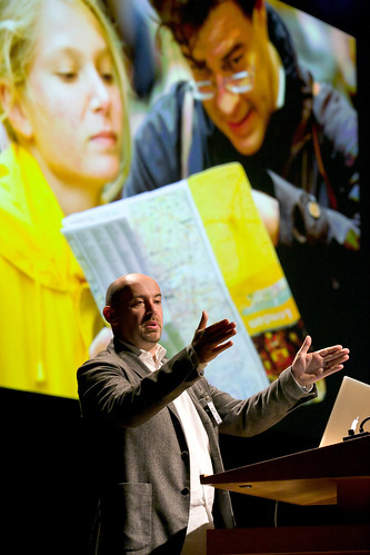
In some cases this was obvious. Tim Fendley’s talk on Legible London (above) was not really about the dry process of making effective signs, but about understanding how people think about themselves in an urban environment: information design as a journey through a street plane at eye level, a dialogue with architecture, and a response to different emotional conditions. (The casual peregrinations of the tourist, and the hurried jog of the business person late for a meeting?) But also design as policy (‘get the people off the Tube’) and empowerment (‘This is your vicinity, walk it’).
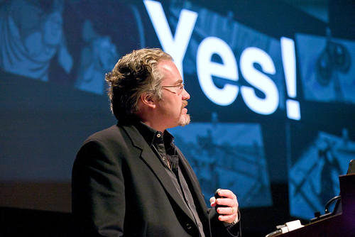
Or Michael B. Johnson using the process of making movies at Pixar to talk, between the lines, about helping people to develop engaging, believable stories (below). His slides provided the most memorable soundbite of the event: ‘Quality is the best business plan’ would have made Don Draper proud.
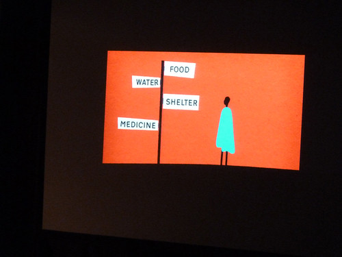
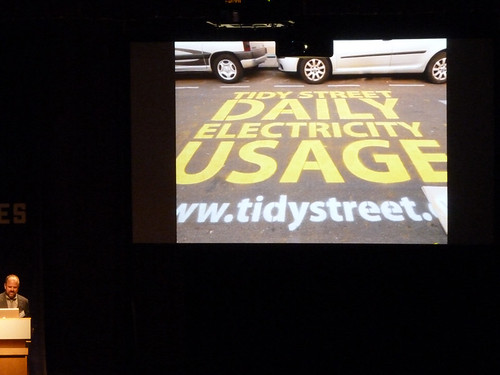
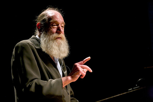
My notes from the three days repeat this focus on understanding how people interact with a designed environment, be it architectural or virtual. On top of this, Nat Hunter and Marina Willer most memorably talked about the strength of narrative in a successful project, and highlighted the responsibility of designers to engage with social issues. Michael Bierut and Chip Kidd’s stories entertained with the vortex of unpredictability that is The Client. In some cases, the meaning was opaque. Lawrence Weiner’s nude voice on a stage offered designers an insight into what art is for. His definition of art as a commentary on the relationship of humans to objects and vice versa would fit easily with most designers, however different their work might be.
There is always a risk that speakers will show you what’s on their hard drive, and the long slots didn’t help in this respect. Two talks leading to the most interesting discussions in the following days were, superficially, of this kind: stuff that had mostly happened years ago. But Jonathan Barnbrook exemplified the Thinking Designer with a Conscience, trying to make sense of an illogical, self-destructive world, with only a pencil and a mouse to make a statement with. There is a strong argument about the designer as social commentator in his work, that should serve as an example for the many students in the audience.
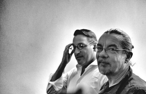
Above: Chip Kidd (left) and Neville Brody (right). Photograph: Thorsten Wulff
Below: Lawrence Weiner
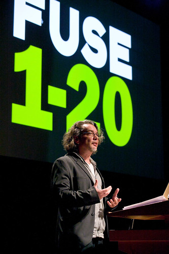
The second talk was by Neville Brody (who I suspect would want an audience, for once, to forget what they know of his past work, and focus on what he’s talking about now). His Fuse retrospective was way overdue for a design audience that is increasingly removed from the period of intensive experimentation of the early years of digital typography. The Fuse series explored the limits of what is a typeface, and questioned what is investigation in design. A lot of the ideas of those years are common currency today, and others are dead – but it is good to revisit them, and ask ourselves if we are pushing ourselves as much.
This conference was not a one-off: TypoLondon 2012 is on the cards, as is an extension to the US. Let’s hope that they continue to stir things up, and remind designers of both the breadth and depth of our field.
Photographs by Gerhard Kassner unless otherwise noted.
Eye is the world’s most beautiful and collectable graphic design journal, published quarterly for professional designers, students and anyone interested in critical, informed writing about graphic design and visual culture. It is available from all good design bookshops and online at the Eye shop.
Eye 81 is on its way to subscribers and bookstores worldwide.

