Saturday, 8:25pm
24 October 2009
Ink and paper - holding up
Another way to decode the future of magazine design?

Colors is a magazine for the rest of the world, writes Andy Cameron of Fabrica.
It’s always had a kind of Web approach, even before the Web got going, so, we wanted to find a way to connect the magazine with all the amazing stories out there.
We decided to open the pages of Colors 76 to contributors who sent us material – pictures, stories, ideas – via the website.
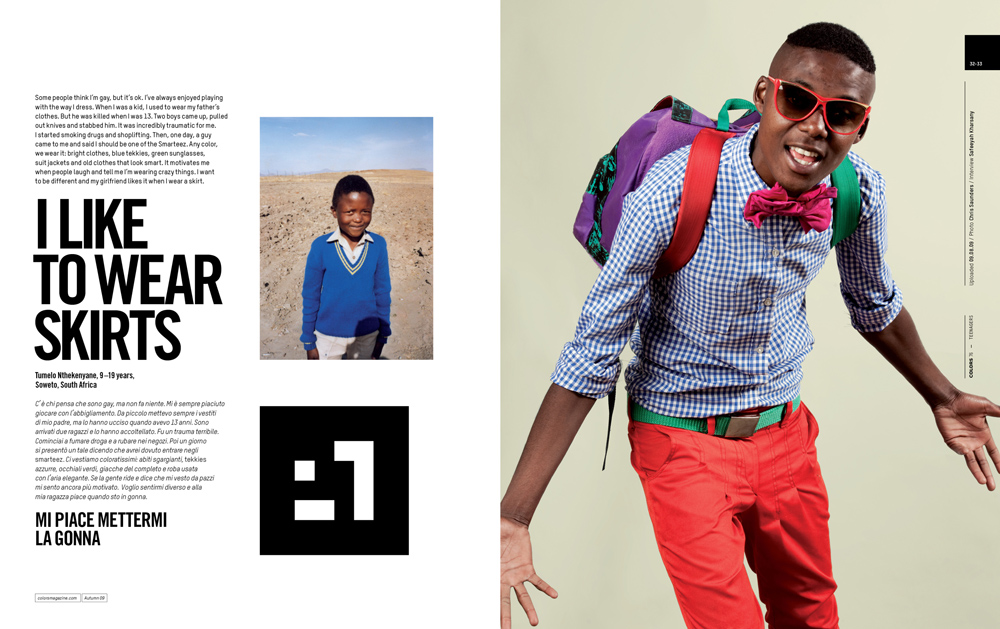
Top: Tumelo Nthekenyane, 9-19 years, Soweto, South Africa. Photo: Chris Saunders.
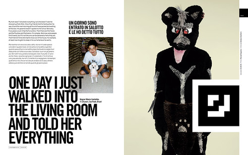
Below: Wagner Ribeiro Santulhão, 11-20 years, Sao Paulo, Brazil. Photo: Manuel Nogueira.
Of course, the Web is full of all kinds of stuff, and there’s no barrier to publication, so we needed to find a way to make our website relevant. We came up with a ‘Web-to-print’ concept: we publish all the stories on the website, and the best stories get published in the printed magazine. So it’s a kind of competition, where anyone can become a journalist for Colors.
We found that even though anyone can publish on a blog, people really like the idea of being published in a magazine like Colors. Ink and paper still has a value – maybe a growing value.
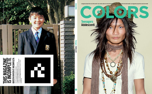
So, we created this link from Web to print and got some amazing stories from journalists we’d never heard of before. Even the cover image (below right) came from a Japanese photographer about whom we knew nothing.
At the same time, we have been experimenting with new technologies called Augmented Reality (AR).
It allows us to connect the magazine to the website, and to put video on the magazine page. This means we can bring the characters to life – they can tell a story, sing a song, whatever. AR is an Open Source technology which has been around for a while, but it recently got ported to Flash, which meant that it would work on the majority of computers around the world – at least those with a webcam. There’s been a few bits and pieces already done with this technology – automobile manufacturers have used it to show 3D models of their latest cars – but little that went beyond a technical trick.
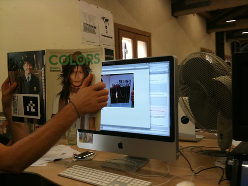
We used it to add another layer of information, which is behind the magazine, which needs the magazine in order to access it. The obvious thing was video. It means we can have a still photo which starts moving, right on the page. It means we can hear the voice of the person in the photograph. It means they can tell their story in their own words. But you have to start with the physical magazine, because you need a printed code to open this new layer when you hold the magazine spread in front of the webcam (above).
So we go from Web to print with the contents and back to the Web to animate the magazine, bring it to life and make a new connection between printed magazine and website.
Read Andy Cameron’s article ‘The medium is messy’ in Eye 30.
Eye is available from all good design bookshops and online at the Eye shop. For a taste of the magazine, try Eye before you buy.

