Tuesday, 10:59am
12 November 2013
Insanely integrated, day one
Tibor Kalman
Sara De Bondt
Morag Myerscough
Felix Pfäffli
Mathis Pfäffli
Theo Jansen
Rens Cools
Design history
Graphic design
Posters
Reviews
Technology
Visual culture
Despite its vague theme of ‘The fluidity in-between …’, the Integrated2013 conference in Antwerp was sharp and entertaining

The biannual Integrated conference organised by Hugo Puttaert, can seem bewilderingly complex at first glance, writes John L. Walters.
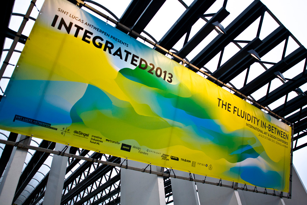
If you only knew about it from its website, a seething panel of randomly generated colour superimposed over large text, and pre-publicity, you could be forgiven for thinking it somewhat disconnected from the real world of reading and designing. (The websites for earlier conferences are equally confrontational.) And that’s before you get round to reading the convoluted manifesto that gave the event its slightly cock-eyed title: ‘The fluidity in-between.’
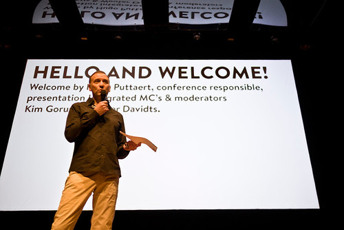
Welcome address by Hugo Puttaert on day one of Intergrated2013.
Top: Integrated2013 promotional banner.
The poster / leaflet declares that Integrated2013 ‘behaves rather like an intangible colourful fluid that lodges itself between a range of visions and philosophies … leaving those present with a sense of “indigestion” that can be interpreted as: “Well, I need to catch my breath, but at least I was there”.’ (Disclosure: I was there as a speaker, alongside Simon Esterson, on the second day.)
Yet once you get there (perhaps ignoring the promise of heartburn and soggy, sensory overload) it begins to make sense. Nearly a thousand delegates, maybe 80 per cent of them students, packed into the impressive Blue Hall at Antwerp’s De Singel and listened – attentively, thoughtfully, critically – to 40-plus speakers in a wide-ranging programme.
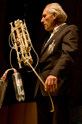
Theo Jansen demonstrates the lemonade bottle-assisted hydraulic system of a Strandbeest.
Puttaert departed from graphic design conference conventions in several ways – the inclusion of fine artist Cristo and Strandbeest creator Theo Jansen added an extra dimension. Both were mesmerising speakers, who willed their young audience to ask sparky questions. The quickfire sequences of ‘Jonn’ [young] presenters – talks of between twelve and 24 minutes – were unpredictable, sometimes disruptive, adding a welcome energy at times when the conference might have sagged. The proceedings were punctuated by some short, colour-themed ‘in-between movies’ designed by third-year students from Sint Lucas in Antwerp.
Rick Poynor talking about the late Tibor Kalman (see Reputations in Eye 20).
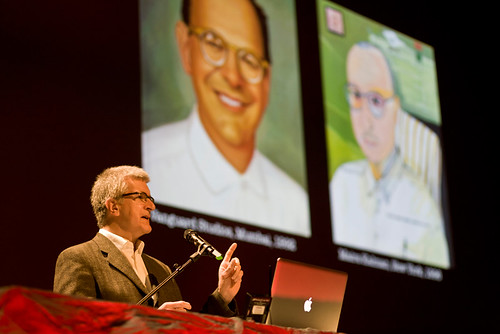
Rick Poynor began the first day with a talk (commissioned by organiser Puttaert) about the late designer Tibor Kalman (1949-89). Early in the lecture, when Poynor asked the young audience whether they had heard of Kalman, very few hands went up. Poynor mapped out the career of Kalman and his studio M&Co from album covers (Talking Heads, Hal Willner’s Lost in the Stars) via Restaurant Florent to his memorable, sometimes subversive promotional gifts. He also took us through Kalman’s startling thirteen-issue run as editor of Colors magazine for Benetton. And we were treated us to some of Kalman’s memorable aphorisms, such as ‘Design doesn’t have to be nice to look at, it just has to work.’ Poynor pointed out that such ideas have entered the design discourse because of characters such as Kalman.
Yet Kalman has often been criticised for his ‘preachy’ or ‘didactic’ pronouncements, and Poynor gave airtime to critics such as Thomas Frank, who was critical of what he termed ‘a bullying species of “Lifestyle Leninism” in the pages of Colors.’
Morag Myerscough speaking about the ‘Power of ten’ summer shows at London College of Communication. See ‘In the thick of it’ in Eye 79.
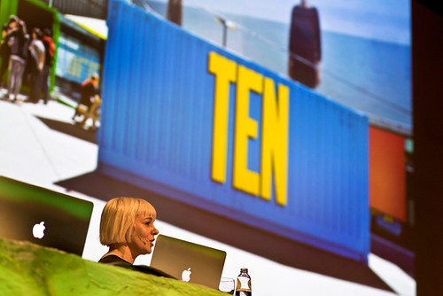
Even the more conventional ‘show and tell’ presentations at Integrated2013 were given an editorial twist. Sara De Bondt, calling her talk ‘Occasional Presentations’, focused her attention on her publishing imprint Occasional Papers, while Morag Myerscough talked about her design for physical spaces such as schools, cafes, arts venues and health centres, many of which required direct involvement with the actual people who used these places.
Another example of Myerscough’s environmental design was in the news just a few days later when adverse weather blew her giant beach ball called I Get Around (a public art installation) into the road by the Old Street Roundabout.
Felix and Mathis Pfäffli.
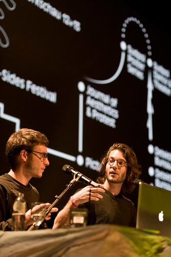
Felix and Mathis Pfäffli concentrated on posters, presenting a multiplicity of startling designs that showed what they called ‘post-digital materiality’. For one of his posters for the ‘B-sides Festival’, Felix drew a diagram for a record player that would destroy the contents of the A-side while playing the B-side (below).
Felix Pfäffli.
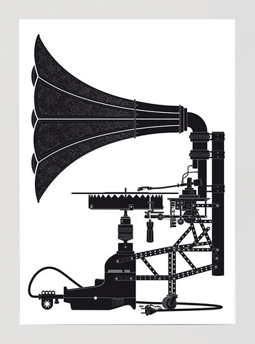
In due course, someone actually constructed such a machine. Felix also explained the ‘three layers of process’ he used to design posters: subjective, objective and graphical, and showed how this informed the design for ‘There must be some kind of way our of here’ (below).

Theo Jansen was the hit of the day with his eccentric Strandbeests – creatures made largely from exoskeletons of yellow electrical insulation tubes, powered by the wind and made to live out a life of poetic movement on the beach near Scheveningen, Holland.
A compilation video showing Theo Jansen’s Strandbeests.
Picking up a cue from ‘Joon’ presenter Rens Cools, Jansen made a passionate case for the negligible importance of ‘creativity’. (The immaculately coiffed Cools had made an eight-hour video in which he sat on a sofa waiting for inspiration. None came.)
‘I work with function,’ said Jansen. ‘I don’t want to make beautiful animals – I just want them to work. Just work hard – don’t try to be creative.’ After showing us several delightful videos that showed his strange, magical creatures skipping on the sand, trotting backwards when the sea got too close,’ he gave a short demonstration of the Strandbeest’s hydraulic systems (made with plastic lemonade bottles) and engaged audience members in discussion, returning to his theme about the dangers of self-consciously trying to be ‘creative’. ‘Don’t try to make beautiful books and you’ll make wonderful books.’
The auditorium at Integrated2013.

John L. Walters, editor of Eye, London
Eye is the world’s most beautiful and collectable graphic design journal, published quarterly for professional designers, students and anyone interested in critical, informed writing about graphic design and visual culture. It is available from all good design bookshops and online at the Eye shop, where you can buy subscriptions and single issues.
