Thursday, 8:00am
6 March 2014
Irrational responses
GraphicDesign&
George Hardie
Bibliothèque
Nick Couch
Kapitza
Peter Crnokrak
Sennep
Europa
Tom Duncalf
Rick Banks (Face 37)
Book design
Graphic design
Illustration
Information design
GraphicDesign&’s Golden Meaning project provokes designers and illustrators to interpret geometry

Late last month, Lucienne Roberts and Rebecca Wright of GraphicDesign& launched their publication Golden Meaning at the Design Museum, writes Joseph Bisat Marshall.
This follows their first book, Page 1: Great Expectations. Golden Meaning takes us on a different path – mathematics rather than literature.
Graphic designer Lucienne Roberts and educator Rebecca Wright established GraphicDesign& to challenge preconceptions. ‘The most interesting thing about graphic design … is what it connects to’, explained Wright. Golden Meaning collates the responses of 55 designers and image-makers to the same brief – to explore and communicate the idea of the ‘golden mean’ across one or two double-page spreads, accompanied by a written rationale for the work.
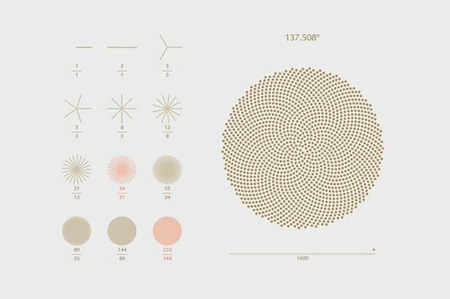
Screenshot from Sennep’s ‘The Golden Spiral’, an investigation into seed formation in sunflowers.
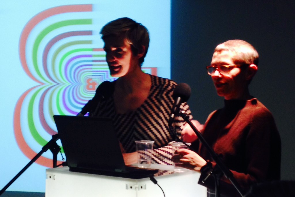
Top: Wright (l) and Roberts at the Design Museum, with custom GraphicDesign& ampersand (designed by Christian Schwartz) on the screen behind. Photo: John McGill
Alex Bellos, Guardian writer and author of Alex’s Adventures in Numberland, worked with GraphicDesign& to produce Golden Meaning, which he explained as ‘geometry combined with the aesthetics and beauty of mathematical order’. The launch began with his explanation of the golden mean (often called the golden ratio or golden section), which was first defined by Greek mathematician Euclid. When the ratio of two quantities is the same as the ratio of their sum to the larger of the two quantities, they are said to be in the golden ratio. This irrational number is denoted by the Greek letter phi (φ) and has a value of 1.618…
Many of the responses to the brief utilised the Fibonacci sequence, which is closely related to the golden ratio – each number in the sequence is the sum of the two numbers before it – 1, 1, 2, 3, 5, 8, 11, etc. (The ratio of each pair of successive numbers in the sequence – 1, 2, 3/2, 5/3, 8/5, 11/8, etc. – gets progressively closer to phi without ever equalling it.)
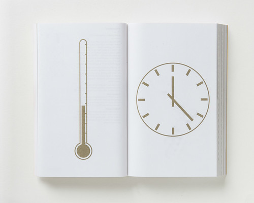
Bibliothèque’s visual mnemonics for the golden ratio and golden angle (blood temperature 38° and 12:23).
Speakers at the event included eight of the book’s contributors, who each spoke of the reasoning behind their designs with candid honesty regarding their mathematical prowess.
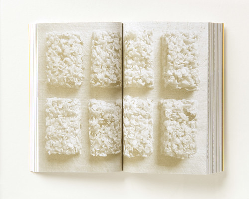
Nick Couch (Desk Camping) had wondered whether the Fibonacci sequence could be applied to a baking recipe, a thought that had occurred to him while watching The Great British Bake Off. He admitted a lack of mathematical and culinary skill, but his response was a flapjack recipe that used Fibonaccian proportions of ingredients to make ‘Golden Bars’.
Nick Couch’s ‘Golden Bars’ flapjacks, sliced into golden proportions.
Spread from Golden Meaning showing George Hardie’s ‘Château d’Yquem’ bottle and glasses.
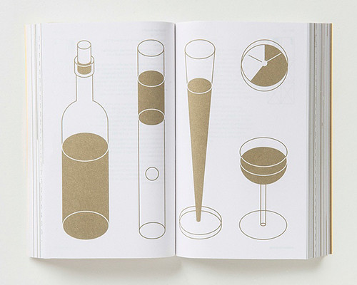
Illustrator George Hardie ‘ended up with a very dry drawing of a very sweet wine’. He said that his ‘whole career seems to have been about wine, bottles, taste, pouring and measuring,’ and Hardie’s final submission is an optimistic drawing where ‘all the glasses are more than half full’.
Other talks included Kapitza’s ‘font system’, Bibliothèque’s visual mnemonics, Peter Crnokrak’s planetary movement, Sennep’s golden spiral generator, Europa’s ‘if Fibonacci was a concrete poet’ and a coded type layout (using Processing) by Rick Banks (Face 37) and Tom Duncalf.
Screenshot from the ‘Language of Nature’ website by Rick Banks (Face 37) and Tom Duncalf.

Submissions were markedly different from each other, though the speakers were unanimous in their engaged and light-hearted descriptions of their processes. With this launch, GraphicDesign& has continued the exploration of graphic design in a progressive nature fitting to 1.6180339887498948482045868343656381177203091798057628621354
486227...
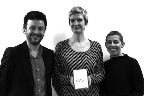
Author Alex Bellos with Wright and Roberts of GraphicDesign&. Photograph by the author.
Joseph Bisat Marshall, designer and design student, Central Saint Martins, London
Eye is the world’s most beautiful and collectable graphic design journal, published quarterly for professional designers, students and anyone interested in critical, informed writing about graphic design and visual culture. It is available from all good design bookshops and online at the Eye shop, where you can buy subscriptions and single issues.

