Tuesday, 8:59am
20 October 2009
Just Add Stock winner, Stamps

Lest We Forget – Hat-trick Design's stamp series for Royal Mail

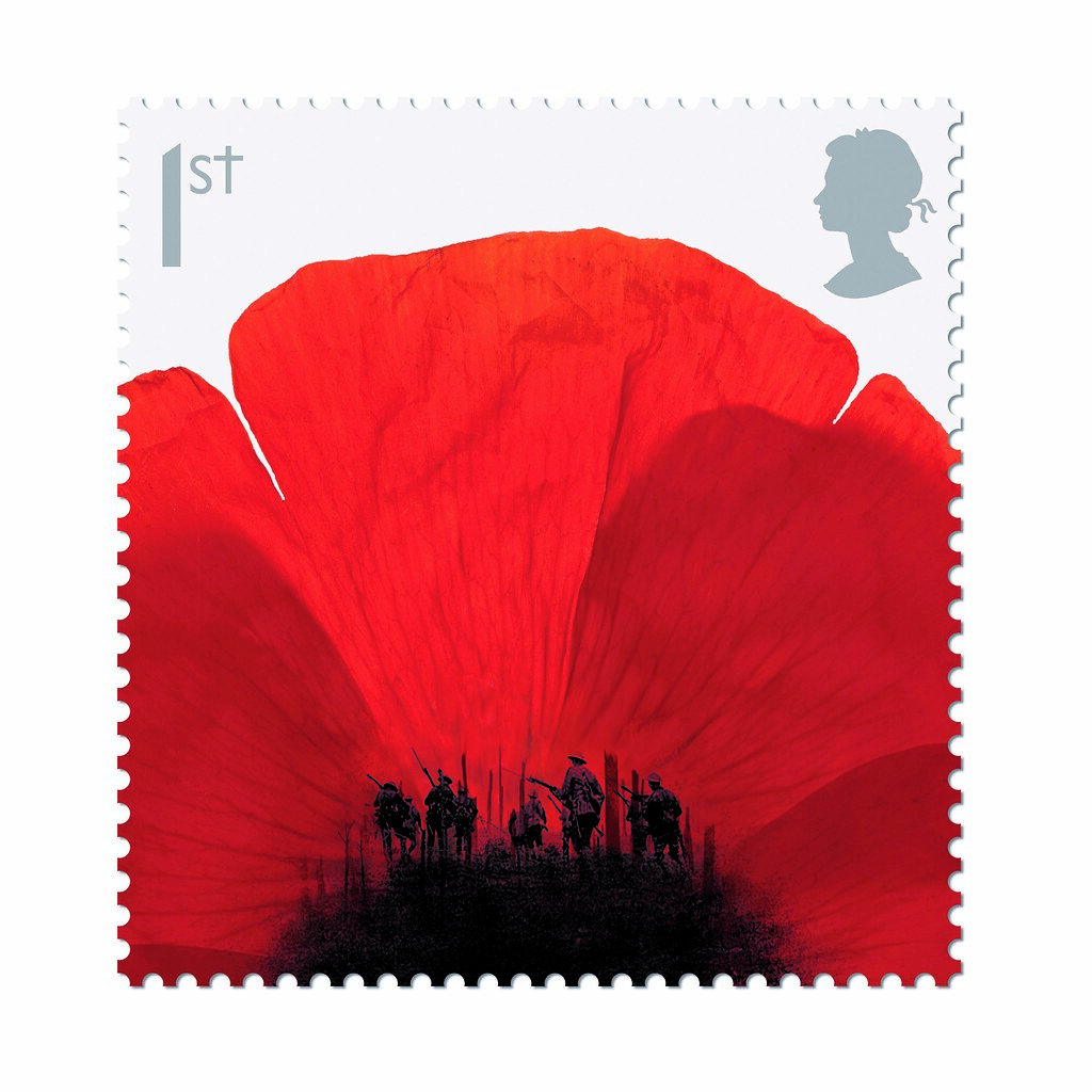
Combining a Remembrance Day poppy with a photograph of the Somme battlefields, Hat-trick’s clever use of stock was the undisputed winner of the Stamps category.
Hat-trick is a small studio based in London, founded in 2001 by Gareth Howat and Jim Sutherland with the aim ‘to be as creative as possible on all our projects, no matter what the brief or client.’ Howat and Sutherland work as Creative Directors, and like to get directly involved with the design projects: ‘We are pretty hands-on, and one of the reasons we set up was to get back to that – we still love designing and working with our designers.’
Their winning entry (top) was the second in a series of stamps designed to commemorate key events in the First World War, in this case the Battle of Passchendaele. Howat comments: ‘We wanted to keep the theme of using an image of a Poppy with a visual twist. We looked at all sorts of ways of showing poppies, from different angles and styles, and one of the first things we noticed was the stamen in the centre are very distinctive, and almost looked like small figures. Having looked through loads of First World War imagery we made an instant connection and thought we could combine the two things.’
Stock photography was a seasonal necessity for this design: at the time of the project, it wasn’t possible to shoot real flowers. Howatt and Sutherland spent a lot of time looking through poppy shots, seeking out an image that showed the delicate petals, and had a real sense of texture. The final flower image was found on Getty Images, and a classic shot of soldiers going ‘over the top’ was selected from the Imperial War Museum image archive.
One of the really big challenges with stamp design is creating something that works at such a small size; Howat describes it as ‘art in miniature’: ‘When you design stamps there is an unbelievable amount of detail that goes into it – it looks deceptively simple but it’s a real labour of love – and so it should be. We have done a few sets with the Royal Mail (Brunel, Darwin, Rescue at Sea etc.) and it’s always a really enjoyable challenge. It does feel like you are creating something that will have a sense or permanence or history to it.’
‘I would say normally that we try to always create imagery specifically for projects, but its how you use the images and the idea behind it that is what really counts for us.’

Above: Royal Mail, ‘Mayday – Rescue at Sea’. This stamp series commemorates the centenary of the adoption of SOS as the worldwide Morse code distress signal at sea: ‘to reflect this we designed a special horizontal perforation in the form of dots and dashes · · · — — — · · · (SOS). This was combined with dramatic duotone photography, with the RNLI high-visibility orange highlighted.’

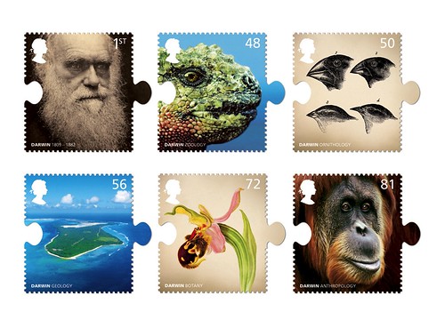
Above: Royal Mail, ‘Darwin Stamps’. This series of stamps uses ‘historical and modern stock images to portray all the areas of Darwin's study, from Geology to Biology. We wanted to communicate how all these areas were interlinked, and that each study informed the bigger picture and ultimately led to his theories.’
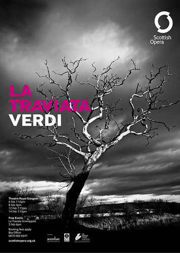
Above: Scottish Opera Identity. ‘The company needed an identity that would challenge the perception of opera as the preserve of rich people, aesthetes, and corporate freeloaders, and make it more accessible to a wider audience. The brief was to ‘Open Up Opera’. The solution is based on taking the ‘O’ of Opera and opening it up to form the ‘S’ of Scotland.’
Just Add Stock: Stamps / Hat-trick Design
Lest We Forget stamp series (Royal Mail)
Design: Hat-trick
Images: Getty Images; Imperial War Museum
To see the winnners, plus all the highly commended entries, read our article about Just Add Stock in Eye 73, out now!
Eye is available from all good design bookshops and online at the Eye shop. For a taste of the magazine, try Eye before you buy.

