Monday, 5:31pm
27 June 2011
Labyrinth of magazines
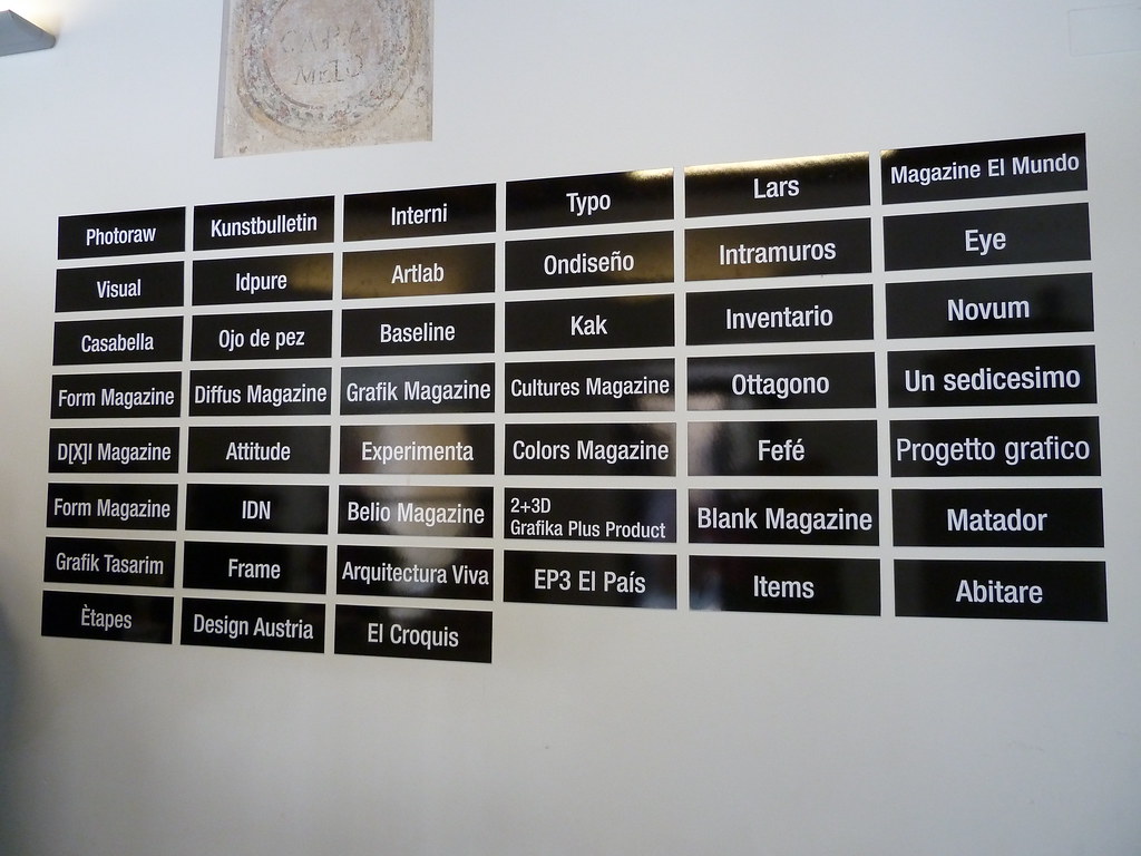
Segovia’s Enformato brings together European design / visual culture titles.

Earlier this year, the newly refurbished Palacio Quintanar in Segovia, northern Spain, held an exhibition of nearly four dozen European design / visual culture magazines, (writes Eye editor John L. Walters) including Experimenta and Visual (Spain), Etapes (France), Typo (Czech Republic), Attitude (Portugal), Colors (Italy) and Eye.
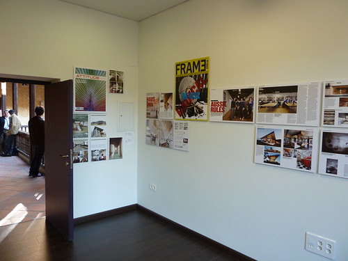
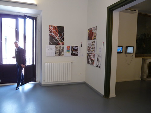
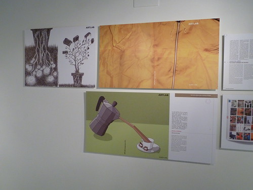
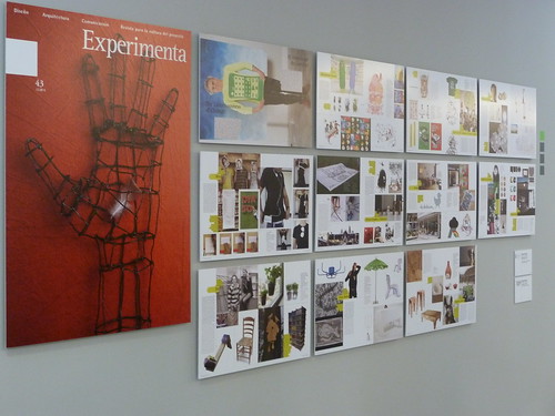
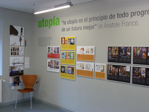
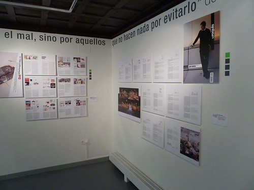
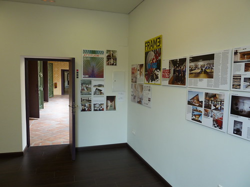
Selections of the magazines’ covers and pages, grouped into categories such as ‘Tipografica, ‘Experiment’, ‘Innovación’, ‘Sostenibilidad’ etc., were displayed throughout the Palacio’s spacious labyrinth. It has a beautiful location: Segovia is bidding to be European Capital of Culture in 2016 and this adventurous space for contemporary culture is one of many arguments in its favour.
To complement the exhibition, Giovanni Ferraro and his curatorial team invited 22 editors and art directors from ten countries to join them for two days of public round table talks on the future of design magazines: specifically those dealing with graphic design, photography, interior architecture and product design.
The three sessions had six editions and a moderator in each, while a tag team of translators in tinted glass booths kept up with quickfire panel discussions and questions from the audience.
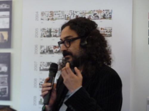
Some speakers described their own magazine’s attitude to publishing in print or otherwise, while others chose to address wider issues. Michel Chanaud (above) from Etapes chose not to speak, but was a genial presence throughout the two-day event.
Much of the debate was about the future of print magazines, and for me there were several ‘Groundhog Day’ moments, since I’d spent the previous evening at the inaugural ‘Printout!’ discussing the theme ‘why print when you can blog’ with fellow editors and an enthusiastic, youthful audience of ‘magazinaholics’.
Familiar issues such as the thrill (and smell) of printing, the relative ‘greenness’ of dead-tree publishing vs short-lived computers and mobile devices and the difficulties of distribution (both physical and virtual) dominated both events. There was just one Web-only title: the Danish Diffus.
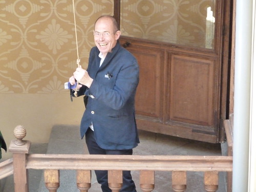
Visual’s Alvaro Sobrino (above) declared: ‘Other publishing houses have money to throw away on digital projects – we can learn from their mistakes. We are like cockroaches, we’re small and hard and we resist everything.’
Daniela Vilas-Boas of Attitude had a similarly poetic turn of phrase: ‘When you drop blue ink in a glass of water, you get a new reality … the internet is like that.’
Italian publisher Pietro Corraini (Un Sedicesimo, Inventario) said that he was not afraid of working on the internet, but declared: ‘Paper is our medium, books are our passion’.
Baseline’s Jonathan Hunt spoke of the way the magazine is using social media as a promotional tool.
So while celebrating the diversity of magazines, the flat presentation boards had some of the levelling-out (blanding out?) effects that were frequently bemoaned during some of the discussions about new screen-based or tablet-style formats.
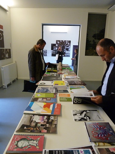
The touchy-feely aspects of magazine use were not completely ignored: there were a few long tables covered with magazines (below), which provided opportunities to browse some recent editions of Matador, and explore titles such as Un Sedicesimo, Photoraw and Fefè.
The eccentric Blank was presented, in all its 3D glory, in a glass cabinet (below). The Palacio Quintanar also had a shop where you could buy many of the magazines on display.
The curatorial concept behind ‘Enformato’ grouped different magazines under (colour-coded) themes. Since the magazines’ layouts and contents acted as ‘default curations’ of design-related content, this worlds-within-worlds approach didn’t always succeed.
As Chanaud remarked, this stretched-out ‘flatplan’ view of a magazine’s contents is the way that usually only a magazine’s editors and designers view the titles, when they put print-outs up on a wall or display board. (Though the Palacio’s light, airy rooms are preferable to many editorial offices I’ve worked in.)
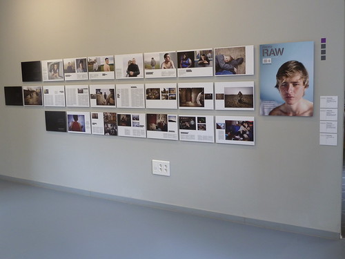
For some magazines, the display emphasised the poster-like qualities of covers and opening spreads. Photo-essays (such as those in Ojo de Pez and Photoraw, below) came across reasonably well, but long articles meant for reading are not best suited to the gallery wall. I’d be interested to hear about the way other exhibitions have shown magazine design and content in a gallery: it remains a challenge for designers and curators.
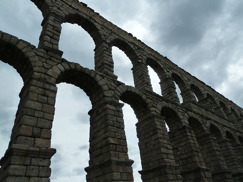
Yet as a venue and a destination Palacio Quintanar and Segovia (below) are admirable. It’s to be hoped that ‘Enformato’ serves as a springboard for further ventures.
Palacio Quintanar. Calle San Agustín, s/n. 40.001, Segovia, Spain.
Tel.: 921 466 385 / [email protected]
www.palacioquintanar.com
Eye is the world’s most beautiful and collectable graphic design journal, published quarterly for professional designers, students and anyone interested in critical, informed writing about graphic design and visual culture. It’s available from all good design bookshops and online at the Eye shop. For a taste of no. 79, see Eye before you buy on Issuu. Eye 79, Spring 2011, is out now.

